MapCarte 298/365: Pin map by multiple people, date unknown

MapCarte298_pinmap

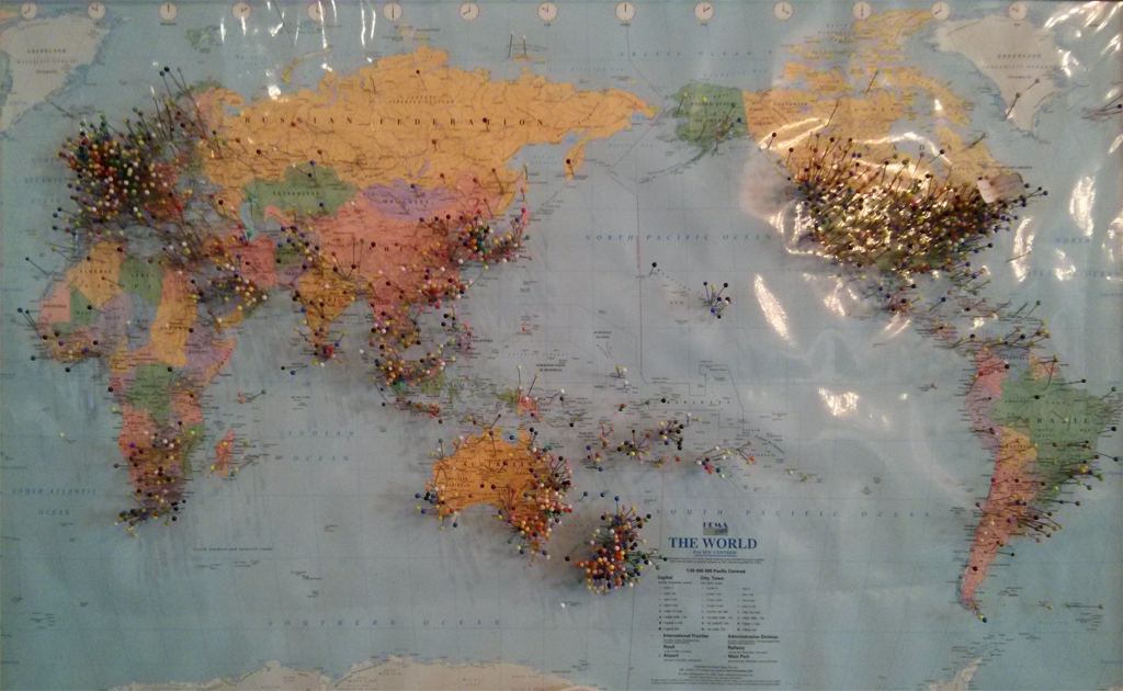
This is a somewhat abstract MapCarte entry in the sense that it doesn’t relate to a specific map, in a specific place or by anyone specific. It’s the sort of map you might find all over the world in various places, made by unknown contributors and whose purpose is also undefined. The physical map of the world, placed on a wall, complete with many map pins stuck in them is a wonderful object and a beautiful piece of collective, cumulative and collaborative design.

Usually found in cafes and coffee shops as a way to demonstrate how such a vendor has a worldly reach, the maps go beyond that objective. They are a physical collection of people, represented in space. The fact that each map pin exhibits a colour suggests a classification of type that simply doesn’t exist. On a conventional map such rainbow colours would cause concern but there’s something unquestioned about the random collection of colours that are positioned across the map.

MapCarte298_pinmap_detail
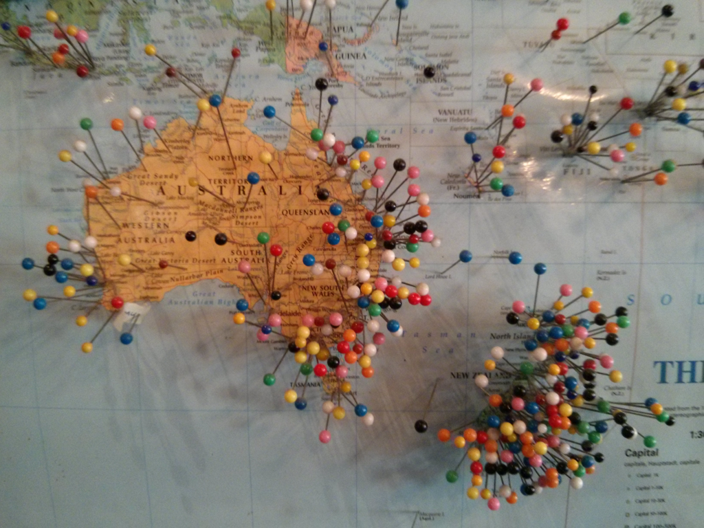
Of course, the areas with densely positioned pins are inevitably those nearest the vendor but that in itself creates a wonderful pattern as people squeeze their contribution onto the map.

Ultimately, these are frivolous maps but which bring delight. We enjoy looking at the maps, each one different yet strangely uniform because they simply show us where people live. In a world of digital cartography it’s pleasing that these personalized renderings still exist. They bring character to many walls and allow us to interact with the map itself, leaving a small mark of where we’ve been to add to those of where everyone is from.


MapCarte 125/365: Where on earth have you been? by The Guardian, 2014

MapCarte125_guardian

A lot is currently being made of personalised geographies and maps that reflect our supposed desire to see content filtered in some way by what map-makers think we might want to see. Google are pioneering personalised content in Google Maps based on our search histories and other preferences. But there’s always been a far simpler way of understanding personalised geographies. Sometimes these are as basic as a world map in a pub where patrons are invited to place a pin to show their location…thus the map of the pub’s patronage takes shape. We may even have a map at home in which we place pins to show where we’ve been.

The Guardian, in collaboration with Kiln have created a simple application that allows us to create our personalised world of travel. The map requires you to input the countries you have visited and the number of times you’ve been there. It’s a simple interface to add your information and the map is then built. What this app does very well is not just default to a shaded choropleth but turn the data into a density equalizing cartogram. Countries visited are shown proportional to each other in size. The map is then presented as if on a folded piece of paper with a nicely constructed layout. You can print your map or share it.

Of course, what’s really going on is The Guardian is collecting data through the choices of our selections which is possibly the real purpose of the map. They still achieve that aim by making the application interesting, simple and designed to encourage participation.

Simple. Fun. Eye-catching. Visit The Guardian’s web site here to make your own personalised map.

MapCarte 93/365: Mem-O-Map by John G. Drury, 1946

MapCarte93_memomapPictorial maps are usually designed for tourism products since their look and feel is suited to the ephemeral sense of place we might gain of somewhere we only briefly visit. They allow us to recall a few places and the stylised graphics give us a clue of perhaps the main defining feature or characteristic. They are often strongly stereotypical, and sometimes include elements that border on being offensive. Here, the style was adopted in a similar vein yet under completely different circumstances.

John G. Drury of the 214th Ordnance Battalion US Govt produced a range of maps for military personnel during the Second World War. Called Mem-O-Maps, their purpose was as a souvenir map on which troops could keep trace of their ‘adventures’ and movements. The maps represent an important historical period and integrate pictorial and geographical elements in a unique way. This example, of Europe, includes the use of cartoons and familiar map shapes used as other objects which belie the conditions and experiences that the troops must have faced in reality. They sanitize conflict but, perhaps, provided troops far from home a way of re-casting their experience and imagining themselves as part of something altogether different.

As a memento of their individual battles, the maps  encouraged servicemen to note where they “landed or anchored” and when, as well as where they “bivoucked or stationed” while there. Some maps note the airfields as well as headquarters and all vignettes of local culture and people.

These almost whimsical maps are designed to support the creation of personalised geographies. At a time when digital mapping is beginning to experiment with the creation of personalised content that would render the same map in different ways for different users, Mem-O-Maps demonstrate the principle in action. Each map has a basic level of content yet individuals are encouraged to customise them according to what was unequally important to them.