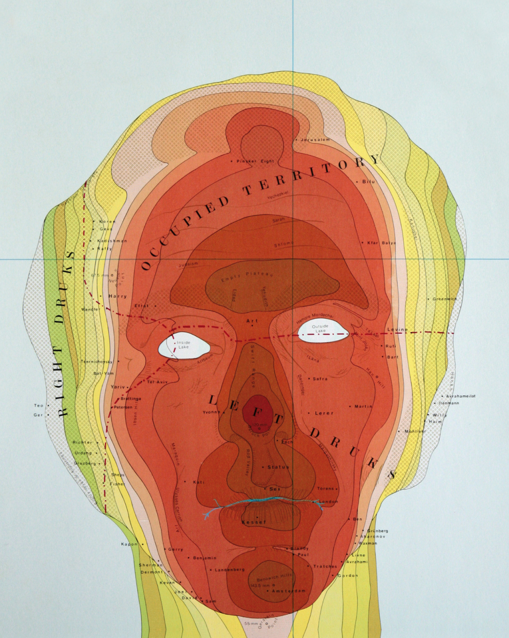
 Using maps as a way of expression is common and fertile ground for artists and a wide range of social commentators. Here, Philip Drucks uses the shape of his own head to provide a narrative and a metaphor for his own existence. The image simply uses the three-dimensional head with symbology used to represent different distances from the viewing plane. It’s effectively a hypsometrically tinted relief map though, of course, a large slice of artistic license has been applied with the colour in particular.
The area around Right Drucks shows the side elevations that mimic a fairly standard tint pallete but the front of the face takes on a startling range of red hues. It’s not the sort of elevation tinting you’d ordinarily find on a map but then this isn’t an ordinary map.
Place names locate family and friends around the map and clever use of other map symbology helps explain the line of the closed mouth (a river) and the empty holes for the eyes. Drucks is not the only one to have mapped the human face or form in this way but it provides a strong image and a powerful way of mapping map symbology onto alternative forms to give them some sense of spatiality.