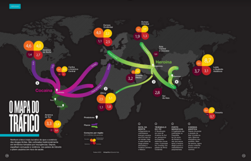
Occasionally, a map can be tangential to the graphic display…sometimes even a luxury or superfluous in it’s fundamental sense. This scenario tends to happen with very simple data and where a thematic map with no topographic detail is about as detailed as one would need. This example of the global drug trade illustrates this perfectly. The flow lines between regions of origin and consumption are perfectly represented by the lines. The proportional symbology illustrates the mix of drug types. There is little need for the map and it is simply used here for emphasis.
Detail is minimal; and the information could easily have been presented in a series of graphs, yet by using the map Asta has immediately connected people’s view of the trade to places. It is used to good effect since the outline of the world is barely visible and recedes to the background. The vivid colours are visually powerful and the text is there for those wishing to read further, though it’s unnecessary in order to get the idea of the information being presented.
A simple dataset, mapped simply but with good clear design to support ease of use, information recovery and understanding. The map is tangential yet plays a good supporting role.


Pingback: Best Map of the Global Drug Trade | Intro to Global Studies