
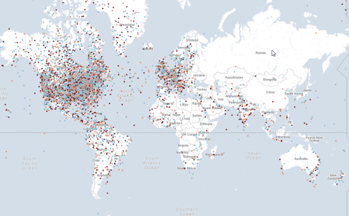
Click above to view interactive map
It’s often the case that a map with lots of push-pins is considered pretty poor cartography. Most would recommend that the data ascribed to each point be summed, aggregated or reported differently. Sometimes, though, the point of the push-pins goes beyond cartographic purism. This map paints an emotional picture of the response to the terrorist attacks of September 11th 2001 and was published on the 10th anniversary as a way of reflecting on the events of the day. Contributors were encouraged to leave a message and to tag their pin with an emotion such as ‘angry’, ‘fearful’, ‘unmoved’, ‘secure’ or ‘hopeful’. Any attempt to look at the responses analytically and come up with a different cartographic representation would detract from the raw emotion.
The very point of this map is to lay bare the data. It’s points on a map that reflect individual reactions to the horror of the attacks. Each person’s contribution is no more or less than any other and so providing a place for the comments to live is the purpose and it needs no more cartographic finessing. This, then, might almost be considered a spatial book of condolence.
There have been hundreds of maps that paint a picture of the attacks showing the detail of the site, the plan of the attack, the social network of the terrorists and the reconstruction but none that simply uses a map to give people a place to share their words. Maps can be divisive and the harsh lines we place on them to demarcate territory often cause conflict. This shows us that they can also be a place for humanity and that brings people together irrespective of boundaries.
