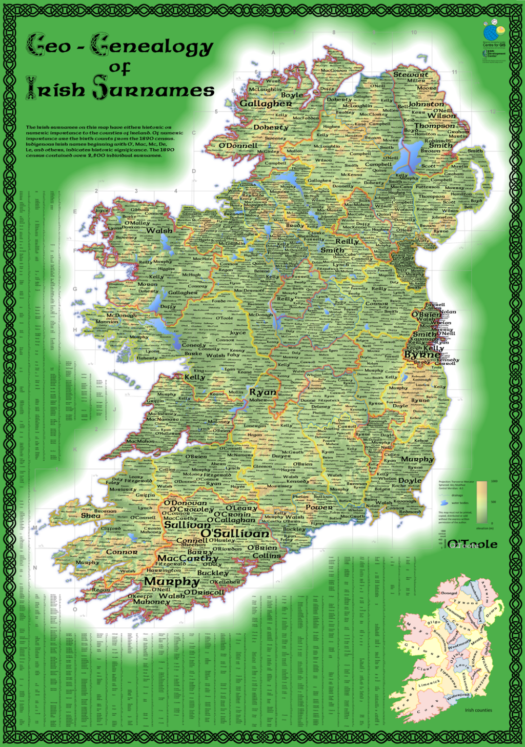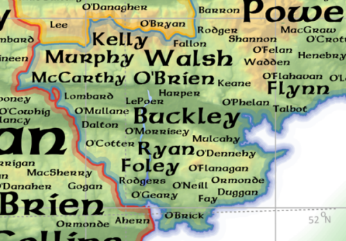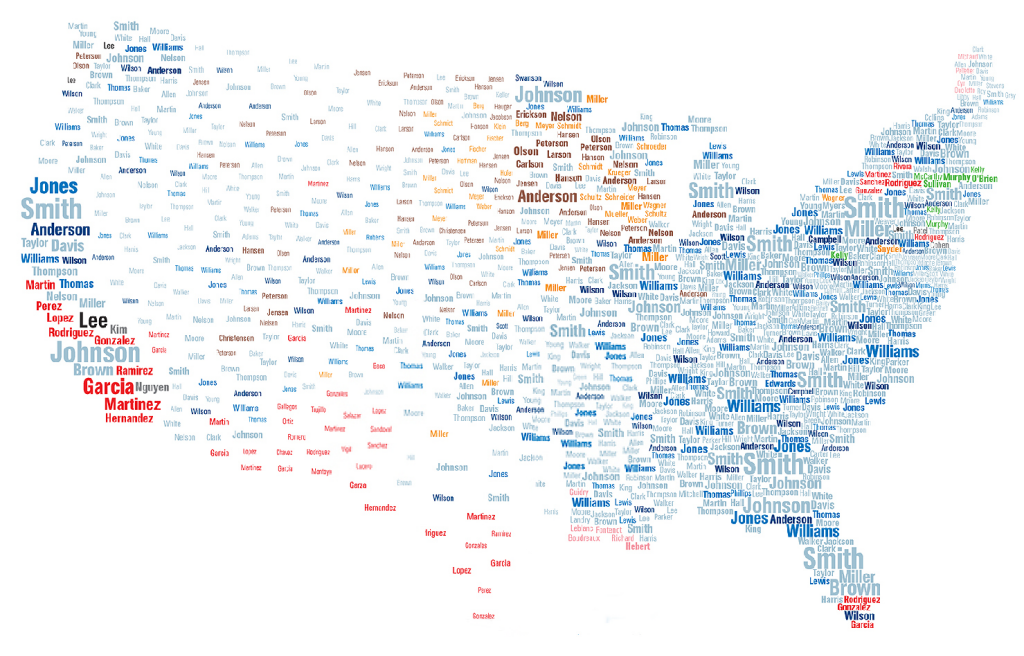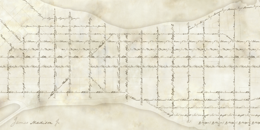
Typographic maps have become rather popular in the last few years as many different cartographers and map-makers have sought to create a map based entirely of typographic elements. MapCarte has featured a number of these (e.g. Irish Surnames MapCarte 76, Axis Maps Mapcarte 179) because they showcase a different approach to design and communication. Here, Daniel Huffman has created a beautiful historic looking map that recreates the street network of Madison, Wisconsin using the street names.
This sort of approach might be somewhat ordinary for many towns but here is a case of the map content providing detail that elevates the end product to something rather different. The street names have meaning as they are all based on the signers of the U.S. Constitution, so named by James Doty when the street network of Madison was laid out in 1836. The map, then, not only provides a depiction of the names but also a link to history of the city and the country.
 Huffman goes further than simply using an historic looking font though – he traced scanned copies of the signatures from the Constitution document itself and shapes the street network accordingly. The mix of size, style and colour gives the map a sepia appearance and creates interest. The signatures add personality to the map and provide a link to the individuals themselves. Each street takes on something of the personality of the signatory and gives it a sense of belonging. It creates distinct patterns and makes each street unique where, conventionally, we’d use standard typeface and treatment to secure uniformity. Huffman shows us that by breaking the rules we can create something both different and meaningful.
As Huffman himself notes the map “aims to reconnect Madison’s modern citizens with the people their city was intended to memorialize”. The design fits that objective, creating not only a lasting memorial but also a beautiful cartographic product.