MapCarte 226/365: Redrawing the Map of Great Britain from a Network of Human Interactions by Carlo Ratti et al., 2010

MapCarte226_interactions

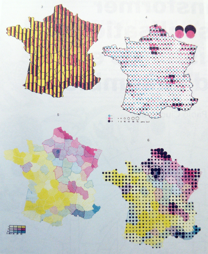
Regional boundaries defined for the purposes of administration inevitably split a country into arbitrary areas. Such areas are never optimal for every mapping situation so one way to overcome the limitation is to draw your own boundaries. This isn’t an insignificant task and requires a deep understanding of the new geography as well as the data to be able to construct the new boundaries.

Here, Carlo Ratti and colleagues questioned whether traditional existing administrative boundaries respect the natural ways in which people interact by delineating space using an analysis of the network of over 12 billion individual telephone calls.  What they achieved was a beautifully abstract map of Great Britain that shows people interact inside traditional boundaries.

The map base is a grid of squares each comprising 3,042 pixels.  Each pixel is a node and its connection strength to every other pixel is shown by varying opacity.  This creates a strong structural framework for the map with connecting lines showing the strongest 80% of links.  Colours identify regions that emerge through analysis with the dark colour for London allowing lines connecting it with elsewhere to be clearly seen across lighter regions.

The prudent use of labels to identify major cities is just enough to support interpretation and the leader lines tie them well to the map, clearing the map itself of labeling.  The tilted viewing angle allows connections to be seen in a way that a plan view wouldn’t allow and since height of the connections is unimportant the perspective distortions don’t compromise the view.

A stark map in many ways and one that hides the complex conceptual and analytical framework that underpins its construction. It works.

MapCarte 213/365: “1945-1998” by Isao Hashimoto, 2003

The topic or theme of a thematic map goes a long way to explaining its success. No matter how hard you might try, a run-of-the-mill subject matter will always find it difficult to speak to a large audience and gain huge plaudits. It’s fair to say that many of the more successful thematic maps tackle an obscure or contentious subject matter. They most definitely do have something to say and if you marry the form and function well, then they stand out from the crowd.

Isao Hashimoto’s utterly simple approach to map-making would not work when applied to any number of thematic maps. Using simple shapes, an aesthetic that borrows heavily from computer games from the 1980s with their blocky graphics, annoying sounds and a blinking almost strobe like effect…this is not an easy map to look at. But that’s the point. The map is a statement on the horror of the 2053 nuclear explosions the map catalogues with a temporal framework of 1 second per month.

Early horrors make way to periods of relative quiet before huge testing programmes begin. The counters show the cumulative ‘scores’ and different ‘players’ enter the game as they become nuclear nations.

Hashimoto’s approach to the map and the style he embraced make this a stand-out map. The visual and audible discomfot matches the subject matter and the stark presentation brings home the message he wished to communicate perfectly.

MapCarte 210/365: Multidimensional mapping by Jacques Bertin, 1967

MapCarte210_Bertin

Although strictly speaking MapCarte is about showcasing great examples of map design, many maps from after the mid-late twentieth century and onwards owe much to one man’s detailed exposition of cartographic symbology. Jacques Bertin’s ‘Semiology of Graphics‘ was first published in French in 1967 and subsequently translated into English and republished. Bertin’s classic ‘Semiology of Graphics’. It is a classic of information design as it leaves almost no stone unturned in presenting the principles of graphical communication.

Bertin developed many standard rules which have become de facto syntax and grammar of the cartographic language. He didn’t make many maps outside of his book but the second part contains over 1,000 maps and illustrations that demonstrate the clarity of the principles at work Here, we see a set of maps of France showing how one can manipulate some basic graphical marks to present multidimensional (multivariate) data. This, of course, is one of the challenges for any thematic map and usually the answer is to eliminate detail and present different variables using separate maps. However, with careful choice of symbology it’s possible to combine symbols to represent multiple pieces of information in a way that doesn’t clutter the image or cause the map reader to be overwhelmed.

A classic text with many perfectly framed maps and illustrations that showcase the graphical language of cartography.

MapCarte 208/365: The United States: Her natural & industrial resources by Stephen Smith, 2014

MapCarte208_smith

Colour can often be the defining element of a design and which gives the work as a whole a very particular aesthetic. This rather beautiful map is not much more than a fairly standard thematic map showing a range of natural resources for the United States as either shaded areas or through the use of mimetic point symbols. The use of different colours and pattern fills to illustrate the range of a particular land uses is not new. Neither are the way in which shape is used to create pictorial symbols representing certain resources…but the colours used make the map stand out.

The colours are not from a standard map-maker’s palette. They are fairly dark and although bright in hue are actually quite desaturated. This gives the map a retro feel, akin to the atlas printing of the 1950s when perhaps only a few solid colours were used. The dark background used for Canada and Mexico focuses our attention on the shape of the U.S. as the main map. The use of lightly coloured bathymetry also helps frame the main map and creates a sensible hierarchy.

Labels are bold but used sparingly. The use of yellow rectangular masks behind some of the key text gives them a strong highlight but because the whole map is bold in approach they fit right in. The title panel is strong and the use of a circular motif goes beyond the standard approach of just placing the title text on the map.

Overall, a bold and very purposeful use of colour and style that creates a strong visual with a unique aesthetic. Maps don’t have to follow convention and this breaks the mould in terms of it’s use of colour.

UPDATE: Despite the some 100 years+ of collective cartographic wisdom your ICA Map Design Commission team are deeply indebted to Marty Elmer for pointing out that the map featured above isn’t as original as we first presumed. While noting its retro appearance and style we were unaware of the existence of the following map produced by the British Information Services sometime between 1939-1945. The original can be seen at the Boston public library.

MapCarte208_GB

This proves a number of interesting points. First, even experienced cartographers are not aware of everything and we learn something new every day. It’s part of what makes cartography fascinating. Second, taking design cues from what has gone before is important because a lot of design is already out there somewhere and informs our work. There’s very little that is truly original and part of what this blog is attempting to do is point to great, properly ground-breaking examples of good design. Third, while the U.S. map we discussed IS a beautiful map it’s a copy. It’s an homage and while there’s nothing wrong with that, if you’re going to make something old, new again then it begets you to cite the work. Both maps are great examples of design. We’re not going to replace the U.S. one with the Great Britain one but had we known of the existence of the latter before the former then it would have been the MapCarte entry.

MapCarte 201/365: One dot for every Starbucks by David Yanofsky, 2014

MapCarte201_starbucks

Maps of point based data are all the rage in this open data landscape since most open datasets offer the location of a phenomena by latitude and longitude along with one or more characteristics. Often it’s just a location but that can still reveal insights when analysed and mapped effectively. A data set of all known locations of Starbucks may seem rather tedious because aren’t they on every street corner? Chris Meller took the data and David Yanofsky began mapping it revealing such gems as the location in the USA that is farthest from a Starbucks (Circle, in northeast Montana some 192 miles from the nearest Starbucks). There are 210 locations in Manhattan (slightly more than 6 per square mile) and if you drive from Boston to Philadelphia you’re never more than 10 miles from a Starbucks.

Beyond the factoids, Yanofsky has created some simple yet effective maps to display his findings, such as a map of the USA with a single dot for each Starbucks that pretty much reflects a map of population density. Of more interest here is the small multiples example where he uses a circle of the same size and scale to display the pattern of Starbucks locations in 25 major world cities. The map is well balanced with a 5 x 5 grid of maps. Colours are stark with a Starbuck’s green dot signifying locations against a black background almost like a radar screen.

The map may be simple yet what Yanofsky does he does well. He maintains clarity through symbology, shows a single theme well and uses layout to create a balanced structure. Above all, he is showing comparisons so his maps are each projected properly and use a consistent scale. This is paramount in any mapping application that purports to support visual comparison. Without the correct structure the message can be severely distorted.

Explore a full write-up and more of Yanofsky’s maps in his cartographic guide to Starbuck’s global domination here

MapCarte 200/365: Breathing City by Joey Cherdarchuk, 2014

Making maps is all about taking a dataset and making something meaningful from it – something that communicates a finding or a result, or something that speaks to an issue or an emotion. In our democratised mapping world, more people than ever are taking interesting datasets and attempting to produce something map-like. All too often the results leave us frustrated but every now and then a perfect storm creates something magical.

Using a detailed dataset of how Manhattan’s population occupies space during their at home and at work phases of the day, Joey Cherdarchuk could have just plotted it using a standard technique. That wasn’t enough. Using the shape of Manhattan as an inspiration he envisaged a lung…a breathing lung that inhaled and exhaled according to the time of day. The data is animated as the map remains static so we get a breathing city and a breathing map. Adding a simple line graph that mimics a cardiograph monitor simply tops off the combination of visuals, metaphor and thinking that makes this map something special. Using a black background and simple text components frames the work well.

The data is unremarkable…but the map produced makes it intriguing and brings it to life.

Details of how Cherdarchuk constructed it are on his blog here.


MapCarte 184/365: The Global Sharknado Threat by John Nelson, 2013

MapCarte184_sharknado


Maps don’t have to be serious but that’s not to say ‘fun’ maps cannot eschew design. This map of the sharknado threat to humankind reveals the terrifying impact that coastal hurricanes have on our fragile ecosystem. Rogue tornadoes have such an updraft that they are capable of lifting even large aquatic species (sharks) and propel them inland. What untold damage may occur from inland incursion of sharks is unimaginable…yet this map sets it out plainly.

John Nelson has applied some of his almost signature styling of using extremely dark satellite imagery as a basemap with thematic detail rendered in highly saturated colour overlays. Historic tornado data is mixed with species habitat and the threat zones identified with the scientific precision of hexagons. Text sets out the problem and adds to the frivolity of the work but regardless of the fanciful subject matter this map won a design award at the FOSS4G conference in 2013.

As we see in many imaginary maps, or maps of imaginary worlds, high quality cartography brings a certain realism to the subject matter. If it’s mapped well…it must be true. This, of course, is also the case more generally so it’s worthwhile looking a little closer at the next great map you see to establish whether it’s real…or unreal.

MapCarte 180/365: Worldmapper by Worldmapper, 2006

MapCarte180_worldmapper

Cartograms seem to be one of those map types that garner polarised opinion. There are as many who find them compelling and highly useful as there are those who find any reason to debunk their utility.

The WorldMapper project, a research project spearheaded by Danny Dorling and Benjamin Hennig have done much to bring the value of the Gastner-Newman cartogram, in particular, to global attention. Taking a range of global indicators, they have produced well over 200 maps showing all manner of socio-economic indicators that illustrate global inequalities. The web site allows individual maps to be seen and also downloaded as an executive briefing document combined with brief notes, graphs and other allied information. There’s even a published book of the maps.

The maps rely on the cartogram to deliver the message. Only colour is added to help identify the different continents and to anchor the eye.

MapCarte180_worldmapper_cartogram

Hennig has gone further with the idea and developed a variant he calls a gridded cartogram. While a conventional gastner-Newman cartogram modifies the size and shape of an area relative to a mapped value, the gridded version incorporates additional detail so that individual grid cells are morphed according to relative internal quantities. The result is a display of internal heterogeneity that the standard Gaster-Newman approach does not support.

MapCarte180_worldmapper_gridded

A great example of the use of cartograms and the development of further cartographic research. More details on Worldmapper at the web site here. Details of the gridded cartograms are on Benjamin Hennig’s research page, Views of the World, here.

MapCarte 178/365: Voting Patterns in the Eurovision Song Contest by Thomas Molen, 2009

MapCarte178_eurovision

Some of the simplest maps can be used to great effect to explore long held assumptions about some phenomena. For many years, when votes are cast from European nations in the Eurovision song contest it’s been generally agreed that certain countries are more likely to vote for others. This map proves it.

Molen’s map for a Swedish newspaper simply shows more eastern countries in blue and more western in orange. The chord diagram is a graphic representation..a highly generalised map. It clearly shows the links between the different nations based on voting patterns. The main picture could not be clearer as orange occupies one side of the diagram and blue the other. The use of colour as a differentiating visual variable does its job perfectly and there’s little need to add any complexity.

MapCarte178_eurovision_web

Click the image above to view online web map

Molen does, however, provide an online version that allows people to interact with the diagram to isolate particular countries and explore the data further. This illustrates how, if the approach is simple enough it can be as effective as a print graphic as well as an online graphic. The online version simply makes use of interaction to give people a way of mining the detail.

Schematic maps and diagrams are a highly graphic representation but extremely effective at isolating very specific detail. Molen shows us how to make use of such an approach.

MapCarte 177/365: Tracking the Economic Disaster by Daniel Mason, 2011

MapCarte177_wood

Innovation in cartography can come from anywhere. This is a prismatic choropleth map but wait…it’s made from wood. Created by Daniel Mason at Cal Poly, Pomona, the map displays each state’s unemployment rate (shown by elevation) and population density (shown by wood type).

What mason has done is worked with two very simple visual variables….lightness and height. He uses lightness of the wood stain to give us that typical choropleth look from light to dark. He then adds in height to encode a second variable and because this map is a gallery installation people are able to view from multiple angles to get the effect.

MapCarte177_wood_legendThe map is laser cut but the legend detail is presented in the same exacting way. It brings a sense of accuracy and precision to what might otherwise be seen simply as an artistic piece.

A wonderfully different approach to making a map…not something that you can put in your pocket and go hill walking with but it’s a gallery piece and works very well in this use context.