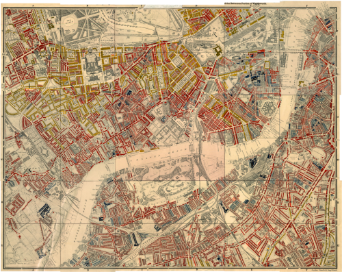
 Charles Booth, an English philanthropist and businessman is renowned for his survey into life and labour in London at the end of the 19th Century. Critical of the value of census returns as a way of identifying inequality, he set to work investigating poverty for which he was recognized by awards from the Royal Statistical Society and the Royal Society.
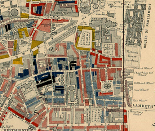
The Maps Descriptive of London Poverty (there are 12 in the set of whichare an early example of social cartography..or cartography that draws attention to social circumstances in order to encourage some sort of social change. Using Stanford’s 6 inches to 1 mile Map of London and Suburbs, Booth coloured each street to indicate the income and social class of its inhabitants.
This choroplethic overlay on a light base is an early form of ‘mashup’ and used a rudimentary diverging colour scheme with black for the lowest class (Vicious, semi-criminal inhabitants) through dark blues and into reds and yellows (Upper-middle and upper classes, wealthy). Neighbouring colours were deliberately similar in hue so the map illustrated social transitions across space though strong gradients are easily seen when blacks and reds are in close proximity. The overlay is slightly transparent to allow the underlying base map detail to be seen for interpretation.
Taking a planimetric basemap that gives a sense of structure and overlaying thematic detail seems commonplace these days but at the time these maps were evolutionary. They weren’t the first thematic maps but they were some of the most detailed and well prepared. As a device to communicate they could hardly be more perfect.
More details at the Charles Booth online archive here.

