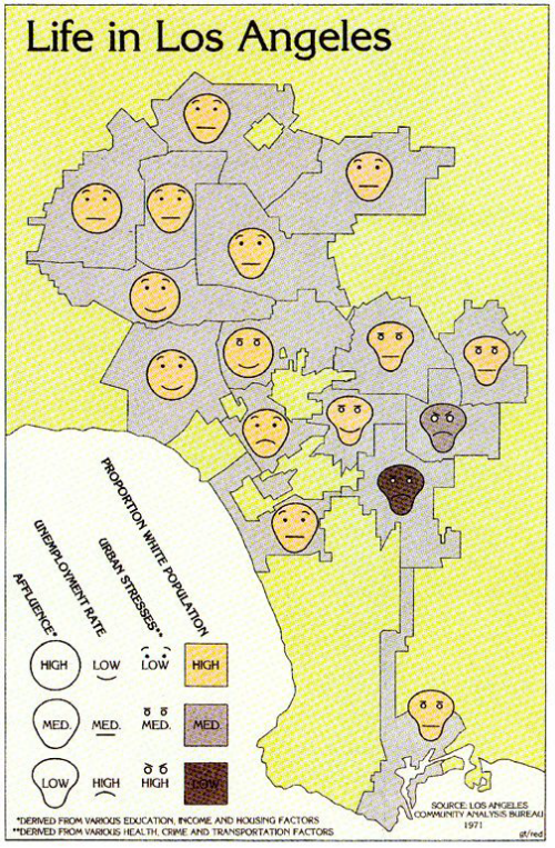
 Mapping multivariate statistical data is fraught with difficulties due to the problem of encoding multiple pieces of information into a coherent yet simple symbol design. The balance between making your data readable and understandable is harder, the more pieces of data you want to show. It’s also very easy to end up with symbol overload that easily translates to cognitive overload.
In 1973, Herman Chernoff an applied mathematician, published a paper in which he proposed the use of a human face to display multivariate data in the shape of the human face. The idea was simple – change the shape, size, placement and orientation of different facial features to encode different variables. The overall result changed the face and the facial expression which brought an overall sense to the combination of data. Chernoff argued that small changes can be seen in human faces due to our innate ability to recognise human faces and their subtle differences. They are extremely economical graphical structures in which
Of course, choosing how to reflect the data in different facial features is fundamental. Here. Eugene Turner creates what has become a well used example of the genre, though the use of Chernoff Faces has courted controversy and not seen a huge uptake largely due to difficulties in construction. The additional problem is in the way in which we automatically interpret the faces through our impression of emotion. Hence the crucial need to ensure your variables are mapped in a way that works rather than one which conveys the wrong emotional response. Turner does a good job of building a facial profile out of social conditions and ethnicity. It’s a simple map but one that characterises the spatial structure of socio-economic life in Los Angeles. It’s also a provocative and arresting image and one which is difficult to hide from.
Chernoff faces deserve a mention in any design related commentary because they are innovative. They’re hard to employ correctly but even if only a small proportion of our data can be effectively mapped using them, they’re still a useful tool in the cartographer’s design armoury.
Chernoff’s original paper can be downloaded here.
