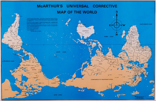
What’s a ‘normal’ looking world map? If you’re from Europe then north is at the top of the map and the Greenwich meridian is usually centred. If you’re from North America then you’d likely see the Americas centred with Europe pushed to the right and Asia appearing on the left. Of course, these are just the ways the map is normally presented. There is no particular reason but familiarity leads to a somewhat conventional view of the world. This map is designed to challenge the familiar.
Maps can be presented in any orientation and alignment and projections give us enormous flexibility. Challenging such engrained conventions is a little harder but here, Stuart McArthur achieved just that with a relatively sparse yet stark representation. He drew his first South-Up map when he was 12 years old. His geography teacher told him to re-do his assignment with the “correct” way up if he wanted to pass. Three years later, as an exchange student in Japan, he was taunted by his friends from the USA for coming from “the bottom of the world.” It was then, at age 15, he resolved to one day publish a map with Australia at the top. Six years later, while at Melbourne University, he produced the world’s first “modern” south up map and launched it on Australia day in 1979.
The map places Australia at just about the visual centre of the page but there are other subtle design elements that help reinforce the message. The gradient of light to dark tan for the land from top to bottom helps highlight Australia and has the converse effect on Asia, North America and Europe. The block of text adds a certain Australia humour to the overall map ending with “South lives. South dominates. Long live Australia, rulers of the Universe”

