
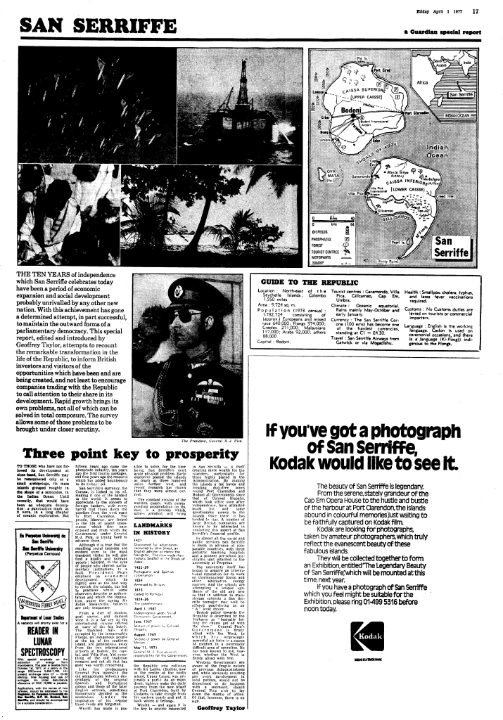
 On this date in 1977, The Guardian produced a 7 page travel supplement in their daily newspaper reviewing a small tropical island named San Serriffe – “a small archipeligo, its main islands grouped roughly in the shape of a semicolon, in the Indian Ocean”. The supplement celebrated ten years of independence from Great Britain and contained a small map in the upper right of the front page. Newspaper maps of the time were drawn simply and since they could only use black ink they had to be carefully prepared using simple linework and pattern fills. Callouts, drop shadows and heavier line weights give hierarchy and allow titles and key features to stand out. The fact the map was relatively unobtrusive on the page and drawn like all other maps in the newspaper gave credence to the reporting.
Of course, very few people had heard of San Seriffe but that wouldn’t be unusual. The history was clearly explored in the supplement having been discovered in 1421 by the English, colonised by Spain and Portugal and gaining independence in 1967. The island itself is near the Seychelles and had about 1.8 million inhabitants as of the 1973 census.
The map and the supplement were beautifully crafted with adverts and numerous photographs of the environment and people. There was even an advert requesting people send in their very own Kodak moments! There are two main islands, Caissa Superiore (Upper Caisse) and Caissa Inferiore (Lower Caisse), the latter having a promontory at Thirty Point. The capital city is Bodoni.
The design, of course, was perfectly suited to the main purpose…as an expertly crafted April Fool’s joke. The island is not real and the map a pure figment of the imagination, led by Philip Davies of The Guardian’s Special Reports department. The effort remains one of The Guardian’s most elaborate and successful April Fool’s jokes which they have revisited many times since to catch up on how the island is developing. Of course, virtually every element of the island related to typography, a perfect ‘printing’ related joke for the newspaper. Others have also added to the mythology of this special island and created their own distinct part of the San Serriffe univers(e). The Guardian began receiving letters from people describing memorable holidays and even some from the San Serriffe Liberation Front. The legacy also includes a Friends of San Serriffe club and many other organisations.
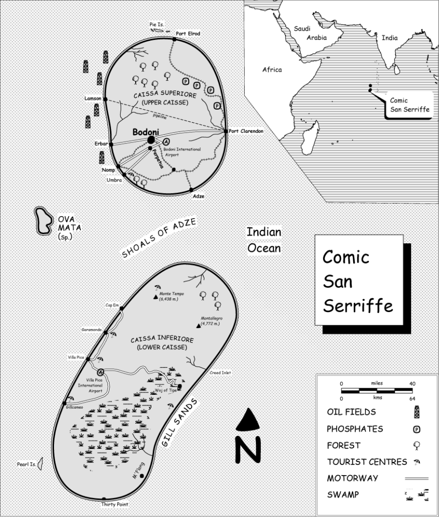
Today (2014) saw the latest addition to the legacy with a beautifully observed new ‘tribute’ map of Comic San Serriffe by Craig Williams. Marrying the fantasy of the original with the typeface that designer’s love to hate is pure genius and deserving of its own place in the San Serriffe pantheon. This isn’t just a copy that mimics the style of the original newspaper production (although it does, right down to the pattern fills and drop shadows)…the new shape of the islands requires adjustments to the page layout to give it a suitable balance. There’s a keen eye on ensuring the cartography works; that each element sits well in the new landscape; and that each element (including the point symbols) has a Comic Sans tweak.
The Guardian’s own description explains the map and its continuing legacy here.