 Maps or charts? What’s the difference? Maps tend to show representations of land forms whereas a chart represents the same detail with much greater precision. The reasons are down to the different uses we make of charts, being predominantly for navigation as a working document where the requirement is to plot a course. The need for greater detail and precision of coastlines, obstacles and perhaps hidden obstructions is critical for navigators at sea. Similarly, aeronautical charts also plot very specific details of landscapes in order for aircraft pilots to navigate safely. There simply isn’t the need for such detail on a standard topographic map.
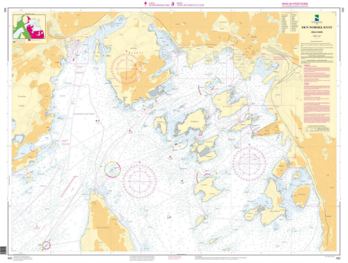
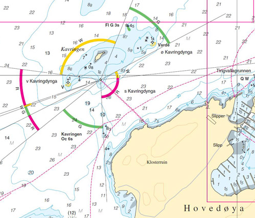
 Not all charts are created equally though and while the focus for a nautical chart is on the detail at sea that doesn’t mean you can ignore the representation of the land. Getting the balance right on a nautical chart with a limited palette of colours and certain conventions is a challenge but one which the Norwegian Hydrographic Service accomplishes. Here, their 2011 chart of Oslo Harbour demonstrates the clarity they bring to the plotting of detail. The subtle use of blues gives just enough bathymetric information at a glance but there’s a lot of white on the map that gives contrast to the spot depth and other information.
 They pay particular attention to the land and make use of a palette of buff and sandy colours that give just enough contrast but which doesn’t swamp the map. In this way they have designed the land to complement and not overshadow the main purpose of the map. The linework is crisp and clear and illustrates the best of chart design and production.
