MapCarte 320/365: Piri Re’is Map by Piri Re’is, 1513

MapCarte320_piri
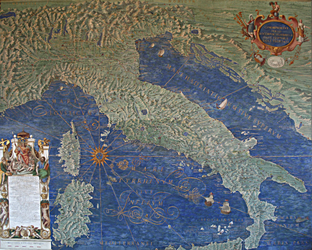
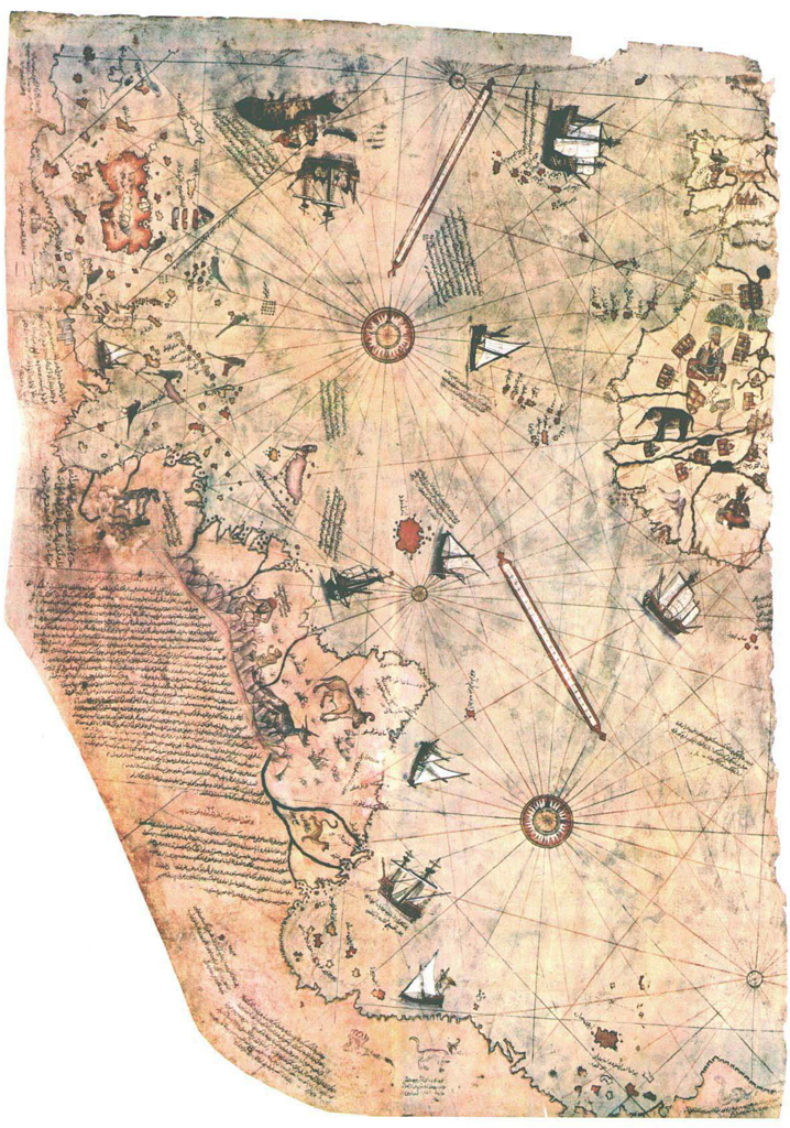
After the discovery of the Americas, numerous maps were made by the various sefaring nations of the period, most notably the Spanish and Portuguese. Possibly the most intriguing and, certainly, one of the most elegant maps was made not by the obvious cartographers but by a Turk, Piri Re’is. Only a portion of the map remains. At one point it would have included the whole world as seen by the Ottomans but only the western segment has survived. This alone, though, tells a remarkable cartographic story.

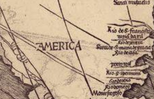
The map is significant as being the only 16th century map to display the Americas in its correct longitudinal position relative to Africa. As a portolan chart it is used predominantly for navigation. The coastal detail is impressive and the ocean is marked with numerous compass roses, rhumb lines (lines of constant bearing) and scale bars. The map is embellished with beautiful tall ships as well as many vignettes depicting indigenous people, flora and fauna, towns and settlements. The colours bring the map to life with careful shading of the coastline allowing it to stand proud in a visual sense and the use of red and blue alternating rhumb lines acting as spokes away fro the compass roses. Colour, generally, is well balanced, used sparingly but effectively as a differentiating tool.

MapCarte320_piri_detail
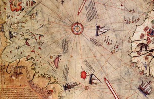
The labelling is particularly impressive and illustrates a compilation of collective knowledge derived from 20 maps used as sources. Maps from Alexander the Great, Ptolemy, Columbus and Portuguese explorers all played a part in the design of the map which reminds us that maps need not be entirely original. What is important, however, is to acknowledge the sources which this map does in its copious notes in the lower left.

The coastline of the Americas continues south and along the bottom. Could this be Antarctica or simply an artistic extension of the unknown southern tip of the Americas. Of course, it’s intriguing to wonder what the rest of the map might have looked like. Piri Re’is himself was a distinguished naval captain who rose to the post of Admiral of the Ottoman fleet. He won numerous battles and surveyed, mapped and wrote the famous Kitab-I Bahriye (Book of Navigation) in 1521. He was executed in 1553 for failing in his attempt to defeat the Portuguese in the Persian Gulf. He left a remarkable cartographic legacy with this map.

MapCarte 319/365: The Gallery of Maps by Ignazio Danti, 1550-1583

MapCarte319_vaticanWhat could be more carto-artistic than 40 painted map frescoes in a 120m gallery? The Vatican is home to The Gallery of Maps, a stunning set of large-scale paintings that showcase Italy through wonderfully rich and vibrant topographic maps. They were drawn by geographer Ignazio Danti as part of a Commission by Pope Gregory XIII in 1580. Others painted (literally by numbers) to fill in the detail.  It was simply designed as a way of decorating The Vatican. The 40 works took three years to complete and cover the whole of Italy as well as a range of panoramic views of major cities.

MapCarte319_vatican2The timing was ripe for maps to be considered an important element in scientific discovery as well as for decoration. The age of discovery had revealed new knowledge and scientific instrumentation such as the sextant, magnetic compass and telescope had improved accuracy of measurement. Mercator and Ortelius were making landmark world maps at around the same time. Pope Gregory XIII wanted The Vatican to join the cartographic revolution through this ambitious project.

MapCarte319_vatican3The maps are beautifully drawn and detailed. The large-scale paintings have a consistency that ensures they are seen as a set. The rich greens and blues for land and water create a beautiful palette that gives the hall a richness of colour. Terrain is well presented with detailed shading and the maps are full of ornate flourishes such as waves in the sea, cities, tents, boats and sea creatures. While many of these elements are totally out of scale compared to the backdrop map, they show a range of important scenes and the design supports the scale, size and purpose of the project as a gallery through which you walk en route to the Sistine Chapel.

MapCarte 318/365: Cassini Carte de France by César-François Cassini de Thury, 1788

MapCarte318_cassiniMapping entire countries is not for the feint-hearted. In 1744, Cassini prepared the first systematic, nationwide survey of a nation state, France. He was later commissioned to produce a more detailed map series to ultimately consist of 180 separate map sheets. This was not the work of a year or even a decade of preparation. This feat was the culmination of a century’s work by three generations of the Cassini family. Monumental in design and scope, Cassini’s map series was the result of scientific survey based on the triangulation of France which began in 1669 by his ancestors. By 1678 the Paris region had been mapped at a scale of 1:86,400. Various wars and other campaigns meant that surveying the remainder of France didn’t truly get going until 1733 when Cassini (strictly, Cassini III) recommenced the survey. Cassini’s map of 1744 laid out the traingulation of France but it required further surveys to fill in the map with topographic detail.

The new topographic map series, also at a scale of 1:86,400 began in 1748. It encompassed an 18-year plan with 10 maps to be published per year. The first two maps in the series took 8 years to be prepared yet they became the first properly surveyed, planimetrically accurate maps of a country. The level of detail was astonishing for the time and out-shone previous cartographic efforts by other European map-making dynasties. These maps immediately elevated France to the pinnacle of European cartographic excellence.

MapCarte318_cassinidetailThe map of Paris shown here was part of the second survey series. The detail and artistry is incomparable for the time. The use of colour highlights different land use types with a bright pink being used to show built up areas intersected by a generalized but highly detailed street network. Shadows are used throughout to emphasise different elements which raises them to create a pseudo-natural look and feel. This is particularly evident on the deep green forested areas which also contain a pattern fill. Topography is shown with shading and fine hachure abd shadows are also used to add depth to rivers, shown in blue. The typography is beautifully applied and pictorial symbols finish off the detail showing the positions of churches and other landmarks.

This is a key map in the history of cartographic design. Accurate and beautiful. Form and function.

MapCarte 315/365: Yu ji tu by Anon, c.1136

MapCarte315_yujituDesign excellence in a map may not be simply because it looks pretty or that one might suggest it has some sense of aesthetic value. In fact, this impression of beautiful cartography often irritates because design is about much more than how a map looks. It’s about getting the form correct, but in concert with the function. A pleasing map to look at will not necessarily be a well designed map. And so the converse is true. This map, dating back to the Chinese Song Dynasty (960-1279) and being made in c.1136 might not be considered particularly pleasing to look at. It is, however, perhaps the most important Chinese map ever produced.

MapCarte315_yujitu_detail

The title translates to ‘Maps of the Tracks of Yu’ (tu being Chinese for map) and is taken in honour of the Chinese ruler Yu the Great. The map, carved in stone, is remarkable in design terms for a number of reasons. Firstly, it’s depiction of the Chinese coastline is extremely accurate for a map of this size and scale. It measures 3ft square and the map’s most important contribution to cartography is that it was the first to use a grid to denote scale. There are approximately 5000 grid squares, each measuring 100 Chinese li (approx 30 miles) so the map is at a scale of approximately 1:4,500,000.

However, the claim of accuracy of topographic detail and scale belies another facet of the map in that it is used as a canvas upon which Chinese mythology is depicted. The origin of the Yellow river is given as sources named by Yu the Great and the legend mixes detail that acknowledges the past and present…meaning it’s part fact and part fiction.

On the face of it, a bland map carved in stone but it’s design is important in cartographic history.

MapCarte 314/365: Atlas Maior by Joan Blaeu 1662-1672

MapCarte314_blaeuatlasDutch cartography is renowned as amongst the very best, principally due to the many dutch cartographers, engravers and printers in the late 16th and early 17th century who formed the period known as the Golden Age of Dutch Cartography. Joan Blaeu was one of the very finest cartographers, son of cartographer Willem Blaeu though originally qualified as a doctor of law. Joan Blaeu became official cartographer of the Dutch East India Company. Alongside his father, he published many atlases and globes, initially using the copperplates purchased from the widow of another cartographer Jodocus Hondius II. Their first original atlas was published in two volumes in 1635 entitled Theatrum Orbis Terrarum. In itself, this was a magnificent pice of scholarly work but here, we celebrate perhaps his finest achievement, the Atlas Maior.

MapCarte314_blaeu1

After his father’s death, Joan Blaeu carried on the business and made many atlases, often working alongside other notable cartographers of the time. His Theatrum evolved into his final work, the Atlas Maior which had a monstrous 594 maps bound in eleven volumes and in its own ornate case (in the Latin version). This was the largest and most expensive book published in the 17th Century and contained some of the most detailed and finest cartography of the period.

MapCarte314_blaeu2

The maps are designed to showcase not only Dutch knowledge and world explanation but also cartographic expertise. They contain dense, rich information with beautiful and ornate layouts. The colours are vibrant and used to delineate different countries or regions with internal vignettes. Typographically, the maps contain a wealth of information using legible but ornate calligraphy. The many cartouche and painted marginalia add to the sense of this being a comprehensive work both scientifically and artistically.

MapCarte314_blaeu_cabinet

Blaeu had originally intended Atlas Maior to be the first of a much larger series. It contained maps of the earth, sea and heaven yet he intended to add maps of the coasts, seas and oceans in a second edition and of the skies in a third edition. He died before he was able to fulfil this ambitious opus yet even still, Atlas Maior is one of the most important works in the history of cartography. The design of such a large project was both revolutionary and brave.

MapCarte 311/365: A map of the world according to the tradition of Ptolemy and the voyages of Amerigo Vespucci and others by Martin Waldseemüller, 1507

MapCarte311_americaSome maps transcend their perhaps modest original purpose and become something really quite special. This map, from 1507 was made in a small town in north-east France by a group of scholars led by Martin Waldseemüller. The map’s somewhat lengthy title “A map of the world according to the tradition of Ptolemy and the voyages of Amerigo Vespucci and others” is perhaps not the most efficient piece of cartographic design ever committed to paper but the map has many other important cartographic elements.

MapCarte311_america_detailWaldseemüller was very much influenced by the voyages of Vespucci who refuted the claims of Christopher Columbus that a series of newly discovered lands to the west were part of Asia. Indeed, Vespucci claimed them as a new continent and the name ‘America’ was born. Indeed, this is the first map to show and name the continent of America and which the U.S. Library of Congress paid $10 million to acquire from a German collector in 2003. It retains the mantle of being known as America’s birth certificate. As per the title, the cartography owes much to that of Ptolemy and is in fact the first to make use of Ptolemy’s new, second projection. However, Waldseemüller wasn’t afraid to alter the map to accommodate new knowledge and this was one of the first that broke the frame of a map to show the newly rounded Cape of Good Hope at the southern tip of Africa – a place that until now had been beyond the frame of Ptolemy’s projection.

As a woodcut, printed on 12 sheets of paper it also represents one of the most intricate and detailed maps of the period, and of many to come. Its detail is impressive for the time although there are many unresolved mysteries it gives rise to…including the question of how Waldseemüller knew of the Pacific Ocean 7 years before its discovery.

Undoubtedly one of the world’s most important cartographic artifacts but also one that shows great scientific influence and care for the aesthetic appearance.

MapCarte 307/365: Tabula Peutingeriana by Anon, 5th Century

MapCarte307_peutinger

Historic maps give us both an insight into the past but also a template from which we develop many of our modern techniques. The Peutinger Table is an historic Roman map that at first sight is simply a map of Roman settlements, spas and topography. It depicts the Roman transportation network and is perhaps the earliest form of road atlas produced though in fact it was produced at a time when Romans needed to be reassured that their empire was both impressive and strong. In many ways it was a propagandist map that was designed to show the vastness of a perhaps ailing empire.

Named after Konrad Peutinger, an economist and historian, who inherited the map in 1508 the map is actually a copy of a lost Roman original that dates to around 300 A.D. It’s impressive in its size and scope being eleven sections wide and nearly 23ft in length. The scope of the map takes readers from the British Isles to India across the Roman Empire but because the map is only 1 foot tall much of the north-south detail is hugely compressed. Around 60,000 miles of roads are shown with distances between cities shown.


MapCarte307_peutinger_detail

The sheer size of the map makes it interesting in design terms but whether the original intent was genuinely for showing transportation networks or simply to boast of the scale of the Roman Empire, the map is impressive.

You can view the entire map as a seamless whole at Richard Talbert’s web site here.

MapCarte 305/365: PLAN fhewing the fituation of the BASE meafured on HOUNSLOW HEATH in Summer 1784 by Major General Willaim Roy, 1784

MapCarte305_royIf you’re going to make an accurate topographic map you need a place, a position of known origin from which to accurately measure. You need a baseline. The origins of Ordnance Survey in the UK can be traced to a survey carried out for King George III and The Royal Society between 1784 and 1790. It set about determining the positions of the Greenwich Observatory and L’Observatoire de Paris relative to one another and also the distance between the two. The survey was carried out by Major General William Roy under the authority of the Board of Ordnance. The first part of this assessment was the need to calculate a surveyed baseline which he set about doing across Hounslow Heath West London. Much of the land which Roy surveyed is now occupied by modern-day Heathrow airport

MapCarte305_roy_chainRoy measured the baseline using metal rods, and later using glass rods to reduce the error due to the expansion of metal, and calculated the baseline at 27,404.01 feet. The line was re-measured in 1791 by the then newly established Ordnance Survey and found to be .23 feet longer…that’s less than 3 inches. In 1885 it was re-measured once again at 27,406.19 feet (5.19 miles, 8.35Km). In short, Roy had managed to measure a line using 1,370 placements of glass tubing, adjusted for temperature and mean sea level to an accuracy of 1 inch in 27,000ft, or 3 parts per million. This is an astonishing feet but one which subsequently allowed Great Britain to become arguably the most complete and accurately mapped place on Earth.

MapCarte305_roy_detailRoy’s baseline was published in the Philosophical Transactions of the Royal Society and his work won him the prestigious Copey Medal. The extract above shows the baseline from west to east as it approaches Hampton Court Palace.

The connection of the Greenwich and Paris observatories by surveyed triangulation wasn’t completed until 1787 but Roy’s baseline also formed the basis for the topographic survey of much of southern England. These surveys were made using a Ramsden theodolite which Roy had commissioned himself (from Jesse Ramsden) and which were the start of the Principal Triangulation of Great Britain, carried out between 1784 and 1853.

The map is a remarkable achievement. It’s understated simplicity showing plots of major features as well as the baseline belies its scientific accuracy and importance.

MapCarte 300/365: Historical Atlas of Canada by University of Toronto Press, 1987-1993

MapCarte300_canadaAny atlas project will undoubtedly set out to chronicle a place in detail, attempting to leave no stone unturned in its quest to be a definitive, authoritative statement. Not many atlases actually achieve that almost unattainable level but the Historical Atlas of Canada does. Prepared as a three-volume set of print atlases and published between 1987 and 1993 the detail and execution is breathtaking. These are hand-drawn maps, each of which is a masterpiece in its own right but as a collection gives us a picture of the historical development of Canada that few other countries can similarly point to. The themes you would expect to be covered are all there, presented in rich plates with detail and attention to detail.

MapCarte300_canada1The complexity of creating an atlas like this which demonstrates not only a depth of scholarly activity but a craftsmanship of the highest order is mind boggling. Each map is somewhat innovative in its own way whether it be the use of insets that are used to magnify certain areas, or how smaller areas are sometimes greyed out while a larger version takes precedence, or how 2D is mixed with 3D gridded proportional symbols that aids our interpretation of magnitude. Each map brings something unique to cartography and as much as it acts as a record of Canadian history it should be used as a model of cartographic excellence too.

MapCarte300_canada2The atlas has latterly been made available as an online project and while there’s sense in this because it has the potential to reach many more people, the exquisite nature of the cartography and the way in which turning the pages allows you to interact with the maps in a human way is perhaps lost.

MapCarte300_canada3This is an elegant collection of maps deserving of the status of atlas. It’s a compendium of cartographic delights.

You can browse the online version here.


MapCarte 289/365: The Molucca Islands by Petrus Plancius, 1594

MapCarte289_plancius

Maps have always served a multitude of purposes and supported the great period of trade in the 16th century, particularly for the Portuguese who dominated the Southeast Asian spice trade. When the Dutch wanted to enter the region to support their own trading aspirations they required maps and this map by Petrus Plancius, astronomer and cartographer, became key not only for their trade but also for cartography.

Plancius used maps acquired from the Portuguese and created his map using Mercator’s projection which had to this point found little favour with navigators due to its complex mathematics. By adorning his map with the riches that lay in wait for bold navigators he was able to persuade his map to be used. In many senses it is a persuasive map with the imagery and style evoking a rich bounty of nutmeg, sandalwood and cloves for those who dared.

The map is both a navigational chart and includes rhumb lines and the depiction of shoals and rocky areas but it is also an early example of the use of maps for corporate purposes as it underpinned the development and later success of the Dutch East India Company. Amusingly, despite its scientific basis the map is still embellished with sea monsters to fill in the gaps and for decoration.

A beautiful example of late 16th century copperplate engraved cartography that supports dual purposes and is perhaps one of the most early forms of persuasive cartography.