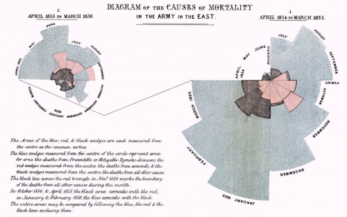
Florence Nightingale was a pioneer in establishing the importance of sanitation in hospitals through her work as a nurse in the Crimean War in the mid 1800s. She gathered data of death tolls and approached the job of communicating this information through applied statistics and graphical communication. She is particularly famous for the development and use of certain graphs, now commonly known as coxcombs or polar area plots, rose diagrams.
Nightingale realised that soldiers were dying needlessly from malnutrition, poor sanitation, and lack of activity. She strove to improve living conditions for the wounded troops, and kept meticulous records of the death toll in the hospitals as evidence of the importance of patient welfare. In creating the graphs, each sector represents a unique time period and a quantity. Because the sectors all have the same angle, they are visually equivalent when used to represent area. The diagrams overlay three variables for comparison and illustrate the temporal component perfectly by representing each month as a separate segment.
Map or graph? Well, it’s a graphical representation of spatio-temporal data. It doesn’t need a map backdrop because location is implicit. A great example of innovation as well as clean design to present a clear message. Plenty of online resources to provide more detail and also animated versions.

