National Tell-a-Joke Day (228/365)

Happy Tell-a-Joke Day. Today the joke is on overly serious cartographers.

Please do let me know if you find anything inaccurate or of professionally negligent about this map.

To steal a line from Richard D. James (a.k.a., Aphex Twin): … I care because you do. šŸ˜‰


View Map Here


Web Mapper GPT Initial Prompt

Hi. Sunday is National Make a Joke Day.

American cartographers are serious. Like… way too serious about maps. They think they are really, really important. And they can be, but most maps are not. In fact, the importance of a map is directly relatable only to the utility it has for anyone at a given time, I would argue. And that’s no joke.

So for this day, the joke will be the map itself. The rhetorical argument we will be making with this map is that maps are a joke. They all lie. They all distort. They all make arguments. And today, on National Make a Joke Day, this map is going to be perfect, because it is a joke. And American cartographers need to chill out, because maps really don’t matter in the grand scheme of things compared to almost anything else.

Please create a map of the US as unnecessarily distorted and haphazard as possible. Perhaps resize the states in inverse order of their actual populations and move them around so they aren’t where they are supposed to be.

Rename the states after famous comedians or pop stars that were born in those states (e.g., Minnesota, which may now be down where California used to be, randomly, and resized quite large given it’s relatively small population, might be named Dylanville (after Bob Dylan) or after a famous comedian who lived there… though, none come to mind.)

For each state, when you hover over or click on it, provide a unique joke that pokes fun or deals with that state. Not too insulting but something based on truth. Each state needs a unique joke. The joke doesn’t have to be cartographic at all, but it should deal with that given state.

Dumb jokes are fine. A little cutting is fine. No jokes based on poverty, race, discrimination, or anything else potentially inflammatory.

Give the map a title something like… “The joke’s on you…” Subtitle: National Make a Joke Day, August 16, 2026.

Put the title across the bottom of the map. Everything above the fold, though. On mobile, keep the title fixed to the bottom.

Include a hamburger icon. When clicked, show a sources modal that says (please rephrase to be a bit kinder and wittier):

“American cartographers need to lighten up. This map is meant to help those who think every generalization decision and every map inaccuracy is fraught with peril realize that nobody is going to die from half-assed maps. And no one outside of online echo chambers cares how inaccurate or unfunny this map is. Loosen up a little. It’ll be really good for you and society at large.”

Explain how each state is sized and arranged. Make a funny remark somewhat akin to: “Please let us know if you think of any way to improve the accuracy or the validity of this map. We care because you do…”

Made for the [#365DaysOfMaps campaign]\([https://mapdesign.icaci.org](https://mapdesign.icaci.org)) of the Map Design Commission for the ICA.

The map should be interactive. Please export as a zip package. Thanks!

National Relaxation Day (227/365)

I’ve been doing a lot of diaphragmatic breathing in recent weeks. I won’t go into details, but it turns out that to fight through any kind of non-acute pain, all you need to do is get up, keep your schedule, and breathe diaphragmatically.

I’m not making this up. I’ve learned this from specialists at the world-renowned Mayo Clinic, and I’ve been testing it when I can’t sleep in recent weeks. By jove, it’s true! Next time you can’t sleep, if you breathe diaphragmatically (or belly breathe) for at least 10-15 minutes, you will fall asleep. It’s pretty neat!

So when I saw this day on the calendar, I got quite excited.

I was thinking… heck, I can share what I’ve learned with others.

If you are stressed about life, can’t stand imperfect maps (note: you will want to learn how to breathe diaphragmatically before tomorrow for sure), AI eliminating your job, prompt cartography, the weather, or upper-management’s decision-making, you can just do what today’s “map” shows you how to do and your migraines, canker sores, phantom back pains, and stress rashes will disappear. No need for a chiropractor, pain meds, or calling that 1-800 number you saw on late-night television with the overly friendly supplement salesperson.

So take a deep breath and learn how to breathe diaphragmatically. Today’s map, or chart of the air ways and vagus nerve, will be a start. It takes practice, but you’ll get there.


View Map Here


ChatGPT / Web Mapper GPT Prompt

For national relaxation day, I would love to create a little interactive visualization (and kind of game, but not really) displaying how diaphragmatic breathing can help relax the central nervous system via the Vegas Nerve. A somewhat minimalist web interface would be needed, that shows a human body outline with the diaphram and lungs reprented, as well as the vegas nerve. The user should be able to pick if tehy are male or female at the start. The outline figure will have stereotypical boy or girl hair and a a smiley face when the app starts after the user selects their gender on the main page.

Then, a cacophony of horn beeps and news quips, etc., just noise will start playing. There will be a little heart-beat monitor that starts beating fast and faster… and a largish button that just says “Breathe In”.

When the user presses it, a simple but professional animation will show air entering the lungs, and the person’s belly and rib cage will expand slightly, as long as the button is held down. Then, after no more than six seconds (if they are still holding the button… The button will switch to say “Breathe Out” and automatically, the person’s breathe will release slowly and the rib cage and belly receded back to the original size. The outside world’s noises will have quieted during the breathing in and stay quiet as the person is breathing out. After a brief pause, the noise and commotion sounds will increase again, and the person’s heart rate will tick upward until the user hit breathe in…

Diaphragmatic breathing… Somewhere on the website have an “What is diaphragmatic breathing?” button for the user to click. When clicked, show a description of diaphragmatic breathing and list all of its known benefits. Please cite studies or the Mayo Clinic website when writing this, but use your own language. Write it for middle- and high-schoolers.

Explain the Symptomatic (fight, flight, freeze) and asymptomitic [sic, please correct] states (relax and digest) and explain how breathing can get you out of the fight, flight, and freeze mode.

Make it informative. Please include some useful iconic graphics that explain the Vegas nerve, etc. Make it approachable for middle-school kids and older.

The site should look professional. Similar to a Mayo Clinic information website (font, colors, etc.). Ideally this web page becomes a gateway for teachers and medical professionals to introduce teens to diaphragmatic breathing. Thanks!

National Financial Awareness Day (226/365)

A couple of years ago my daughter asked me if we’re poor as we were passed by a bunch of classmates and their parents in their gorgeous, newish, super-sleek SUVs, while we trundled out of the school parking lot in our 12-year old, beat-up, dinged compact hatchback largely held together via duct tape and strategically placed Amazon bubble wrap.

I thought it was interesting that the quality of one’s car possession was equated in her mind to having money or wealth. Because as anyone who keeps tabs on US car loan and lease defaults knows, it clearly is not. In fact, having a nice new car, much less two or more, in an American household is perhaps better associated with massive, largely avoidable household debt. Not always, mind you, but quite frequently.

Every nice car has an opportunity cost: cars depreciate quickly and irrevocably. What could the money being spent on down- and monthly-payments have been invested in or spent on otherwise? Would it have increased family wealth?

These are the things that go through my mind every time I’m tempted to upgrade my car to an electric vehicle or pickup truck. The whole point of a vehicle is to get me from Point A to Point B. Since I travel about 10-15 miles total a week, mostly to swim practices, there is no logical justification for buying a new car, regardless that it’s quite embarrassing to beĀ that car that no one else wants to park next to, because well… it’s a banger!

And these thoughts of mine coincide with today’s theme of US National Financial Awareness.

Americans, by and large, are not particularly savvy when it comes to finances or spending. This isn’t meant pejoratively; it’s beared out in numbers across almost all geographic scales.

So for the first time in a while, I’m actually pumped about one of the national days. I think it may have merit – unlike GIS Day, which I personally think is silly, but I know many, many people love for some reason – and they spend lots of money on GIS-promotion t-shirts that they could instead invest in retirement, but I digress and I’m mangling my days up…

In the US, most people can be accused of trying to keep up with the Joneses from time-to-time. Case in point: wanting to be able to say I had a PS5 to my friend who had one already was one of the foolish reasons I dropped money on a… Playstation 5. The PS4 was plenty good. And now the PS5 collects dust in the corner. But… okay, honestly, playing Star Wars Battlefront 2 may have been worth it. šŸ˜‰

But affluence isn’t measured in financed (or dusty and paid-for) possessions. It’s measured in household wealth, income, and… (debt).

A lot of Americans driving nice cars and with PS5s and big houses are actually living paycheck-to-paycheck. (This likely at least partially explains the absolute terror of the white-collar workforce about AI rapidly diminishing their roles and salaries.) I just read that many Americans are (again) refinancing their mortgages this year to pay off their other debts – and presumably, lease newer cars? Most Americans (probably) don’t own their homes or cars outright, but actually, owe a lot of money on them. And this is really sad to me; because…

If my daughter’s first inclination is any indication, the cycle of debt is self-perpetuating and self-manifesting. Buy beyond your means to look like you’re living the American Dream; fall into (avoidable) debt; then work frantically and non-stop to buy (and often finance) more things to keep roleplaying the American Dream. The dream itself is a nightmare America doesn’t seem capable of waking up from.

Now surely, there are quite a few people (including many reading this blog) that can afford nice cars. (Hell, I have saved enough driving my current trashcan on wheels that I could afford one myself. But spending money on cars doesn’t make sense when there are new power tools and board games that I could instead purchase!) And many successful Americans are affluent. Likewise, many Americans cannot even afford a crappy hatchback. (Money best not spent, likely, as cars are money pits.) But my point is that the appearance of wealth and having money are two very different things. America has been appearing wealthy while bankrupting itself at the national and nuclear-family scale for decades. And it’s hard not to believe that this fact isn’t going to come home to roost soon.

This also goes for the stock market, which is due for a monumental crash in the relatively near future. (First of all: the market is cyclical, so crashes are inevitable. Second of all, AI investments are a bubble. They check every box of a Ponzi Scheme right now. Ponzi schemes are stellar if you get in early and out before the implosion; so get out while the money is good, I advise. Though, I only own a crappy hatchback, so take anything I say regarding investments with a grain of salt compared to your financial advisor in a Lexus.)

So many “wealthy” Americans right now feel wealthy because the S&P 500 keeps going up – never-ending gains. But when it crashes 50% or so in the next year or two, they will literally have 50% of what they thought they had. And given Americans tend to live on perceived wealth, not actual money under the mattress, this won’t be good. Because money in one’s Fidelity account is not real money when it is invested in index funds. It’s ether. It’s a mental stimulus. Stocks, mutual funds, and bonds are not wealth until you cash them out. So even a great 401(k) is illusionary. When (not if) everyone tries to sell at once, well… you know… it’s not worth anything. Same with your unpaid-for house and… well, cars are worth less and less everyday without any outside intervention. The good news? In Minnesota, at least, registration gets cheaper and cheaper every year – the hatchback only cost me $30 for tabs this year!

Anyway, these are all the things swirling in my head as I asked the Spatial Data Creator and Web Mapper GPT tools to help me create a map for Financial Awareness Day.

I decided to map debt by county. Different kinds of debt, naturally. Credit card, auto, and student loan debt, as well as medical debt – though, the latter dataset has a lot of null or missing data, unfortunately. Overall debt levels by household in different counties are included too.

The prognosis: the US is kind of as poor as I imagined. Not evenly. Not everywhere. But pretending you’re living the American Dream is expensive. And the real dream doesn’t seem particularly attainable.

Add to this the US government’s incredible financial debt – with interest payments now passing its total defense spending – and there isn’t much light at the end of the tunnel. There aren’t that many people left to tax to pay the debt off… And taxing the rich won’t cut it either, since it won’t make much of a dent in our trillion dollar interest payments.

It’s a pickle. All I can do is drive my hatchback into the ground and tell my kids not to be fooled by appearances. Save your money. Avoid the American Dream. Invest wisely. Don’t get greedy. Cash out before bubbles pop. Spend money on things that give your life value, meaning, and perhaps, help you earn more income (e.g., a new Mac for making prompt-based maps may be a better investment than new rims; a $20/month subscription to ChatGPT a better investment than Netflix; a new chain saw to cut down trees to provide your home with affordable heating… that last one is directly Minnesota related, I suppose).

Hopefully this map scares some people straight. For others, I hope it adds some nuance to the dire situation of debt across the US. No matter what, I hope you find it interesting to explore. (I asked Web Mapper to add some interactive charts to make it a bit more fun. Hey, even if the news is almost all bad, at least you can have fun. What’s more American than that?)

Have an awesome Financial Awareness Day!


View Map Here


Web Mapper GPT PromptĀ 

Hi, I would like to create a dataset to celebrate Financial Awareness Day. Are tehre any good datasets out there that show average household income debt by county, or average household retirement savings, etc.?

If not, are there any US national datasets showing average state or county-level debt – via bonds, etc.? That may be even more interesting?

Please do some research and scour the internet and report back what you find about such datasets. I am not willing to pay for them, but I can set up a free API account to access them if that is requried. No problem.

Thank you!

Spatial Data Maker GPT Prompt

Please analyze the attached dataset of every county in the US and its various debt rates.

Create a US county map that a map user can zoom in on, explore, and examine, using different visualization, classifications, and chart techniques, please, showing US national debt county by county. Please allow for state zooms, county lookup, a static info box for specific counties, the ability to show or hide chart panels that are interactive and cross-filter with the map. Allow multi-select on the charts where it makes sense. Give the map a name related to a potential paucity of US Financial Awareness given debt across the US. Allow the user to switch between viewing a map and data of total debt, financial aid, auto, and medical (where medical exists).

I am attaching a Dashboard template. Please follow it as well as possible but you may diverge where it makes sense?


International Left Handers Day (225/365)

I just realized how high today’s number is… 225 days?! It’s hard to believe we’ve been doing this map-a-day thing so long. I’m actually worried about what might happen when the year ends. I may end up grieving or something. Or perhaps I’ll revisit some of these daily maps and do them justice, I suppose. But enough thinking about the future; I have spent the last two weeks getting educated about mindfulness. So I will focus on the task at hand, which is…

Celebrating International Left-Handers Day!

What a day! It’s wonderful. I woke up this morning, and thought: I wonder what it’s like to be left-handed. So I tried to do everything with my left hand instead of my dominant right. And it went about as well as you’d suspect. It didn’t take too long of me banging about for my daughter, who is left-handed, to ask: “What the hell is wrong with you this morning?!”

I informed her that I was practicing solidarity with her. She essentially told me to piss off and stop making so much noise – in a much nicer and more subtle way.

I’ve always loved the fact that we have a single lefty in our family – no one else is left-handed on her mom’s or dad’s side either… she is a dexterous enigma. Where did these (recessive?) genes come from? Or how did her brain wire itself to prefer her left hand? (If so, it must have been very early on, as we noticed that she was going to be a lefty almost straight away. Every doctor, relative, and friend told us that you can’t tell until “age two”, but we were calling it around six months. It was obvious then, no matter what the experts say.)

Alas, “south paws” tend to go on and do fairly well in life. I mean, presumably a lot of them become na’er-do-wells and mess up their lives like right-handed people too, but if you want to become President of the United States, being left-handed seems to increase your odds. (Though, there could be an argument that being President doesn’t exclude you from being a na’er-do-well, I suppose.) And Rocky Balboa was a lefty – his license plate in Rocky IV was “South Paw”!

For those of you upset with term “South Paw”, I don’t really apologize. It isn’t a derogatory term at all, but a term of endearment coming from early 1900s baseball – I’ve been told. You see, baseball fields, at least the professional ones, are typically aligned so that home plate is west, the pitcher’s mound and outfield east. Left-handed pitchers – which are rarer and more difficult to hit for many batters – were therefore referred to as “south paws”, because their throwing hand was to the south. (At least, that’s what a baseball aficionado from Penn State once told me back in 2001 while attending a Pirates baseball game, so I’m just taking it as gospel to my grave, and if it is incorrect, spreading misinformation. Isn’t the first and won’t be the last time… I’m at peace with it. Lots of diaphragmatic breathing going on in this household these days.)

Alas… here is today’s map. I love my daughter, and I want left-handed people of the world to unite and usurp the hegemony of right-handed people like myself. The map is meant to inspire lefties to rise up… I guess.

One thing I will note: not all countries have equal reliability scores. This is noted on the map, and each country is given its own reliability score, but don’t forget that. I lived in Hungary for nearly three years. I never noticed more than one out of four people being lefties, and I played a lot of pool/billiards there too. (Though, in a weird twist of fate, I shoot pool left-handed, because i was taught to play by my childhood friend who was left-handed, and it came to feel normal. There’s probably a reason I really suck at pool to this day – I shoot with the wrong hand and I can’t see 3D… yeah, meet me at the billiards hall to make easy money!)


View Map Here


Spatial Data Maker GPT Prompt

Are there any datasets you know of showing the preponderance of left-handed people versus right-handed people by country in Europe or internationally?

Web Mapper GPT Prompt

Can you please design a simple, interactive map showing differences between left-and-right handedness, country by country. An information window should show useful information about each country when selected. Use an appropriate visualization technique and the attached style map.

Equal earth projection, please. Emphasis should be on Left-handedness. Which countries have more. The more the better, because this is to celebrate “Left-handed Day.” Pretend that left-handedness is a very valuable commodity – Soviet style! šŸ™‚

Thanks! Please make sure the mobile-phone version works in portrait mode and that the info window is minimizable and opens from the bottom. Design the desktop app stylistically. Above the fold design no matter what, though. It should fit int he window. Thank you! šŸ™‚

World Calligraphy Day (224/365)

This one’s a little bit meta. One of the central themes of this year-long experiment is simply that technology eventually overtakes us, and new ways of doing things become available. In cartography, this has always been the case. Many decades ago maps were committed to print through copperplate engraving where skilled engravers produced printing plates in reverse that were then inked and used to print maps. One characteristic of these maps was the ornate written elements and ornate borders and flourishes. Engravers were skilled craftsmen in their own rights and this was a way of showing their skills.

And so, with the development of lithography, and many subsequent forms of automated lettering the ornateness tended to die out, replaced by functional letterforms. And in terms of education students are recommended to keep type simple and legible, and to avoid ornate forms. Well, yes, maybe. But it’s rather a shame that ornate lettering has somewhat died out.

So I thought that today we’d ask AI to go back in time and use the most modern of image creation to prepare a map as if it were engraved. I simply asked it to recreate the fantastic Equal Earth map in an historical form as if the lettering had been engraved. It’s “okay”. I can guarantee that this same prompt made earlier in the year would have made an absolute mess of both the geography and the labels with most mis-spelt, and misplaced. There’s still a few problem areas on here but nothing a little re-prompting or editing in Photoshop wouldn’t solve.

calligraphy


Original Prompt (ChatGPT)

Could you create a political world map where each country name is a beautiful calligraphic style. The intent here is to create a map that has the appearance of an old copperplate engraved map with extremely ornate letterforms that demonstrate the art of the engraver. My suggestion is to use a well-known map as a starting point such as the Equal Earth Political map so you can ensure you get both the geography and labelling positionally accurate. No hallucinations!

Mountain Day (223/365)

This is a relatively new day, only enacted in Japan in 2014 as a way of encouraging people to get to know mountains, and the blessings that come from them. Of course, it helps that Japan has some absolutely stunning mountains formed mostly by volcanic activity. Mt Fuji is, of course, the most famous but there are thousands more cone-shaped volcanic peaks. And I can certainly recommend snowboarding down a few of them in the depths of Japanese winter, then following it up with a dip in an onsen, and a fantastic meal of sushi and local seafood in a small family-run taverna. I digress.

I decided for today to see if we could get AI to conjure up an homage to the classic historical images of mountains presented in aspect for comparative purposes. Alexander von Humboldt perhaps created one of the most famous but many more exist. It’s a fairly illustrative request this one so let’s see…

mountains

Original prompt (ChatGPT)

There are many famous depictions of the world’s largest mountains all shown on one sheet in aspect, overlapping one another, with the smaller mountains in the foreground. There are all highly illustrative and often beautiful historical images. I’d like you to recreate this style of ‘map’ showing the world’s top ten mountains. Please try and make them as faithful to what the actual mountains look like in real life. Please add key statistical information such as the name, surveyed height, and the first known ascent, plus any other useful trivia. On the page, please have a small locator map that indicates where these mountains exist in the world.

National Lazy Day (222/365)

It’s National lazy Day so, given I really can’t be bothered today let’s just leave today’s map entirely up to AI.

Lazy

Original Prompt (ChatGPT) for the Lazy Map

I’m feeling really lazy, because it’s national lazy day. Can you just make me a map? Anything will do. ThanksĀ 

Hold Hands Day (221/365)

Holding hands. A simple, yet caring sign of affection between two people. It doesn’t have to be romantic. The day is designed to celebrate the power of touch, and to show support, and care. Yet it’s simply not allowed in some parts of the world, and while there are no explicit laws against holding hands in public it might be construed as a public display of affection in some places that either deems PDA illegal or frowned upon.

Rather than let Nano Banana 2 loose on this entire map I used Copilot to return lists of countries where PDA are not allowed legally or culturally. I then fed this into Google Gemini to do the mapping. To try and control the geography and labelling i also fed an Equal Earth wall map into the prompt. It seemed to help!

PDA


Original prompt (Nano Banana 2)

Please create a map showing the following countries and their stance on Public Displays of Affection. Needless to say, the countries have to be correc6tly located and labelled:

These are places where kissing, embracing, or similar public affection can potentially lead to fines, arrest, prosecution, or other legal consequences. In some cases hand-holding between spouses is tolerated, while other forms of PDA are not.

Saudi Arabia
Iran
Qatar
United Arab Emirates (UAE)
Sudan (through public-morality and indecency laws)
Indonesia (Aceh Province) under local Sharia regulations, which are stricter than the rest of Indonesia.

The following are frequently cited as having public-indecency provisions that can sometimes be applied to PDA, although enforcement is generally less consistent:

Egypt
Malaysia (particularly under state-level Islamic regulations affecting Muslims)

In these countries, hand-holding is typically acceptable and legal, but kissing, prolonged embracing, or overt romantic behavior in public may be viewed negatively, especially in conservative or rural areas.

India
China (particularly outside major metropolitan areas)
Sri Lanka
Japan (legal, but traditionally reserved about overt PDA)
South Korea (increasingly accepted among younger generations, but still relatively restrained compared with Western Europe)
Morocco
Jordan
Oman
Ethiopia
Kenya (especially away from tourist areas and major cities)
Armenia
Georgia

I’m uploading an Equal Earth Wall map to help you generate correct geographies. Please use it as a geographical basis for the thematic map of this topic but only label countries listed above. Please use red, orange, and yellow as category colours (red is illegal). Style the map as if it is going to be fairly small, and used on a web site as a locator. It doesn’t need too much detail.

National Sneak Some Zucchini Onto Your Neighbors’ Porch Day (220/365)

It’s National Sneak Some Zucchini Onto Your Neighbors’ Porch Day in the United States. It isn’t anywhere else. This deserves a map, and you’re in the right place. You can go elsewhere for an explanation but it’s to do with farmers getting rid of their excess harvest of squash. Now you know.

Zucchini

Original Prompt (ChatGPT)

Can you create an image of a venn diagram with the left circle labelled as “U.S.A.’ and the right circle labelled as ‘Rest of World’. The two circles should not overlap. The title for the diagram should be “Simplified World Map of National Sneak Some Zucchini Onto Your Neighbors’ Porch Day”. The left circle should be shaded blue, and the right circle shaded orange. There should be a legend that shows the two colour chips with the labels ‘Do it’ next to blue, and ‘Don’t do it’ next to orange.

Fear and Loathing in Cartography

Long read… If I were still Editor of The Cartographic Journal this would be the next Editorial. If I had some upcoming presentations and a keynote then here’s where my thoughts are at the moment.

I’m going to start this essay by harking back to my student days. It’s 1989. I’m sat in a large room in Oxford with around 30 other students at the beginning of a Bachelors degree in something called cartography. We were sat on stools around large tables that had opaque Perspex tops, and lights that shone from within. Literally light tables (albeit they were heavy beasts! They were to become one of the defining tools of our learning, along with the adjacent darkroom, and the store room stocked with peelcoat, scribecoat, film, snopake, scalpels, and all sorts of other critical tools for making maps (scalpels!!! – yep – couldn’t make maps of the time without them). Upstairs on a mezzanine floor were half a dozen small Macintosh computers. We wouldn’t get to play with these for at least another year. Next door was the photogrammetry lab with all sorts of incredible devices. Pretty much my entire degree programme was analog apart from a few dalliances with computer assisted technologies.

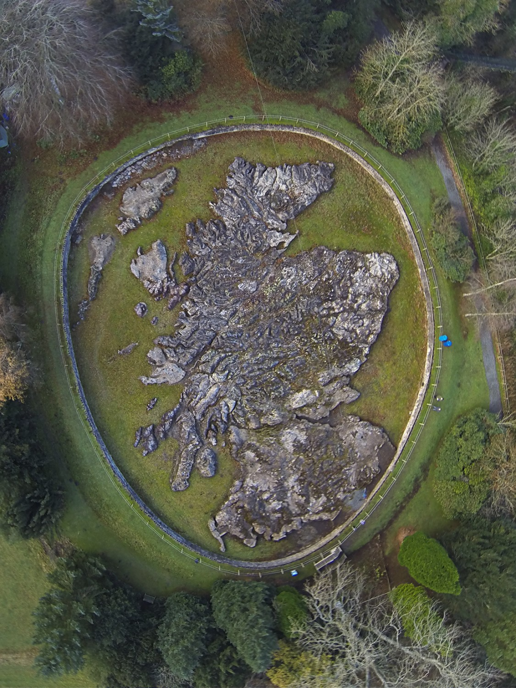
And so, sat around those light tables, my friends and I were set our very first practical assignment. The task – draw a map. I mean, it was a cartography course after all but we thought we might get a little tuition before being asked to create a masterpiece. I guess there were all manner of reasons our professor started us off this way. Having spent many years as an academic I now understand the motive, the pedagocial approach, and the idea of using the exercise as a way of establishing what sort of raw materials he was going to be working with for the next three years. But the exercise itself was intriguing. We were given a passage of text that described a geography. And our task was to interpret the text and draw a map. And that’s what we did. Here’s the passage of text:

Draw, stating your scale, a contoured map to show an island 65 km long from SW to NE which varies in width from 48km in the SW to 16km in the NE. The SW coast is much dissected by long, narrow fjord-like inlets, and is fringed by 5 small rocky islands of varying sizes. From this coast the land rises sharply to a plateau some 600m above sea level and extending through about one-third of the island. The plateau descends to a low undulating plain about 25km long and 20km wide. From the plain a range of hills rises to the NE, flanked by a coastal plain about 8km wide. From these hills. rivers flow to both plains and also from the plateau to the larger plain. The plateau is gritstone. The hills which run down to the coast in the NE, to form cliffs, are chalk. Much of the smaller coastal plain is marsh, but the larger plain, from which two estuaries open, is of well drained alluvial land. ln addition to relief and topography, show drainage, possible sites of settlement and lines of communication. Name your island appropriately!

And here’s my interpretation of the text. I got a B+ which was a decent grade I thought.

foot1

I’m going to park this story for a while, but I’ll return to it later.

There’s been a lot of noise about AI over the last year or so, and it’s blown up in geo-circles too. Ian Muehlenhaus and I have been experimenting with AI in an exercise we’ve called #365DaysofMaps as part of our contribution to the research agenda of the International Cartographic Association. You can check out our daily blogs (with occasional longer form write-ups and thoughts) at mapdesign.icaci.org.

In outline, we began to recognise in late 2025 that AI was likely the next big paradigm shift in cartography. We’ve both seen a few of these shifts having trained with pens, French curves, darkroom technology, then desktop publishing, GIS, Illustration software, mainframes, terminals, desktops, the web, mobile, and cloud computing (phew!). We missed out on the shift from clay tablet to papyrus, and copperplate engraving to lithography, but we’ve seen enough to appreciate that every now and again technology rears its head and transforms the way we do our work (the how of what we do). It’s often transformative. Sometimes you don’t need to jump all in. Often, old skills die, but you develop new ways to work too. I once wrote an article that likened editors of journals to Dr Who. The editors regenerate from time to time but the overarching work remains. It’s just the stewardship remains as another person becomes responsible for upkeep for a moment in a bigger life of something far bigger.

I feel like that about cartography too. I am but a blip in the landscape of a domain that has been very good to me and given me a wonderful career. I’ve tried my best to pay it forward in what I do. I don’t always hit the mark but I’d like to think more often than not I’ve made a reasonable contribution during my time. And so the cycle continues. New technologies bring new players, and new approaches. And what I’ve generally noticed is that any time this happens it comes with a tremendous amount of fear, trepidation, sometimes panic, and occasional loathing.

Yes – loathing. I know many who genuinely hate how technology impacts their work. They get all comfy in their slippers. They know what they know. And they like what they know. Along comes change and it’s disruptive. Of course that can be challenging. It’s how you respond to such challenges that’s important.

I suspect all of us in cartography feel this to some extent or another wondering how AI will change our professional lives. If you work in technology that produces software that cartographers use you’ll have seen it already. AI is being imbued into the software we use on a daily basis. It doesn’t matter what your preferred choice of sword is, they’re all being sharpened with AI. Maybe you work in a mapping agency who will likely be looking for ways to further automate and streamline production. Or maybe you’re a freelancer concerned that AI will render your services redundant if people no longer deem your fees are economically prudent when they can have AI make the map they want in a fraction of the time for an even smaller fraction of the money. We go online and see it being used everywhere. And it’s potentially scary what it can do with apparent ease. And inevitably the fear is compounded when we see almost immediate use of the technology for nefarious purposes.

In the week I am writing this, Google released a new tool in Google Earth which allowed users to deploy their Nano Banana Generative AI tool to add imaginary places and spaces directly into the satellite imagery. Now, the intent was to enable people to use it for sensible purposes, perhaps as a planning tool, but within a day people were showing fabricated road traffic accidents in Amsterdam, and imaginary nuclear powerplants in Iran amongst other applications. And Google were forced to remove the tool. Quite a climbdown. But as with any innovation in human history, there’s always bad actors who find a way to utilize it for an unintended purpose.

Our mapping experiment was intended to just play in the sandpit of AI, outside of our daily jobs. We wanted to see what the fuss was, what potential it had for our cartographic workflows, and where the pain points were. In other words, to perhaps try and get a little ahead of the curve to be forewarned and forearmed.

I’m not much of a coder, or even a web mapping guy beyond using a GUI to publish maps to the web. But Ian is far more adept at those parts of cartographic practice. We broadly agreed that he was going to see how AI could help make web maps while I would focus more on Generative AI using image generators to make maps. We’d do 7 days on, 7 days off, and use lists of ā€˜Days of…’ as a way to generate the themes for the maps we’d make. That way the map topics effectively choose themselves and would, to an extent, limit any bias we might bring to the process by being too invested in any one particular map.

Crucially, this would be completed outside of our day jobs so we really needed the work to be a minimal time sink. We had to take a daily theme, think of a map, design and produce it (using AI), and write a short blog to accompany it every day. So off we went.

As I write we’re about 7 months into the project. We’ve written up various thoughts and experiences along the way via the blog. We’ve learnt a lot, and continue to do so but perhaps the overarching outcome so far is that the pace of change has been so rapid that the sort of maps we made in January and February pale into comparison with what AI is capable of offering now, just a few months later. It’s quite staggering. And along with that experience has been the increasing noise around AI in cartography in general, and of our project as it ended up bubbling to the surface in July.

We’ve had a lot of support from onlookers interested in following progress. But as with many pieces of work that play with new technology the critics soon emerged. I’m not going to get into the details here but being called ā€œprofessionally negligentā€, ā€œunethicalā€, ā€œslopmerchantsā€, ā€œlazyā€, and a whole host of other epithets is disheartening. We believe it reflects very poorly on the moralistic posturing some have taken which is deeply ironic given some of the same folks have explicitly railed against similar public commentary before (for instance at the onset of web mapping when many, me included, were less than positive about the quality of the maps being published).

Those who have labeled us may call their comments ā€˜critique’ if they like, but if you begin by saying ā€œI hate maps made using AIā€, then use various slurs to talk about colleagues and theirĀ  efforts, you’re picking a fight and simply trying to provoke a reaction.

It’s not helpful. It’s unnecessary noise. We’ve tried to ignore it and not respond on social media. I’ve commented on these issues elsewhere so there’s no point giving more air to it, other than to say it’s been an interesting side issue to try and face scrutiny in this fashion from a community we set out to offer assistance to via our experiment.

So, in summarizing my personal thoughts at this point in time, I’ve been looking for a way to better frame my own thinking on the use of AI in cartography. Many comments borne out of my daily experiences are written up in the daily blogs, but what’s the overarching narrative?

I’ve been accused of being an ā€œAI proponentā€ which is laughable just because I am making maps using AI and the glove seems to fit the negative narrative some wish to portray me in. I also make maps using GIS, as well as pens and pencils. But it’s as if the AI badge is used solely as derogatory framing at the moment. I apparently make untrustworthy slop using AI, but trusted, and beautiful maps using GIS. I simply don’t believe I can be both people at the same time. So I’ve been exploring how I can summarise my thoughts.

A good friend of mine (thanks Steven!) sent me an article by Jeremy Theocharis who has clearly been thinking along similar lines. I don’t know Mr Theocharis at all. He appears to be a developer who specializes in open-source infrastructure in support of manufacturing, but not of anything cartographic. His article, I thought, was a decent stab at framing commonly expressed critique about AI but while also being clear of where he saw its value to his work. I saw many parallels between his experience and mine (and Ian’s). It made me think of how I can adapt the sentiment in much of what he was saying into the cartographic realm.

And before someone claims I’m plagiarizing, I’m not. Any decent student was always taught to do exactly this – use books and other people’s ideas as a framework for expressing their own perspective, and cite your sources. Straight up copying is clearly plagiarism but building on what others have said becomes a useful contribution.

Anyway, here goes…

I’ve read plenty of people’s comments and some more thoughtful critiques of using AI in creative work, and many of them are hard to disagree with from the perspective they take. They point out issues like homogenization of creative output, loss of cartographic craft, overreliance on tools, and the erosion of deep domain understanding. These seem to be well worn criticisms of AI but there’s every chance we heard very much the same criticism when GIS killed traditional design and production methods, or when print cartography was existentially threatened by web mapping. In the context of cartography, these concerns are obviously resonant but are they simply parroting the obvious claims made by anyone who fears major change, especially if it has the real possibility of impacting their livelihood.

In my experience, domain knowledge and understanding simply do not die. New people start making maps, and they are usually pretty sub-par but people learn, and standards normally improve. We’ve seen that in web mapping over the last decade for certain. Are maps any more homogenized than they once were? I would say not. There is a remarkable breadth of design on show right across the board. Maps have never just been made by cartographers either. Some of the best, and possibly most famous, maps in cartographic history both of decades ago, and in the last few years have been made by people with no formal cartographic training. What matters is the map is the output of human input, and people use a wide array of tools to achieve their aims.

Maps are not just technical artifacts; they are interpretive, aesthetic, and communicative acts. They encode decisions about what is important, what is legible, and what story is being told. So when people say that AI will dilute the intent or flatten the uniqueness of cartographic design, there is possibly some truth in that, if we let that happen. And it’s that last part that I feel is crucial.

If we simply ask an AI agent to ā€œmake a map showingā€¦ā€, and we leave the entire process of design to how the LLM interprets the request then guess what, the map is likely going to be utter crap.

Now, let me caveat that. I sometimes make purely illustrative maps such as those you might see by Jo Mora, Heinrich Berann, Anton Thomas and many others. I might not have weeks or months, or even the required skill to make that kind of map. In this particular circumstance I, the human in the loop, am making a conscious decision, to leave the design work to the LLM and its image generating capability. I want to see what it comes up with. If I do not like it, I don’t have to use it, and I can ask again for a different map. Some call this the very worst of the use of Generative AI in Cartography – ā€œlow ambitionā€ resulting in ā€œAI slopā€. Sure, I am handing over the task of coming up with, and producing a design that is highly illustrative, but the outcome only exists if I let it, and if I subsequently approve it and use it. I see it as one form of using AI for a very specific form of cartographic output. I get that these type of maps are not to everyone’s taste. Just the same as any artwork.

And so, via our experiment, I’m using AI. Not because the (sensible) critiques are wrong, but because they’re incomplete, and because shouting down people for trying things out just backs you into a corner anyway. I am trying to be open-minded even though my inclination is to remain skeptical.

As someone who graduated from a cartography bachelor’s programme that had taught me manual photogrammetry and projection plotting, darkroom print technology, and the skill of a ruling pen and a scribing tool straight into a workplace that demanded we start using GIS, I think I’m reasonably well placed to have some sense of the importance of not getting too wedded to how things have always been done. Life moves pretty fast, as Ferris once said.

Let’s dig deeper and translate some common criticisms of AI into the mapping domain.

ā€œAI erodes originalityā€

I’m not going to get into the issues of AI being trained on copyrighted materials too deeply. I have no control over it. Is it unethical? I can see that argument but on the other hand we all look at, absorb, and develop ideas from reading and seeing copyrighted materials every day of our lives. Has anyone ever made a map that hasn’t been, to some extent, informed by someone else’s work? Maybe the key aspect here is in being able to cite sources of inspiration. I have tried to ensure the maps using AI that I have made have cited their sources. It’s not always worked but it’s something we can consider as an ethical way of recognizing prior art.

ā€œAI erodes the environmentā€

Is AI bad for the environment. Again, the answer is almost certainly ā€˜yes’ but most of all human activity is bad for the environment. We are parasites on this planet. I can take a principled stance on using AI or not, but then I have to consider absolutely everything I ever do in the same light. Products, food, travel, clothing etc. maybe a better approach is to at least be considerate in using AI? And hopefully the environmental cost will reduce over time because it likely isn’t currently sustainable.

ā€œAI erodes qualityā€

Is AI guilty of producing what is commonly referred to as ā€˜slop’, or in other words it produces generic output instead of carefully curated quality? In cartography, this means AI-generated maps often default to familiar design patterns—commonly used colour ramps, conventional symbology, and standard framing. They tend to look like something you’ve seen before. But that’s because you probably have seen these maps before. Remember, LLMs have been ā€˜trained’, and that training has comprised of what’s available to whoever trained the LLM. But is this really any different to our ability to recognize a map made using all types of tools.

For many years the use of an orange gradient fill, and one of a number of north arrows from the Esri style libraries, easily marked a map out as having been produced using Esri technology. Despite the recognizable fingerprints, did we vilify the person who made that map, or decry the technology for having familiar and over-used defaults? Quality comes with thinking. That doesn’t disappear through using AI.

ā€œAI erodes trustā€

Perhaps ā€˜trust’ is a key dimension to this framing. In other presentations I’ve explored the way in which people fall generally into three types when creating maps – honest cartographers, liars, or bullshit artists (after many other authors who have explored creative deception). Honest people want you to be able to trust their map, and see you as a trustworthy source. Liars also want you to trust their map, but they deliberately tell you something that lies about the topic. BS artists don’t care what they map, but they still want you to trust them. So how do you build trust when using LLMs to help make maps, particularly if the default perception is that you are doing no more than offering up ā€˜slop’?

Well, personally speaking I don’t necessarily trust people. I take a healthy skepticism into my reading of other people’s maps. But I can normally sniff out the human in the loop. I can see where people have likely spent time, and that in turn, is often deserving of my time. But it’s not as easy anymore. And certainly not for the novice map reader.

Maybe the point here is that more senior cartographers will already have amassed a certain well of trust. Why should the assumption be that they will throw that away just because they’re using a different tool? I don’t think that will happen. And senior people have always taught junior people so that idea of developing trust through mapping truthfully should be maintained.

Of course, people will claim that credibility is on the line. I’m aware that is how our mapping experiment has been framed by some. I’ve heard comments that suggest I should hold higher standards, or I am risking the reputation I’ve built over my career. But this is precisely why it’s important to use my relatively prominent position in the cartographic community to experiment and explore from within the discipline. I don’t feel I’m risking my credibility – or maybe I am, and actually that’s perfectly OK, because taking risks is part and parcel of doing good work and moving a discipline forwards. Sure, I could kick back, earn my salary and simply eek things out until I retire. But trying to make a difference is a critical part of helping shape a discipline. I am using LLMs but it’s my thinking, based on my experience, that I am using. The LLM is simply implementing my thoughts in new ways that widen the scope of my cartographic toolkit.

But there’s also a fascinating aspect to this question of trust. I have a sense that some people, at least, hold maps produced by AI to a higher standard than maps produced by more traditional means (is Adobe Illustrator or GIS traditional?). There seems to be a hang-up over so-called ‘image-maps’ because they’re seen as inaccurate and only formed of pixels. Yet even if i use vector data when creating a map using a GIS I will inevitably use heavily processed raster data within it, and may maps all end up as images anyway. The same pixels. So, some are hating on image-generators when we’ve been generating maps using pixels for decades anyway. For example, my map of the Total Eclipse was roundly loved. It won awards. Yet there’s some serious license taken with the way I depicted shade across the map, and frankly it’s utter nonsense. One expert in solar eclipses kindly pointed out that if you are in the track of 100% occlusion you will experience totality, and darkness. But even in an area close by at 98% occlusion you’ll actually not experience 98% darkness. It’ll actually seem more like full daylight because you really don’t need much sunlight for it to appear like daylight. So I used imagery on my map to create an illusion. This is a creative deception that I created to give the map emphasis, and for artistic effect. It’s a lie. Yet the map was made by my hand so it was entirely trusted. The point being, we’ve used images, and raster dats as part-or whole in map-making for decades to create effects that ‘work’ for the map being made. Hillshades? Hachures? Contours? All fabricated. Yet now, some seem to expect absolute perfection from an image generator else it’s ‘slop’. Maybe this is holding AI to different standards. Or maybe the real skill of a cartographer is that we’ve mastered the art of creative deception to the extent people can neither spot it or care enough to hunt it out even when it’s right in front of their noses.

ā€œAI erodes learningā€

If an AI generates a choropleth map, chooses a specific projection, or suggests a layout, it can bypass the mental steps that actually teach you cartographic principles. Yes. But many maps are already made in a vacuum of people not knowing thematic mapping techniques (non-normalised data), which projection to use (equal area is essential) and layout (awkward, misaligned elements, missing or poorly sized elements etc). Perhaps a better way of thinking about this is that expertise remains essential specifically to act as a human litmus test for what an AI might produce. Accept what works, technically and aesthetically, and reject, or ask for ineffective or inappropriate work to be redone.

Of course, the novice who isn’t particularly interested in making maps using cartographic wisdom will continue. These people are not interested in learning anyway. This problem plagued early web mapping, but yet is not in evidence to anywhere near the same degree anymore in that realm. I suspect a similar pattern will play out with AI maps. The early adopters and experimenters will make mistakes, and will evidence a poor ability to make sound decisions (I’ve certainly made some pretty poor maps, though my intent was still to be truthful). But this will improve. Learning about cartography is not in and of itself a function of the tool used to make the map anyway.

What is learning based upon anyway? It’s usually based on what has gone before; the structure, frameworks, arguments, agreement, best practices of the discipline. Rules (such as they are) form our understanding but are there to be broken meaningfully, and justifiably. LLMs are amplifying all of this because they can provide the history of cartography rapidly. They are sharp and to the point, fast, and good at looking things up and checking. If you give an LLM very little then don’t expect much in return. Maybe quality is actually something that AI can improve across the board (though maybe that’s still a work in progress).

ā€œAI erodes craftsmanship.ā€

The careful tuning of label placement, the subtle balancing of visual hierarchy, the selection of typefaces—these are the things that distinguish a thoughtful map from a merely functional one. The argument here is that maps somehow have to attain an almost mythical level of craftsmanship to be considered valuable. Very few made by any means, pass this almost unattainable test. Many more remain useful, and functional, if not necessarily hitting the highs of a masterful map.

But this is like any design. A chair is designed. Every chair is designed. Would I prefer a chair designed by Charles, and Ray Eames or one from IKEA? Well, they likely both perform the same function so what’s the problem? (And actually I have both an Eames chair and chairs from IKEA so both can sit side-by-side anyway.). But despite them being functionally the same one is held up as exhibiting much higher design standards. That in itself is largely subjective even if we agree.

Everything is designed. But not everything is necessarily designed equally. True craftsmanship will persist. It always does. And I suspect it’ll simply become easier to identify the best maps from the rest. And if you stand by your work, whatever tool you used to create it, then you are continuing your craft. You are engaged in it. And, maybe you also help generate a little more credibility in the process.

Craft changes too. Once it was how you engraved a letterform into copperplate. Now it’s developing into how you direct the LLM. And yes, I do think of this as a form of craft. Accepting what an LLM gives you is literally the worst thing you can do in most circumstances. You are absolving yourself of the responsibility of crafting a piece of work. But checking the output and then asking for changes, wholesale, or minor tweaks, is engaging with the work, and crafting the output. To do this successfully you bring to the fore your cartographic expertise – and once again, emphasise its value rather than letting the LLM take over the work in an ad hoc manner. Because the human is capable of discerning something that is ā€˜good’ from something that is patently ā€˜bad’, we remain critical in the cartographic process. Of course, sometimes the response ā€˜hallucinates’ and conjures up something that is patently incorrect. So, correct it. And on the rare occasion the LLM gets stuck in a loop of not being able to deliver what you need, start again, or use a different LLM and AI agent… or train your own agent based on your more specific criteria.

ā€œAI erodes heterogeneityā€

When many designers use similar LLMs, we risk a convergence toward a narrow visual language of maps. Yes, quite possibly, but you simply can’t argue that AI will produce generic outputs (bad), erodes craftsmanship (bad), and then claim that homogenization is also bad. If more maps are constructed to better standards, then whether they begin to look similar or not is almost immaterial. There will always be maps that buck the trends, and if the human in the loop specifically directs the AI to make a map that veers from theĀ  common visual languages it is most familiar with, then other map designs can and will be built.

So we’re back to craftsmanship again, and those who develop their craft using AI and are better able to marshal LLMs to produce what they are thinking about, then they will be seen as those who produce the better work. Has it ever been any different in cartography? It’s always those that think the most who produce the best work. The ones who are merely technically competent can produce good work, but it rarely shines quite as brightly or for as long.

These critiques are valid. They describe real risks I’ve observed in early experiments with AI-assisted mapping workflows. Even some experiments I’ve been publishing could be used as examples to support the assertions. (I’m sure some folks will revel in showing me a map I’ve made that contradicts my thinking.)

But there’s levels and nuance to this question of validity. In terms of the experiment Ian Muehlenhaus and I are currently involved in, we committed to make a map a day during 2026 simply to see what AI offered. As noted elsewhere, we’ll report on the detail of our experiment when we’re at the year end, and in appropriate places (i.e. not social media), but it’s been fascinating to see how the technology has developed even over such a short amount of time. AI has certainly proved to be incredibly useful to meet the central aim of making a map a day. How else would that have been possible given this is a side-project and unfunded. By the end of the year, we’ll have made 365 maps. These are typically quick (and often non-QA-ed generative AI maps). Sometimes, given our schedules, we have time to iterate more on a given map but not always. These may be built using different LLM image creators, and designed into full-functioning web maps or even interactive online games (honestly, some of the interactive maps and games Ian has built in a few hours are killer!.)

But we have also become keenly aware of where AI hasn’t necessarily supported the ideas we’ve wanted to execute. Maybe the assumption it is a solution to everything is currently its biggest fallacy. What tool is a true panacea? None! But as part of the cartographer’s wider tool kit, we feel it is going to have a major role to play going forward.

I find AI useful—not as a replacement for cartographic thinking, but as a force multiplier for it. The key is to treat AI not as the map-maker, but as a cartographic assistant that operates within constraints defined by the human in the loop. The human will need cartographic expertise to direct AI to make what they envisage. Along the way the AI will translate the directions into a product that meets the requirements which can then be honed, or even simply rejected. Think of AI like this – it’s a new UI for making maps, but it doesn’t replace you in the making of the map. It’s a new UX for sure too, and you may not prefer it but I’ll bet there’s even now aspects of your current workflow and toolkit you don’t exactly enjoy either.


Following on from my brief assessment of some of the main crtiques as I currently see them, here’s my ten point plan of where I feel AI is currently able to help us make maps:

  1. From blank canvas to rapid exploration

In the early stages of map design, I often don’t know what the final product should be. I may have data, a topic, and some vague intent, but not a visual direction.

AI can help me explore:

  • Alternative visual encodings
  • Different thematic treatments of the same dataset
  • Variations in design logic
  • Layout sketches

This isn’t about accepting the first suggestion. It’s about quickly generating many starting points so I can react to them critically. The value isn’t in the LLM’s initial output; it’s in the acceleration of iteration.

Ā 

  1. Automating the repetitive, preserving the interpretive

Cartographic production includes a lot of necessary but non-creative work:

  • Cleaning attribute tables
  • Generating standardized symbology sets
  • Drafting metadata
  • Creating multiple versions for different scales or audiences

AI can help with these tasks, freeing up time for decisions that actually matter:

  • What should this map emphasize?
  • How should the spatial relationships be interpreted?
  • What is the narrative?

The more I delegate the mechanical parts, the more attention I can give to the interpretive core of cartography. Making a map is essentially an intellectual activity, not just a bunch of skills. You can’t just put skills together and expect a map to emerge. You have to do the thinking first, and work through the intellectual issues first.


  1. AI as a critique engine

One of the most interesting uses of AI is not to generate maps, but to evaluate them.

I’ve started using AI to ask questions like:

  • ā€œWhat might confuse a reader about this map?ā€
  • ā€œIs the visual hierarchy aligned with the intended message?ā€
  • ā€œDoes the colour scheme support accessibility?ā€

The responses are not authoritative, but they are surprisingly useful as a second opinion. They often surface obvious issues I’ve possibly become blind to. In this sense, AI functions less like a designer and more like a junior reviewer who never gets tired of looking at drafts. Ian’s Map Doctor provides a really valuable tool to give me a check on my work, and even suggests alternatives which, of course, I can either take on board or reject. In many ways this is akin to having an automated checklist to provide you with an extra set of eyes on your work. And who doesn’t value that feedback? Some of the best feedback I’ve ever received on my maps has been the harshest. Sometimes it hurts but I don’t recall a piece of sound advice ever not making the map better.


  1. Expanding cartographic vocabulary

There’s a subtle but important benefit to AI having been exposed to previous work: exposure to unfamiliar approaches. AI models have seen vast quantities of visual material. Despite my years in the industry I can’t possibly have seen everything, but AI has likely seen more than many of us put together. When prompted carefully, they can suggest:

  • Less common technical or design choices
  • Unusual but valid thematic representations
  • Alternative labeling or symbology strategies
  • Non-traditional map forms (e.g., isochrone maps, cartograms, hybrid narrative layouts)

Not all of these suggestions are good or will be applicable for a specific mapping task. But they can break me out of habitual design patterns and stretch me. In cartography, habit is both a strength and a limitation. I can recognize the work of many of my peers through subtle design signatures that become their trademark. Great! Until they then suggest they were trying to be different.


  1. The risks are real, but worth facing honestly

The criticisms don’t disappear just because the tool is useful in some contexts. If I rely too heavily on AI, I risk weakening my own cartographic judgment, and possibly the trust others may place in my work because of their own views of the value of AI (whether rational or not). My judgment is built through repetition, failure, and refinement. Other’s judgment of me is built through my body of cartographic work and previous writings, and I hope in understanding that we don’t always have to agree on everything. Different views count.

So, as I experiment, I intentionally use AI in a way that tries to keep me in the loop rather than replacing me. Sure, that means I have inevitably faced the ire of peers who are devoutly anti-AI (c’mon, I work for a proprietary GIS company and have faced probably more open source zealots over the years than anything the AI-haters can throw at me) but pushing myself and my craft with new, and emerging technology is a path I’m keen to tread. It won’t all work. But it’ll make my practice all the richer. I can promise you now, I’ve made sloppier maps without AI than I have using AI.


  1. Widening technical capabilities and freeing up creative opportunities

As I’ve noted, if many mapmakers use similar prompts and models, we may see a narrowing of visual styles. This is especially problematic in cartography, where diversity of representation can reflect different cultural, analytical, and communicative priorities.

The antidote is not to avoid AI and assume it’s a scourge that cannot be reined in, but to assert stronger design intent than the model defaults to. AI is not a substitute for effort in the cartographic design and production process, but how we expend effort is shifting. We are in a position to effectively outsource the purely mechanical aspects of our jobs, releasing more time to focus on the creative and thoughtful dimensions. That, I find emancipating! Where once people freed themselves from the scribing tool, and scripting languages, we’re potentially free from the shackles of the GUI, and the mouse too.

AI often encodes implicit assumptions about what a ā€œgood mapā€ looks like: North-up orientation, certain colour conventions, familiar symbology. If I accept those without critique, I inherit them. So I try to treat AI outputs as proposals, not solutions. My acid test before I release a map remains the same whether it’s built using AI or not – do I like what I see? Am I happy to put my name on it? Does it stack up? Many maps I’ve made have never seen the light of day and live in perpetuity on my hard drive. The same is true of maps I’ve made using AI. Many don’t exist publicly.


  1. Being realistic about AI

Rather than being hamstrung by some existential crisis about AI, I’ve found myself taking a far more practical stance. Here’s how I think about AI in cartographic design today, though this may change in the coming months or years of course:

  • It is not a cartographer
  • It is not a source of truth
  • It is not a substitute for spatial reasoning
  • It does not necessarily exhibit good cartographic taste

In many respects I find myself at that crossroads again. The same one I experienced when I graduated from a bachelors degree that had taught me what we might now refer to as ā€˜traditional cartography’, and which had zero GIS in the curriculum. I was becoming aware of GIS but little did I know that as I collected my degree certificate, and my ā€˜qualification’ in cartography that most of the mechanics of what I had learned was obsolete. But the theories, concepts, and critical thinking was immediately transferable. Having to re-tool or die on graduation taught me that the career I was entering was one heavily impacted by technological change. That was the life I was going to lead. I still rely heavily on much of the bedrock of cartographic thinking I was exposed to at University, and from which I was encouraged to express through forming my own thinking and practice. But the mechanics of making maps in the late 1980s and early 1990s were left behind long ago.

I’m therefore realistic enough to accept the cycle happening again. But not so unrealistic to expect it to reinvent everything. It may, though, be kind of useful for helping do what I do. It’s worth exploring.


  1. Own your use of AI

Given I’ve started using AI, it is a tool that I’ve found can:

  • speed up exploration
  • build and process data (including conversion and formatting)
  • handle repetitive production tasks
  • suggest alternatives
  • act as a reflective mirror
  • create maps under close direction
  • iterate

But the responsibility for clarity, accuracy, and meaning still sits firmly with the cartographer… with me. I cannot absolve responsibility to AI, and nor should I. Any mistake on the map is ultimately my mistake whether I put it there using a scribing tool, a pen, a poorly executed geoprocessing tool, an errant mouse click, or using an AI agent and an LLM with a cruddy prompt.

I don’t believe in stamping maps ā€˜made with AI’ because it’s a hostage to fortune. People tune out. Bias gets in the way. The assumption remains, at least at the moment, that AI=slop. It doesn’t, but it’ll take a while to tune that out of the conversation in the same way that it took several years for the proliferation of web maps to yield more consistently solid work.


  1. The Core Tradeoff

The tension I am finding, and one which seems to flare up among the cartographic community every now and again, is similar to other creative domains going through the same growing pains with AI:

  • If you use AI, you claim to gain speed, breadth, and convenience.
  • If you avoid AI, you claim to preserve depth, difficulty, and perhaps originality.

The question is not whether these critiques are correct, they likely are. The question is whether the tradeoffs are worthwhile, and more so, to acknowledge that the two are not mutually exclusive anyway. I can still quite easily avoid AI, or I can go all in. I prefer to simply acknowledge that a new tool has entered my cartographic toolkit, and I can and will use it when I see fit, and where the benefits outweigh the alternatives.

Even when I do make use of AI the goal is not to outsource thinking. It is to think better about maps, with alternative tools that do things I cannot execute using other tools that bring the same benefits.

And framing AI use as unethical is just such a lazy caricature. You cannot be both ethical and unethical by virtue of using one tool over another for any mapping task as long as you remain the human in the loop. Avoiding AI does not make you an ethical mapmaker by default. And now is not the place but I can give you chapter and verse on the lack of ethical behaviour a good number of cartographers exhibit despite their vacuous statements to the contrary. Just do good, open, and transparent work. Ethics is more about your general conduct in life, and in the way you carry yourself professionally, and not a function of one tool or another.


  1. Seek joy in your work

I feel so indebted to the domain of cartography in so many ways. It’s brought me a good lifestyle, many good friends, travel, and experiences I would likely never have otherwise had. I have tried to pay it back and pay it forward through my work whether it’s maps, presentations, books, writing, or simply sharing what small piece of wisdom I can with someone. I’ve been fortunate to help many students launch their own careers which is an immense source of pride. And most of all, I’ve had fun. It’s a wonderful career and domain to be involved in.

I know not everyone agrees with my perspective and ideas but it would be terribly boring if that were the case anyway. Healthy debate is critical to the advancement of any scientific field and long may that continue (despite the current trend for codes of conduct that actually stifle debate). But ultimately, use AI or don’t use AI – and continue to seek joy in your mapping pursuits.


Where do we go from here…

Cartography has always evolved alongside new technologies, from hand-drawn plates, to GIS, to automated rendering systems. Each shift has been met with skepticism, and each has ultimately expanded what maps can be. These shifts have always engendered fear by those who fundamentally reject change. Some fall by the wayside. New folks emerge to develop the domain in new, and exciting ways, the cycle continues, and something else will undoubtedly emerge to challenge what we know, and hold dear and true.

The clarion call of ā€˜use AI on everything’ is to be avoided. You can be an early adopter, but it doesn’t mean you adopt it for anything and everything. Just ask yourself what the value of using it in a particular context is and proceed with caution.

For consumers, the last decade has been characterized by fake news, and fake maps and so on. And now, people are complaining that they can’t tell if something is made using AI. Are they being tricked? Are they watching a deepfake? Is it a deepfake map? Well, perhaps what we’re actually witnessing is that more than ever the needs of the general public to be even more critical of what they are seeing is paramount, and for that we need way more than printing ā€˜made with AI’ across a map. We need way better education. We need people to better understand geography, and to be able to properly interpret graphical work. Yes – we need graphicacy! We always have. Maybe now we need it more than ever. That said, if cartographers use AI with intent then we won’t ever get to the situation of AI interpreting or imagining the map, and maps will continue to be the paragon of trustworthiness (I can hear someone in the back saying ā€œbut…but…all maps lieā€, and yes, you’re right but let’s not go into that here).

Maybe what we’re actually seeing is a reimagination of what it means to be a cartographer. For decades people have made maps, and you never had to be a cartographer to do so. Web mapping brought computer scientists and coders to the domain, and the move toward web-based storytelling brought even more. AI is likely to see more try out map-making. That simply means people no longer need to hire an actual cartographer to help them make a map. All those years learning about projections, metadata, points, lines, and polygons…and for what? Is spatial special? Not really. But cartographers (and geospatial folks generally) have for far too long relied on what they believed was a superpower – the ability to drive the machinery to make the tool of the trade – the map. Possibly because no-one else wanted to. Sure, we learnt about the art and science, but it was our technical proficiency that gave us the skills that were in demand – the ability to actually make maps, and often good maps. Maybe AI has finally destroyed that which set us apart. If AI can handle the technical aspects of map-making, and we can fob off the mechanics of map-making then others are bound to want to become involved.

People no longer have to stare at a blank piece of paper (or screen) and a folder of datasets and figure out what ways the data needs manipulating, what analyses need applying, and how to render the results in a meaningful cartographic manner. No. They can simply ask AI a logical question, and tell it to make a map that shows the results. The AI will figure out what the query means, how it needs to parse the data, perform the analytical steps, and show the answer on a map. In simple terms, a machine is now capable of performing all the parts except defining the initial question (plus any further iterations required by the human).

This is not the end of geography, or of cartography. As my good friend Ed Parsons has recently expressed, it actually emphasizes the continued, and extended importance of it. We’re literally in a situation where all of that mechanical friction to making a map (hours, days, weeks) has been taken care of. That means we have way more time to dedicate to the fundamental questions themselves. By allowing us to focus more on these questions, we as the human in the loop, can reapportion our time to the more critical aspects of map-making, and not merely the days of mechanically placing individual labels by hand.

What is expertise anyway? What does it mean to be an expert cartographer? By shunning the potential of AI in our domain, are we really claiming that our ability to drive software is what makes us special? Is pushing buttons what makes us expert cartographers? Or is it actually more about how to understand often complex spatial patterns and develop ways of communicating the same information to different audiences? I know where I stand on this.

AI continues the trend of allowing us to break free from how we make the map. A while ago lithography replaced copperplate engraving and cartographers rejoiced. More recently, the ability to use a drafting pen to draw the map was replaced by the computer which could draw a far more consistent line width than any hand. More rejoicing as automation sped up our processes. And now that change is upon us again as we no longer have to use a mouse to drive a GUI, or write code – we can replace our focus from simply operating software to what is truly important in cartography – making a map that shows what, where, and when, to other humans. We can think more clearly about what AI cannot, namely the questions that need asking. AI isn’t a cartographer. It has no innate interest in being a cartographer. We do.

AI is simply a layer of evolution in cartography, as it is in many aspects of life currently. But we’re moving beyond simply executing the mechanics of making maps to being able to focus more on the critical aspects of map communication. The challenge, I feel, is not to resist it, nor to surrender to it, but to use it in a way that strengthens the cartographic craft instead of diluting it. And that, like good map design itself, is a matter of judgment. Human judgment. Alberto Cairo recently asserted a personal heuristic about using AI in information design/visualization which has relevance to this discussion. He suggested you ā€œmight consider using AI

  1. If you can clearly envision your desired design and the decisions and process that would lead to it if you were to use non-AI tools instead.
  2. Even better: If you – alone or part of a team with sufficient time and resources – could recreate the same design with non-AI tools.ā€ [original emphasis]

I like this sentiment. It backs up the essential idea that AI is merely a tool that can be deployed but not to absolve the designer (cartographer) of the thinking behind the work. I can see exceptions, such as using the artistic capabilities to produce a piece of work that your talent is perhaps not sufficiently capable of achieving (e.g. pictorial or artistic maps) but even then, collaborating with an artist that can bring to bear their abilities is always possible.

And so. Back to the original exercise of creating a map by hand that I began this essay sharing. What my professor had unwittingly given us as our first assignment was a prompt.

It was a written expression that directed us, as students to make a map, using whatever tools we were comfortable with. We all used pens, and coloured pencils because that was the technology at our disposal not having learnt anything about proper cartographic tools. And so I thought, some 37 years later, that I would feed the exact same prompt into today’s AI agents and see what LLM image generators would create.

ChatGPT created ā€˜Skerrychalk Island’

foot2

Google’s Nano Banana 2 created ā€˜Aethelred’s Isle’

foot3

I can attest to the fact that both these maps were made in a fraction of the time it took me to make my original hand-drawn map. Would you grade either as a B+ or better?

But as with the original prompt and 30 novice cartographic students who each created something different to one another, the two maps above are also very different. But they do contain clear similarities that are explicitly interpreted from the detailed direction of the prompt. These similarities are also in evidence on my map. All three came from the same prompt.

The beauty of this exercise is that the imaginary island was in fact a description of the geography of a footprint on a bath mat. My recollection is that no-one figured out they were drawing a footprint. Maybe I’d have got an A+ if that had been my interpretation.

So why share this and bookend this essay? Well, I think my Professor, Roger Anson, was onto something back in 1989 (and no doubt earlier with previous student cohorts). He wrote a prompt. And he asked his tools of choice (us, as his students) to draw a map following that prompt. Over the years I’ve learnt many different ways of drawing that prompt, and in fact have used the same exercise on my own students. Here’s a later version of the result I made using GIS.

foot4

Obviously a footprint right? Well yes, if you direct your tool of choice with intent, and given I knew it was supposed to be more foot-shaped when I used GIS to create this version the output was always going to look like a footprint. But it’s only a footprint because we, as humans, recognise it as such.

What I believe this proves is that the cartographer remains in complete control of the output whether they draw with pens, a GIS, and even when using an LLM. In the case of this example maybe my Professor should have slowed down and thought a little more about the prompt. It probably needs a little more work if he truly expected our outputs to look like a foot. Slowing down is probably not a bad approach when using AI and LLMs. Process your thinking. Express your direction with intent. Be detail oriented. I’ve long-held the belief that one of the drawbacks of all sorts of automation in cartographic design and production has been the erosion of the importance of time in the process. This has always been magnified by automation though the provision of an ‘undo’ button is always a help. Probably my over-riding criticism of AI in cartography is that it will erode thinking time further, for those who don’t especially care about thinking anyway. This issue will become magnified with maps being made by AI in minutes.

Slow down. You move too fast. You gotta let the morning last…

Take time to think. The cartographer is still in control. Until the next dissonance in cartographic design and production technology at least, which will undoubtedly bring more fear and loathing.

If you got this far, then thanks for spending the time. Happy mapping (however you make your maps)!