MapCarte 331/365: In peace by Brigitte Williams, 2007

MapCarte331_williams1
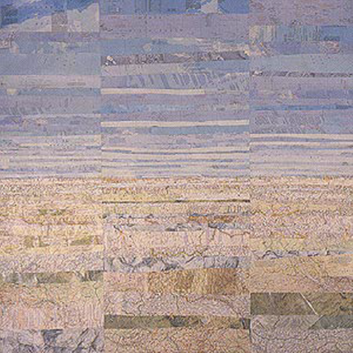
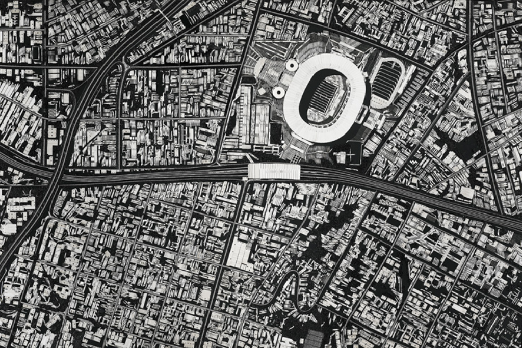
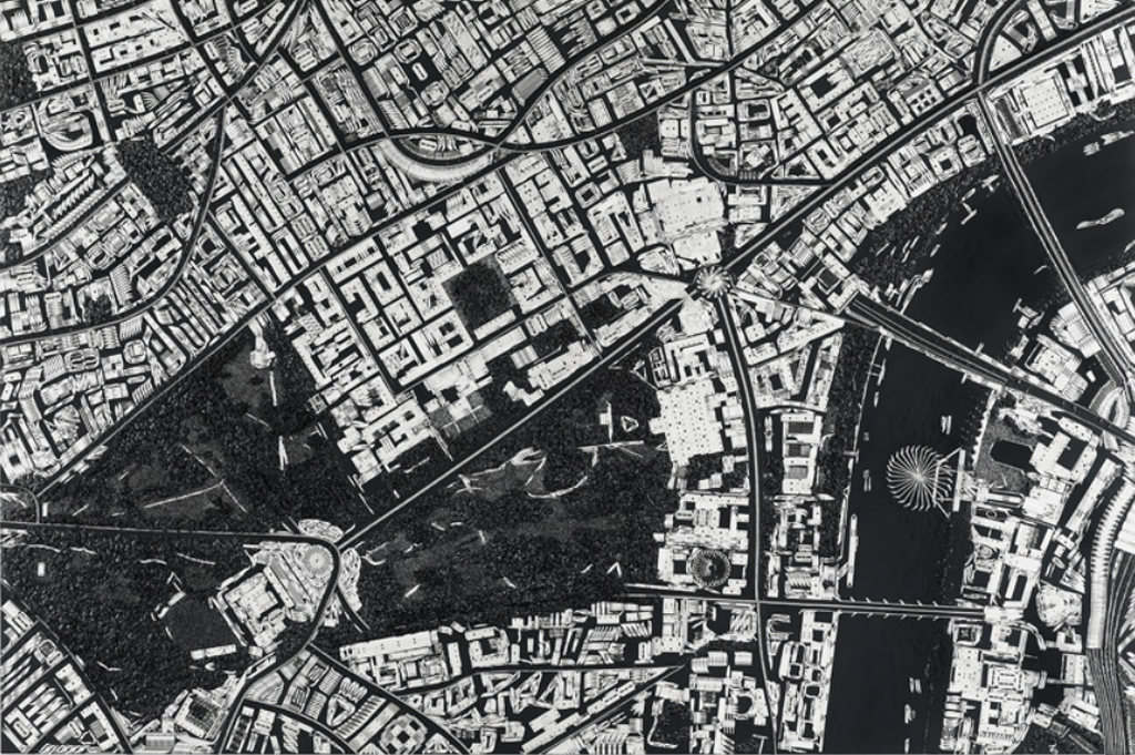
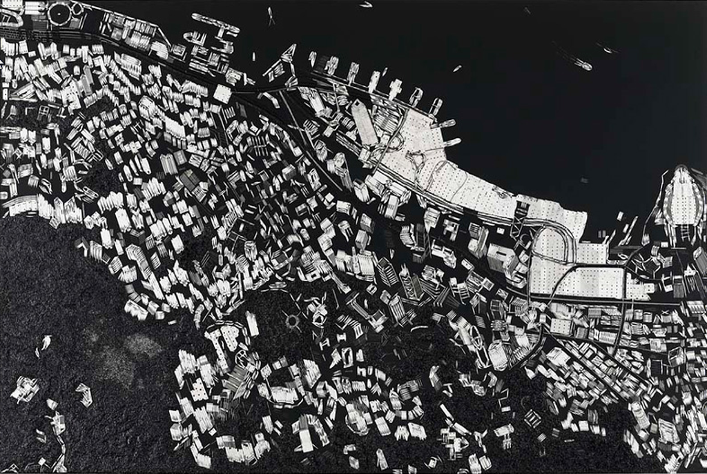
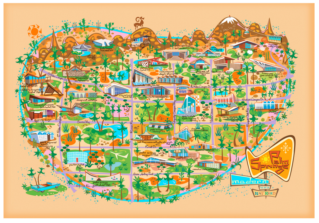
Taking world shapes, maps, outlines or other map-related content gives artists a palette to work from that immediately creates recognition in the audience. People are instantly able to recognise the shapes of countries so the barrier to seeing and becoming interested in a piece of abstract art is perhaps lessened. Brigitte Williams has created numerous works that follow this principle and in so doing she organises her work in some sense of structure to provide a commentary on the relationship between the patterns she makes and out understanding of the world.

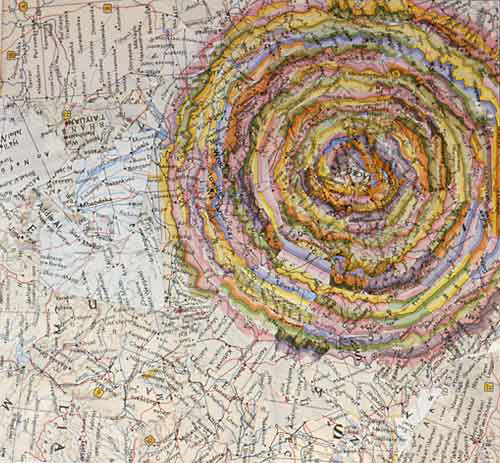
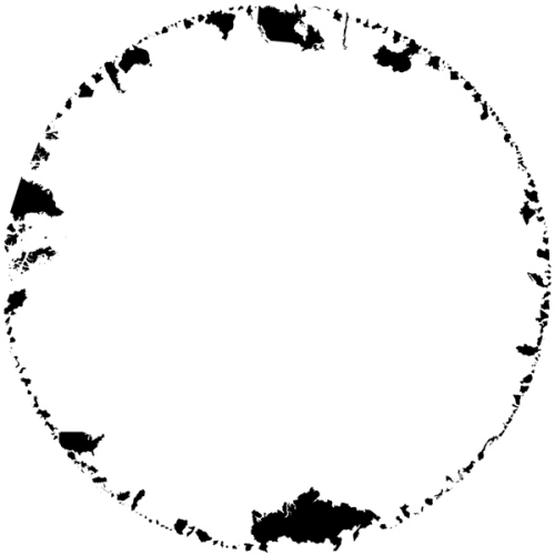
In Peace is a stark, circular image that is predominantly white space yet has the shapes of countries form a circle. A circle of peace perhaps? The white emptiness in the middle perhaps also suggestive of a lack of communication or maybe some other visual metaphor? It’s a strong aesthetic.

MapCarte331_williams2
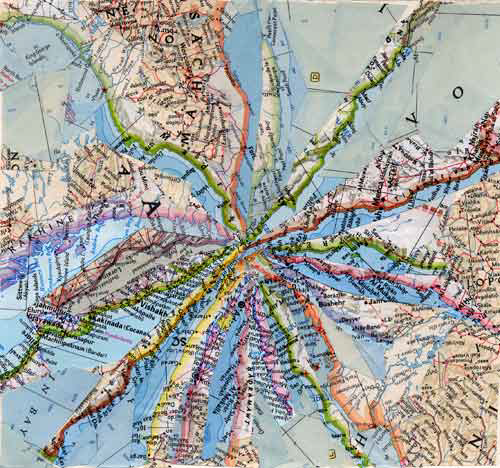
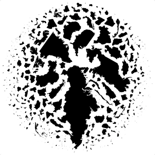
A second piece, called Dislocation, shatters the perfect circle and positions the countries in an apparent random order. They are actually placed quite deliberately and seem to have perfect borders and an amount of white space dissecting them.

MapCarte331_williams3
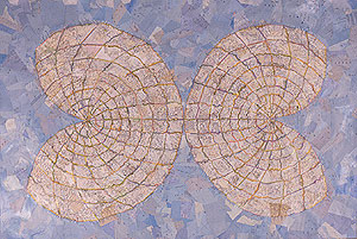
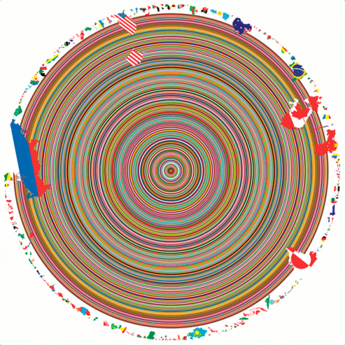
Finally, she also uses colour and splashes the countries shapes with flags which seep into a series of concentric rings to create an almost hypnotic pattern. This work is called United.

Williams is simply borrowing shapes from the world of mapping and repurposing them but creating new works that make us reflect on the structure of our world and place within is no bad thing. Sometimes the very familiar shape and structure of our world on a standard globe becomes rather unremarkable and it’s important to stand back and reflect on different perspectives once in a while.

You can see more of Willaims’ work here.

MapCarte 330/365: The island of Philip Gonzalvez by Philip Gonzalvez, c.1985

MapCarte330_gonzalvezIt’s probably possible to make a map of just about anything and that includes the human form. The natural undulations and features of the body provide a rich terrain for people to let their cartographic juices loose on. Philip Gonzalvez did just that in this map of his face. In what has been referred to as ego-cartography, this map describes his facial features using map symbol metaphors.

The face is an island, strangely detached from its body but the usual green for land and blue for surrounding water provides the clear story that we’re looking at a man as an island. Prominent features are symbolised in a different colour to connotate elevation and a change in terrain with many other standard cartographic representations used to show discrete facial features such as the hairline as a border, eyes and nostrils as lakes and there’s even spot heights shown (and bathymetric depth noted). The République de Cheveux (Hair Republic) sits on the border of part of the Fleuve Ride (Wrinkle River), with the Fédération de la Face (Federation of the Face) beyond. There’s ports and ferry routes as well as all the usual map marginalia such as a graticule, north arrow, legend, border and scale, as both a representative fraction and scale bar.

The map even offers a cartographic joke as the meridian line dissecting the island is at 360 degrees west of GR. (Greenwich) which given that longitude is split into 360 degrees would place the map exactly back at Greenwich.

It’s whimsical and hand drawn. There’s nothing particularly exact but as an artistic representation, in map form, it clearly illustrates that map’s can be made of anything. As ubiquitous and recognisable objects, drawing another object in the style of a map doesn’t present a major challenge to the viewer…though perhaps intrigue and a fascination for how the artist has encoded their unique geography does.

MapCarte 329/365: Collapsed borders by Heidi Neilson, 2001

MapCarte329_neilson1The artist’s palette is enriched by maps as they make use of them in a multitude of ways to inspire their work or, indeed, as objects within their work. Artist Heidi Neilson produces a wide range of eclectic works mainly through the medium of publication. Her prints and other works on paper tend to take on a specific theme and she often explores the subject matter of geography through one medium or another. Here, a series of works entitled ‘Maps’ takes maps as they exist and then cuts them up before restructuring them to create an entirely new object. that object shows a careful redistribution of linework, shapes and colours that build something other than the map. The work takes on a new form and new meaning that encourages us to look upon the maps in different ways.

MapCarte329_neilson2Essentially, Neilson is taking an esoteric look at the way in which maps document space and through deconstruction and reconstruction, commenting on the ability of the same marks to give us something completely different, just reconfigured. The four works here reflect the new patterns that emerge. Sea level shows how strips of maps that contain broadly the same tone can be manuipulated to create a view of the horizon as if across a beach with the golden sands merging into the blue sky on the horizon.

MapCarte329_neilson3Projection takes tonal variation a stage further by reconstructing a map projection. Again, blues form the background while lighter colours and sharp lines are used to create the new map projection in the foreground. The other two examples are referred to as Collapsed Borders and the colourful vignettes often used to demarcate political boundaries are singled out and repurposed to create different shapes…a circle (perhaps a sun?) and converging lines (perhaps a mountain top with ridge lines). These two examples in particular show how the usual patterns we see on a map and the recognisable symbology can be manipulated into something quite different.

MapCarte329_neilson4Cartographically, it perhaps reminds us just how much we rely on our map user’s inate sense of what they expect to see on a map and how we design with that in mind. Rarely do we modify the codification of our maps beyond what is already familiar. We do this to establish trust and to ensure our map’s speak to our users. This sort of artistic venture with maps shows us that we can dare to be different and it brings a new aesthetic to the map. It may also help us to go beyond our defaults and search for new ways to represent meaning.

MapCarte 328/365: Black Scalpel Cityscapes by Damien Hirst, 2014

MapCarte328_hirst1This MapCarte series has attempted to draw attention to classic cartographic design that we recognise in great maps. Occasionally it has also highlighted the work of artists who either approach cartography in an innovative way or use maps as part of their artistic works. This example falls squarely in the latter category as renowned British artist Damien Hirst moves away from the infamous Tiger Shark in formaldehyde as part of his ‘The Physical Impossibility of Death in the Mind of Someone Living’ series to explore the structure of maps. The subject of death is, though, never far away from Hirst’s work as these spectacular urban maps are constructed entirely out of medical instruments.

MapCarte328_hirst1_detailBritain’s richest living artist, compared by Tracey Emin to Andy Warhol in terms of his importance to art, has displayed this series called ‘Black Scalpel Cityscapes’ in São Paolo, Brazil, which features surgical instruments arranged as bird’s-eye map views of 17 cities, including Moscow, New York, Beijing, and Vatican City. The works use scalpels, razor blades, skin graft blades, safety pins, stiching needles, wire cutting spools, hooks and gloss black paint to represent buildings, roads and other features of the urban landscape to create faithful vies of the cities.

Hirst uses his art to comment on themes of surveillance and modern imagery based maps such as Google Earth. His use of surgical tools is a metaphor for the dissection of societal wide anxieties over surveillance and the digitization of warfare, as well as Orwellian distopias and the way surveillance imposes on individuality.

MapCarte328_hirst2Hirst suggests these works show portraits of living cities but all of them have echoes of conflict either as sites of recent terrorist activity, epicentres of religious or socio-cultural importance or major world cities. Even Leeds, UK (his birthplace) is represented. Milton Keynes, UK was the inspiration because of the regularity and systematic structure.

MapCarte328_hirst3While some may wittily suggest this is at the cutting edge of art, it’s certainly taking cartography to a new place. Our usual modes of design and production are challenged by Hirst yet the images he produces are familiar, accurate and aesthetically pleasing. He hasn’t created some modernist haze, but the use of sterile instruments to create sterile scenes in black and white that we recognise immediately as a satellite view or an aerial photograph is impressive. The works are beautiful and engaging. They mimic our more usual ways of seeing cities from above. The materials challenge our thinking and challenges our cartographies.

Many of the works are planimetric but Hirst even tackles 3D in the Hong Kong example. While there is no colour at all in the images, the metal of the surgical instruments catches the light as you view the works to create different views of the world. Hirst also recognises that the works have to be a certain size for the instruments to work since at smaller scales the size and shape of the instruments wouldn’t create the curves and lines required. These works are not just random cartographic experiments. Hirst has studied cartography, scale and representation to bring his art to life.

MapCarte328_hirst4More of these works can be seen at Design Boom’s web site here and Hirst discusses the work himself in a short film on the White Cube gallery web site here.

Now then…how much for one of these pieces Mt Hirst?

MapCarte 327/365: Sachsenhausen Memorial and Museum Visitor Map by L2M3 Kommunikationsdesign GmbH Stuttgart, 2008

MapCarte327_sachsenhausenMaps have incredible power to affect the way we perceive and feel about a place before, during, and after we experience it. Cartography really can change the way we see the world.

Located 22 miles (35 km) north of Berlin, the concentration camp complex at Sachsenhausen was designed and regarded by the SS (Schutzstaffel) as ‘ideal’. The infamous words ‘Arbeit macht frei’ (Work makes [you] free) are incorporated within its gates, through which 200,000 political prisoners – and eventually those regarded as ‘racially or biologically inferior’ – passed from 1936 to 1945. Sachsenhausen subsequently became a Soviet ‘Special Camp’, housing 60,000 inmates until 1950 and, after several years of neglect, was transformed into the Sachsenhausen National Memorial in 1961. Following the reunification of Germany, the site became the state-funded Sachsenhausen Memorial and Museum in 1993 and today attracts around 400,000 visitors each year.

MapCarte327_sachsenhausen_detailAt first, the map itself may seem nothing special. But its power lies in its subtlety and simplicity, through its poignant and eerily clinical blend of dark red, greys and white. The map presents us with a cold, soulless landscape and invokes an attitude fit for entering a place that has borne witness to countless atrocities and felt the depths of human cruelty and systematic murder. We are not to regard this as any normal landscape; neither beautiful nor commodified, but barren and scarred.

The map therefore captures the uniquely strong sense of place with a perfectly muted aesthetic that aligns our expectations, encourages reverence, and in doing so re-educates our understanding of the expressive range of cartographic language.

MapCarte 326/365: The contiguous United States by distance to the nearest McDonalds by Stephen Von Worley, 2009

MapCarte326_mcdonaldsMaps are powerful ways to get a message across. Often it’s possible to state some fact to do with a spatial question or a theme but mapping it takes it to a whole different dimension. For instance, in 2009 Stephen Von Worley started thinking about the rise of the country strip mall in the United States and what it meant to the spatial identity of wilderness. In short, he asked himself a question: how far away can you get from our world of generic convenience? Well there’s no dataset that’s going to give you that straight answer so he used a proxy…and he set about mapping that proxy to show how far you can get from McDonald’s restaurants.

He decided McDonald’s was a good fit for the study because of the way in which it colonizes such centres and towns. The 13,000 restaurants mapped are the result. In design terms he could have simply positioned dots but he’s used distance symbolized by changing colour to show the closeness to a McDonalds (bright yellow), through reds to the darkness of what he calls the “McFarthest spot”; the real wilderness between McDonalds. You travel through red to get there…the blackness. Of course, he’s cleverly used McDonalds corporate colours and a non-too subtle use of black to connotate emptiness but it makes the map work well. It’s got a strong aesthetic and lacks the need for any additional description.

This is perhaps as close as you can get to a visual data dump but simple symbolization decisions and choices create an attention-grabbing and visually arresting image that speaks to the original question. It’s also worth pointing out the use of an appropriate projection that doesn’t distort shapes or areas. A small decision that makes the map visually accurate.

You can read more about the map on the Datapointed blog here.

MapCarte 325/365: Mount Everest Expedition by Major Henry Morsehead, 1921

MapCarte325_morseheadThe Great Trigonometrical Survey of India in 1856 established Mount Everest (known as Peak XV) as 29,002 ft (8,840m). The survey itself was incredibly accurate compared to the modern height of 29,029ft (8,848m). It was named Mount Everest by the Royal Geographical Society upon recommendation by the British Surveyor General of India, Andrew Waugh, who named it after the man he succeeded, Sir George Everest. It was nearly 100 years later, in 1953, when Tenzing Norgay and Edmund Hillary made the first official ascent though debate continues to surround the possibility that George Mallory and Andrew Irvine may have reached the summit as part of the 1924 expedition. They made a final attempt on the summit on June 8th but disappeared in the clouds after being spotted high on the mountain. Mallory’s body was recovered in 1999 at a height of 26,755ft (8,155m). Surveys and maps of Everest were critical in the understanding of the mountainscape, the plotting of the various potential routes to the summit and the eventual success. The map made by Major Henry Morsehead as part of the 1921 expedition is arguably the finest early, detailed and complete map of the region.

MapCarte325_morsehead_detailThe 1921 expedition was in effect a reconnaissance by the British who reached an elevation of 22,970ft (7,000m) on the North Col after a 300 mile march. Nepal didn’t allow foreigners into the country so the British expeditions had to approach the region from the Tibetan side. The map clearly illustrates the divide between nations in the limit of the detail, with Everest being shown on the south edge of the detailed map. The impressive detail is wonderfully rendered with hand drawn hillshading in grey to identify slope and aspect. Darker shading shows higher areas and ridges are shown as if illuminated vertically. Water and glacial features are shown in a light alpine blue hue with only one further colour, red, used to show the different routes through the region. The map is a work of art in relief portrayal and clarity and a result of more than simply marching to Everest itself. This map required Morsehead and his team to explore the entire region in harsh conditions. They weren’t alone in their map-making endeavours with others in the team also undertaking photographic surveys, collecting specimens of flora and assessing the geological structure. Indeed, Alexander Heron’s Geological map is also impressive in its own right.

MapCarte325_heronDespite initial thoughts of using the 1921 expedition for a full assault on the summit, the trip was eventually led as reconnaissance. Before they had left the region, the Royal Geographic Society’s Mount Everest Committee had already established a subsequent expedition for the following year to go for the summit. The 1922 expedition used Morsehead’s map to push on via the North Ridge route to an elevation of 27,300ft (8,320m) which was the first time a human had climbed above 8,000m. It was also the first attempt on Everest that used bottled oxygen to counter the effects of elevation. George Mallory, who had taken part in the 1921 expedition, had discovered a potential route to the summit though on the third attempt seven porters died in an avalanche and the expedition abandoned. They had established a new record climbing height but the lure of the summit would have to wait.

To date over 4,000 different climbers have made nearly 7,000 summits. Some 250 people have died trying to climb Everest. Today’s climbers take modern equipment and digital maps yet for its time and, still, Morsehead’s map retains its status as a cartographic gem that supported early attempts on the summit.


MapCarte 324/365: 1:25,000 City plan of London by the Military Topographic Directorate of the Soviet Army, 1985

MapCarte324_sovietlondonIt’s not always the case that those closest to the geography are those that either make or use the maps. Plenty of examples of covert mapping operations litter history, particularly military history. During the Cold War, the Military Topographic Directorate of the Soviet Army General Staff conducted a secret global topographic mapping program on a vast scale. The true extent is yet to emerge, but the availability of global and regional map indexes together with map sheets at 1:15,000,000, 1:2,500,000, 1:1,000,000, 1:500,000, and 1:200,000 scales, with further territories (including areas within the British Isles) covered at 1:100,000 and 1:50,000 scales, suggests that this was probably the most comprehensive and systematic cartographic project ever undertaken.

In addition, the production of thousands of street plans of towns and cities around the world at large scales, such as 1:25,000, 1:15,000, 1:10,000, and 1:5,000, have come to light since the collapse of the former Soviet Union in 1991. These include Paris, Berlin, Helsinki, Dublin, Vienna, New York, Los Angeles, Dakar, Luanda, and Cairo, and many others around the globe, all produced to standard specifications and using a variety of source material, including satellite imagery.

MapCarte324_sovietlondon_detailOver 90 towns and cities were mapped in the British Isles, including London, which is shown here. The plan comprises four sheets, which join together once the inner margins have been cut away. The astonishing level of detail includes the identification of strategically important buildings and their classification according to their use (e.g. military buildings shown in green, governmental and communications in purple, and military industrial as black). This extract lies at the centre of the four sheets and includes the Houses of Parliament (bottom left, in purple) and several of the city’s railway stations (in black). At a distance the maps might appear similar to the sort of standard topographic sheet you’d expect but the typographic detail makes plain the authorship.

The sources used to compile the detailed hydrography and the construction material of bridges and their height above water (which can be found on many of these plans) remain unknown and it is not unlikely that direct observation played a role. That so much geographical detail was mapped at a time when the obliteration of many of these cities seemed a real possibility is the paradox of the programme’s amazing legacy. Designed for a very specific purpose.

Executed with considerable expertise and care in the look, feel and accuracy of the finished product. Not bad for a map created on foreign soil without anyone’s knowledge.

MapCarte 323/365: Bathymetrical chart of the Oceans by John Murray, 1899

MapCarte323_murrayOcean exploration was a key scientific objective in the late 1800s. Any numbe rof oceanographic, biological, chemical, geological and physical discoveries had been made and one of the preeminent scientists was John Murray. The results of his voyages on H.M.S. Challenger led to this map, the first to make its focus the deeps, what occurs underneath the surface rather than previous voyages and explorations that were concerned with coastal and shallow waters. Murray recognised that measurement at depth required correct and operational instrumentation because it was indirect measurement that was required. Why was this necessary? Accurate survey of the ocean floor was paramount to the correct siting of telecommunications cables across the ocean basins. For that you needed an accurate map.

This map for the first time showed ‘the deeps’ according to Murray. The mid-atlantic ridge is clearly shown as are areas of the Atlantic Ocean that are greater than 3,000 fathoms deep. In many ways, Murray, the Challenger expeditions and this map were critical in the establishment of oceanography as a distinct branch of science.

MapCarte323_murray_detailMurray went beyond calculating bathymetry though, he estimated temperature of the ocean floor as distinct to the surface as well as the amount of light penetrating the darkness and the impact on flora and fauna and marine deposits. The map uses subtle bathymetric tinting and is the first to officially name many of the deep ocean floor troughs. It’s not a complex map but it’s apparent simplicity belies the efforts and science that went into making it.

Maps do not need to appear complex. They can be used effectively to communicate scientific discovery, accuracy and new knowledge. This map, for its time, was revolutionary and was the first to give us a sense of what lies beneath the surface of the vast expanse of seas and oceans.

Murray’s ground-breaking essay on The State of Ocean Science can be read here.

MapCarte 321/365: Palm Springs Modern by Nat Reed, 2012

MapCarte321_reedWhen mapping a specific theme it’s often useful to create the map to reflect that theme; to make the map speak to the mapped phenomena and attract the map viewer with an object that does justice to the content. There’s little point creating a map of Palm Springs Mid-Century Modern architectural heritage in some nonsensical gothic style. It just wouldn’t work and your map loses credibility. Here, Nat Reed has captured the spirit of the 20th century Desert Modernism that found its home in Palm Springs.

The use of glass, clean lines, the combination of natural and manmade resources and the focus on indoor/outdoor spaces is what characterised this particular design aesthetic with the backdrop of the stunning desert landscape. The affluent clientele were a perfect audience for these visionary architects to let their creative juices run wild and they created notable buildings of almost every type. Today, Palm Springs remains vibrant but lives off much of its historical vibe, including the architecture. Nat Reed’s map evokes that spirit and reflects the design ideals inherent in the architecture.

MapCarte321_reed_detailThe map is heavily stylized in shape. Scale is abandoned and symbology is clean and angular (see the sun, cacti and big horn sheep for instance). The map captures the retro feel perfectly. Colours are bright and vibrant; the illustrations of the buildings cartoon-like yet also showing some of the essential character of each building. This is a fantasy map luring you to the fantasy land of Palm Springs and with at least an inspiration from early Disneyland maps. The grid structure of the streets holds the work together amongst the palm trees and other green foliage. There’s even an outer river or moat that seems to envelope Palm Springs making it appear even more like a fantastical island. With north to the right, the San Jacinto mountains are shown in aspect at the top of the map with the city laid out before them. The typographic elements are also in keeping with the overall theme.

Here is a modernist map that creates a perfect cartographic link to the theme being mapped.

More details of Reed’s map and other prints on his web site here.