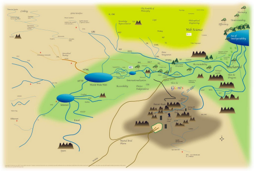
MapCarte 341/365: Mapping analogy for explaining to people the mingling and evolution of influences in the World Wide Web technology by Tim Berners-Lee, 2007

MapCarte341_leeIf I say that this map by Sir Tim Berners-Lee will never win any design awards then you’d be perfectly within your rights to question why it warrants a spot in MapCarte. That would be to ignore the map’s function which is to explain how the world wide web works to mere mortals…and the use of a map is a perfect metaphor. The complex world of wires that Berners-Lee is credited with inventing during his time at CERN. Of course, the world has grown way beyond those early beginnings and is far more complex with a range of complementary technologies which interlink in weird and wonderful ways.

The map, then, portrays these relationships and shows how various components connect together and what each is used for. Even if you have no idea what TCP is or how Google fits into the scheme of things this map gives you a sense that you can at least position them within. There are some wonderful touches and the map isn’t devoid of graphical treats. Google isn’t directly mentioned but the colour coding of the word ‘Giants’ is unmistakable and riffs off the logo. There’s also some vague areas thrown in that refer to accountability or logic or efficiency and understanding. There’s even a ‘here be dragons’ reference.

So what of the map’s overall appearance? Well it’s reflective of an early computer game aesthetic. It’s simple and clearly generated using simple paint tools. In many ways it works in this form where a more accomplished map or diagram might not. It reflects complexity through simple graphics. There’s no place to hide in this realm as depicted and the seas and mountains add to the sense of some sort of fantasy map, perhaps almost Tolkien-esque. Even the fonts used perhaps add to the impression that this is a role-playing game map. It’s a look and feel that works well.



MapCarte 340/365: Airspace: the invisible infrastructure by NATS, 2014

Cinematic cartography provides us with a sumptuous feast of data representation. It captures the intricacies and patterns of large datasets and, in particular, those that have some element of flow or movement about them. Here, NATS give us a state-of-the-art 2 minute 30 second video showing the patterns of air traffic in and out of UK airspace over a 24hr period incorporating some 7,000 separate flight movements.

Of course, there are the usual flights in and out of the UK in addition to local flights but there’s also some really fascinating vignettes and what NATS do well is not simply present the viewer with a mass of moving stuff…they have gone to the effort of incorporating text and moving the image around to explain precisely what is being seen. This teasing out of individual elements gives context to the overall patterns and allows us to appreciate the complexity all the more.

There’s an ebb and flow of movement beginning with transatlantic traffic, then European arrivals followed by the first wave of departures and the congestion build up around the usual nodes of London, Manchester and central Scotland. They then focus on the holding stacks over Heathrow airport before picking out some military training flights and the movement of oil-rig workers from Aberdeen to North Sea rigs.

The aesthetic of the film perfectly matches the function with darker base elements and glowing flow lines. The marginalia and textual components are in balance with the overall piece and the movement, panning and zooming works well to take us on a tour without awkward jolts visually or in relation to the content in view. Speed, resolution and camera control are perfectly attuned to give the viewer a pleasing visual experience.

Fascinating and beautiful. The melding of cartography with large fluid datasets in an engaging form.

You can read more about the video and also links to other similar works from NATS on their web site here.

MapCarte 339/365: Abstract maps by Jazzberry Blue, 2013

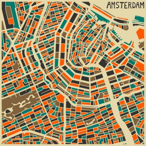
MapCarte339_jazzberryThe shape and form of the various geographies around us make for interesting canvases for a wide range of artistic interpretation. Rendering the familiar in challenging alternative colour palettes can bring a new aesthetic to the landscape and perhaps challenge our notions of what works in a cartographic sense in representing geography.

Artist Jazzberry Blue tends towards the creation of abstract works that centre on geometrical shapes and patterns. Maps have also provided a focus for many pieces of work as colour is used in an imaginative way to re-style the cities. Here, the shape of Amsterdam is clear with roads and canals cutting through a patchwork of bold colour whose palette is in perfect balance. While a traditional map prtrays the structure of a city it’s conventional use as a product to aid navigation, wayfinding or other spatial requirement dictates its style supports those functions. Artwork doesn’t have the same requirement and with the shackles thrown off, it gives us a wholly different way to view space and place.

These are no doubt maps but they are maps as an art form rather than for conventional purposes. You’d not be able to use them for wandering round a city…but they will likely look terrific hanging from a wall.

You can see many more examples of maps by Jazzberry Blue at the Jazzberry Blue web site here.


MapCarte 338/365: Drucksland – Physical and Social by Michael Drucks, 1974

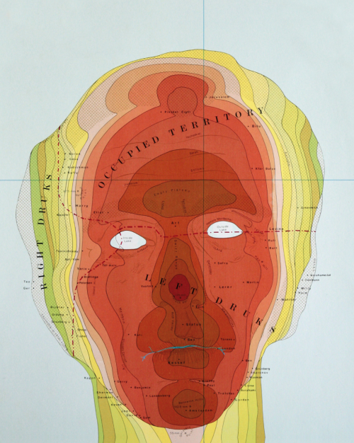
MapCarte338_druckslandUsing maps as a way of expression is common and fertile ground for artists and a wide range of social commentators. Here, Philip Drucks uses the shape of his own head to provide a narrative and a metaphor for his own existence. The image simply uses the three-dimensional head with symbology used to represent different distances from the viewing plane. It’s effectively a hypsometrically tinted relief map though, of course, a large slice of artistic license has been applied with the colour in particular.

The area around Right Drucks shows the side elevations that mimic a fairly standard tint pallete but the front of the face takes on a startling range of red hues. It’s not the sort of elevation tinting you’d ordinarily find on a map but then this isn’t an ordinary map.

Place names locate family and friends around the map and clever use of other map symbology helps explain the line of the closed mouth (a river) and the empty holes for the eyes. Drucks is not the only one to have mapped the human face or form in this way but it provides a strong image and a powerful way of mapping map symbology onto alternative forms to give them some sense of spatiality.


MapCarte 337/365: A New and Enlarged Description of the Earth by Gerardus Mercator, 1569

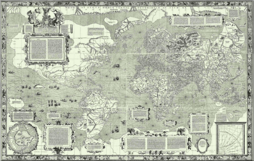
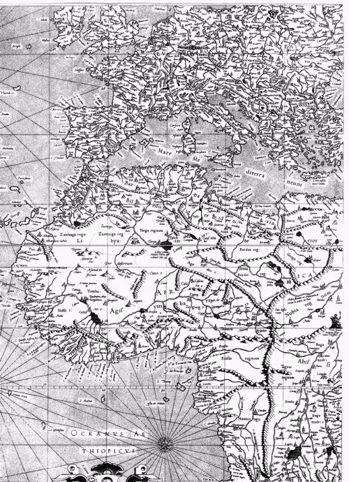
MapCarte337_mercatorThere’s arguably no more widely known figure in historical cartography than Mercator. His legacy has been the mathematical basis and projection developed and first used in his map of 1569. The map’s content at the time was rich and presented as complete a knowledge of the Earth as had been seen before. The projection, though, surpasses the content and is still the basis of many maps and, in particular, navigational charts to this day. The reason is simple – the Mercator projection allows one to plot straight lines of constant bearing (rhumb lines) which makes it a perfect map to support navigation.

MapCarte337_mercator_detail

The map was produced across 18 separate sheets measuring a total of 202cm wide by 124cm tall. It was compiled from a range of sources including previous maps made by other cartographers, Mercator himself and portolan charts by Portuguese and Spanish sailors. These charts provided Mercator with the detail of coastlines that made this new projection so useful for supporting navigation. It was the first time the detail and projection had been used combined. The map is littered with cartouches and other marginalia including descriptions of the science of measurement that forms the basis of the map. In one such legend Mercator states that his first priority is “to spread on a plane the surface of the sphere in such a way that the positions of places shall correspond on all sides with each other, both in so far as true direction and distance are concerned and as correct longitudes and latitudes.”

A remarkable map of the time and one that continues to be used, and it has to be said mis-used, to the present.

MapCarte 336/365: National Geographic Atlas of the World, by the National Geographic Society, 1963-present

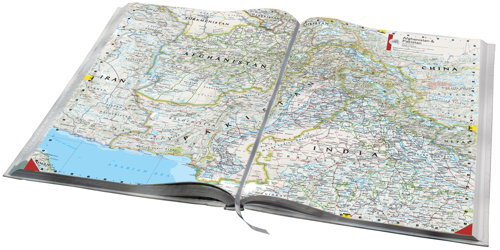
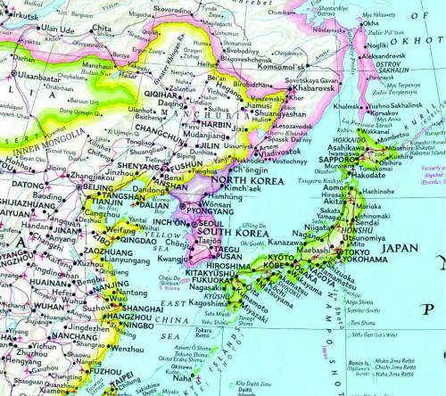
MapCarte336_natgeo1First published in 1963, the National Geographic Atlas of the World is now in its 10th Edition, published in 2014, and contains over 300 maps and nearly as many illustrations.  The maps are beautiful and engaging and the overall design has become a hallmark of National Geographic publications.

Though most new atlases are published to update changing geographies a key element in the success of an atlas series is continuity. If a design works, it becomes a house style and something instantly recognisable. Many people familiar with maps can spot a Nat Geo map in an instant…most other people will also be able to spot one even if they are unable to name it.

MapCarte336_natgeo2One of the most notable design features involves colourfully marking the country boundaries yet keeping the interior of the geographic areas as black text on a white background (this extract from the 1992 6th Edition).  This helps establish a clear figure-ground between mapped features and the labels and harks back to the use of hand painted tint bands on early historical maps.

The atlas is also notable for its use of the Winkel Tripel Projection, a standard since 1998, and for its custom proprietary fonts originally designed in the 1930s and named after staff cartographers of the era (Darley, Bumstead, Riddiford etc.).  The fonts and extensive labeling alone sets the atlas apart from others and gives it an unmistakable style.  Touches, such as the curved lettering from point features around a coastline, are also a signature National Geographic style.

You can see more of National Geographic’s atlas at their web site here.

MapCarte 335/365: World Trade Center site by Frank Culbertson, 2001

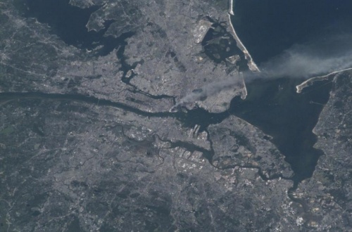
MapCarte335_culbertsonWe’ve already seen the power of remotely sensed imagery in MapCarte 115 where the focus was on the Landsat satellites, one of which took a remarkable image of the attack on the New York World Trade Center on September 11, 2001. Of course, remotely sensed imagery is simply data, processed in the case of Landsat to render a true-colour image that gives the illusion that we’re looking at a photograph. Photographs are different to images built of data in the sense that they capture information in the same way as we see it with our own eyes. They are created when visible light reacts to a photo-sensitive surface such as film or, in digital cameras, a CMOS chip. Photographs also capture a moment and are unique in that they give us an instant portrait. Here, we focus on the beauty of photographs as a means of capturing information about our world. There are a multitude of photographs we might have chosen and aerial photography (and photogrammetry) is its own sphere of cartographic science. But a photograph has the power to evoke emotion. Someone pushed the shutter and captured the picture. A human being was involved in the creation of the image.

Here, we show a simple photograph taken in a remarkable way of the same September 11, 2001 terrorist event in New York City. The picture was taken showing a smoke plume rising from lower Manhattan iby astronaut and Expedition 3 Commander Frank Culbertson. Culbertson was the only American not on planet Earth on that day. He was aboard the still under construction International Space Station orbiting 250 miles above the planet. As the craft was due to pass over north east U.S. he grabbed a camera expecting to capture images of New England but instead he saw the smoke passing across lower Manhattan. With no access to video feeds, communication with mission control soon established what was going on and with every orbit Culbertson could see the events unfolding, later seeing a gash in the Pentagon.

He has since said that one of the remarkable outcomes in a visual sense is that all of the con-trails of planes criss-crossing the U.S disappeared as air space was closed…except for one heading towards Washington D.C. – Air Force One carrying President Bush.

Photography has always been an important part of map-making and the design of many maps and map products relies on aerial photographs. Here, the photograph can be used in its raw state. We don’t need an abstract map to be made to point out the features and events. The photograph does that job.


MapCarte 334/365: 2012 Presidential election by Chris Howard, 2012

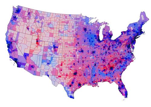
MapCarte334_howardThe choropleth technique is a standard thematic mapping approach which is flexible and relatively easily understood by map readers. The principle is simple…where enumeration areas have a greater relative magnitude, they get shaded darker and vice versa. There’s some simple design rules for choropleths such as ensuring you’re using normalized data, that is, data that equalizes for population or some other denominator which is important to ensure we see areas symbolized properly in relation to others. It’s also important to set up the shading scheme with colours that connotate some quantifiable difference between areas. We naturally see shades of any hue in this way (e.g. light to dark red or light to dark blue). That’s not to say we can’t get a little creative with the choropleth which is what Chris Howard has done here with his map of the 2012 Presidential election result in the USA.

Howard uses a diverging colour scheme with a mid purple where the Democrats and Republican’s shared a pretty even vote. The colour moves towards a strong blue for areas that have a strong Democrat share and to red for a strong Republican share. This is a standard approach where you have a dataset that tends around some mean, average or key value. He goes further though and creates a version of the value-by-alpha technique created by Roth, Woodruff and Johnson. The original value-by alpha technique assumed a black background and the general idea is to use a layer of transparency across the top of the standard choropleth that modifies what we see according to a second piece of information. For the results of the election, transparency is used to encode the population density. The alpha layer is highly transparent where the population density is highest, and near black where it’s at its lowest. This has the effect of highlighting the areas that have more voters. Howard has simply created a version against a white background with increasing white added to the alpha layer where there are lower population densities. We therefore see a set of muted colours that decrease their importance in visual perception…in line with the very nature of such areas in voting terms. Fewer people just don’t contribute as many votes.

It creates a beautiful map with a wide range of colours but one that is perfectly understandable. Howard also goes further by adding a layer of populated places that sits in the map and just gives a subtle highlight to the major cities, helping them stand out a little. He also changes the colour of the County borders to either a red or blue to show the predominant vote in that area.

Choropleths can seem rather boring despite their utility. By thinking a little about how you might be able to develop the visual message you can end up with some very attractive thematic maps that invite perhaps a little more interest.

MapCarte 333/365: Disputed territories of Burma, Siam and China by Anon, 1889

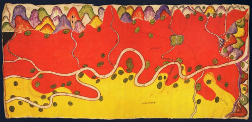
MapCarte333_burmaIn the late 1800s the Burmese already had a good appreciation for topographic mapping and cartography in general. They used maps for taxation and land use and also as a way of plotting military campaigns. Many of these maps were collected by British diplomats and also colonial authorities but in addition, indigenous maps by the Shan and T’ai peoples were also collected. Here, a Shan map created in 1889 relating to a border dispute between Burma and China illustrates wonderful cartographic approach using colour to represent the different areas.

This map was painted by an anonymous Shan artist in tempera on paper and it covers an area of 47 square miles along the Nam Mao (Burmese Shweli) River. There are about eighty villages and hamlets shown in green. The map text is in Chinese Shan with red areas representing the British Shan state of Möng Mäo and yellow showing Chinese territory. The colours are rich and vibrant and leave the reader in no doubt as to land ownership.

Most of the map is planimetric but the mountainscapes on the upper and right borders show the bounding mountain ranges in aspect with wonderful colour. By modern standards there’s considerable cartographic license in terms of the precision of the topographic record. In design terms, the map is a work of art and a quite sumptuous representation.


MapCarte 332/365: Flight patterns by Aaron Koblin, 2006

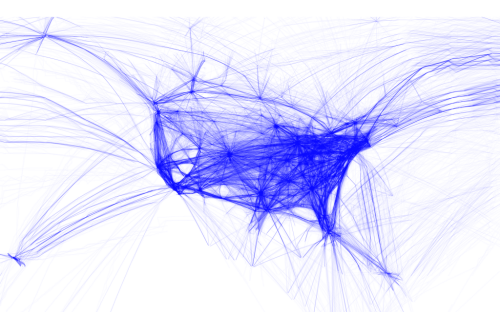
MapCarte332_koblin1Making maps from digital data has become a key outcome of the democratization of data and the use of the internet to store and share. Ad to that the availability of a wide range of digital mapping tools from full-scale professional GIS, through high-end illustration packages to open source offerings and new players offering ways to build maps through coded solutions. Each to their own but there’s a rich suite of products to suit tastes and abilities. A number of people have played with flight data from openflight.org but here, Aaron Koblin goes that extra mile to create a range of different products.

He used the Processing language to convert origins and destinations to geodectic curves to show all commercial flights routes between paired airports. His products are relatively simple…perhaps more data art than map but certainly their end appearance is map-like and they portray spatial relationships. He has created a number of alternatives that show all routes or which classify them by colour based on make or model of aircraft. He’s extracting the detail in the data and working with them in map form.

MapCarte332_koblin2His maps aren’t just static though. There are zoomable slippy maps that show the work in greater detail, overcoming one of the limitations of digital map design that means we have a constrained format. The ability to use multiple scales means we can design across a range of scales despite the dimensions of the viewing mechanism being relatively constrictive.

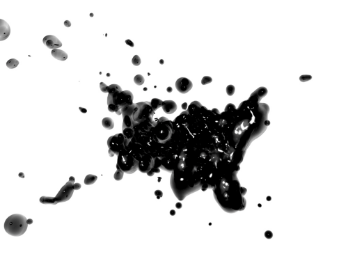
MapCarte332_koblin3Finally, he turns the relatively easily understood linear representations into animations and more artistic forms such as the blobular version. Of course, this perhaps ventures a little far from a form that allows people to interpret the data but it’s bringing new approaches to the cartographic aesthetic. Experimentation with form is useful. It perhaps doesn’t always carry a function other than to look appealing but beautiful data art is pleasing cartography all the same.

You can see more of Koblin’s flight patterns here and here.