MapCarte 29/365: Our U.S.A. A Gay Geography by Frank Taylor & Ruth Taylor, 1935

MapCarte29_taylor

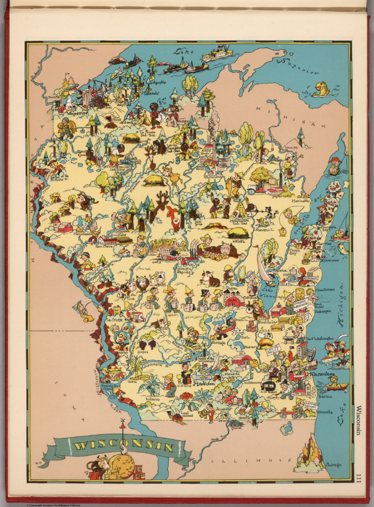
A charming pictorial atlas. Ruth Taylor’s maps present a hugely entertaining picture of the United States in cartoon form. Each state and outlying territories gets its own page and original drawing which provides a snapshot of the social and geographical setting of the area of the time. The landscape is populated by people going about their daily lives; the major sights and scenery are illustrated as well as crops and indigenous flora and fauna. Each map shows the main topographical features and geography of the area in a way that no reference or thematic map can achieve. Here, the map itself has character as well as allowing you to glean a basic understanding of what is where.

As with most cartoon-style atlases and maps, the images are stereotypical and sometimes jarring in a modern context. The map of Tennessee, for instance, shows a Ku Klux Klan member complete with robe, hood and pistol. However, such maps often reveal what was culturally or socially of note at the time of their creation and illustrations were often included precisely to be provocative or even satirical in style.

Pictorial maps genuinely combine cartography with art and are often sought after and collectible. Consequently, many are disassembled as individually the maps can command a higher value than the complete book.

MapCarte 28/365: Bike Share Map by Ollie O’Brien, 2013

MapCarte28_obrien

Click the image to view online map

Developed from an initial version showing London’s bike share scheme in 2010, Ollie O’Brien has developed his map to provide links to around 100 similar schemes across the globe. Technically, the work showcases the potential of tapping into real-time data feeds that makes the map not only interesting but truly purposeful. The one key aspect that web mapping offers is the ability for a map to update when data changes. Here, O’Brien demonstrates how to harness that and create a genuinely useful information product which captures change approximately every 2 minutes.

The map itself takes a standard thematic proportional symbol approach that indicates size of the bike station and uses colour (which can be modified to your own liking) to show whether a station is relatively full or empty. The addition of statistics on each bike station (revealed by a mouse roll-over), the overall statistics for a city, usage graphs and animations that show the ebb and flow of daily use patterns add to the utility of the map. Here, detail is the key and the map gives the user a number of different ways to consume it as well as modifying the viewing experience.

More detail on Ollie’s site here.

MapCarte 27/365: Willamette River historic channels by Daniel E. Coe, 2013

MapCarte27_coe

Borrowing heavily from the Mississippi river channel maps designed by Harold Fisk (MapCarte 26), Daniel Coe has taken LiDAR data of the Willamette River, Oregon and created a stunning image of historic river channels.

At a glance the map might appear to be a plume of smoke or possibly an electric storm. The title is the only real hint of what the image represents but it’s enough. Adding contextual detail such as roads or cities would take this abstract map and revert it to a simple topographic reference map. The impact would be lessened and here we have an example of ‘less is more’ as the map invites the reader to figure out what they’re looking at. Once understood, you begin to explore the many twists and turns of the channels and can visualize the feel of the water rushing through and carving the landscape. Coe uses a single blue hue that becomes lighter to represent deeper channels and this simple effect is stunning…almost creating an x-ray of the landscape that picks out one feature and shows it far more clearly than a standard map can ever hope to show.

Further details and a link to buy a large format poster here.

MapCarte 26/365: Alluvial map of the Lower Mississippi Valley by Harold N. Fisk, 1944

MapCarte26_fisk

In 1941, the Mississippi River Commission appointed Harold Fisk to undertake a geological survey of the Lower Mississippi Valley.  His detailed and exhaustive report contained 15 maps that illustrated the historical courses of the river, colour coded for different ages of point bar migration, chute cut-offs, and avulsions.

As a collection they succinctly present the complicated story of channel evolution of the river and are archived by the US Army Corps of Engineers (download here).  Rather than attempting to fit all detail on one map, Fisk let the geography drive the size and scale necessary to show detail clearly.  The maps exhibit a perfect blend of neutral basemap to provide a context for the coloured detail of the river morphology though almost every colour has a percentage of black to allow it to tone harmoniously with the grey background.

The organic historical stream flow patterns make an intriguing visual and despite the fluidity of the mapped phenomena the maps appear very structured.

MapCarte 25/365: In Flight by Kiln, 2014

MapCarte25_kiln

Click image to view the online web map

The first map of 2014 to be added to MapCarte is an impressive effort by Kiln, who have designed a multimedia app that celebrates 100 years of aviation history. Designed for The Guardian, the app shows how a story can be told through expertly integrating pictures, audio, commentary and animation with the map as a central character. The map holds the story together, providing a focal point that the story returns to at different points. The map itself is simple in design and allows you to explore historic flight data as well as real time patterns.

The background map is tastefully presented and the animated flight lines work well (with a nod to a number of other web maps that illustrate flow). The pace of the presentation is crucial and allows people an immersive experience. Controls are obvious and support, rather than interfere, with its use. Functionally, the app gives the user variation and holds the attention well. The commentary means that the map is supported by a story we can follow.

MapCarte 24/365: The Racial Dot Map by Dustin Cable, 2013

MapCarte24_Cable

Click image to view the online web map

Dot maps have always provided a way of overcoming some of the limitations of the choropleth map for mapping population based data. When constructed correctly, unpopulated places are devoid of symbols so we see the true structure of the populated places through dot density.

Here, Dustin Cable has made good use of the web map as a medium to create a highly detailed map which re-renders at each scale revealing increasing levels of detail. At its most detailed he assigns 1 dot to 1 person. Dots are inevitably placed randomly within the finest census geography available but with a dasymetric technique being deployed at larger scales he creates an accurate view of the racial diversity. Colour is used to differentiate between the main race types and user controls allow you to toggle between a simple monochrome representation to the coloured version which allows you to see structure more clearly in one; and diversity in another.

Cable allows the user to remove the UI controls to create an uncluttered viewing experience and also allows us to toggle basiv topographic detail (roads, place names etc). This is a great way of allowing us to orientate as well as seeing how geography acts to split the racial groups but also provides the flexibility to remove map content to give increased clarity to the data itself. Marrying a highly detailed map with simple display is the winning combination on this map.

MapCarte 23/365: Earth Wind Map by Cameron Beccario, 2013

MapCarte23_Beccario

Click image to view the online web map

Building upon the original wind map concept, Cameron Beccario has expanded the scope to a global scale.  The near real-time map offers a range of data views including wind, mean sea level pressure and temperature. The animated flowlines are coded using ‘industry standard’ colour schemes (though some are subject to long debates about their effectiveness). The map is mesmerising but really comes into its own with simple and intuitive controls to vary a wide range of parameters. You can modify the height of the wind layers you’re viewing, the time (to explore historical conditions) and also the projection. This provides a fascinating way to morph the global view into different shapes that reveal alternative patterns visible in the data. Controls are hidden from the main view to reduce clutter and Beccario includes full references and discussion of the product. A work of art and a strong aesthetic built upon solid cartography.

MapCarte 22/365: Hurricanes since 1851 by John Nelson, 2012

MapCarte22_Nelson

 A stunning poster format print map of all known Hurricanes and tropical storms since 1851 from the NOAA archive.  As the availability of archived geolocated datasets continue to grow, many are experimenting with different ways to map the detail. John Nelson’s maps are visually strong as he creates high contrast between the map elements. Here, he uses a basemap that is almost faded completely into a black background. The familiar image of Antarctica acts as a good visual anchor that allows people to orientate themselves to the unfamiliar polar stereographic projection. Mapped onto this projection, the storm paths produce a fantastic swirling ring around the map – a pattern that wouldn’t be nearly as dramatic if he’d used an alternative projection.

Nelson uses almost neon colours for the hurricanes tracks and differentiates by intensity using size and colour. He also applies a fair bit of Gaussian blur to create a soft focus on many of the map elements to great effect which creates a unique style. On a dark background, Nelson’s map shows how the normal connotation of dark = more is reversed as light = more and sits higher in visual perception. Useful graphs and other peripheral information is illustrated succinctly around the well balanced map.

This is one of a number of similarly styled maps which can be seen and also printed on Nelson’s website.

MapCarte 21/365: View and Map of New York City by Herman Bollmann, 1962

MapCarte21_Bollmann

Published for the 1964 New York World’s Fair, Bollman’s map maintains scale equally throughout by an axonometric projection, a technique developed as early as the 15th Century.  Bollmann, a woodcarver and engraver, drew this spectacularly detailed map by hand from 50,000 ground and 17,000 aerial photographs to allow readers to view all parts of the map at the same scale.

The map exaggerates widths of streets to create a perfect amount of white space in which buildings sit.  The dense fabric of the city is represented at the same time as giving clarity to individual buildings.  Vertical exaggeration is used to give a sense of the skyscrapers soaring.  The street numbering is consistently placed and beautifully letter-spaced.

The rich detail invites closer inspection and the colouring, predominantly in pastel shades (to identify building function) with deep grey roof-tops mimics the grey skyline of Manhattan. Other versions exist such as Constantine Anderson’s 1985 map and Tadashi Ishihara’s version from 2000.

MapCarte 20/365: Seafloor map of Hawai’i by Tom Patterson, 2012

MapCarte20_Patterson

Tom Patterson’s beautiful map of the seafloor topography of the Hawaiian islands is pleasing on the eye due to the balanced layout and choice of blues he uses for the bathymetry. Blue, of course, is routinely used for representing water features but here, Patterson veers towards turquoise and aquamarine that gives us an impression of clear tropical waters. The lighter coastal waters provide a natural vignette to emphasise the land/water zone.

The often dramatic and explosive volcanic forces at work that create the islands are in some respects subdued by the colours but the seafloor terrain is captured in all its jagged detail using a plan oblique technique. Text is well placed and designed with a simple sans serif font and colour aids in differentiating text by function and also to place the labels in different visual planes.

Large hi resolution versions and wall maps can be downloaded from Tom’s website here.