 Just when you thought your daily dose of MapCarte from 2014 had finished…here’s the beginnings of a less frequent, intermittent post of great maps on which to feast your cartographic senses.
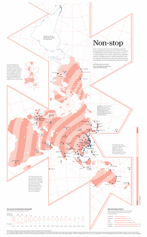
In an age where flashy, spinning, animated, colourful web maps seem to be all the rage it’s refreshing to see that applying some control on your cartography can still bring to life a fantastic example of the art of map-making. Here, Alberto López has created a simple but graphically effective map showing the non-stop flight paths from Hong Kong. The first aspect that grabs you is the use of RB Fuller’s Dymaxion projection. Visually interesting, it adds something unique to the display. The same data could easily be shown across a cylindrical projection or, if we wanted concentric flight time zones, an azimuthal projection dentred on Hong Kong…but the map would not have been as interesting or stimulating.
Similarly, instead of the usual use of flowlines that arc across the map (on a cylindrical projection) or which would radiate from a point (on the azimuthal), López has chosen instead to use time bands. The simple two colour approach to showing time also echoes the coastline, graticule, map frame and other components. The use of blues for the destinations and also the outline of the area outside the range of non-stop aircraft is subtle and uses contrast to good effect.
There’s a subtle use of two different typefaces, one for the main map components and descriptions and another for the introductory panel that again creates a visually useful and pleasing contrast. The inverted distance band labels in white situates them well in the visual hierarchy. The simple but useful graphs add to the story by showing us some of the salient aspects of the data in a more useful way.
This is effectively a two-colour map (maybe use the blue for all textual components instead of black?) which creates an interesting and engaging map. There’s a lot of good cartographic design going on here to establish good hierarchy, contrast and balance which when brought together creates a great finished product. It doesn’t need to be anything more than it is and proves that keeping things simple is both an art and an effective solution.
The map was published as part of the South China Morning Post’s infographics feature here including links to a larger version.

