
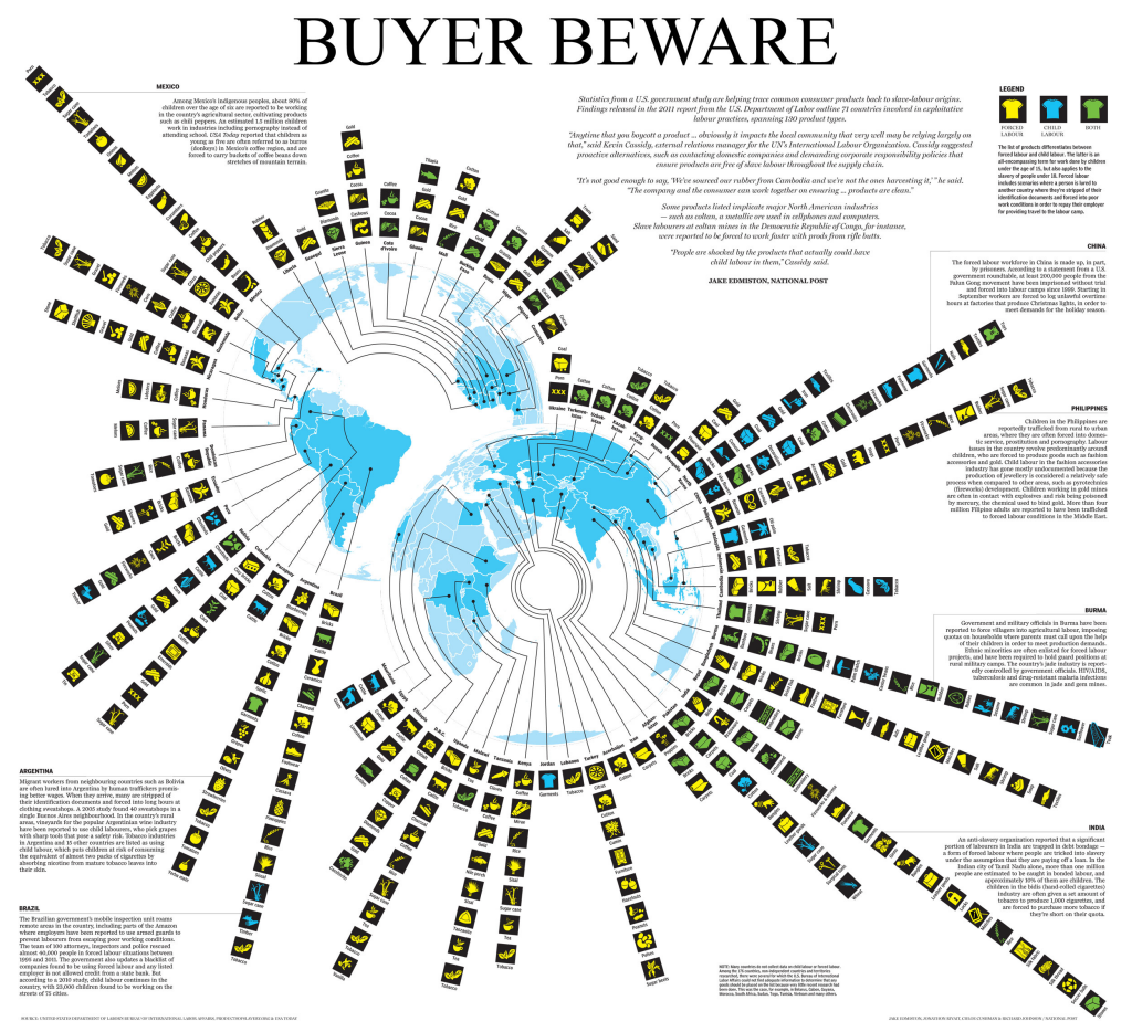
 The rise of the infographic as a form of representation has brought with it some unwanted baggage. In trugh, information graphics have always been around but giving them a label has suddenly brought them into focus. What most people think of as an infographic might be summed up in this fantastic parody from web-comic XKCD…the list-like approach to representing a vaguely connected set of facts using seemingly random graphical approaches. Maps have always been information graphics. They are a specific form that deals with the spatial representation of data. We use design to encode meaning and to create visually interesting graphics that communicate to an audience. Perhaps where we’ve seen a development over recent years is in the use of maps as anchors for a story; where a different visual aesthetic is formed by bringing together maps, strong non-spatialised graphics and other components such as text. This example shows how a modern map-based infographic brings together the elements in a well-composed display.
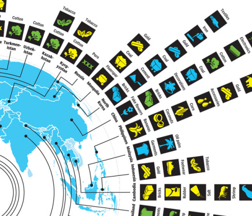
In effect, the infographic approach to cartography emphasises the role of layout in design. The map is used as the core though in truth it’s really used simply as an image. There’s no information encoded into the map itself. It’s devoid of labels or any meaningful data. Instead, it plays the role of the mechanism that leads to other detail and allows us to use forms that might not be useful in other contexts. Here, two azimuthal projections of the globe are organised to support the use of leader lines to the information encoded using systematic, uniform pictorial graphics. Each is represented using the same general form and pictographs encoded with shape and colour give us the detail. The graphics are easily understood and overall, create an interesting pattern on the page, inviting the inquisitive reader.
 The overall layout is augmented by panels of text that bring the story to the same page rather than an approach which might have seen the map embedded in a passage of text. This combination of the written passages and an interesting graphic gives us a form of graphical story-telling that integrates many different visual components, including maps into a coherent whole. It’s an infographic…but really, at it’s heart, it’s just well designed thematic cartography.
