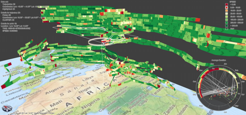
 Compexity is often inherent in data but difficult to tease out in a meaningful way when we try and represent it visually. One of the key design tenets for cartography is selection and omission and this is often done to simplify the mapped phenomena to bring some salient characteristics into view. It’s not always an appropriate approach because complexity may very well be the very aspect you wish to convey…but that doesn’t mean that you don’t also want readers to be able to make sense of what it is that’s being mapped. The search for alternative forms of visualization is almost a discrete type of cartography in itself. Beginning with data and a desire to find an appropriate form with which to map it is important for cartographic research and in design terms gives us new ways to represent data. Here, Tominski et al propose a new form of visualization they term a trajectory wall that demonstrates the art perfectly.
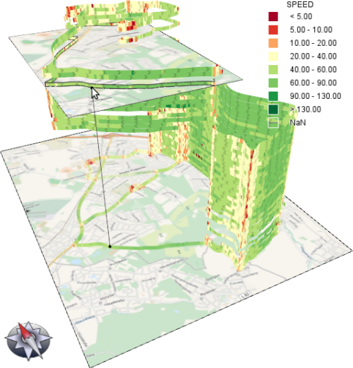
Mapping trajectories has always caused difficulties for cartographic representation. The data by its very form requires the mapping of both spatial and temporal information as well as some attribute which can, of course, vary both spatially and temporally. Attempts to resolve some of these visualization issues have been made before but this is the first real solution to accommodating all components in a single approach. The core approach is a stacked representation in a hybrid 2D/3D display. The 2D base gives spatial context while trajectories are stacked in 3D space with attributes encoded through colour. The temporal aspect is encoded through the order of the stacked trajectories as well as a linked graphical time display.
 The approach is a development of the space-time cube by Torsten Hagerstrand and which has subsequently found a re-birth with the onset of 3D enabled Web GL browsers that genuinely bring interactivity to the toolbox of the cartographer in a new way. The ability to use 3D and to provide full interaction overcomes many of the limitations of static displays that have hindred proper 3D cartography. Tominski illustrates how we can develop such graphical approaches to make visual sense of complex data. Of course, full interaction and query also gives the user additional ways of exploring the data through visualization.
You can read more about the technique here.

