
Cartograms seem to be one of those map types that garner polarised opinion. There are as many who find them compelling and highly useful as there are those who find any reason to debunk their utility.
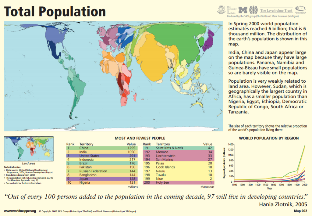
The WorldMapper project, a research project spearheaded by Danny Dorling and Benjamin Hennig have done much to bring the value of the Gastner-Newman cartogram, in particular, to global attention. Taking a range of global indicators, they have produced well over 200 maps showing all manner of socio-economic indicators that illustrate global inequalities. The web site allows individual maps to be seen and also downloaded as an executive briefing document combined with brief notes, graphs and other allied information. There’s even a published book of the maps.
The maps rely on the cartogram to deliver the message. Only colour is added to help identify the different continents and to anchor the eye.

Hennig has gone further with the idea and developed a variant he calls a gridded cartogram. While a conventional gastner-Newman cartogram modifies the size and shape of an area relative to a mapped value, the gridded version incorporates additional detail so that individual grid cells are morphed according to relative internal quantities. The result is a display of internal heterogeneity that the standard Gaster-Newman approach does not support.
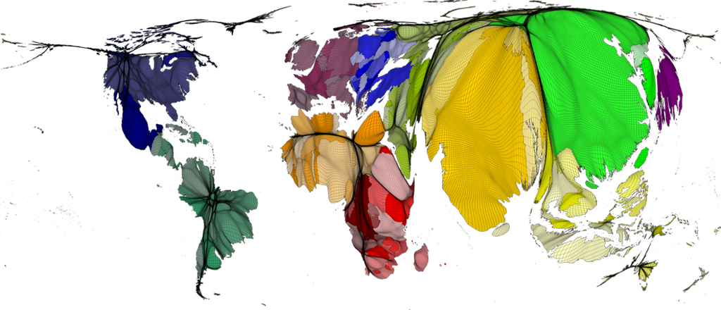
A great example of the use of cartograms and the development of further cartographic research. More details on Worldmapper at the web site here. Details of the gridded cartograms are on Benjamin Hennig’s research page, Views of the World, here.
