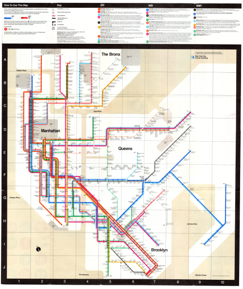
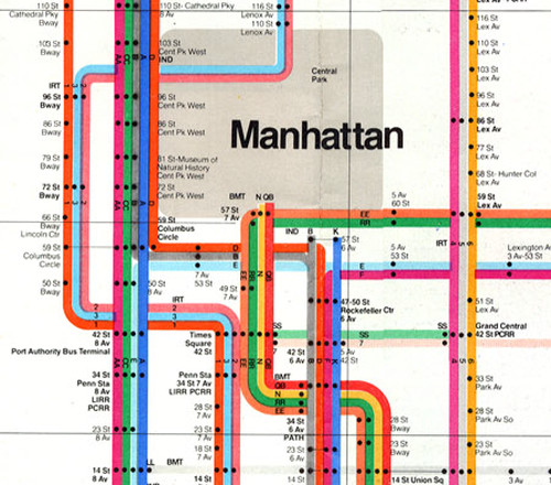
The 1972 map of New York City’s subway system by Massimo Vignelli has often been seen as a polarising map in design terms. For every one person who characterises it as a striking piece of design or commending its beautiful aesthetics, another will point to the geographical liberties it took. These included a square shaped Central Park that might come as a surprise for anyone exiting at 59th Street for a walk only to find the distance horribly distorted. Vignelli’s map only lasted 7 years and was replaced in 1979 with a more topographically correct version that included above ground detail, inter-modal transport links and dramatically thinned linework. This replacement was designed by a committee of 12 people.
The problem, perhaps, lies not with the map, but with the map users. While the London public grew to understand that Harry Beck’s map was grossly distorted yet a perfect solution to navigate from A to B, New Yorker’s simply didn’t appreciate the same approach. Despite the clean, modern lines and bold colours, Vignelli himself explained the issue at a conference in 2010: “I think the real reason is space. But not because Manhattan is too small, it’s because they want to put too much information that doesn’t belong in the diagram. That’s why. All of a sudden there is …and there is no reason. I mean, all you want to know is [how] to go from A to B,”
Like Beck’s map, it was geographically inaccurate by design. Above ground detail was omitted. It was a schematic diagram to support ease of travel through a complex network. Vignelli had been tasked with streamlining the wayfinding task and bringing New York into the future. He succeeded in meeting the design brief yet people eventually reacted by demanding a ‘map’ as they perceived it in the more traditional sense. The replacement, far from being the simplified classic created by Vignelli attempted to overlay multiple disparate layers of information creating a fragmented and unpleasant version. Vignelli’s map was abstract yet provided clear information for the single task at hand.
A classic of cartographic design certainly…but also a classic case of transposing an approach to a new environment and a set of users less inclined to be accepting. Ensuring that a map’s user is satisfied might be considered paramount and so on this basis, Vignelli’s map has remained controversial and may even be considered a classic failure despite its obvious beauty and his good intention.
Vignelli did design a more recent NYC Map for The Weekender…this time a digital version which retained the main components of his original which he still staunchly defends. The digital version can be seen here.


“The problem… lies not with the map, but with the map users.” That says it all right there! The transit map exists to serve transit users — not the other way around. The problem lies with the Vignelli map.
In musing about Londoners’ acceptance of the Beck Map versus many NYC riders’ rejection of the Vignelli, one must consider the complex differences between the two cities. One major difference: London’s chaotic medieval street plan masked diagram inaccuracies while NYC’s precise street grid amplified them, making the Beck Diagram a success and the Vignelli ultimately a failure.
Regardless, these beautiful and historic 20th century static forms have been surpassed by an explosion of 21st century map making and technological innovations such as vector tiling and GPS positioning. Just ask anybody who uses Google Maps for transit directions on their mobile device.