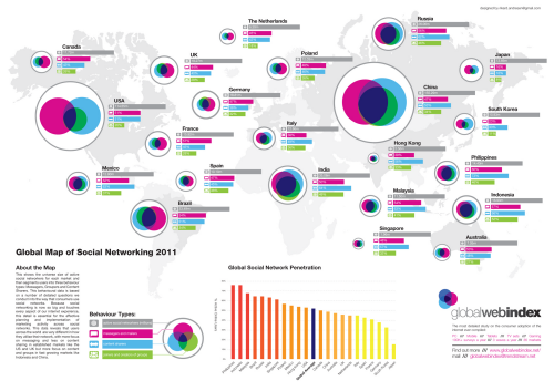
A static thematic map showing active social networkers. More often than not, maps take complex data and omit a great deal of information to present a single message clearly. Sometimes, however, clarity is achieved through a deliberate design that integrates a number of variables so that the multivariate character of various inter-relationships is preserved. These maps are designed to be studied beyond a simple glance. They contain detail and do not apologise for demanding that the map reader explore them. Often, the design challenge is to communicate complexity simply and by mapping multiple variables you inevitably make the job harder!
Here, Rikard Andresen uses a range of graphic devices and successfully creates a simple, clean and effective map. Bar charts show quantities and Venn diagrams show how they overlap and interact. The use of simple colours is a logical symbolisation that feeds off people’s innate understanding of colour. The Venn diagrams are proportional and actually function as small multiples allowing easy visual comparison with each other.
The map itself is almost immaterial to the overall display but as a subtle background it helps to lead the eye to different countries. By necessity, symbols are not placed directly across countries but that doesn’t matter. What Andresen creeated in fact, is a discontinuous Dorling cartogram, presented with a visual link to approximate location to aid our ability to peruse logically. The title is unobtrusive, the surrounding detail supports the map. The main map is allowed to take central stage.


