
Click the image to view the online map
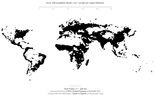
Simplicity in map design is difficult to achieve but Derek Watkins perfects the art with elegant efficiency in his interactive map of world population density, an interactive rendering of Bill Bunge’s The Continents and Islands of Mankind. Good design is often more about what you leave out than what you include. Avoiding unnecessary interaction and pointless user-controlled options, the map shows a single theme but allows you to control the binary classification (populated or not) to reveal different views of the dataset.
Beautifully generalised, almost amoebic ‘blobs’ are used to show populated areas. The image above shows 5 people per square kilometer but this can be changed using the classification bar to show different classifications up to areas of 500 people per square kilometre. This reveals the most populated areas on earth and where populated places with similar densities exist. The alternative would have been to show different densities as a choropleth but the classification is what gives the map its interaction to create several maps of different densities.
The lack of a coastline focuses attention on the populated places and our ability to recognise the familiar shapes of the world allow us to identify places easily. A subtle toggle to add place names is included but switched off by default – a nice touch.
There are no zoom or pan controls – the map works at one scale and shows that not every online map has to be slippy. Colour is simple – just black on white and with a red flash for the value of the data in the legend…which also acts as a title.
