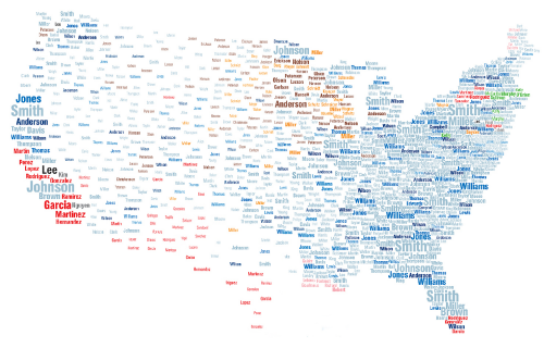
 A beautiful example of the use of typography as a literal and communicative multivariate symbol. The map appears incredibly clean and simple yet it is actually conveying several pieces of information. Location is inherent in the positioning of the surnames showing the top 25 surnames in each state. They are sized by their magnitude in the same way as a proportional symbol to show quantitative information. Additionally, colour is used to denote the origin country and so we see patterns of names as a qualitative symbol.
The map, then, gives us an insight into not only the spatial pattern of surnames but an indicator of some of the historical patterns of immigration and settlement. Population density is also implied through the general distribution and size of the names with the most densely packed and largest being located in urban areas and the more populated states.
Published in National Geographic in February 2011, a zoomable version of the map can be seen here.

