Atlas of Design call for maps

atlasofdesign

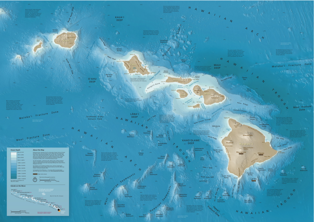
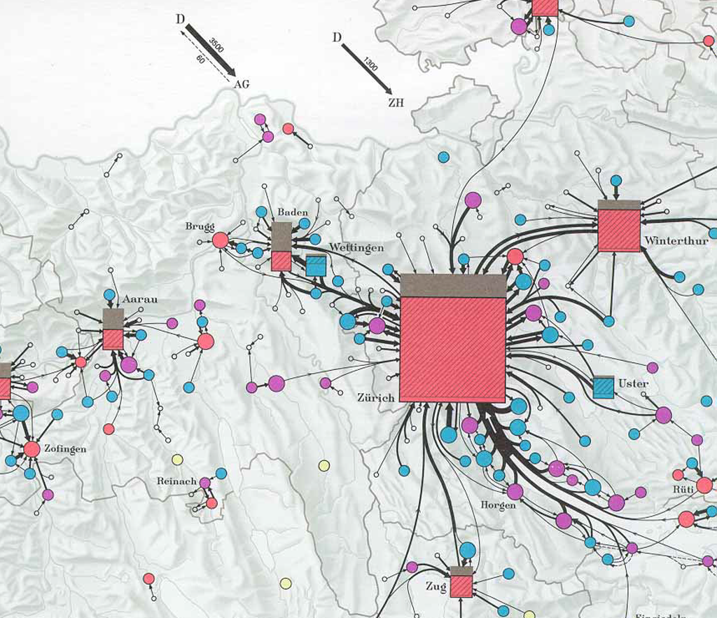
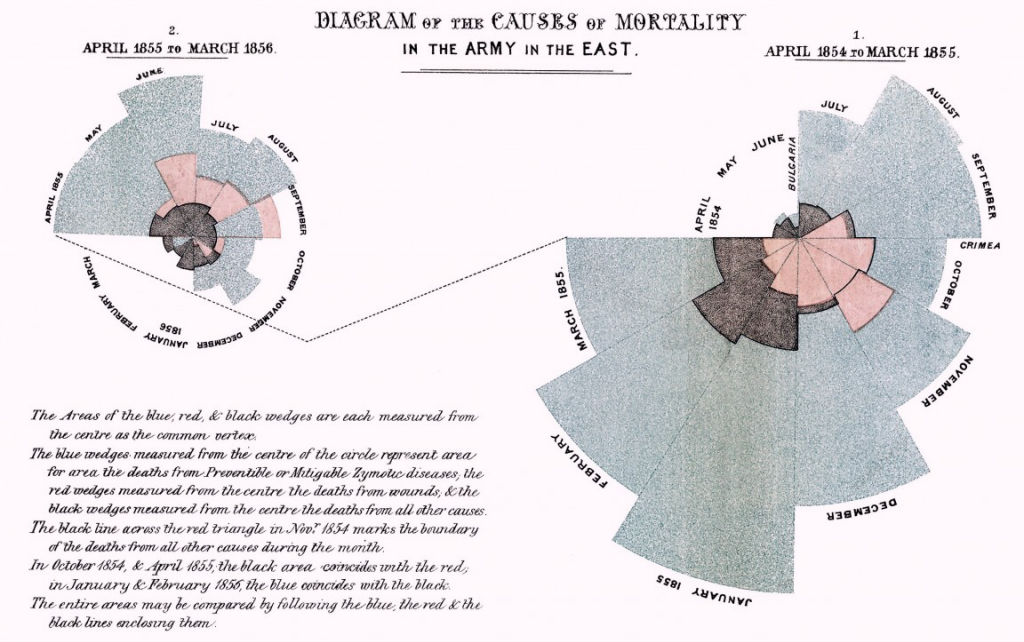
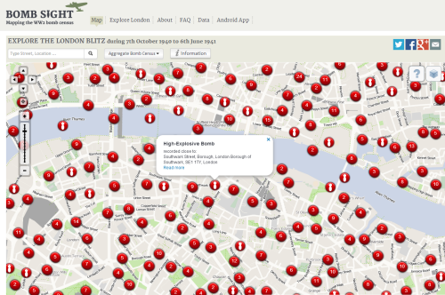
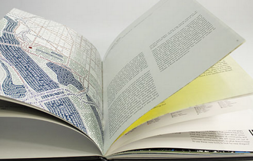
The call for map submissions has just been announced for the second volume of the Atlas of Design. An initiative by the North American Cartographic Information Society (NACIS), the atlas acts as a showcase of beautifully designed maps alongside commentaries that explain a little of why the map is as it is and how and why it works so well both graphically and as an information product. In many ways the atlas was an inspiration for our picto-bite approach MapCarte series but crucially both are curated by cartographic experts. This provides a look into the world of mapping from authoritative sources. We need more of this!

Edited by Tim Wallace and Daniel Huffman, the first volume (published in 2012) presented 27 beautiful maps and even though beauty is so often in the eye of the beholder there can be no argument that the selection represents some of the finest contemporary mapping of the last few years. The 2014 volume looks set to improve on the first (no pressure there!) but this is a community effort so we’d encourage those of you who produce stunning maps to consider contributing.

In a world where quantity is currently out-pacing quality, the Atlas of Design is a much-needed antidote to much of what we see. It acts to inspire people towards a greater appreciation of well-crafted maps and how they can be far more powerful when properly thought-through, designed and produced. This is more than just ‘pretty maps’ and a gallery of aesthetically pleasing maps; this is about showing the value of the art and science of cartography; the expertise that a cartographer can bring to bear; and a return to high quality over mass production.

Submit your maps here. Go on…you know you want to!

MapCarte 21/365: View and Map of New York City by Herman Bollmann, 1962

MapCarte21_Bollmann

Published for the 1964 New York World’s Fair, Bollman’s map maintains scale equally throughout by an axonometric projection, a technique developed as early as the 15th Century.  Bollmann, a woodcarver and engraver, drew this spectacularly detailed map by hand from 50,000 ground and 17,000 aerial photographs to allow readers to view all parts of the map at the same scale.

The map exaggerates widths of streets to create a perfect amount of white space in which buildings sit.  The dense fabric of the city is represented at the same time as giving clarity to individual buildings.  Vertical exaggeration is used to give a sense of the skyscrapers soaring.  The street numbering is consistently placed and beautifully letter-spaced.

The rich detail invites closer inspection and the colouring, predominantly in pastel shades (to identify building function) with deep grey roof-tops mimics the grey skyline of Manhattan. Other versions exist such as Constantine Anderson’s 1985 map and Tadashi Ishihara’s version from 2000.

MapCarte 20/365: Seafloor map of Hawai’i by Tom Patterson, 2012

MapCarte20_Patterson

Tom Patterson’s beautiful map of the seafloor topography of the Hawaiian islands is pleasing on the eye due to the balanced layout and choice of blues he uses for the bathymetry. Blue, of course, is routinely used for representing water features but here, Patterson veers towards turquoise and aquamarine that gives us an impression of clear tropical waters. The lighter coastal waters provide a natural vignette to emphasise the land/water zone.

The often dramatic and explosive volcanic forces at work that create the islands are in some respects subdued by the colours but the seafloor terrain is captured in all its jagged detail using a plan oblique technique. Text is well placed and designed with a simple sans serif font and colour aids in differentiating text by function and also to place the labels in different visual planes.

Large hi resolution versions and wall maps can be downloaded from Tom’s website here.

MapCarte 19/365: Atlas of Switzerland 1961-1978 by Eduard Imhof, 1978

MapCarte19_Imhof1

Eduard Imhof, Swiss cartographer, was asked to produce an “Atlas of Switzerland” in 1961. The atlas illustrated the country with its variety of nature, population, culture and economy in maps that exhibited the full expression of Imhof’s abilities. Supported by numerous Swiss scientists the first edition was finished in 1978 and published by the Federal Office of Topography. The maps are authoritative precisely because of this fundamental scientific basis and consultation but they are brought to life by the artistry of Imhof.

Imhof himself was an expert cartographer and artist. That combination is fundamental to understanding his work since the artistic dimension to his many works creates maps that are beautiful on the eye. Here, even a complex statistical map showing daily commuter patterns in 1960 mixes clear geometric point symbology with perfectly curved distributive flowlines. Text is kept to a minimum and the hillshaded backdrop provides a subtle ground to the thematic figural elements. This map is simply one example from an atlas that as a collection is clinically designed and represents the very best of atlas production.

This will not be the only Imhof in the MapCarte series.

MapCarte 18/365: Diagram of the Causes of Mortality by Florence Nightingale, 1858

MapCarte18_Nightingale

Florence Nightingale was a pioneer in establishing the importance of sanitation in hospitals through her work as a nurse in the Crimean War in the mid 1800s. She gathered data of death tolls and approached the job of communicating this information through applied statistics and graphical communication.  She is particularly famous for the development and use of certain graphs, now commonly known as coxcombs or polar area plots, rose diagrams.

Nightingale realised that soldiers were dying needlessly from malnutrition, poor sanitation, and lack of activity. She strove to improve living conditions for the wounded troops, and kept meticulous records of the death toll in the hospitals as evidence of the importance of patient welfare. In creating the graphs, each sector represents a unique time period and a quantity. Because the sectors all have the same angle, they are visually equivalent when used to represent area. The diagrams overlay three variables for comparison and illustrate the temporal component perfectly by representing each month as a separate segment.

Map or graph? Well, it’s a graphical representation of spatio-temporal data. It doesn’t need a map backdrop because location is implicit. A great example of innovation as well as clean design to present a clear message. Plenty of online resources to provide more detail and also animated versions.


MapCarte 17/365: Bomb Sight by The Bomb Sight Project, 2012

MapCarte17_BombSight

Click image to view the online web map

This web map presents the London WWII bomb census between 7.10.1940 and 6.6.1941. It’s a terrific effort that catalogues anti-invasions sites, bomb types and adding an overlay of the bomb maps themselves.  The map is the result of a year’s worth of work which hints at the effort needed to build an interactive web map with good quality content.

Zoomed out to a scale of 1:72,000 or smaller the map of London becomes awash with red symbols which ordinarily would be considered the antithesis of how to depict multiple overlaying features. Yet here, the result is to visually demonstrate the extent of the blitz and it’s visual impact is stunning. Zooming to a slightly larger scale and you can pick out individual strafing attacks and the impact of lines of bombs. When you zoom in further the symbols begin to separate and change into ones which portray individual bombs that can be interrogated.

Filters, graphs, search, statistics and ancillary information make this a well produced piece of work and if you view on a mobile device there’s a great augmented reality version that means you can view through your mobile phones camera with an overlay of bomb details as you wander around London.

Great example of a portal to historical information through a web map.

MapCarte 16/365: Hong Kong Street Map Series, HKSAR, 2010

MapCarte16_HongKong

Published by the Survey and Mapping Office of the Government of the Hong Kong Special Administrative Region, this monochrome street map series at 1:10,000 covers the entire region across 59 sheets with contours at a 20m interval. It is highly detailed to include all the necessary topographic elements of roads, buildings and points of interest.

The greatest achievement of this map series is that it is published entirely in monochrome. Given the ease of which colour can be applied to maps today it serves as a perfect reminder that often, monochrome can be both useful and impactful. The map also demonstrates the clarity of design that the cartographers achieved given the limitations imposed by the lack of colour. They managed to design over 100 uniquely identifiable features through the design of black and white point, line and area features. This is map design stripped to its very basics but to great effect. Designing in monochrome is a very useful way to control your design even if you end up adding colour.

A zoomable version is available on the ICA web site, here, to allow more detailed inspection.

MapCarte 15/365: Wonderground map of London Town by MacDonald Gill, 1914

MapCarte15_Gill

The mapping of London’s Underground rail network predates the classic maps by Harry Beck but as significant features of the landscape the stations play a central role on this beautifully detailed and humorous map from 1914. Drawn by MacDonald Gill, the map was not designed for navigation or any functional use but, rather, as a story of a range of countless incidental details of London’s attractions.

The map was commissioned as an attempt to overcome the perception of the underground as overcrowded, dirty place with train services that were frequently late. The company was losing money as the trains were empty at weekends. The map, then, was central to a re-branding effort and presented a somewhat impressionable, romantic vision of train travel in an attempt to lure passengers to use the service. Hung at every station, it mixed topographical inaccuracy with a cartoon style and became extremely popular. It also became the first poster to be sold to the public and the tube to this day has a strong connection to artistic works.

Gill himself went on to design the official Underground maps between 1920-1924 and has another association with the tube in his tutor, Edward Johnston, who was himself commissioned to design the now famous letter form for the network.  The map is full of pithy stories and invites people to engage with the landscape proving that detail is often key to making a good map.

There’s a fantastic article on the history of the map including a hi-res version that allows you to explore the map in detail on the BBC web site here.

MapCarte 14/365: 100 Aker wood by E. H. Shepard, 1924

MapCarte14_Shepard

Maps of fictional places have always been ripe for cartographic depiction. One of the simplest, earliest and classiest is E. H. Shepard’s depiction of the fictional 100 Aker Wood in which the A. A. Milne children’s stories about Winnie-the-Pooh are set.

The map is small format and appears on the inside front covers of the books. As such, it immediately immerses the reader in the imaginary landscape providing settings for the many adventures. The map is whimsical and playful with the central characters being positioned throughout to depict them in the scene itself and even the north point is labelled POOH rather than NSEW. The imaginary wood is actually based on part of Ashdown Forest in Sussex, England. Many locations in the stories can be linked to real places in and around the forest.  The landscapes were directly inspired by the distinctinctive high, open heathlands of heather, gorse, bracken and silver birch punctuated by hilltop clumps of pine trees. Both the map and Shepard’s other illustrations can be matched to actual views, allowing for a degree of artistic licence.

The map has become synonymous with the Winnie-the-Pooh stories and shows us that through maps, our imagination can be brought to life.

MapCarte 13/365: Atlas of the Historical Geography of the United States by Charles Paullin and John Wright, 1932

MapCarte13_Wright

Charles O. Paullin and John K. Wright’s Atlas of the Historical Geography of the United States, first published in 1932, is an award winning work of art. A magnificent historical atlas published ahead of its time and including innovative thematic representations. Each one of the nearly 700 maps makes it a truly fantastic cartographic work.  The attention to detail is exquisite and builds to a rich set of maps that detail just about every facet of America and the social, political and economic fabric of the country at that time.

The purpose of an atlas is to create a collection of works that relate to the area in question and this is one of the best of the early 20th century. Its contents are curated and written by authoritive figures. The maps are combined with temporal and statistical detail and context is provided through textual explanations. This is a true compendium that expertly mixes a range of approaches to capture the history and geography of the U.S.

A new digital version has brought the atlas to a new audience and while it doesn’t necessarily portray the work as well as the original the huge benefit of being made available online is it can be seen by a much wider audience now than ever before. You can see the online version here.