MapCarte 122/365: Les 100 Tours by Idé, 2013

MapCarte122_lestours

Click the image to go to the online web map

While web maps clearly bring with them greater possibilities for data display (access to data through popups), animation and multiscale, not every web map necessarily needs all of these techniques to be successful. In fact, one of the basic tenets of map design is to keep it simple. Just because your technological palette allows it does not mean you need to deploy it.

This web map of the history of The Tour de France by Idé (a french computer graphics design agency) illustrates the philosophy perfectly. The map itself is static, single scale and cannot be zoomed or panned. It doesn’t need to. The base map detail is simple and effective. It does not need detail. The symbology is generalised but symbolic at the scale and meaningful. It suits the map perfectly, showing simple route paths between tour stages marked by point symbols. The stages are named, and the direction of the tour shown with small arrows. Colours are all in concert with one another and France itself is highlighted among the other land.

Idé don’t completely dispense with web controls. They use interaction to show the 100 years of the tour. The graphic time slider allows users to move to a particular year. The map updates. There are three pieces of information for each year – an anecdote, the stage classification and the overall classification. The map needs no more.

That’s it! There is nothing spectacular about this map except the simplicity is expertly crafted and the no-frills approach reminds us all that often the simplest graphical approach coupled with a clear use and usability make a really great map.

Update: The original post contained an error which attributed the authorship of the map to Henri Desranges…which of course is ludicrous. Apologies.

MapCarte 121/365: Wahlland by Moritz Stefaner, 2013

MapCarte121_election

Click the image to view the online web map

Following the mapping of elections has become almost as much of a spectacle as the elections themselves. Media outlets seem to fall over themselves trying to provide more detailed and expansive coverage than their rivals. Over the course of the last decade we’ve seen countless ways to map the detailed voting patterns as they are announced and the map takes shape. Proportional symbols, choropleths, a variety of cartograms and three-dimensional techniques have all been used in recent years.The map presented here hasn’t been widely used and takes a different graphical approach altogether.

Made as a web map and published by the online arm of German newspaper Die Zeit (The Times), the Wahlland map shows the Germand Bundestag elections of 2013. The electoral districts of Germany are arranged by their voting behaviour using a very abstract approach that is based on similarity of lifestyle, preference and attitude rather than geography. Each district is represented by a series of triangles arranged almost like a coxcomb chart over each district. Each segment maps the results (by size) for the party represented (by colour). Rather than simply mapping voter numbers the size maps the relative difference to the average result of that party overall. Only parties that are above average are mapped and the districts are arranged so that more similar districts are clustered. It’s a novel approach to mapping multivariate statistical data that shows not only the salient information of the results but in a way that adds value and provides some sense of the underlying geography and patterns being revealed. Which districts voted like each other? Are they geographically proximal or distant?

The design goes beyond by providing a very helpful legend (hidden until required) and also allows data to be seen through hovering over each segment. The map can be filtered by state or by party so the clusters are easily viewed and the subtle background shading works to anchor the eye to a cluster and give a hint as to the overall quantity of vote for a party. Geography is thrown to the wind but this is a novel and well crafted alternative to more traditional forms of mapping elections that is visually eye-catching and performs well. Even the way it draws is neat, smooth and easy on the eye.

MapCarte 120/365: Environment and health atlas by Imperial College London, 2014

MapCarte120_sahsuClick the image to go to the atlas web site

Mapping health and disease is often fraught with difficulties. Data is often aggregated to a resolution that doesn’t really provide much insight; is lacking a temporal dimension that is important to identify trends; or is not able to be published due to patient confidentiality issues. What we tend to see are over-generalised maps or snap-shots of a partial story that then get misconstrued in terms of what they might reveal, or which paradoxically seek to infer some outcome that the data might not support.

The Small Area Health Statistics Unit at Imperial College London has been researching patterns of health and disease for several decades. As a research grouped backed by the UK Medical Research Council and Public Health England they have unique access to detailed health data both at a fine resolution and across multiple years which they have been researching to better understand patterns of health and disease. The ability to publish the results of research is often restricted to scientific papers but this new atlas for the first time brings to life much of their effort in this area of scientific endeavor for the public and policy makers.

MapCarte120_sahsu_kidney

Kidney disease, an example atlas page. Click image to view online.

The atlas is the result not only of the 20+ years of research that has gone into understanding patterns of health and disease but also the 7 years it has taken to bring it to light as a publication. Navigating the complexities of working with this type of data and producing a worthwhile publication are not inconsiderable. This is a significant and monumental achievement. It combines data from many different sources over many years and the maps are not only well designed thematics but represent considerable analytical work in their production. This isn’t just mapping numbers, it’s analysing vast amounts of information in a statistically rigorous fashion and preparing maps that summarize the results succinctly. They are authoritative and are exemplars in treading that fine line between ensuring data privacy while revealing worthwhile information.

Many of the maps deal with hugely sensitive topics but they do so in a mature and considerate fashion. The online atlas is clean, modern and allows people to access the work through an efficient, unencumbered user interface. Each map allows users to view female or male patterns, to zoom in, rollover to see administrative boundaries and labels and to click to reveal detailed graphs. So many elements of the maps are linked. As you move across the map, the graph updates, there is a simple statment of above or below averahe that updates and even the legend brings the class into focus. These are all small but very effective controls that give the work a cartographic polish. The side panel is reserved for interpretative text and further information – critical to ensuring that the map’s message is not taken out of context. There’s even a set of risk factors to enable viewers to understand patterns in a socio-economic context and a glossary that explains medical and statistical terms clearly. This sort of attention to detail is too often missing from modern maps.

Making this work freely and openly available in map form is a triumph and sets the standard for online atlases of health for years to come. In many ways the online version may well cannibalize the potential sales market of the print version, itself a beautifully constructed print atlas but that alone is testament to the prime motive of this work. It’s data about the public, mapped for the public. The work has gained many plaudits and rightfully so.

MapCarte 119/365: Armsglobe by Google Ideas, 2012

MapCarte119_google

Click the image to go to Armsglobe

This data visualization (map?) was produced by Google as part of the 2012 Google Ideas INFO (Illicit Networks, Forces in Opposition) Summit. The data was provided by the Peace Research Institute Oslo (PRIO) and comprises a database of small arms imports and exports. There are over 1 million data points of individual exports and imports that map the transfer of small arms, light weapons and ammunition across 250 states and territories across the world between 1992 and 2010.

The purpose of the map was to highlight the illicit trade in small weaponry as a way to shed light on the fact that 60% of all violent deaths are due to small arms and light weapons. Creating a visually arresting, in-your-face map provides just the right aesthetic for capturing people’s attention. Sure, the data could have been mapped on a flat map with muted colours and a conservative approach but sometimes the subject matter and the purpose need something altogether different. The design is deliberately startling and captivating and illustrates patterns and trends in the import and export market so that one can better understand how they might relate to conflicts.

The armsglobe is fully interactive and allows intuitive zooming and rotation. Click events highlight a particular country and the labels rotate and scale as the map view updates. Graphs provide some quantifiable comparisons that show a breakdown of imports and exports. The viewer has control over showing or hiding some of the graphs as well as different ways to filter the data. In this way, one can show everything to gain an overall impression or focus on a specific type of import or export. there’s even a temporal slider to explore historic data.

Use of Armsglobe during the 2012 INFO Summit

The most impactful aspect of the design is the contrast between the map’s background and the flow lines themselves. A black background and a globe that has black water bodies and grey landmasses, turning lighter on selection is a perfect backdrop for the neon, pulsing flowlines. the animated symbology clearly shows the flow’s origin and direction as well as quantity. It’s unconventional but hugely effective.

Often the trick to producing a well designed map is not simply going with convention, but trying something altogether different. It’s often harder to succeed with the latter. This design approach wouldn’t suit every mapping need but here, it works in concert with the theme and the map’s purpose. Form and function.

MapCarte 116/365: Google Maps by Google, 2005-present

MapCarte116_google1Lars and Jens Rasmussen’s mapping company was acquired by Google in 2004 and the mapping landscape transformed on February 8th 2005 when Google Maps was released as a web-based product (maps.google.com).  Google Maps (and numerous complimentary products) has both disrupted and revolutionised the way the people view, use and make maps and how they interact with their surroundings. Google’s intent to organise the world’s information to support their Search capabilities has often been expanded to the ideal of “organising the world’s information, geographically”. Let’s not forget that Google are a company whose focus is advertising and the revenue raised from placing adverts on web pages, their search results and on the map is what funds the business. The map has become a key mechanism for people and we perhaps cannot have predicted the astonishing rise of its use.

MapCarte116_google5

Several other disruptive technologies have converged to enable this to happen, not least the ubiquity of the internet and rapid development and uptake of mobile devices. People now expect information to be streamed rapidly, often through a map interface. Google’s map is now part of our everyday toolkit in a way that can perhaps never have been imagined. Designed to support Google’s mission but designed so well that it is perfect form of viral marketing itself.

MapCarte116_google4

In addition to becoming the default map of choice for finding places and navigating, the Google Maps API has also underpinned the democratization of online mapping to allow anyone to create geographically contextualized mashups and also customise the base map data to their own style. The original design left much to be desired and problems of disjointed data and poor cartography have been addressed so today’s product gives a finely tuned, responsive and clean map experience.

MapCarte116_google3

The design is recognizable and supports a strong, clear brand that is consistent at a local scale, globally.  Integration of complementary functionality (e.g. routing, traffic information, overlay of social media and photographs, zooming, panning, querying and measuring) provides an application with a multitude of purposes that goes beyond a general reference map.  The design is automatically modified depending on its use.  For instance, secondary roads widen at particular scales when you overlay traffic information to show each direction of traffic flow.  The appearance of 3D buildings and moving shadows at large scales (in some cities) represent the built environment like never seen before.

MapCarte116_google2

Google Maps is used every day by millions to actually ‘do something’. No other map in history can claim such widespread adoption and use. it’s successful because it works. With that many people using and testing if it wasn’t up to the task it’s use would soon diminish. It is content rich yet very straightforward. The colour is subtle and the typography sits well at each scale and transitions between scales. This is a single map but designed at 20+ scales to work at each scale and to work across the scales. It accommodates a wide and diverse range of users and is localised. It supports terrain layers, satellite imagery and hybrid mapping. it allows you to incorporate photo tours and switch between 2D and 3D and StreetView. There isn’t much this map does not do.

MapCarte116_google6

Can we ignore the fact that Google brought Mercator back to prominence? Maybe not…but Web Mercator is a perfect technical solution for serving tiles of data because it tesselates in squares, is efficient and scales rapidly. It won’t be long before projections can be modified in web maps so until then we just have to accept them (and deploy our own maps using different projections) when necessary.

Quite simply the map is, and continues to be revolutionary. The 2005 map would get nowhere near MapCarte. The 2014 version is state-of-the-art and in less than 10 years Google are leading big league cartography and fully deserve inclusion.

I’d be surprised if anyone reading this doesn’t know how to access Google Maps but just in case…it’s here.

MapCarte 103/365: OpenStreetMap by Steve Coast, 2004

MapCarte103_osm

This series of great maps tends to focus on a single map, its design and success. OpenStreetMap is fundamentally different but equally deserving of inclusion. It isn’t a map as such but the main output is data – map data that anyone can use freely to create their own maps and support their own endeavors. The idea of making a free, open and editable mappable dataset and the movement it has inspired has revolutionised mapping and was very much by design.

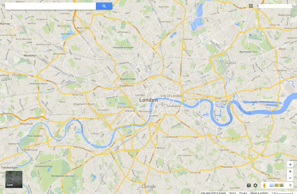
At the time of its creation, the United Kingdom in particular was both one of the most detailed and accurately mapped places on earth yet, paradoxically, most of the data was kept locked behind the paywalls of proprietary and national mapping organisations. Inspired, Steve Coast set about creating the phenomenon that is OpenStreetMap by focusing first on the UK itself. Volunteers using GPS receivers undertook ground surveys and collected data which was uploaded and used to populate the first iteration of the map. The idea, and crucially the process of contributing data, was simple. Users collected data using GPS receivers and made notes then uploaded the points of interest and tracklogs to the OpenStreetMap web site (www.openstreetmap.org). They could categorise and attribute the data into a consistent schema and edit data submitted by others directly in the browser to improve accuracy and detail. The community driven map was born.

Since its inception, the ways that people can add data have increased including the ability to use aerial photography as a backdrop for data creation (in effect, on-screen digitising). Many other commercial organisations have also allowed the use of their data either directly or as an intermediary step to populate OpenStreetMap.

MapCarte103_osm2

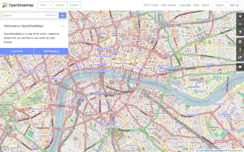
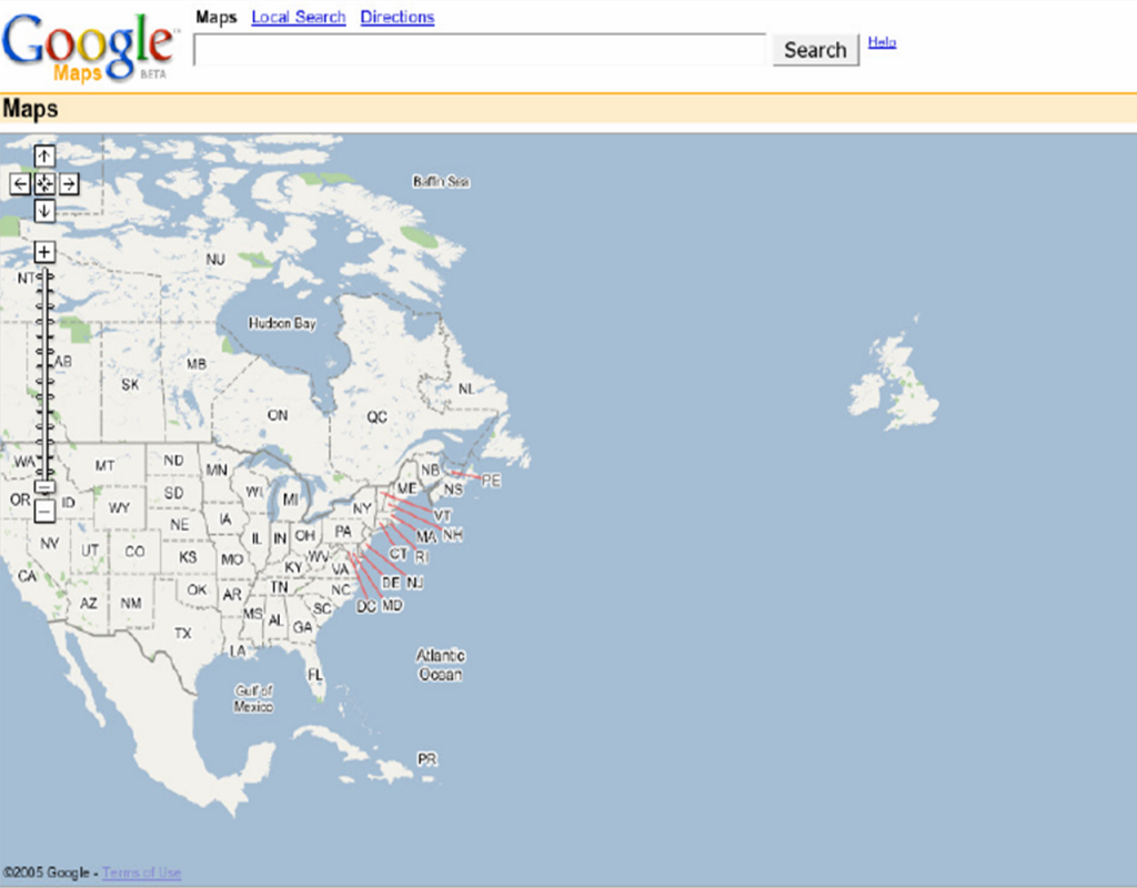
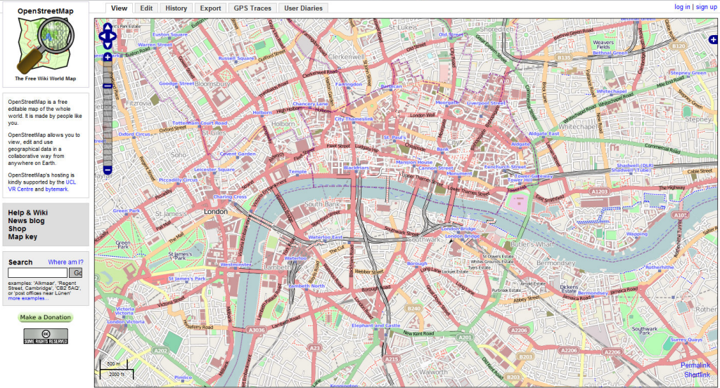
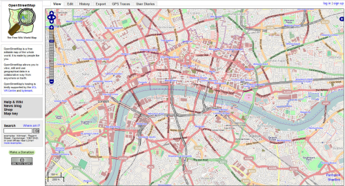
Click image to go to the current OpenStreetMap web site

Early adopters were mainly those in countries that had relatively poor access to open map data. United States contributors were initially conspicuous by their absence mainly due to the relatively rich and available data they already enjoyed. Contributors are varied culturally, geographically and technically. This, coupled with uneven data coverage, has led to some criticism of the accuracy and consistency of the dataset but in early 2013 the number of registered contributors reached 1 million and growth and data quality continue to improve. Maps can be used directly in the browser or the data can be processed using a number of methods and used in other applications. It is this flexibility and ability to use the data under, formally, a Creative Commons (CC) license and now an Open Database License (ODbL) that has led to its wide uptake. OpenStreetMap is used in many commercial applications but perhaps most importantly it has been critical in the disaster management and response of major natural disasters. For example, volunteers responding to the 2010 Haiti earthquake mapped roads, buildings and refugee camps of Port-au-Prince in just two days. As a way to generate rapid data for crisis mapping and to support disaster response and recovery efforts it’s hard to see a better approach than that which OpenStreetMap supports.

A piece of great design in its own right, ItoWorld’s 2008 animation showed the phenomenal growth of OpenStreetMap edits. Similar examples illustrate the mapping of disaster response.

OSM 2008: A Year of Edits from ItoWorld

ItoWorld’s visualisation paints a fascinating picture as the OpenStreetMap movement captures and publishes new features from single roads to entire countries.  The simple temporal legend gives a sense of the speed at which data was acquired and reflects the impact and speed of OpenStreetMap itself in this era of democratized mapping and citizen science.

An impressive momentum has built amongst the community resulting in more people making and editing the data, making maps from the data, producing new and better software tools for the data and generating new and exciting products. Much of the use has been from non-geographers and non-cartographers which represents a massive departure from those more usually interested in maps. This burgeoning growth has certainly led to massive and often disruptive innovation some of which is truly innovative yet you’re more likely to see a terribly designed map made with OpenStreetMap data than you are a good one. This is in many ways inevitable as far more people who have non-geo backgrounds become users of OpenStreetMap data. That balance will shift as more people come to recognise not only the value of such a resource, but how to see it as more than just a technical challenge and use it effectively in tandem with knowledge and understanding of cartography. As for affecting the way map data is made available, OpenStreetMap has changed the landscape in profound ways. The freeing up of even the most tightly controlled geographical datasets is a work in progress but one from which there is no return.

MapCarte 96/365: OpenCorporates Maps by KILN, 2013

MapCarte96_kilnClick on the image to explore the web map

One of the biggest challenges in cartography is the design of a map that can succinctly illustrate the complex, intertwined nature of connections between similar phenomena. These are typically flow maps between one connected place and another and might show the movement of goods for instance. However, as globalisation continues apace they are increasingly about the interconnectivity of global entities – perhaps not along physical routes but in terms of their relationships to one another. Of course, the larger the geography, the more the content, the bigger the challenge.

Here, KILN’s challenge was to design a map to illustrate the first global database of all the companies around the world. The data was supplied by OpenCorporates and contained all of the interlinkages from global organisations (which in truth are comprised of a multitude of subsidiaries) down to local businesses. The hierarchical nature of the data lends itself to a tree-like structure though with thousands of entries the design would soon have become too cumbersome both visually and in terms of performance through a web browser. Clustering would also be impractical due to one of the major design headaches for cartographers…detail is often most detailed in the smallest areas. Think urban vs rural differences or, in this case, huge numbers of businesses in relatively small locations like the United Kingdom.

The solution KILN settled on was a cartogram that gave each company a symbol of equal size which were then tesselated, grouped by country, into the shape of that country. The result is a map that clearly shows the relative importance of countries in terms of the quantity of companies they hold (the overall size of the country shape) as well as the density of interlinkages between companies. What works visually also works interactively as each company and country can be isolated to show the parent and children links.

It’s a combination of a cartogram and a schematic map. The shapes are abstract but as a design solution to mapping complexity, using as simple an approach as possible pays dividends.

KILN themselves describe more of the work behind their design on their web site.

MapCarte 92/365: Reshaping New York by The New York Times, 2013

MapCarte92_newyorktimes

Click the image to view the online map

As part of a special series of articles exploring the mayoral legacy of Michael Bloomberg, The New York Times presented a map-based application that told the story of some of his more notable achievements and impact on the city of New York. Telling a story through maps isn’t novel but telling it through a responsive digital environment with clean, crisp graphics, a minimum of words and a narrative that allows the user to explore is an achievement. The New York Times are contemporary masters of digital map-based story-telling.

The application takes the form of a linear tour, opening with a clear statement ‘from buildings to bike lanes to painting over Broadway, how the city changed in 12 years of Bloomberg’. There’s a ‘begin tour’ button yet it doesn’t actually matter where you click to advance the story to the next page. This is a clever trick…no need for people to have to worry about hitting a particular point on the page…the page turns wherever you touch it…much like you can turn the page of a book pretty much anywhere on the page.

The maps include 3D renderings of the city’s buildings….simple grey blocks rather than detailed facades work because the skyline is uniquely familiar. Key buildings in the story are picked out in red – the only other hue used as a focal colour and there are subtle shadows and shading to add depth and structure to the image. It’s a nicely composed illustration with labels added with a semi-transparent knock-out mask as appropriate. Some clicks reveal (rapidly) an aerial photograph that contrasts well with the simple map rendering. These maintain the interest and help to illustrate the facts using real imagery that reinforces the reality. As you move through different topics, different colours are used to match different themes. Red for buildings. orange for rezoning, green for bike lanes. Three colours that we can easily recall when thinking about the topics in the story.

Between stories and scenes, the maps animate smoothly with an almost surreal fuzziness until they stop and come into focus. This is a great trick and allows us to pause while the map gets to where it’s going before the focus draws our attention back.

MapCarte 87/365: The Refugee Project by Hyperakt and Ekene Ijeoma, 2012

MapCarte87_refugee

Click the image to view the online web map

Web maps have become far more than static maps delivered online. They’ve become more than simply slippy maps that allow you to pan and zoom. Whilst it’s probably too far-fetched to think about cartography undergoing a paradigm shift, there’s no doubt that when done well, the modern web map offers an experience that maps have been unable to support until now. Technology has in many ways caught up with the imagination and enabled map-makers to use animation and interaction to create exploratory and immersive experiences.

The Refugee Project is an excellent example of the genre. The map is simply a canvas upon which the story unfolds through sensible symbology and a simple, intuitive user experience. Maps tell stories and here, the narrative shows refugee migrations since 1975 with historical context and key events that help explain the patterns. The simplicity of the dark base map contrasts well with the blue and red proportional symbols…simple outlines with no fill that overlap but which can still be seen independently. There are buttons and sliders to modify the data being viewed as well as a time slider to cycle through the maps or to pause on a single year. Clicking countries brings that data into focus by muting the background and adding connectivity lines.

When done well, web maps have the opportunity to use technology to bring something new to the map consumer. Here is an example of the craft that hides the complexity of construction to give a clean user experience coupled with a strong visual design.

MapCarte 77/365: PLUTO is Free! by Andrew Hill, 2013

MapCarte77_hill

Click on the image to view online web map

Andrew Hill expertly designs and stitches together a selection of maps that celebrate the release of New York City’s PLUTO dataset in 2013. This is more about celebrating the release of a major dataset than producing a ‘map’ yet the well crafted cartography is what makes the data shine. The PLUTO dataset contains tax lot level data from the NYC Department of Finance Tax Map. It contains land use and geographic data about the city’s five boroughs. Hill cycles through maps that each ask a single, simple question of the data. The map reveals the story of the city and uses multiscale design and user interaction where appropriate.

As you cycle through, the range of maps is well matched to each dataset and illustrated with simple, effective and eye-catching approaches. The collection illustrates how map choice has a major role to play in how we perceive the data. Of course, Hill could have presented most of the maps using standard choropleths but the result would not have been as compelling.

The maps were initially prepared to provide images for projection at a party so the original design needed to be impactful and visually stunning. The high contrast layout goes a long way to helping create a strong aesthetic. They also work as a linear gallery online, highlighting not only the data but high quality cartography, professionally applied in a clean UI.