MapCarte 220/365: Iceland by Aitor García Rey, 2013

MapCarte220_iceland


Click on the image to view web map.

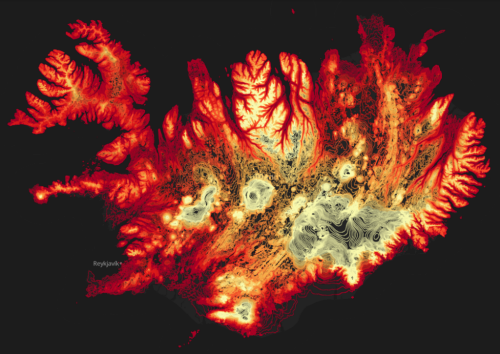
There are a multitude of different ways to represent terrain that might be derived from Digital Elevation Models including analytical hillshades, contours and hachures. All of these, of course, result in fairly traditional representations yet Aitor García Rey has taken the concept of contours (isolines of equal elevation) and created something remarkably different. The interesting thing is he actually hasn’t done anything remarkably different.

Rey’s approach is all down to the particular look and feel. There’s no additional topographic detail on his map other than the contours. He avoids traditional colours such as muted browns and goes, instead, for a palette that ranges from fiery reds in the lower elevations to almost white hot burning colours for the higher elevations. The land of fire and ice is represented with colours that provide the perfect metaphor. He uses a stark black background and nothing more…the contours do their job wonderfully at 20m intervals and which morph to suit each scale of the multiscale web map perfectly.

Quite simply, a beautifully alternative view of Iceland and a novel way of using and symbolising contours.

More details of the technique on Rey’s web site here.

MapCarte 204/365: NYC Taxis: A day in the life by Chris Whong, 2014

MapCarte204_NYCtaxiClick image to view web map

Increasing access to unique and intriguing datasets is driving a massive map-making movement. People are exploring data in many interesting ways and occasionally developing some creative cartographic products in the online medium particularly. Chris Wong has done just that. Taking a dataset of different New York taxi cab fares he’s processed and manipulated the data into a form that can be mapped in a compelling way.

Notwithstanding any dataset such as this is prone to some level of uncertainty and the fact that Wong took some cartographic license (the actual routes mapped are based on the Google API suggestion, not a GPS tracklog for instance) it’s the mapping that is really quite impressive.

By taking a single journey we are pairing the data right back from the millions of cab journeys. It helps show how real each cab is and how it travels independently of the rest. Our imagination can extrapolate to the whole and it’s a good way to personalize a theme when mapping. It overcomes the generalisations that must be made to make any sense when mapping the entire dataset.

The mapping is clean and intuitive. The yellow/black theme aligns with the taxi cab colours and creates a sleek, modern look and feel with high contrast between components and good use of ancillary colours and transparency. The hovering data panels provide cumulative information on time and running totals. The graph shows the linear pattern of fare accumulation. The movement of the map is particularly creative as the focal point (the cab) remains central in the map view as the map pans and the journeys are traced. This gives an excellent way of holding the gaze while the map does the work rather than relying on the user to pan and zoom around. It reduces effort on the part of the user who can simply sit back and view the moving map.

A beautiful web map in terms of design and the marrying of form and function.

MapCarte 196/365: Trees, cabs and crime by Shawn Allen, 2009

MapCarte196_trees


Three colour print technology is based on the principles of the subtractive colour model whereby magenta, cyan and yellow pigments are combined to create pigments that absorb certain wavelenghts of light. We begin with a white background and mixing gives us a full palette of subtractive colours.

Why not use it to create a trivariate thematic map which illustrates the density and overlap of certain features as they occur in the environment. This map uses equally sized circle symbols representing three separate features in San Francisco. While they possibly cannot be said to correlate to one another in a causal sense we get a clear idea that trees signify a particular type of landscape, that cabs tend to concentrate in the north east and the downtown area and that crimes occur throughout. Interestingly, the mixing of the subtractive colours gives us reds, blues and greens showing the predominance of two of the variables…and occasionally some black showing the presence of all three in close proximity.

Crime tends to appear on east-west streets rather than north-south but the main outcome of the map is to see the city through a different lens through subtractive blending.

A neat reworking of a well established technique that creates a visually interesting map and one which perhaps has further utility.

A web map version can be seen here.

Ed notes…details here.

MapCarte 175/365: Spring Spree by Senseable City Lab, 2011

MapCarte175_springspree

Click image above to go to project web site

On the face of it, mapping patterns of people spending money over the Easter period doesn’t sound particularly fascinating but the content is not the focus here. MIT’s Senseable City Lab, with BBVA, use an unprecedented dataset of financial transactions on which to craft their innovative cartography.

The work illustrates the purchasing patterns across Spain during Easter 2011. Using data gathered by the BBVA banking network of over 4 million transactions, this visualization shows how 1.4 million individuals and 374,220 businesses spent €232 Million in the week of Easter.

The map examines the spatio-temporal character of transactions categorized by the type of sale (e.g. food, fashion, restaurants) but instead of just delivering flashing lights as so many animated temporal maps do, the sensible speed and classification of the work allows the person viewing to assimilate the information.

The data is graphed and is shown at the same rate as the map giving a view of the peaks in graph form as well as spatial form. The clear vertical time lines anchor the graphs and, cleverly, the use of blacks to browns gives us a way of seeing night and day. The labels of the classes use the same colour as the data points themselves which is a simple but extremely effective way of reducing the barriers to seeing.

An extremely well constructed web map that proves it is possible to take a huge dataset and make a spatio-temporal map that makes sense.

MapCarte 166/365: The Wilderness Downtown by Chris Milk, 2010

MapCarte166_milk


Click the image to launch the app. Use Google Chrome.

As technology develops new ways of working then inevitably art has a new avenue to pursue. It also goes that cartography experiments as people use maps as a canvas for various endeavours.

The Wilderness Downtown is an interactive music video/movie featuring We used to wait by Arcade Fire and built as a way of experimenting with Google Chrome’s interface.  Constructed in collaboration with Google, it’s without doubt one of the most innovative ways in which maps feature in a short film.  Many of the components of the movie are based on the Google Maps suite; the viewer types in an address before launching the movie which then launches multiple inter-related Chrome windows to create a map-based journey through your neighbourhood that accompanies the music.

The main hooded and mysterious character is seen running through the neighbourhood the viewer specified, across satellite images and amidst rotating Street Views.  Animated components (flying birds, exploding trees) add to each window to use the maps in innovative ways as you become the eyes of the runner.  The concept of allowing people to fly through their own neighbourhoods and stop and look at their own house as part of a music video is truly unique and this work spawned many derivatives.

Linking maps to music, animation and user-controls allows them to play a central character in a narrative. This example supports music. Innovation such as this is really only limited by the imagination.

MapCarte 165/365: FIFA Development Globe by Studio NAND and Moritz Stefaner, 2012

MapCarte165_stefaner

View the web map by clicking the image above

Globes are always powerful symbols and more and more use of them is being made in the online world, largely as a result of the impact that Google Earth has had and people’s appetite for rotating, panning and zooming earth-like objects. We have always spun globes…we are just now able to do it digitally as well as we can the desk globe.

Moritz Stefaner, in collaboration with Studio NAND, Medienfabrik and Jens Franke have designed a truly abstract globe to act as a container for thematic detail relating to FIFA’s football related educational activities worldwide. The digital medium supports such an abstract approach well with countries and continents constructed from tessalated triangles. Triangles also follow through to the symbology used to represent the different activity with numeric and qualitative information being assigned. Symbols can be filtered and, of course, the globe can be manipulated to focus on specific countries.

As the globe spins we see the inverse of landmasses through what is, in effect, a transparent model. This could cause visual clutter but the elegant abstract nature of the approach allows the design to capitalize on the aesthetic.

Colours, graphs, statistics and navigation are all intuitive and the application performs smoothly. There are focus-context changes made all the time as you spin the globe to bring different information into view and you can filter any amount of the content. There’s even an ambient low-level soundtrack to provide an aural abstract experience at the same time as interacting with the globe and various clicks and indications that some state change has been implemented by the user controlling the map.

A globe is an enjoyable experience because it’s tactile and allows you to see what’s round the corner as it is spun. This digital version is no less tactile which is a success for a digital application.

More detail on Moritz Stefaner’s web site here.

MapCarte 157/365: Histomap revisited by Santiago Ortiz, 2013

MapCarte157_histomapView the interactive histomap by clicking the image above

Maps don’t have to be made to look the same. Often, very abstract graphics can be equally deserving of the title ‘map’ even though they may not look anything like our conventional view of a map. In 1931, John B. Sparks produced what he referred to as a histomap which was a detailed diagrammatic layout and explanation of history with a focus on the relative power of contemporary states, nations and empires. It’s a pictorial map that plots four thousand years of world history linearly and which shows us how different countries came to be. The map begins at 2000 B.C. and identifies different ‘people’ loosely based on their geographical location in the world. Time passes as you read from top to bottom over 158cm and these peoples form identifiable groups and eventually, countries.

The original can be viewed on David Rumsey’s Map Collection site here and is an excellent information graphic in its own right. It has twin timelines on the left and the right to aid rapid reading across and the sans serif typeface allows a copious amount of detail to be included. Colours are simple and bold and allow the ebb and flow of the relative proportions of sub-groups to be seen through time. Representing time on any map poses challenges because to be really useful we need to see comparisons between and across different periods. Sparks was successful to an extent because he chose simply to plot everything on one lengthy document but there’s no denying it’s cumbersome.

Step forward 80 or so years and technology offers a new way to view the information. Rather than completely re-imagine the original, Santiago Ortiz has taken it and amplified it by creating a scrolling magnifier. The reader’s focus remains central to the image and simple mouse movements up and down (no clicking or dragging!) make the diagram scroll. The entire diagram fits within the window on screen and simply warps to unfurl as you explore. When you do click, you open a second tab that links to the Wikipedia article for that century. The map, then, not only gives information directly through the original image but adds to it through a link to additional resources. It’s an organised graphical map portal to world history.

There’s often very little that can be done to improve upon classic information design yet Ortiz brings a new approach, user interaction and aesthetic to the work. He enriches it and makes it attractive to modern eyes using modern viewing and data linkage mechanisms.

MapCarte 151/365: Flight paths tracker by Julius Tröger, 2013

MapCarte151_flighttracker

Click on the image to view the web map

Web-based dashboards of digital data feeds are becoming increasingly popular. If the data feed is available the chances are someone has made an attempt to map it and place it on a web page. Many fall short, being little more than data dumps but where someone takes time to consider the data structure and the possible user need then they can design the interface and cartography to work in harmony.

Julius Tröger’s Flight paths tracker for Berlin was designed to support the Berlin Morning Post story on air traffic in and around Berlin as the city awaits construction of a new airport. The data has been used in multiple ways by different sites (paid and free) but generally they illustrate the data planimetrically. This creates some considerable overlap in congested areas. Tröger’s solution is to flip the map and give the view depth and the flexibility to show the vertical axis. This immediately turns the map into a 3D space-time cube where height of the aircraft is shown in its relative above-ground position. Colour helps to demarcate different altitude zones and the map can be rotated that allows you to look along a flight path. The paths have a neat radar type shadow on the ground and they can be clicked to reveal details about the noise impact.

There are multiple ways to interrogate the data using different map views, different tabs and a rich approach to data linking and brushing between map and graph components. Graphs give summaries of various measures aggregated to a user entered location and you can isolate particular dates and times as well as certain airlines or individual aeroplanes. Controls are clear and obvious. The map can be viewed in German or English and various results shared across social media. A nice effect is the fading of the map itself beyond the immediate zone of interest – it supports focus as well as giving the overall map a pleasing aesthetic rarely seen in other web maps.

An example of a web map that has gone beyond the defaults for displaying live data feeds and which shows what you can achieve by re-thinking the purpose of the application.

MapCarte 127/365: Iceland Illustrated by Borgarmynd, 2012

MapCarte127_iceland1

Click on the image to view online web map

Combining the artistry of a hand drawn map with a modern digital publishing approach may at first seem like some sort of paradox yet there is nothing that states a hand drawn map has to be on paper and a digital map has to be nodes and vertices. In fact, some of the most interesting cartography comes from combining techniques that at first sight might appear to be not particularly well suited to one another.

Iceland Illustrated, by Borgarmynd, have created a large 3D hand drawn terrain map of the country principally as a tourism related product. It is available as a printed map but they have also re-purposed it to provide the backdrop to an online web map. The map provides a beautifully rendered backdrop which is used to provide a base for the location of geotagged photographs of Iceland’s spectacular scenery with modern pictograms showing the locations. Compare the approach with the same areas on Google Maps illustrates the difference. Where Google shows us barren nothingness, Borgarmynd has detail, rock drawing, colour and features. Of course, Google’s approach has to be consistent globally…but when you’re mapping a specific place you can stretch your artistic license a little.

MapCarte127_iceland2

Click on the image to view online web map

The same approach has also been taken for their map of Reykjavik proving that you can easily transfer the same detailed, hand drawn watercoloured approach to a large scale environment and make it equally fit for purpose as the base for an online web map. Again, pictograms mark the locations of photographs and other points of interest. The only difference between the country and city level maps is the former is planimetric (with some plan oblique rendering of mountains) and the latter is an isometric drawing in greater detail.

A very successful marriage of old and new.

MapCarte 123/365: Motorcycle Accidents by MCE Insurance, 2012

MapCarte123_motorcycle

Click on the image to view the online web map

Interactivity is the key to making a good web map. it does not have to be all singing, all dancing, it just has to be clear to the user in terms of how it works and then it needs to work.

The map of motorcycle accidents by MCE insurance illustrates how the user interface design supports interaction effortlessly. On opening, you’re presented with a nicely stylised base map of Great Britain. It’s tilted, has some texture, has some simple effects like patches of trees and also some moving clouds and a gleaming sun. These items aren’t particularly purposeful but they do create a look and feel that lifts what might have been a very simple base map above the mundane…crucially without over-doing it. Making your map ‘different’ is a good move as long as it doesn’t detract from the overall purpose. The monochrome base to all content except key figural elements works well.

The list of filters is neatly presented on the right in a vertical column. No awkward tabs to leaf through. Clicking on a filter turns it into a highlighted arrow pointing to the map. Symbols update. Hover over a location and you’re presented with clear facts in a popup (no click needed). Each filter is colour coded and the map updates accordingly with the same coloured themes that provides an immediate visual link. The information panel on the right provides some headline information.

The map, in many ways, is simply a visual anchor for the information. It takes a back seat and allows the user to drive other content. It’s a very useful way to incorporate maps and graphics together and to make the delivery of the detail more engaging.