MapCarte 253/365: L’arsenal de l’apocalypse by Le Nouvel Observateur, 1991

MapCarte253_gulfwar


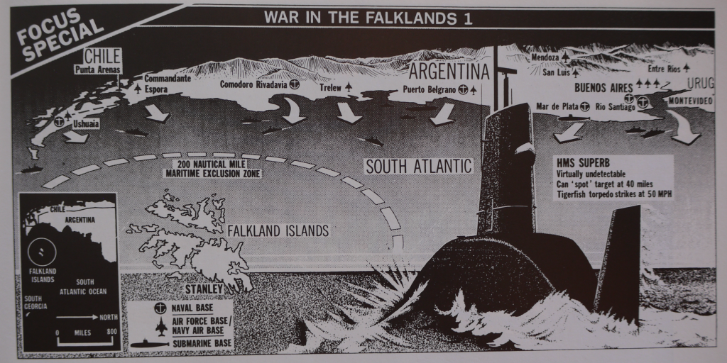
There’s nothing like conflict to get the cartographic juices of newspaper, magazine and television media flowing. It almost seems to ignite a battle to present the most compelling map or information graphic; one that brings together as much useful information in one dramatic illustration. The art in this is to ensure that clarity remains and to avoid the temptation to over-dramatise or place too much on the map. This is a challenge for cartography generally, but for a map that accompanies a newspaper article which is there as a supporting component to the story, the requirement to be prudent is paramount. The map needs to attract the reader to spend a few moments. It is a complement to the report. It doesn’t need to tell the whole story but it needs to contain the essential facts.

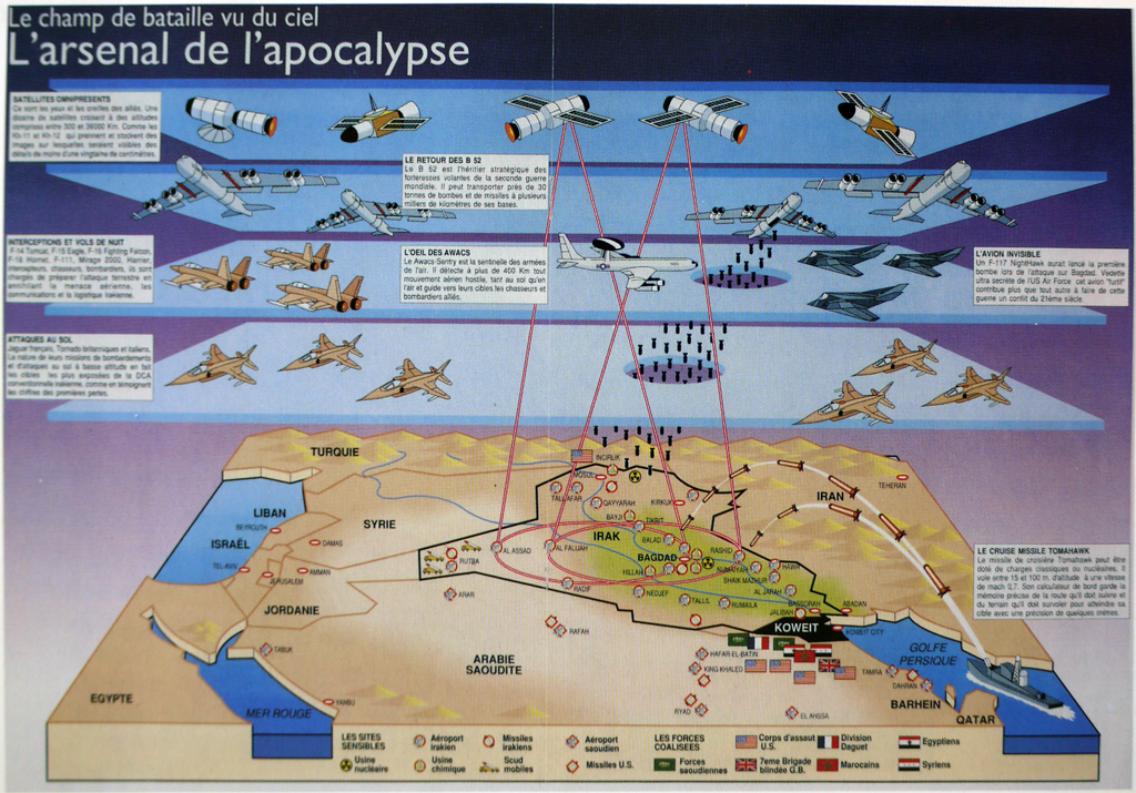
This French example from early in the first Gulf War shows how the balance can be achieved. there’s a tremendous amount of detail yet it’s illustrated in a clear, unimpeded fashion. The tilted block diagram is almost apologetic as the shape of Iraq is laid out amongst simple shapes of water bodies and mountains. But it’s the firepower from above that the article is emphasising as layers of armoury, missiles and satellite technology pour over the landscape. Scale is irrelevant. This is about showing the blanket capabilities of the allies. The illustration of bombs dropping through a clean-cut hole in the sky and those fired from the warship in the gulf itself are clinical. The laser-red of the satellite monitoring gives us a sense of precision. Of course, war is anything but clinical, clean and precise but these sort of illustrations present us with a sanitised version that explains the technology being used.

The maps used in such graphics are merely the canvas upon which a story is told but they are the crucial element. Combined with high quality illustrations, media maps do a good job of putting maps in front of many thousands of people.

MapCarte 244/365: War in the Falklands by London Sunday Times, 1982

MapCarte244_falklands


There was a time not so long ago when newspapers included simple yet dramatic illustrations, often that incorporated maps. That’s not to say that such work doesn’t still exist but it tends to encompass larger scale projects. What perhaps has not changed is the drama that a media illustrator often brings to the subject. Of course, this is by design not only to capture attention but also to perhaps enforce an editorial perspective.

Here is a lovely example of a black and white newspapre graphic (dare we say infographic?) from  1982 by The Sunday Times of London. The Falklands War between Great Britain and Argentina was underway and the British Navy and Military were on their way to battle. This map flips the map to a transverse perspective to fit a horizontal layout. Argentina is at the top – seemingly overbearing as an oppressor, emerging from a dark backdrop. The bottom half shows an ocean in perspective with a foreboding British submarine making a hasty route to the islands. The arrows from Argentina reinforce the invasion. The islands are stuck in the middle!

This is propaganidist cartography. Subtle but effective at rallying the Telegraph’s right-wing readership who file in behind the advancing submarine. Such maps and illustrations had to be rapidly produced but they were often highly dramatic. They told not only the story of where, but were imbued with layers of additional imagery and meaning.


MapCarte 240/365: From the old homeland to the new homeland! By Fritz Freudenheim, 1938

MapCarte240_fritz


MapCarte tends to feature the work of adults principally because maps created by children generally do not exhibit a strong design philosophy. But children’s maps can have a certain aesthetic all of their own due to the simplicity of the graphics and often unwieldy use of lines and colours. Then there are the maps made by children that provoke thought, perhaps not designed intentionally to do so but which catapult them into our consciousness.

This map by eleven year old Fritz Freudenheim was drawn in 1938. His family escaped Berlin in the late 1930s and this map documents their journey, their homes and the various locations they went along the way. The title says it all – From the old homeland to the new homeland. Germany is the largest European country on his map as you’d expect. It’s a mental map and a picture of the familiar. They reach Hamburg, the main export for fortunate Jewish emigrants. They board the Jamaique and travel via Belgium, France and Portugal. Africa is a brief stopping point but drawn small with only Morocco labelled. They eventually reach Uruguay, their final destination and South America is shown in bright colours, relatively well defined, yet detached from North America.

Mental maps and, children’s mental maps often bring us cartographic treasures. This map, though a tragic pictorial description of escape from oppression shows how illustrating the plight of one person or family can give us a sense of empathy that perhaps mapping hundreds of thousands using aggregate statistics cannot.

While perhaps unintentional this is a well designed map. The familiar is drawn as important, the unfamiliar smaller and less detailed. The layout works well and the linear story is clear and unambiguous.

MapCarte 101/365: Silk Map by John Waddington Ltd, 1941

MapCarte101_waddingtonDuring World War II, Germany allowed prisoners access to humanitarian aid. One of the items they were allowed to receive was classed as ‘games and pastimes’. The Allies concocted a plan to pose as charities and send clandestine items hidden inside games such as compasses, money and maps. The most famous example was the use of the board game Monopoly by Waddington’s. Files were disguised as playing pieces. Real money was covered by Monopoly money and the maps were concealed in the boards. These were not board games, they were perfectly designed escape kits.

MapCarte101_waddington2_detail

The maps were crucial to any escape as servicemen in foreign lands would have no other way to get to the safety of a friendly territory. The maps were printed on silk since paper made a noise when folded and unfolded, was harder to secrete on one’s person and neither dissolved nor tore. British Secret Service conspired with the games manufacturer John Waddington Ltd who had mastered a way to print on silk and also happened to be the licensee in Great Britain for production of Monopoly. Silk was the innovative and crucial aspect of the design and plan. The map user in this case could not use a traditional map and neither could it have reached their hands. Servicemen were told that if they were captured they were under orders to escape; and to look for escape packages that held a special edition of the game identifiable by a small red dot printed on the Free Parking space.

MapCarte101_waddington2

It’s estimated that thousands of the games were produced and up to one-third of escapees relied on silk maps but since the instructions demanded the games were destroyed there are very few examples remaining. Further, both escapees and Waddington’s employees were sworn to secrecy until the incredible plan was declassified in 2007. Subsequently, surviving Waddington’s craftsmen and the company have been honoured for their part in the successful escape plan. The design of the escape plan is credited to Christopher Hutton, a prolific inventor of escape gadgets and the maps themselves were based on those published by John Bartholomew, the Scottish cartographer, whose detailed maps of Europe provided excellent detail. Bartholomew waived his copyright fee as a contribution to the war effort.

If there is a better example of matching a map product to the users very specific needs then it should be hard to find. Indeed, it’s not the map’s content that represents great design – it’s the map as a product.