MapCarte 221/365: Submarine Cable Map by TeleGeography, 2013

MapCarte221_submarine


TeleGeography have become renowned not only for the detail and accuracy of their annual map of the world’s submarine cables but also for the design and style they exhibit. Let’s be honest…the data isn’t necessarily the most scintilating for a general audience but they’ve taken the approach of switching the design annually to reinvigorate the map and the interest.

The 2013 version was particularly impressive. Taking cues from the maps of yesteryear and designing it as an historical document is an interesting counterpoint for a modern dataset. The execution is impeccible with cartouches, muted colours, vignettes and parchment style fills. Even the typography follows suit and the title is akin to old-fashioned ornate copper-plate engraving. It’s this attention to detail that makes the map so well composed rather than just an historical style applied clumsily.

While the 2013 map is a terrific juxtoposition of design and theme, you can see many more examples of the changing face of TeleGeography’s map on their web site here and an interactive version here.

MapCarte 206/365: Swiss National Map 1:25,000 1088 Hauenstein by Swisstopo, 2013

MapCarte206_swisstopo

There are very few maps in the world that might be described as perfect but the work of Swisstopo has been consistently at the pinnacle of topographic map design for decades. Their maps illustrate scientific accuracy and precision of construction but it might be argued that many topographic maps by many other mapping agencies can claim this also. What sets Swisstopo apart is their ability to create a beautiful map by carefully considering colour, balance, contrast, heirarchy, labelling density and positioning. These are all core to the map design process but achieving success with such consistency is almost magical.

The new range of 1:25,000 scale maps by Swisstopo, of which the Hauenstein sheet is one, shows that they have not lost their eye. Building upon the legacy of elegant maps that have gone before, this updated design shows clear lineage with contemporary flair. The lines are cleaner, the marks almost more deliberate.The text is so well placed it looks as if it sits perfectly at home amongst the other map features. The density of information is almost unbelievable and to achieve such a well balanced product without recourse to more omission and simplification is astonishing. The classic Imhof-inspired hillshade lends a clarity and brightness to the topography and gives it the unmistakable look of a Swiss topographic map.

The fact that Switzerland’s topography is spectacular of course lends itself to inspire cartographers to make a beautiful map but it’s another thing altogether to achieve it. These 1:25,000 sheets have been modernised but still deliver. They remain iconic and engaging and represent the very best of modern topographic mapping.


MapCarte 195/365: Central Park Tree Map by Ken Chaya and Edward Sibley Barnard, 2011

MapCarte195_centralpark

There’s nothing quite as absurd as a map-maker intent on capturing some phenomena to a ridiculous level of detail on a map. There’s something particularly impressive about such dedication and the search to create that perfect record that can be unsurpassed. Maps have always been seen as providing accuracy, precision and a documentary source so it’s no wonder that we can find all manner of individuals who take it upon themselves to dedicate huge numbers of hours to their cause.

Edward Barnard and Ken Chaya are responsible for perhaps the most detailed map of trees ever produced. As a project that began innoccuously in 2008, it soon grew to become a tireless survey of every tree in Central Park, New York City. The resulting map is not just a record of the nearly 20,000 specimens but a beautifully detailed cartographic product.

MapCarte195_centralpark_detail

The map does not constrain itself to a standard paper size and is produced in the same aspect ratio as the park itself on a long thin vertical strip. It would have been easy to splice it up into sections and run them parallel on a standard landscape page but the impact of using a non-standard page size is worthwhile. The colours are vibrant and each tree species is given its own mimetic planimetric symbol. This adds colour, texture and shape to the map to give a sense of the distribution, size and type of trees.

Some elements of the park’s physical structure are presented in obliquely which provides anchor points and recongnisable places. These work well to create some sense of depth in the work.

MapCarte195_centralpark_legend


Overall a beautiful map and testament to the dedication and perseverance of two men and their quest to make a map that had never been made.

More details at the author’s web site here.

MapCarte 189/365: Busen Region, South Georgia by British Antarctic Survey, 2013

MapCarte189_busen


Are there any parts of the world left unmapped? Given the ubiquity of online map services and the seemingly endless maps one can purchase of all parts of the globe you’d be forgiven for thinking there’s nowhere left to map. In fact it’s one of the classic questions one gets when asked what you do for a job. Upon hearing ‘cartographer’, the common response is along the lines of “hasn’t everywhere been mapped”.

This map, produced by the British Antarctic Survey fills in one of the missing pieces by mapping the Busen region of South Georgia in more detail than ever before. This is an inhospitable environment yet one which is seeing increased visits for tourism as people attempt to tread in the footsteps of Shackleton.

The map is the result of many hours of pouring over 90m imagery but, more than that, it required several months of ground survey work. The resulting map illustrates the harsh environment and the rocky landscape. The hillshading and elevation tints are well marshalled and there is sufficient labelling.

MapCarte189_busen_detailThis possibly isn’t going to be a best seller but it’s good to know that maps like this are still made and that those missing pieces in the world map are slowly being explored for cartographic purposes.


MapCarte 187/365: Health Hangars by Lateral Office, 2010

MapCarte187_health


Maps don’t just tell stories or get you from A to B, they also provide a window into proposals, analysis and decision making scenarios. In that sense, maps support a very wide range of user needs. This example illustrates how maps can provide a way of seeing how a new proposal might be implemented. Nunavut has a disperse population, remotely located from major population centres yet which still require basic human needs such as health care. This map illustrates how a new system called Health Hangars might work.

Beyond the map’s use as a decision-making tool, it’s beautifully illustrated. The settlements that are the focus are shown in darker colours and more vivid representations which fade to the surrounding areas. This gives a way of leading the eye to the important places on the map.

The flight lines do not need to be curved yet they add a pleasing quality to the map, reminiscent of flow lines you’d see on a global flight map. The text is simple and purposeful and there are some excellent touches such as the width of the flight lines, the end points and the flourishes of greens in the settlements. The inset map  and legend across the foot of the map are simple and effective.

All in all, a map that provides function with a form that mimics the natural environment of snow, ice and desolation to give the subject matter meaning.

More detail on the web site here.

MapCarte 185/365: Mt. Hood by Kelly Abplanalp, 2013

MapCarte185_hood


Hachuring has been a very successful technique for the depiction of relief over the centuries yet it suffers from the problem that it requires a lot of space on the map. It can have the effect of causing visual clutter and a very dark image despite it’s excellent relief portrayal.

If you base your entire map on a modified hachure then you will really limit your space for any other detail but this can result  in some surprising results. Kelly Abplanalp has used a heavy hachure effect with large strokes for her map of Mt Hood. The subject lends itself to the technique due to the overall shape and the variation in terrain across relatively short distances. There’s an almost feathered effect created by the different densities of stroke and the major terrain changes can be easily identified.

This is more art than a map though it creates a strong aesthetic and a very bold impression. It demonstrates how you can take a cartographic technique and explore its potential for artistic interpretation. The inset map is a nice touch, being designed using similar stroke patterns and a brevity of labelling and other contextual detail ensures the main map image is clear and visually imposing. The red linework adds a pleasing contrast and accent colour.


MapCarte 182/365: Reliefkarte der Centralschweiz by Xaver Imfeld, 1887

MapCarte182_imfeld2

Throughout cartographic history there have been a number of eminent artists, map-makers and illustrators who have brought beauty and precision to the depiction of relief. We can trace relief depiction back to the very earliest maps when illustrations of mountains in aspect were etched into clay tablets. Since, many different techniques have been used including panoramas, oblique illustration, hachures and contours.

At first sight this beautifl map by Imfeld appears to be just another planimetric map with well executed hill shading but looking closer, it uses an intriguing additional approach. Rather than viewing mountains in an orthographic perspective, Imfeld has re-positioned the viewing angle to create a parallel orthographic view. This has the effect of showing the mountains partially in aspect which accentuates their form while not obscuring too much detail.

MapCarte182_imfeld

Imfeld, from Switzerland, became famous for his cliff drawings and especially for two masterpieces: The “Reliefkarte der Centralschweiz” shown here and his map of the Mont Blanc area. He’s less recognised as the first to use a parallel orthographic projection which has seen many reinventions yet here it is, drawn by hand to a high degree of precision. His mastery of colour, tone and shading is spectacular. Though containing many labels, they merge into the map without becoming dominant.

A superb topographic map, ahead of its time in many ways but giving modern map-makers a great example of relief depiction that improves on the standard orthographic approach.

MapCarte 149/365: Mt Everest in 3D by 3D RealityMaps, 2011

MapCarte149_everest

For cartographic purists there’s very little that matches a beautiful planimetric topographic map of a region. In many respects these are the maps that define the art and science of cartography because they are the standard-bearers for how we graphically describe the world around us. Those that are capable of crafting a beautiful topographic map have given us some wonderful, rich, detailed and beautiful examples. Often, the most visually impressive are of mountainous areas which demand that cartographers tackle the issue of elevation and relief. This is an art form in its own right.

However, new technologies afford us different ways to view the world and in many of these remote, often highly dangerous, areas different approaches to data capture and map design are giving us new maps and new ways of seeing. Here, 3D RealityMaps have flown small planes over Mount Everest and filmed the landscape using a 3D camera. The captured footage allows researchers to build a 3D computerised model of Everest to 15cm resolution which can then be viewed through a downloadable app.

The model can be downloaded to explore allowing you to wander around Everest and follow many of the famous climbing routes, base camps and weather stations. The images are crisp and clear and have been expertly stiched together to create a seamless model of the mountain and its surroundings. The project also makes good use of satellite derived data to build a range of different components in the final map including WorldView-2, RapidEye, Landsat and ASTER. Some of this data was combined to provide surrounding coverage or to build a detailed terrain model to drape the primary imagery. Labels and annotated routes add to the detail of the work and enable the user to retrieve context to go with the pretty pictures. Photorealistic quality models and unrestricted navigation through a mountain region is made possible through the app.

This is modern surveying used to create a modern, engaging product. It’s a far cry to ground survey and planimetric mapping but it provides us with a way of looking at such a place that a traditional topographic map cannot similarly achieve. That’s not to say it top trumps topographic maps. It’s different. It adds to the canon of cartography.

You can explore and download the app at 3D RealityMaps here.

MapCarte 143/365: Journey Through Time by Swisstopo, 2013

MapCarte143_swisstopo

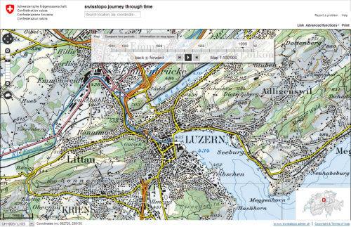
Click on the image to launch the Swisstopo Journey Through Time

Swiss cartography is renowned for its accuracy, quality and artistry and no collection of maps, let alone topographic maps, could ignore them.  Swisstopo, the official name for the Swiss Federal Office of Topography are responsible for the production of topographic maps at a range of scales but how do you select a map representative of their work when we could conceivably fill an entire year of MapCarte blogs with just their work? Thankfully, they have produced a wonderful portal that allows you to explore the rich history of their work.

Journey Through Time lets you explore any area of Switzerland, from any time period mapped at any scale. It allows you to search, to animate through maps from different times, and to compare maps using an innovative overlay technique that fades one through to another using a simple slider control. Metadata is rich so you can easily identify the map and some of its background information. You can link to a specific map for sharing and also print out a full extract. As an example of a rich portal into national mapping this is beyond compare. As examples of design it’s tough to beat too.

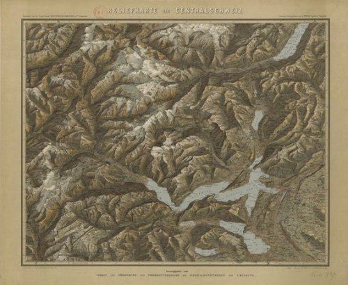
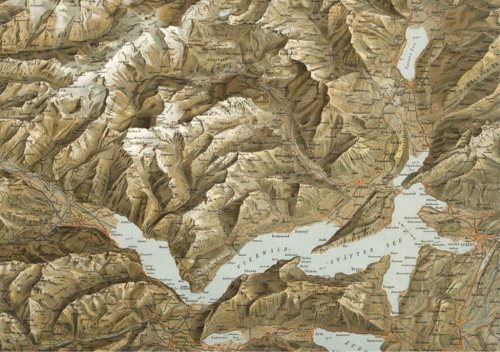
The use of colour in particular has always been a characteristic of Swiss topographic mapping. On many map series (particularly the 1:100,000), colour is used to vary label meaning, show quantities, represent or imitate reality and to decorate which visually enlivens the map.  The Swiss “style” is well structured, maintains uniformity, uses white space effectively, contains beautiful typography and unrivalled depiction of relief on topographic reference maps.

The typeface sets a classic tone using primarily ‘antique’ looking serifs that includes a unique combination of thick and thin strokes.  Hill shading on most series and scales is in the classic Swiss style based on the work of Eduard Imhof.  The maps are rich in content and deliver complex information in a succinct, well organised manner.

Swisstopo topographic maps are truly works of art. It’s actually tough to pick a stand-out amongst their many stand-outs so to be able to explore their catalogue through time and compare their artistry allows us to appreciate the full range of their work.

MapCarte 135/365: The Chevalier map of San Francisco by August Chevalier, 1911

MapCarte135_sanfranVery rarely do we see maps titled in such a way that they go beyond the theme or subject matter of the work. More than that, how many maps do we ever see where the author adds their own name to the title. It’s a bold statement and one that’s difficult to pull off since recognising a piece of work by the author’s name is usually only conferred by peers after the work is published and widely admired. August Chevalier didn’t wait and his map of San Francisco bears his name. On this occasion any hint of self-agrandising might be allowed since the map is stunning.

The “Chevalier” Commercial, Pictorial and Tourist Map of San Francisco (its full title) was designed and engraved by August Chevalier, lithographer and publisher. The original first edition was later published with improvements and additions in 1911. The map portrays San Francisco in a way that we rarely see today by emphasising the relief. For a relatively large scale (1:9,400), the map unusually employs contours to depict relief. More typically, it also shows all of the important buildings as life-like pictorial representations so in some respects combines techniques more often seen on different scales of map type. This works to great effect.

The map also uses hill-shading to accentuate the character of the topography and the clear and bold street names add local detail. The parklands are shown clearly as are the docks and other key places which become recognisable by their use. A neat trick sees Chevalier allow his map to extend beyond the graphic border. This gives an expression of the landscape continuing beyond the map and allows it to appear less constrained; a little more fluid. The shaded vignette effect used to depict the water is slightly patterned and also expertly applied to accentuate the landform.

MapCarte135_sanfran_detail

This is a beautiful poster sized map that captures something of the city that modern maps overlook. San Francisco, like many cities, has considerable variation in land use and topography but our sometimes overly abstract representations and distillation of features to geometric shapes can lose some of the character. Chevalier proudly put his name to this map and he deserves the accolades.