MapCarte 288/365: Atlas of Canada International Polar Year Map by NRCan, 2008

MapCarte288_circumpolar
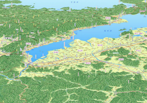
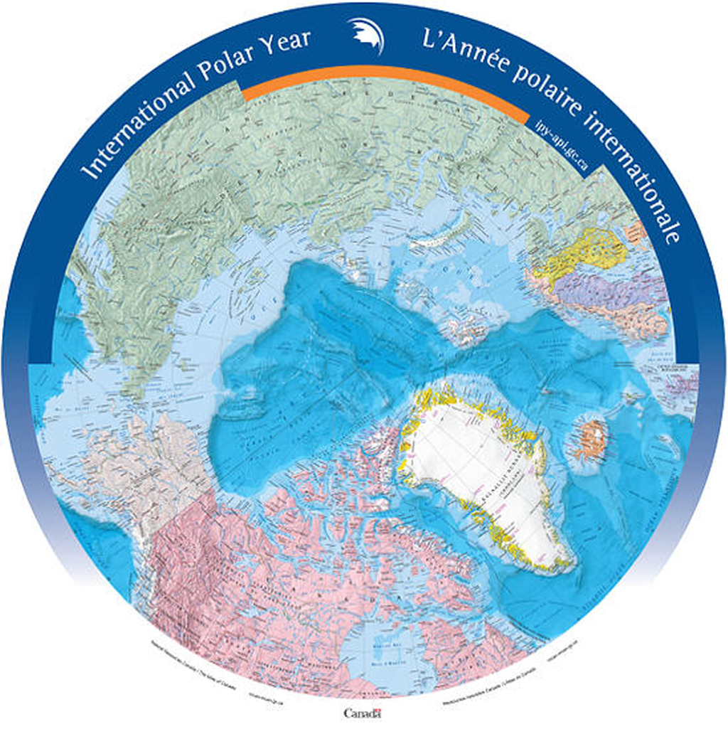
Fitting a map to a piece of paper or a screen is not necessarily the optimum approach to creating a suitable layout. While creating maps of different shapes on a screen is technologically a step too far, when the map is designed for print there remains the opportunity to play with projections and shapes. Here, the Atlas of Canada Program and NRCam illustrate how to handle the shape of a map perfectly. Mapping the North CIrcumpolar region, the region north of 55 degrees latitude, demands an azimuthal projection. Consequently, the map is round rather than the more usual equirectangular maps we tend to see.

The map illustrates national boundaries, Canada’s 200 mile exclusive economic zone as well as the usual toporaphic and reference detail one would associate with a small scale map. The scale of 1:10,400,000 results in a map 1.6 metres in diameter and the impact of such a large map is impressive. Visually, the circular shape immediately invites exploration. Upon closer inspection the drawbacks of a circular shape have been mastered. Typographic placement is a particular difficulty. Horizontal text dowsn’t work on a circular map but ensuring curved text follows an appropriate line is imperative to create harmony. Sometimes type is placed across a curve relating o the landscape but often it follows either lines of longitude as they radiate or lines of latitude when the meridians become too steep up and down the page.

MapCarte288_circumpolar_detail

Colour is well handled, further detail of minimum permanent sea ice extent, the tree line and historical surveyed locations of the Magnetic North Pole from 1831 to 2007 are included to make the map a combination of topographic reference and thematic map. It’s a successful hybrid.

The unconventional format makes perfect sense for the map but brings with it an interesting added dimension that creates interest and reinforces the information portrayed.

The original map (square format) can be downloaded from Natural Resources Canada with additional information here.

MapCarte 286/365: Kii – Kinki 360° panorama map by Masaki Oda, 2009

MapCarte286_kinki

Japanese cartography is renowned for the quality and craftsmanship of their panoramas. The detail is exquisite and the scenes are so well framed with not only landscape but, often, a narrative of and contained within the vista itself. This beautiful example from the studio gTonbi-eye by Masadi Oda is in a full 360 degree perspective and depicts the landscape of the Kii peninsula near the centre of the Japanese islands.

As an area that receives large annual rainfall measures there is a lot of dense natural forest so the image is predominantly green though there are diverse landscapes revealed with plains, mountains and basins on view.

MapCarte286_kinki_detail1

To the north is the city of Kyoto but the impressive design characteristic of this work is the combination of such a macro-level image but which also allows the reader to view the micro detail of different urban or rural regions. Creating a map that supports these tow very different scales and views is impressive. The maps are made by hand which makes their design all the richer since every stroke has been thought through and carefully applied. There’s no analytical work involved to apply equal treatments across similar data types which has the result of making each component just that bit different.

MapCarte286_kinki_detail2

The mountainscapes are shown predominantly as aspect molehills but with a carefully applied hillshade to give added depth. The outlining of each mountain ridge in a darker colour wouldn’t be seen naturally but gives each mountain a presence and clarifies the image. At over 3 metres in length if you wrapped the map around you and stood in the centre you would genuinely see the landscape.

MapCarte286_kinki_detail3Finally, the author has added some realistic haze effects so that distant features seem subdued in comparison to the foreground. Our eyes are naturally accustomed to this in the real world and the map mimics it and makes the reader feel at ease. Even Mt Fuji makes a distant appearance in the distant haze.

Rich in detail, colour and thinking.


MapCarte 285/365: Lake Wakatipu by Simon Bardsley, 2014

MapCarte285_bardsley

Terrain representation is vital to good topographic cartography. It goes a long way to defining the look and feel of a map and has become a subset of cartographic expertise and practice that has defined many cartographers and their research interests and products. Classic terrain representation has long been associated with artists who were able to marry a keen eye for terrain with a well honed artistic ability. We might look at the work of Eduard Imhof as perhaps the finest exponent of hill shading for instance (See MapCarte 58). Many of the very best techniques began their life as manual techniques for which others have experimented with analytical versions. It’s debatable whether analytical techniques retain the elegance and beauty of manual techniques but they are sufficiently developed for map-makers to now be taking their experiments further.

In this example, Simon Bardsley has gone beyond default hillshade techniques to use a multidirectional model which captures the terrain in a stylized way. The shading almost represents contouring and might be seen as terracing if shown using traditional colours (or merely darker on the non-illuminated South-East slopes). Yet he’s used a range of pink and orange hues to subtley shade the hillshade and create a different aesthatic altogether. Bardsley describes the effect he was attempting to convey as a sunrise over the mountains. Certainly, the rich colours give that impression but it perhaps goes further.

MapCarte285_bardsley_detailWhether these are the actual colours one might see is perhaps questionable but it’s the impression evoked. It’s how we relate the palette we see in the real world and mentally merge it with the detailed hillshade. The map is abstract in real terms yet we are able to imagine the mountains at sunrise through the lens Bardsley paints. There’s even some hydrographic detail picked out using the technique which, of course, wouldn’t necessarily look that way in reality but leads us to imagine shimmering, reflecting light as it casts across the surface.

Terrain experimentation often leads to unexpected results. Bardsley illustrates that you can do interesting things with hillshading and analytical terrain representation and we get a beautiful map as a result.


MapCarte 282/365: The Heart of Canyonlands by Tom Patterson, 2014

MapCarte282_canyonlands

Beautiful maps are not the preserve of a bygone era when people spent years surveying, then designing and producing their map. While that has often led to some spectacular and often unparalleled cartography, modern techniques are no less capable of producing similarly impressive work.

Here, Tom Patterson, inspired by the map of the Heart of the Grand Canyon by Bradford Washburn (MapCarte 100) sets out to create an equally impressive representation using modern data, software and processing. He achieves it with ease in the sense that the finished product provides an exquisite depiction of the terrain morphology and colours of the landscape. Patterson uses a range of techniques to build a realistic rendering of the terrain that captures not only the vertical component but also something of the horizontal structure and bedding that the hillshading techniques yield. In particular, the techniques used give an impression of rock texturing synonymous of historic, manually drawn relief and rock shading typical of the Swiss school of cartography. Patterson successfully and impressively gives us a realistic and engaging three-dimensional landscape.

MapCarte282_canyonlands_detailRather than leave the map as a function of processed digital elevation models, Patterson goes further in attempting to give a realistic rendering. Thee colours are derived from a process that combines aerial photography with the relief renderings. This allows natural colours to play a part in colouring the map though there is some additional exaggeration of colours such as blue for water features to make them sit comfortably and boldly in the landscape.

Overall, a combination of advanced digital terrain model processing, some clever compositing with aerial photography and a keen eye to manually adjust what’s required give the map the finished look. It’s a beautiful depiction and harks not only to a bygone era of care in terrain representation but also to a future when we should strive to achieve such a wonderful result in our mapping.

You can download a high resolution version of the map here and it’s featured in the NACIS Atlas of Design Volume II.


MapCarte 281/365: Columbia River watershed by Jake Coolidge, 2014

MapCarte281_columbia


Maps are usually bounded by arbitrary administrative constructs because we readily identify with them…countries, states, counties. They may otherwise use a graphical boundary defined by, say, chosen lines on a graticule. There are many other ways to define the boundary and, therefore, the focus of the content for a map which can resonate and serve your map better. Here, Jake Coolidge focuses on the Columbia River watershed but instead of making a map of the 7 states and parts of Canada its water originates from as a framework for the map, he’s used the watershed itself.

Once seen this may seem an obvious approach but it’s all too easy to rely on digital data which comes pre-packaged and organised. Simple selection queries perhaps don’t go as far as might be needed. Coolidge’s map is hand drawn though and the benefit of starting with a blank canvas means less reliance on other data. Choices can be more sensibly made.

The map focuses on the rich and varied terrain that makes up the watershed. The curved perspective view from space gives us a sense of the size and reach that a planimetric approach wouldn’t similarly achieve. Indeed, the simple act of adding exaggerated curvature and an horizon makes an impressive statement.

MapCarte281_columbia_detailThe depiction of features is carefully applied with each getting equal and detailed attention. The text sits comfortably in the landscape and the two components work well together. The lack of colour serves the map well too. There’s no distractions from the raw landscape and the sense of scale and scope is perhaps enhanced by taking the approach of making the map in monochrome with pencil and ink.

There is a benefit of taking a hand-drawn approach to map-making that Coolidge’s map also demonstrates. It takes time to make such a map and that time is demonstrated across the entire map in the detail of each decision to make a mark. While analytical techniques bring us speed, uniformity and allow those with less artistic abilities to make great maps, the time it takes to craft something by hand teaches the map-maker valuable skills as they wrestle with the various decision-making processes of map design. The product is a rich and beautiful map.

You can view a larger version of the map at Coolidge’s web site here or in the NACIS Atlas of Design Volume II in which the map is featured.


MapCarte 279/365: World Atlas of Wine by Littlehampton Book Services, 1971

MapCarte279_wine1

Hugh Johnson’s world alas of wine, publihed by Littlehampton Book Services is a magnificent example of thematic atlas cartography. The numerous pages explore the terroir in a way that had not previously been attempted in such detail. Each page explores the specific local geography of a region and the various wider geographies that impact the wine of that region. For instance, the page here showing Chablis, France, illustrates the topography and differentiates between Chablis, Chablis Premier Cru and Chablis Grand Cru through a pleasing colour scheme. The main map is placed in its regional context and the nice addition of different labels adds to the layout.

MapCarte279_wine2

The maps are simple yet beautiful works of art that explore the fields and vineyards of the different producers. They show clearly the topograpy as well as the local land ownership and production.

MapCarte279_wine3

But the maps are not just topographic; a number explore the geography through 3D block diagrams and alternative representations which bring to life the geography of wine. The atlas is jam packed with maps of all parts of the world though the focus of this first edition is on he main European producers. Later editions give more prominence to the increasing contribution of new world winerys.

A perfect excuse to pour a glass of your favourite wine and then pour over a delightful atlas to explore its origins.

MapCarte 276/365: Medallandssandur by Torgeir Husevaag, 2010

MapCarte276_medallandssandur

Art and cartography can evolve in all manner of strange circumstances. Many cartographers will try and imbue their work with an artistic element. Many artists use cartographic works to create a piece of art. This example belongs to the latter category though in some respects it bridges the two.

MapCarte276_medallandssandur3

Torgeir Husevaag stumbled upon a series of old topographic maps during a stay in Iceland and bought them with an idea to make something of them. The map sheets were interesting because very little of the printed area had any land. They were predominantly sea and typical of a printed sheet system that inevitably leaves some sheets bereft of much detail.

MapCarte276_medallandssandur2

Husevaag’s artistic approach looked at the vast expanse of nothingness and attempted to fill in the gaps with invented phenomena. This, indeed, was an attempt to mirror the perpetual cartographic habit of filling gaps in maps with something, anything. He added a number of different features by drawing on the maps to show a representation of whale song using a sonar pulse, the juxtaposition of crop circles represented in blue in the sea, a pair of mating whales, and an impression of Iceland’s largest mountain depicted as contours in the ocean.

MapCarte276_medallandssandur1

This MapCarte is purely art but draws inspiration from past cartographies to generate new images and uses for the empty spaces on maps.

MapCarte 274/365: The Milford Track by Roger Smith/Geographx, 2014

MapCarte274_milford

Despite the almost incessant claims that print cartography is dead nothing could be farther from the truth. While we are seemingly inextricably linked to our digital mobile devices there’s something eternally useful about a paper map. The batteries never run out in the middle of nowhere. They suffer to a lesser degree in rain or bright sun. They can be crammed into your backpack…you can even damage them and not break the bank! That doesn’t mean that print cartography cannot develop.

In this example from Roger Smith, he applies his unique graphic approach to the creation of a series of maps designed to support planning as well as hill walking along some of New Zealand’s most famous and spectacular walks. Here we feature perhaps the most famous, the Milford Track, designed for outdoor use to support the need for navigation and information along the track.

MapCarte274_milford_detail

Smith uses a pseudo-natural looking base map which contains a lot of textures. The usual flat depiction of terrain (e.g. a solid green fill for forested areas) gives way to textures that mimic the environment. Here, he’s providing some sort of naturalistic look that falls short of the visual clutter associated with draped satellite imagery. The fills and textures are consistent and help to demarcate different vegetation types and the colours, browns and greens and rich and earthly.

The hill shading and attention to detail gives a dark, brooding appearance and helps give a sense of awe to the magnificent landscape. If ever a map evoked an environment then this is it. The Milford track itself is prominent and depicted in bright yellow (as in ‘follow the yellowbrick road’) that contrasts well with the background. The contours are also prominent and help to show how the track rises and falls with the topography. Typography is generally printed in light colours to contrast with the background and a hint of shadow is used to lift it which works better than the somewhat standard approach of using a halo.

Perhaps the most interesting aspect of the map is the design of the material. It’s printed not on paper, or even tyvek…but ona water-proof, insect-proof and tear-resistant product made of crushed mineral deposits. It’s printed on crushed rock and that means you can do pretty much anything to it and it’ll survive. You can’t do that on your iPad in the middle of a 4 day hike in the middle of nowhere.

MapCarte 259/365: Yosemite Valley by John H, Renshawe, USGS, 1914

MapCarte259_yosemite

As more and more maps are created by digital means it’s easy to forget that many digital techniques still fail to achieve the artistry that a hand drawn map can bring to bear. Cartography has always been heavily populated by artists who have brought considerable graphical skill to the process of design and production but as we search for ever more automated techniques that more people can deploy we perhaps lose a little of that exceptional individual work. Hand drawn maps bring a style that can be as different and unique as a Monet to a Van Gogh or a Turner to a Banksy.

Here, John Renshawe shows us a rich palette of colour with deep browns and earth tones to depict Yosemite Valley. Lush greens and bright blues complement this excellent colour scheme that attempts to show the landscape as rich as one might find it in reality.

MapCarte259_yosemite_detailThe manually developed hill shade is particularly striking and though analytical hillshades have advanced tremendously, the ability of an artist to consider individual elements in the terrain rather than a computer’s approach of applying a technique systematically provides a unique and pleasing result.

The text sits comfortably in the map and the use of a border in a complementary colour completes the overall image. A beautiful, rich and warm map.


MapCarte 229/365: Divided Islands by Die Zielt, 2012

MapCarte229_islands

Sometimes what seems the most insignificant of map topics makes for some of the most intriguing cartography. In fact, the quality of the cartography might be one of the reasons that makes a perhaps uninteresting topic all the more interesting.

Here. Die Zielt magazine has created an illustration of the world’s divided islands. There’s no more explanation needed because the title says it all. In fact, it goes to show how important a title can be in framing the map. Of course, the geography is completely dispensed with as the islands are illustrated from the largest at the top of the page to the smallest giving a good balance. The faux-grid in the background hints at a proximity that doesn’t exist but it helps to group the islands together not just by theme.

The use of colour is exceptional by using blues for all features including the background, white for text and a strong red line to illustrate the borders themselves. The globes at the foot of the page give us a good structure and the overall composition is well crafted.

A simple idea, almost whimsical but which demonstrates the power of high quality cartographic design.