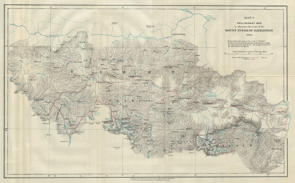
 The Great Trigonometrical Survey of India in 1856 established Mount Everest (known as Peak XV) as 29,002 ft (8,840m). The survey itself was incredibly accurate compared to the modern height of 29,029ft (8,848m). It was named Mount Everest by the Royal Geographical Society upon recommendation by the British Surveyor General of India, Andrew Waugh, who named it after the man he succeeded, Sir George Everest. It was nearly 100 years later, in 1953, when Tenzing Norgay and Edmund Hillary made the first official ascent though debate continues to surround the possibility that George Mallory and Andrew Irvine may have reached the summit as part of the 1924 expedition. They made a final attempt on the summit on June 8th but disappeared in the clouds after being spotted high on the mountain. Mallory’s body was recovered in 1999 at a height of 26,755ft (8,155m). Surveys and maps of Everest were critical in the understanding of the mountainscape, the plotting of the various potential routes to the summit and the eventual success. The map made by Major Henry Morsehead as part of the 1921 expedition is arguably the finest early, detailed and complete map of the region.
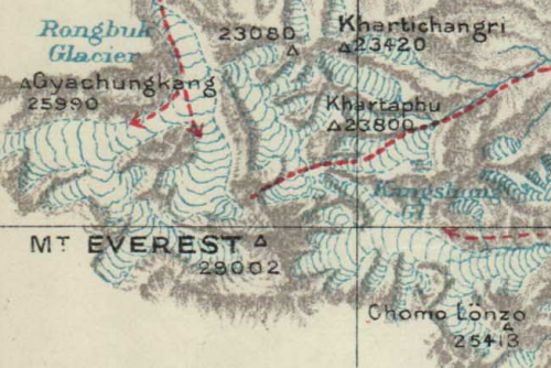 The 1921 expedition was in effect a reconnaissance by the British who reached an elevation of 22,970ft (7,000m) on the North Col after a 300 mile march. Nepal didn’t allow foreigners into the country so the British expeditions had to approach the region from the Tibetan side. The map clearly illustrates the divide between nations in the limit of the detail, with Everest being shown on the south edge of the detailed map. The impressive detail is wonderfully rendered with hand drawn hillshading in grey to identify slope and aspect. Darker shading shows higher areas and ridges are shown as if illuminated vertically. Water and glacial features are shown in a light alpine blue hue with only one further colour, red, used to show the different routes through the region. The map is a work of art in relief portrayal and clarity and a result of more than simply marching to Everest itself. This map required Morsehead and his team to explore the entire region in harsh conditions. They weren’t alone in their map-making endeavours with others in the team also undertaking photographic surveys, collecting specimens of flora and assessing the geological structure. Indeed, Alexander Heron’s Geological map is also impressive in its own right.
 Despite initial thoughts of using the 1921 expedition for a full assault on the summit, the trip was eventually led as reconnaissance. Before they had left the region, the Royal Geographic Society’s Mount Everest Committee had already established a subsequent expedition for the following year to go for the summit. The 1922 expedition used Morsehead’s map to push on via the North Ridge route to an elevation of 27,300ft (8,320m) which was the first time a human had climbed above 8,000m. It was also the first attempt on Everest that used bottled oxygen to counter the effects of elevation. George Mallory, who had taken part in the 1921 expedition, had discovered a potential route to the summit though on the third attempt seven porters died in an avalanche and the expedition abandoned. They had established a new record climbing height but the lure of the summit would have to wait.
To date over 4,000 different climbers have made nearly 7,000 summits. Some 250 people have died trying to climb Everest. Today’s climbers take modern equipment and digital maps yet for its time and, still, Morsehead’s map retains its status as a cartographic gem that supported early attempts on the summit.