National Mapping Authority topographic map series have been the bread and butter of many nations. Each has developed a unique style and brought a particular sense of design to their map sheets. Many of us have grown up with a love of our own national maps having used them in school and on holidays. They become familiar and known. We understand the symbology, the scales and the look and feel they bring to our understanding and appreciation of the environment. We featured one such mapping series by Great Britain’s NMA, Ordnance Survey, in MapCarte 30. Here we focus on the famous quadrangle maps from the United States, specifically the large-scale 7.5 minute series.
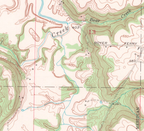
The United States Geological Survey (USGS) largest (in terms of scale and quantity) and best-known map series is the 7.5-minute or 1:24,000 quadrangle series. The scale is unique in national mapping being related to the measurement of 1 inch to 2000 feet. Each of nearly 57,000 maps is bounded by two lines of latitude and longitude covering 64 square miles in southern latitudes but, due to convergence of meridians, only 49 square miles in northern latitudes. The specification has been applied to many other geographies that the US mapped during military operations which demonstrates a high level of flexibility and versatility in the design.
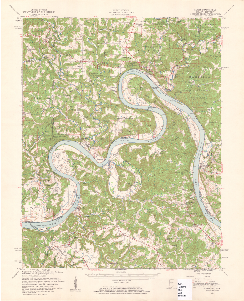
The example we show here is the Alton Quadrangle (195) that covers part of the Ohio River on the Indiana/Kentucky border. It shows the balanced composition of the sheets perfectly as it encompases considerable elevation change depicted with the signature orange-brown contours as well as the forestry and water bodies.
 As a brand, the series is instantly recognizable and successful. The content serves both civilian and military purposes and supports varied usage. Marginalia is well structured and complex information delivered in a succinct, well organised manner. The series was officially completed in 1992 and while The National Map (http://nationalmap.gov/ustopo/) represents a new generation of digital products the impact of the originals persists with new maps arranged in the 7.5-minute quadrangle format as well as retaining the same look and feel.