MapCarte 342/365: Satellite Map of Earth by Tom Van Sant, 1990

MapCarte342_vansantWhat better to represent the culmination of cartographic knowledge and achievement at the close of the twentieth century than a portrait of the Earth from space?

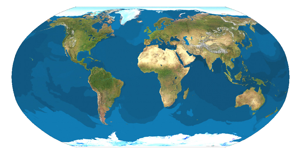
The first cloud-free, high-resolution composite image of the Earth was completed on 15th April 1990. It featured on the title page of the National Geographic World Atlas that year and was produced by artist Tom Van Sant with technical assistance from Lloyd Van Warren, Leo Blume and James Knighton. Using multiple whole-Earth mosaics collected by Advanced Very High Resolution Radiometer (AVHRR) sensors on board TIROS-N (Television and InfraRed Observation Satellite Next generation) satellites, the composite was derived from over 2,000 images with a ground resolution of 4.6 km. The project required ten months of software development and both interactive and non-interactive methods of creating the mosaics using a Stardent GS1000 Graphics Supercomputer – then amongst the most powerful machines of its type.

MapCarte342_vansant_detailBut is it a map? ‘First-of-a-kind portrait from space’ was its title in the November 1990 issue of National Geographic, strengthening the cartographic pedigree of this latest mapping achievement. A portrait is usually intended to flatter its subject; while appearances need to be accurate to form a resemblance, complete faithfulness – even allowing for Oliver Cromwell’s desire for ‘warts and all’ – is beyond the objective of the artist. Hence, as a map, Van Sant’s Earth portrait aptly represents the blend of art and science that characterises cartography and its drive for an aesthetic perfection that reflects impossibility more than reality. Not only do we see a cloud-free and perfectly and evenly illuminated Earth, but one in perpetual bloom with maximum vegetation cover wherever you look. Drainage and relief were enhanced using high-resolution hydrology and elevation databases and the images themselves were filtered, corrected and manipulated to produce the best view possible.

In The Power of Maps (1992), Denis Wood deconstructs Van Sant’s Satellite Map of Earth, unveiling the very human forces behind each decision in its production. Yet, aptly completed on the birthday of Leonardo da Vinci, the image is also a reminder of cartography’s unique fusion of art, science and technology – and the cartographer’s desire to portray a pleasing world.

MapCarte 116/365: Google Maps by Google, 2005-present

MapCarte116_google1Lars and Jens Rasmussen’s mapping company was acquired by Google in 2004 and the mapping landscape transformed on February 8th 2005 when Google Maps was released as a web-based product (maps.google.com).  Google Maps (and numerous complimentary products) has both disrupted and revolutionised the way the people view, use and make maps and how they interact with their surroundings. Google’s intent to organise the world’s information to support their Search capabilities has often been expanded to the ideal of “organising the world’s information, geographically”. Let’s not forget that Google are a company whose focus is advertising and the revenue raised from placing adverts on web pages, their search results and on the map is what funds the business. The map has become a key mechanism for people and we perhaps cannot have predicted the astonishing rise of its use.

MapCarte116_google5

Several other disruptive technologies have converged to enable this to happen, not least the ubiquity of the internet and rapid development and uptake of mobile devices. People now expect information to be streamed rapidly, often through a map interface. Google’s map is now part of our everyday toolkit in a way that can perhaps never have been imagined. Designed to support Google’s mission but designed so well that it is perfect form of viral marketing itself.

MapCarte116_google4

In addition to becoming the default map of choice for finding places and navigating, the Google Maps API has also underpinned the democratization of online mapping to allow anyone to create geographically contextualized mashups and also customise the base map data to their own style. The original design left much to be desired and problems of disjointed data and poor cartography have been addressed so today’s product gives a finely tuned, responsive and clean map experience.

MapCarte116_google3

The design is recognizable and supports a strong, clear brand that is consistent at a local scale, globally.  Integration of complementary functionality (e.g. routing, traffic information, overlay of social media and photographs, zooming, panning, querying and measuring) provides an application with a multitude of purposes that goes beyond a general reference map.  The design is automatically modified depending on its use.  For instance, secondary roads widen at particular scales when you overlay traffic information to show each direction of traffic flow.  The appearance of 3D buildings and moving shadows at large scales (in some cities) represent the built environment like never seen before.

MapCarte116_google2

Google Maps is used every day by millions to actually ‘do something’. No other map in history can claim such widespread adoption and use. it’s successful because it works. With that many people using and testing if it wasn’t up to the task it’s use would soon diminish. It is content rich yet very straightforward. The colour is subtle and the typography sits well at each scale and transitions between scales. This is a single map but designed at 20+ scales to work at each scale and to work across the scales. It accommodates a wide and diverse range of users and is localised. It supports terrain layers, satellite imagery and hybrid mapping. it allows you to incorporate photo tours and switch between 2D and 3D and StreetView. There isn’t much this map does not do.

MapCarte116_google6

Can we ignore the fact that Google brought Mercator back to prominence? Maybe not…but Web Mercator is a perfect technical solution for serving tiles of data because it tesselates in squares, is efficient and scales rapidly. It won’t be long before projections can be modified in web maps so until then we just have to accept them (and deploy our own maps using different projections) when necessary.

Quite simply the map is, and continues to be revolutionary. The 2005 map would get nowhere near MapCarte. The 2014 version is state-of-the-art and in less than 10 years Google are leading big league cartography and fully deserve inclusion.

I’d be surprised if anyone reading this doesn’t know how to access Google Maps but just in case…it’s here.

MapCarte 46/365: Cloudless atlas by Mapbox, 2013

MapCarte46_mapboxAerial photographs and remotely sensed images have not only been used for decades to derive map detail but they are increasingly used as the map itself. This can provide a detailed view of the world as it exists rather than the abstract landscape that a map often presents. Of course, problems of cloud cover, poor resolution and mismatched imagery, often captured at different times of the year can create a less than pleasing result.

A fresh approach to making a mosaic of NASA’s LANCE-MODIS data has been developed by Mapbox. Rather than taking the best image of a particular place and then quilting them together, Mapbox stacked images and processed them, pixel by pixel to get the average of the least cloudy pixel before stitching it all back together to create a seamless cloud-free atlas. Completely synthetic but a great example of using generalisation techniques to create a product that is greater than the sum of its parts (literally). Beautiful, consistent imagery.