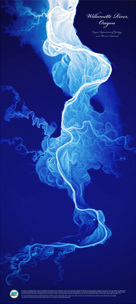
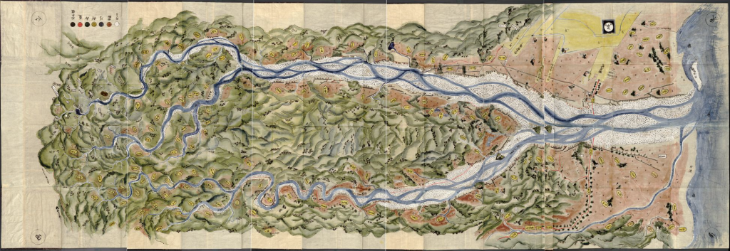
 Instead of creating general purpose reference maps that depict the topographic detail of a specified area, an alternative approach is to let a specific feature define the area itself. In this sense, the feature becomes the central player in the map and all other content becomes its supporting cast. It also determines the shape, format and, possibly, the size of the finished product. This superb example shows the Abe River region in Japan from the mid 19th century. The river itself defines the shape and scope of the map with the flow from north-west to south-east being depicted from left to right across the map, with straightening being used in places. In this case, north is towards the upper left rather than directly upwards.
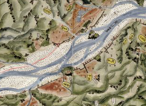
The map is predominantly pictorial with relief in particular shown pictorially. Relief is drawn in aspect while the map in general is planimetric; a fairly typical approach of the time in Japanese cartography. It’s also worth noting that the mountains are not uniformly drawn with their base at the bottom and peak at the top across the map – they change orientation so, for instance, toward the left of the map it’s noticeable that the mountains are rotated left by 90 degrees to show them as the origin of the river and make the flow of the river make more sense visually.
 There is very little text on the map itself, the reverse side being used for notes on the geography of the region. This allows the map to remain clutter free and for the topography to be drawn in detail. The finish is in watercolour and ink with major land uses benefiting from different hues to demarcate the landscape.
The braided river flowing through alluvial deposits and floodplains is particularly well represented and stands out amongst other rich colours of the surrounding mountains. The stippled pattern for the plains adds to the texture of the map and creates a sense of realism that a relatively solid fill doesn’t. There’s no frame as such and the river washes out into the sea to the right.
A beautiful map and an example of allowing your subject or theme dictate many of the other cartographic choices to be made.