MapCarte 135/365: The Chevalier map of San Francisco by August Chevalier, 1911

MapCarte135_sanfranVery rarely do we see maps titled in such a way that they go beyond the theme or subject matter of the work. More than that, how many maps do we ever see where the author adds their own name to the title. It’s a bold statement and one that’s difficult to pull off since recognising a piece of work by the author’s name is usually only conferred by peers after the work is published and widely admired. August Chevalier didn’t wait and his map of San Francisco bears his name. On this occasion any hint of self-agrandising might be allowed since the map is stunning.

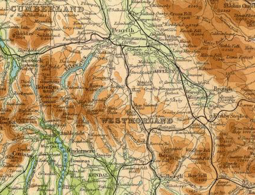
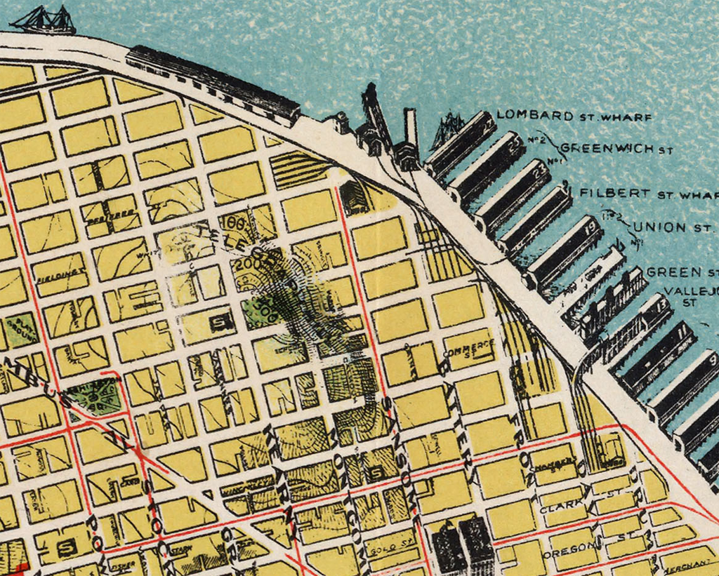
The “Chevalier” Commercial, Pictorial and Tourist Map of San Francisco (its full title) was designed and engraved by August Chevalier, lithographer and publisher. The original first edition was later published with improvements and additions in 1911. The map portrays San Francisco in a way that we rarely see today by emphasising the relief. For a relatively large scale (1:9,400), the map unusually employs contours to depict relief. More typically, it also shows all of the important buildings as life-like pictorial representations so in some respects combines techniques more often seen on different scales of map type. This works to great effect.

The map also uses hill-shading to accentuate the character of the topography and the clear and bold street names add local detail. The parklands are shown clearly as are the docks and other key places which become recognisable by their use. A neat trick sees Chevalier allow his map to extend beyond the graphic border. This gives an expression of the landscape continuing beyond the map and allows it to appear less constrained; a little more fluid. The shaded vignette effect used to depict the water is slightly patterned and also expertly applied to accentuate the landform.

MapCarte135_sanfran_detail

This is a beautiful poster sized map that captures something of the city that modern maps overlook. San Francisco, like many cities, has considerable variation in land use and topography but our sometimes overly abstract representations and distillation of features to geometric shapes can lose some of the character. Chevalier proudly put his name to this map and he deserves the accolades.

MapCarte 133/365: The Times Atlas of the World by The Times 1895-present

MapCarte133_timesExtract from the Times Atlas 2nd Edition, 1920

World reference atlases were once revered for their quality, consistency and magnificence as publications. No self-respecting household would lack a decent atlas. The ability to have a world atlas on your cellphone or tablet is certainly challenging the publishing model for such atlases but there is some way to go before the print atlas is consigned to history.

The Times Atlas of the World (latterly with the addition of Comprehensive Edition) was first published in 1895 and is currently in its 13th Edition.  Originally containing 117 pages and over 130,000 names it has grown to a 544 page publication with 125 map plates and over 220,000 indexed names and is marketed as The Greatest Book on Earth. It claims to be the benchmark of cartographic excellence and that’s some claim – though entirely fitting for such a well research work that exhibits well crafted, refined cartography. The 2nd Edition began a long association with Bartholomews as suppliers of the maps in the atlas and represents some of the richest and magnificent maps out of all the editions.

MapCarte133_times_detail

The 10th Edition, published in 1999, was the first to be produced entirely using computer cartography but until that time much of the map drawing was by hand. Unsurpassed global coverage of the world’s physical and political features in a single volume, the atlas is both prestigious and authoritative.  It has a classic style and traditional appearance and is meticulously presented.  Crucially, the intricate design has stood the test of time and the maps are beautifully laid out, easy to read and fascinating. Every aspect of cartographic design is executed to a high standard – composition and layout, colour and typography, balance, hierarchy, contrast and symbology.

In an age of querying the internet for answers, when questions of authority and accuracy remain, the Times Atlas is unparalleled and remains a reference publication of the highest quality.

You can view hi-resolution contents of two of the older Times atlases at the David Rumsey Map Collection including the focus here: the 1920 2nd Edition.

1895 1st Edition is an English version of the German ‘Andrees Allgemeiner Handatlas’ from the publisher Velhagen & Klasing.

1920 2nd Edition containing maps by Bartholomews

The current version is available via the Times atlas web site here.

MapCarte 116/365: Google Maps by Google, 2005-present

MapCarte116_google1Lars and Jens Rasmussen’s mapping company was acquired by Google in 2004 and the mapping landscape transformed on February 8th 2005 when Google Maps was released as a web-based product (maps.google.com).  Google Maps (and numerous complimentary products) has both disrupted and revolutionised the way the people view, use and make maps and how they interact with their surroundings. Google’s intent to organise the world’s information to support their Search capabilities has often been expanded to the ideal of “organising the world’s information, geographically”. Let’s not forget that Google are a company whose focus is advertising and the revenue raised from placing adverts on web pages, their search results and on the map is what funds the business. The map has become a key mechanism for people and we perhaps cannot have predicted the astonishing rise of its use.

MapCarte116_google5

Several other disruptive technologies have converged to enable this to happen, not least the ubiquity of the internet and rapid development and uptake of mobile devices. People now expect information to be streamed rapidly, often through a map interface. Google’s map is now part of our everyday toolkit in a way that can perhaps never have been imagined. Designed to support Google’s mission but designed so well that it is perfect form of viral marketing itself.

MapCarte116_google4

In addition to becoming the default map of choice for finding places and navigating, the Google Maps API has also underpinned the democratization of online mapping to allow anyone to create geographically contextualized mashups and also customise the base map data to their own style. The original design left much to be desired and problems of disjointed data and poor cartography have been addressed so today’s product gives a finely tuned, responsive and clean map experience.

MapCarte116_google3

The design is recognizable and supports a strong, clear brand that is consistent at a local scale, globally.  Integration of complementary functionality (e.g. routing, traffic information, overlay of social media and photographs, zooming, panning, querying and measuring) provides an application with a multitude of purposes that goes beyond a general reference map.  The design is automatically modified depending on its use.  For instance, secondary roads widen at particular scales when you overlay traffic information to show each direction of traffic flow.  The appearance of 3D buildings and moving shadows at large scales (in some cities) represent the built environment like never seen before.

MapCarte116_google2

Google Maps is used every day by millions to actually ‘do something’. No other map in history can claim such widespread adoption and use. it’s successful because it works. With that many people using and testing if it wasn’t up to the task it’s use would soon diminish. It is content rich yet very straightforward. The colour is subtle and the typography sits well at each scale and transitions between scales. This is a single map but designed at 20+ scales to work at each scale and to work across the scales. It accommodates a wide and diverse range of users and is localised. It supports terrain layers, satellite imagery and hybrid mapping. it allows you to incorporate photo tours and switch between 2D and 3D and StreetView. There isn’t much this map does not do.

MapCarte116_google6

Can we ignore the fact that Google brought Mercator back to prominence? Maybe not…but Web Mercator is a perfect technical solution for serving tiles of data because it tesselates in squares, is efficient and scales rapidly. It won’t be long before projections can be modified in web maps so until then we just have to accept them (and deploy our own maps using different projections) when necessary.

Quite simply the map is, and continues to be revolutionary. The 2005 map would get nowhere near MapCarte. The 2014 version is state-of-the-art and in less than 10 years Google are leading big league cartography and fully deserve inclusion.

I’d be surprised if anyone reading this doesn’t know how to access Google Maps but just in case…it’s here.

MapCarte 20/365: Seafloor map of Hawai’i by Tom Patterson, 2012

MapCarte20_Patterson

Tom Patterson’s beautiful map of the seafloor topography of the Hawaiian islands is pleasing on the eye due to the balanced layout and choice of blues he uses for the bathymetry. Blue, of course, is routinely used for representing water features but here, Patterson veers towards turquoise and aquamarine that gives us an impression of clear tropical waters. The lighter coastal waters provide a natural vignette to emphasise the land/water zone.

The often dramatic and explosive volcanic forces at work that create the islands are in some respects subdued by the colours but the seafloor terrain is captured in all its jagged detail using a plan oblique technique. Text is well placed and designed with a simple sans serif font and colour aids in differentiating text by function and also to place the labels in different visual planes.

Large hi resolution versions and wall maps can be downloaded from Tom’s website here.

MapCarte 16/365: Hong Kong Street Map Series, HKSAR, 2010

MapCarte16_HongKong

Published by the Survey and Mapping Office of the Government of the Hong Kong Special Administrative Region, this monochrome street map series at 1:10,000 covers the entire region across 59 sheets with contours at a 20m interval. It is highly detailed to include all the necessary topographic elements of roads, buildings and points of interest.

The greatest achievement of this map series is that it is published entirely in monochrome. Given the ease of which colour can be applied to maps today it serves as a perfect reminder that often, monochrome can be both useful and impactful. The map also demonstrates the clarity of design that the cartographers achieved given the limitations imposed by the lack of colour. They managed to design over 100 uniquely identifiable features through the design of black and white point, line and area features. This is map design stripped to its very basics but to great effect. Designing in monochrome is a very useful way to control your design even if you end up adding colour.

A zoomable version is available on the ICA web site, here, to allow more detailed inspection.

MapCarte 10/365: Tongariro National Park by Geographx, 2013

MapCarte9_Geographx

 Click here to view an online zoomable version.

A large format poster provides the media for this map proving that size sometimes does matter in cartography. Sure, this could be presented on the web but the impact would not be as impressive. Sometimes a map deserves space and to be seen in its entirity at once (the irony here being we’re referencing an online version!).

Geographx have become masters at creating 3D maps based on plan oblique and orthographic oblique projections that create a pleasing end product free from some of the distortions the more usual perspective view creates. The techniques create parallel projection lines and places the viewpoint at infinity. Crucially, they allow features in the landscape to remain figural and work particularly well in mountainous regions. Additionally, the photo-realistic textures and colours used give us a sense of place and the natural beauty of the landscape which is used to great effect here to highlight the snow covered slopes of Mounts Ruapehu, Tongariro and Ngauruhoe. The addition of more traditional topographic content (vector lines, point symbols and labels) allows it to go beyond merely the artistic and also serve well as a reference map.