Maps don’t have to look like maps though the further they veer from what we see as a traditional conceptualisation of space, the more people think of them in a different way. Terms such as diagram or infographic are commonly applied to maps that people don’t feel are worthy of the title ‘map’. Even Beck’s fantastic map of the London Underground polarises opinion with as many considering it a diagram.
Stanford Kay’s effort in mapping carbon emissions almost certainly fits this mould. The metaphor is immediate as the shape of two footprints is a wonderful way of exploring the cost of our carbon footprint. The feet are made up of proportional circles showing the amount of carbon dioxide emissions per country. It’s a Dorling cartogram but it’s not entirely devoid of spatiality. The symbols are organised into broad regional areas so you get a sense of how different contries compare on a regional basis by simply recognising the colours. International comparison comes through exploring the different sized symbols and their labels.
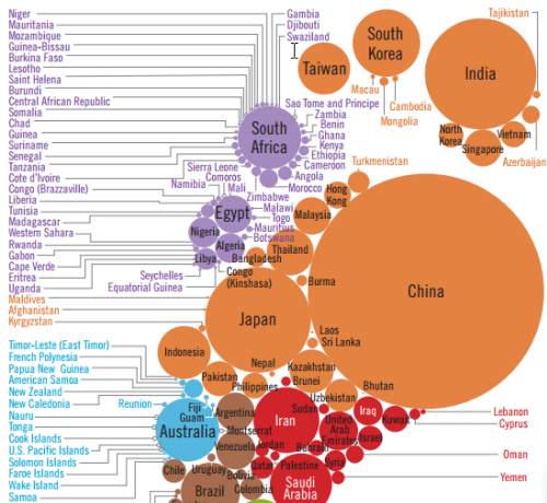 Certainly this is at the heavily stylized end of the cartographic spectrum but it maps data represented spatially. The left foot shows us totals and the right foot reorganises the data per capita so we get two feet, each of which shows us a different aspect. Text is fairly limited but a nice touch is the linking of the countries labelled in list form with the symbols of the circles themselves.
The traditional shape of the outlines of projected countries gives way to a more powerful aesthetic. It’s a beautifully organised piece of work.We shouldn’t be afraid to make maps that use strong visual metaphors.