MapCarte 274/365: The Milford Track by Roger Smith/Geographx, 2014

MapCarte274_milford

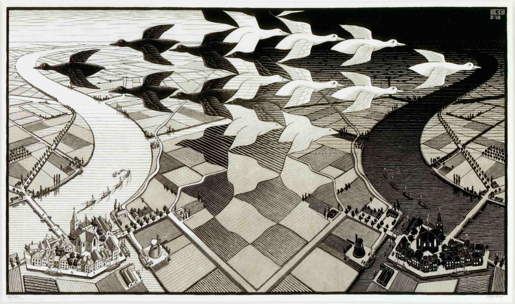
Despite the almost incessant claims that print cartography is dead nothing could be farther from the truth. While we are seemingly inextricably linked to our digital mobile devices there’s something eternally useful about a paper map. The batteries never run out in the middle of nowhere. They suffer to a lesser degree in rain or bright sun. They can be crammed into your backpack…you can even damage them and not break the bank! That doesn’t mean that print cartography cannot develop.

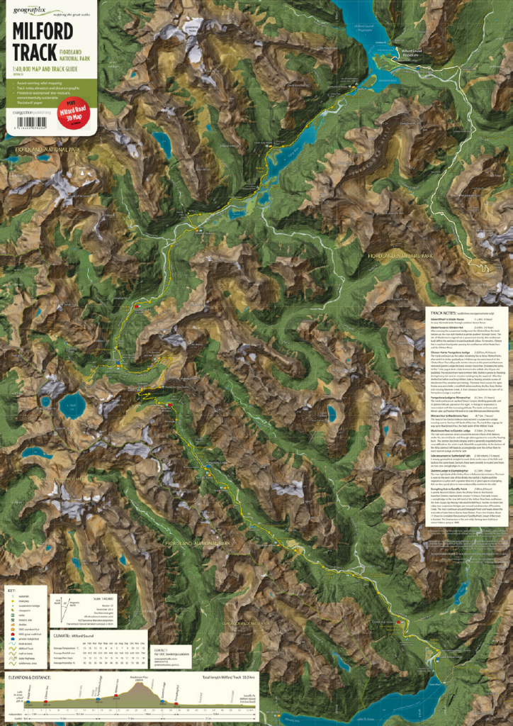
In this example from Roger Smith, he applies his unique graphic approach to the creation of a series of maps designed to support planning as well as hill walking along some of New Zealand’s most famous and spectacular walks. Here we feature perhaps the most famous, the Milford Track, designed for outdoor use to support the need for navigation and information along the track.

MapCarte274_milford_detail

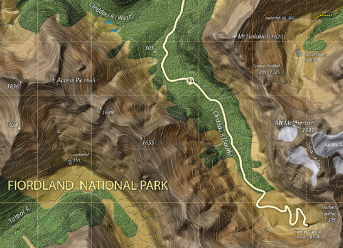
Smith uses a pseudo-natural looking base map which contains a lot of textures. The usual flat depiction of terrain (e.g. a solid green fill for forested areas) gives way to textures that mimic the environment. Here, he’s providing some sort of naturalistic look that falls short of the visual clutter associated with draped satellite imagery. The fills and textures are consistent and help to demarcate different vegetation types and the colours, browns and greens and rich and earthly.

The hill shading and attention to detail gives a dark, brooding appearance and helps give a sense of awe to the magnificent landscape. If ever a map evoked an environment then this is it. The Milford track itself is prominent and depicted in bright yellow (as in ‘follow the yellowbrick road’) that contrasts well with the background. The contours are also prominent and help to show how the track rises and falls with the topography. Typography is generally printed in light colours to contrast with the background and a hint of shadow is used to lift it which works better than the somewhat standard approach of using a halo.

Perhaps the most interesting aspect of the map is the design of the material. It’s printed not on paper, or even tyvek…but ona water-proof, insect-proof and tear-resistant product made of crushed mineral deposits. It’s printed on crushed rock and that means you can do pretty much anything to it and it’ll survive. You can’t do that on your iPad in the middle of a 4 day hike in the middle of nowhere.

MapCarte 268/365: Day and Night by M. C. Escher, 1938

MapCarte268_escher

Our modern digital tools make manipulation of data fairly straightforward and it’s relatively simple to apply some abstract thinking and techniques in order to create something interesting. If we cast our minds back 100 years, the method of print production was based on mechanical techniques and though invented much earlier, the woodcut process saw a renaissance for fine art printing. With woodcut there wasn’t much room for error and it took a particularly skilled craftsmen to create cartographic products or, for that matter, any products. Prints made from woodcut that are based on geometrical patterns…and those with a positive and negative display are perhaps even rarer.

Dutch graphic artist M. C. Escher is well known for his mathematically inspired woodcuts and lithographs. They often feature architecture or explorations of infinity and tesselations. Here, we show his Day and Night produced when he was age 40. It’s a woodcut in black and grey printed from two blocks and measuring some 68cm wide. It was one of his first prints to show the tesselated tile approach that incorporated an abstract positive and negative image. It lends itself perfectly to the display of a map image that represents the illuminated landscape in day and night in mirrored fashion. The white flock of birds flying above the ground merge with the daylight sky on the left and to the right, the black flock blends to create the night sky. The illusion also works top to bottom as the patchwork of agricultural fields morphs into the birds in the sky.

It’s a wonderful illustration not only of technique but also mastery of design and thought. The care required to get the illusion correct is of the very highest order. In some senses it also illustrates how one might have gone about creating thematic maps where different shades of monochrome were required (e.g. in a choropleth) since the patterns and differences between shades are perfectly balanced and easily distinguishable which is in part why his work is so well formed.

You can see much more of Escher’s work at the official site here. Well worth a look!

MapCarte 75/365: Khumbu Himal by Institute of Cartography at TU Dresden, 2013

MapCarte75_dresdenIf you’re going to take over the job of mapping the famous Scientific Association for Comparative High-Mountain Research maps of Nepal then you’d better do a good job. Here, Manfred F. Buchroithner, Thomas Himpel and Hannes Künkel from TU Dresden have artistically redesigned the 1965 original map and employed somewhat unconventional colour schemes to create a beautiful printed map. Using extensive fieldwork and current satellite imagery the map content has been updated and changes in the land use are in evidence as for the first time, tourist information is presented.

MapCarte75_dresden_detail

At a scale of 1:50,000 the map shows considerable topographic detail. The lineage of classic Swiss-style depiction of mountain terrain is evident but the colours have been tweaked to give even clearer lines. The detail is breathtaking and although the map is abstract (the earth doesn’t actually look like that of course), the colours and symbology give you an unparalleled sense of place. The production of the map as a large format printed sheet gives strong credence to the claim that print mapping is not dead in an era when the balance of map publication is shifting towards the screen. When maps are designed and produced to this high quality they deserve to be created as tangible objects to enjoy.