MapCarte 246/365: Oblique map of Yosemite National Park by Tau Rho Alpha, N. King Huber and Clyde Wahrhaftig, 1986

MapCarte246_yosemite


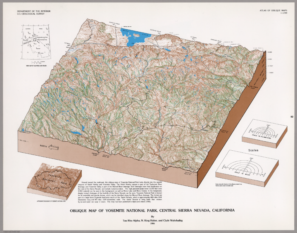
The ability for modern web browsers to portray our world in three dimensions is perhaps now taken for granted. We’re able to pan, tilt and fly around Google Earth and other applications and see the terrain draped with all sorts of imagery and map layers. 3D has not always been so easy to portray. Traditional terrain representations such as hill-shading and contours are staple techniques but tilting the map until very recently meant creating a block diagram.

This block diagram of Yosemite National Park illustrates the technique with the map tilted to an oblique view. This would normally create a foreshortened image due to the perspective view but many block diagrams, instead, use an isometric projection so that scale is maintained across the image.

Of course, to construct these maps without the assistance of a computer, one requires a heavy artistic touch. This map is painted beautifully. It also makes use of the sides of the block, as if the map is extracted from the earth, to provide additional information. Other diagrams add to the overall display which creates a compelling view of the valley and the park.

MapCarte246_yosemite_detail

Isometric block diagrams bring a certain scientific aesthetic to cartography yet they have traditionally been prepared by hand using techniques from some of the very best landscape artists such as Erwin Raisz.

A full version of the map can be downloaded from the David Rumsey Map Collection here.


MapCarte 199/365: Gifu by Hatsusaburo Yoshida, c.1940

MapCarte199_yoshida

Long before satellite imagery and aerial photography, cartographers had to imagine the landscape and explore different ways of representing the world. Hatsusaburo Yoshida trained as a textile designer but is well known for his spectacular birds eye view maps, produced in the early to mid 1900s.

His work was informed by tireless local surveys which included not only measurements of the landscape but meetings with local people to gain a sense of what’s important to an area. This provided a way of developing a sense of what to include or omit on the map.

Yoshida’s maps are vibrant and colourful. They sow mountains as key features represented almost in aspect while much of the other detail is presented in perspective. There’s an abstract feel to the symbology and the clean lines used to represent real world features yet he manages to maintain a certain realism to the portrayal. The textual components use a billboard technique that lifts labels off the map which is a clever technique for this style of mapping. His skies and clear, cloudless sunsets illuminate the map to give it a crystal clear depiction unencumbered by haze or clouds.

Beautiful hand drawn maps showing the very best of design and representation. More examples of Yoshida’s work can be seenĀ here.