
 Topology is a vital concept that helps us understand how geographical features are related to one another. There are a number of ways that different topological relationships can be defined so that we better understand what features border one another, or are enclosed by another feature for instance. In cartography, such relationships are often implicit yet the relationship of connectivity is often something that can be used explicitly. Subway maps are really just topological diagrams showing connectivity between stations along with symbology that defines lines of equal value (for instance a named route).
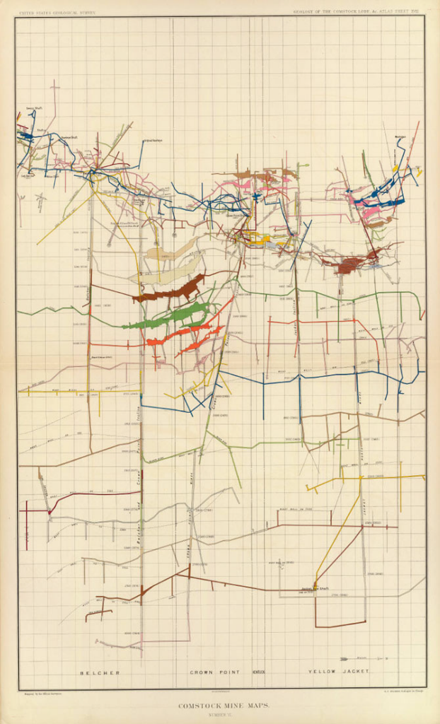
Maps do not always have to show planimetric detail though; and this example of the Comstock Mines map by USGS illustrates how connectivity can be mapped in vertical space. The point at which a mine system enters the ground is largely insignificant in the context of the labrynth that exists below ground. In a system that lacks any form of alternative spatial context it’s vertical and horizontal distances and the connectivity between shafts that dictates the geography. The Comstock Mine maps, a collection of beautifully simple diagrams depicting the mining of silver ore in Nevada in the late 1800s, illustrate how a map can be drawn to show vertical (z) space but on an x, y plane). The slice through the system shows the relative horizontal distance of different shafts but more importantly the vertical distance. Connectivity is clearly illustrated and the use of a graphed background allows the reader to very quickly determine a mine’s depth and also distance.
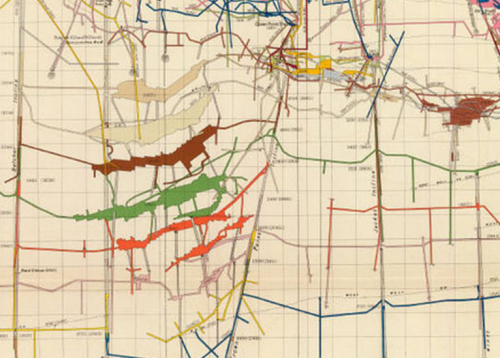
Colours are used effectively to demarcate different horizons in the map and different systems by demarcating each separate hundred feet of depth. These maps, then, are much the same as a modern subway map in that they shows connectivity and the relationship between one component and another clearly.
The Comstock Lode was legendary for the amount of mineral wealth it yielded – something close to an inflation-adjusted $400 million in silver and $270 million in gold per year at its peak. It was also instrumental in the development of extraction technology. Here, though, we can marvel at the gorgeous mapping that was produced by George Becker and USGS.