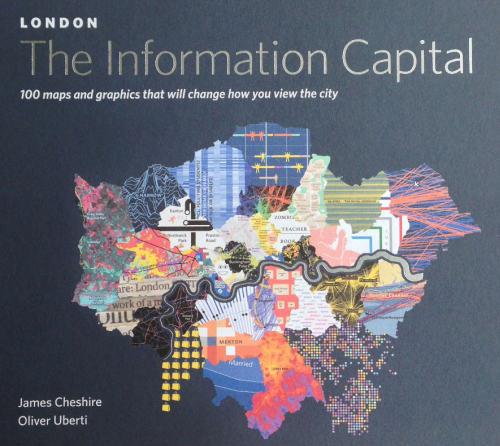
 This is likely to be the only entry in MapCarte that can claim to have achieved the standards of design and innovation required to be discussed herein before it’s even been published. This new book of 100 maps of London by James Cheshire and Oliver Uberti is actually published today and having seen the pre-press material some weeks ago it was clear that one or two of the maps were special. Indeed, the more one saw of the work in the book, the more it became obvious this entry should celebrate the entire book rather than attempt to select one or two noteworthy examples. It’s an atlas of noteworthy examples and that’s a strong statement before all of the maps have been seen. Some accolade – but this is a book that contains some of the very best of modern cartography which sits at the intersection of information graphics, compelling storytelling and inspiring cartography.
 This book is the collaboration of geographer and visual journalist. Geographer Cheshire has produced some fantastic previous work (featured in MapCarte 7) and here, he takes his keen eye for the interesting and obscure and translates the data into simple, clean yet imaginative maps with the help of Uberti. Self-described as a visual journalist, Uberti clearly knows how to shape a story using beautiful graphics. The combination works well and the team have produced a fantastic array of visual treats, each using different graphical approaches but without falling into the trap of making each map different just for the sake of making it different.
 For any cartographer, the book contains a plethora of brave and rich design. The unique approaches taken to displaying the data bring something very different to the world of mapping. These are no ordinary thematic maps. They stretch the boundaries of convention and deliver works that engages not only our interest in the themes but our interest in how the design has been constructed and how it works. It’s a coffee table book for the average punter interested in a fascinating look at London but for anyone interested in cartography it offers something much more.
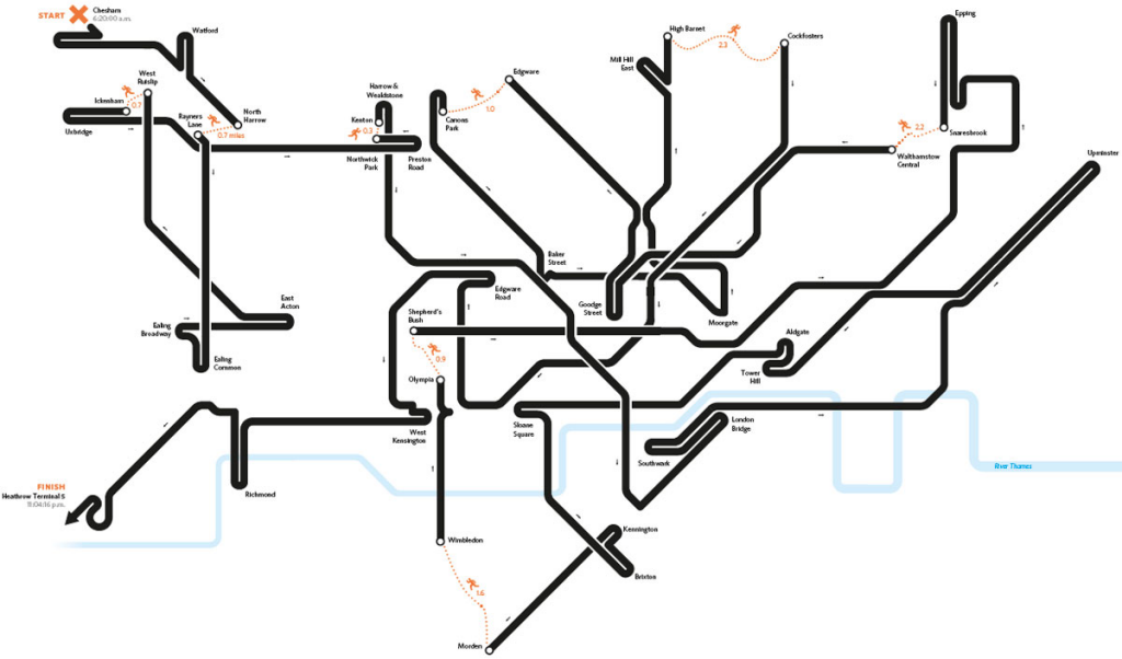
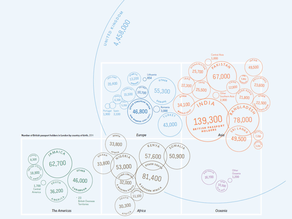
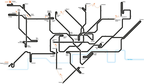
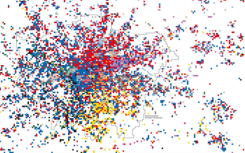
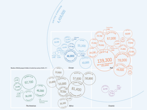 Maps showing the optimal route through the London Underground take the familiar and cast it in such a way that we immediately see the path. The map of football supporter territories is a patchwork of small raster cells. The map showing the number of passport holders in London by nationality brilliantly uses a symbolic round passport stamp as a proportional symbol that contains both label and number and also clusters using colour to represent continents. Overlaps do not matter. It’s a cartogram and the design works wonderfully.
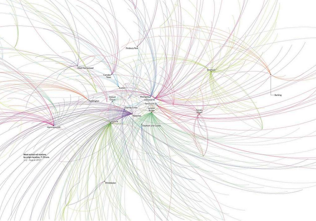
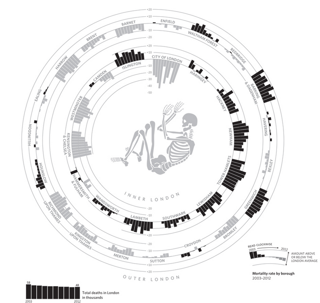
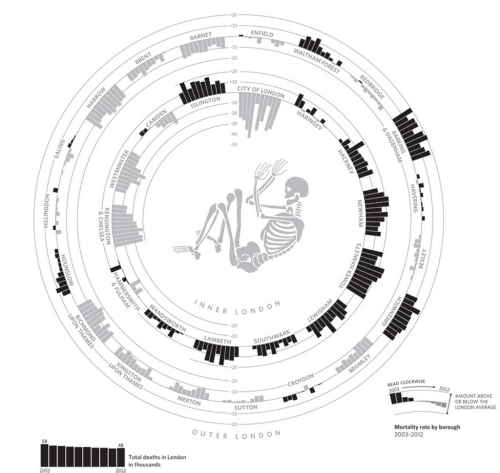
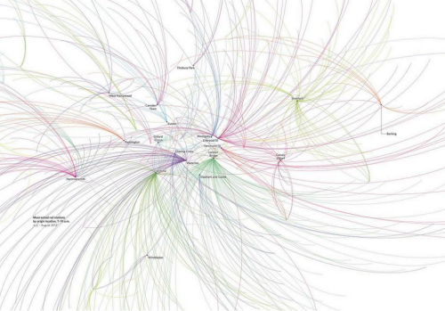 Flow maps of Oyster card tap ins to represent commuter journeys, the distribution of entertainment by type as a strip of tickets and the arrangement of bar charts organised to represent the shape of inner and outer London all play with geography but retain the essential message.
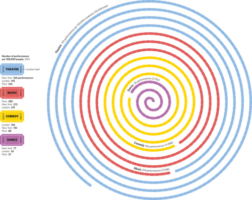
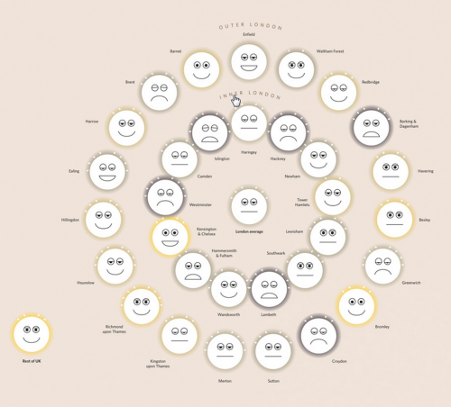
 Not all the graphics and map types are entirely original in the sense that it’s impossible to create 100 new map types. The treatment is original though; highly original. And the authors have also plundered the archives to resurrect and make fine use of some arguably under-used techniques like Chernof Faces and Coxcombs.
 Altogether a superb illustration of the art of cartography. A masterful appreciation of data and the ability to distil it into meaningful and interesting maps. Each map offers up something new and interesting. They go beyond the mundane and create a portfolio of design to inspire and delight any map nerd and many more besides.
The authors ask interesting questions that they then translate into maps and take their inspiration for mapping the fascinating facts of London from previous pioneers of London mapping such as Harry Beck, Charles Booth and John Snow. It works. This book stands shoulder to shoulder with some of the very best in thematic mapping to paint a portrait of the city.
You can explore the book further at the web site here or via James Cheshire’s web site here.

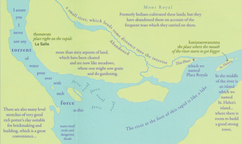
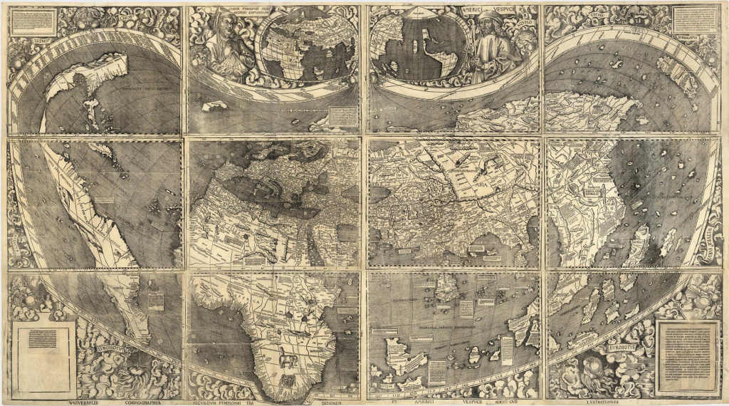 Some maps transcend their perhaps modest original purpose and become something really quite special. This map, from 1507 was made in a small town in north-east France by a group of scholars led by Martin Waldseemüller. The map’s somewhat lengthy title “A map of the world according to the tradition of Ptolemy and the voyages of Amerigo Vespucci and others” is perhaps not the most efficient piece of cartographic design ever committed to paper but the map has many other important cartographic elements.
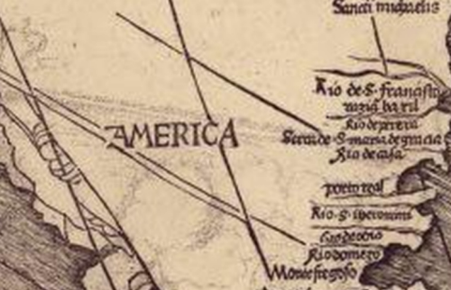 Waldseemüller was very much influenced by the voyages of Vespucci who refuted the claims of Christopher Columbus that a series of newly discovered lands to the west were part of Asia. Indeed, Vespucci claimed them as a new continent and the name ‘America’ was born. Indeed, this is the first map to show and name the continent of America and which the U.S. Library of Congress paid $10 million to acquire from a German collector in 2003. It retains the mantle of being known as America’s birth certificate. As per the title, the cartography owes much to that of Ptolemy and is in fact the first to make use of Ptolemy’s new, second projection. However, Waldseemüller wasn’t afraid to alter the map to accommodate new knowledge and this was one of the first that broke the frame of a map to show the newly rounded Cape of Good Hope at the southern tip of Africa – a place that until now had been beyond the frame of Ptolemy’s projection.