MapCarte 225/365: Is Barack Obama President? By The Guardian, 2012

MapCarte225_president

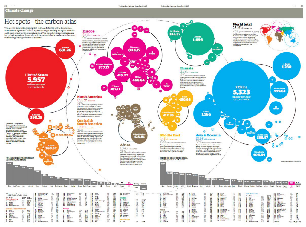
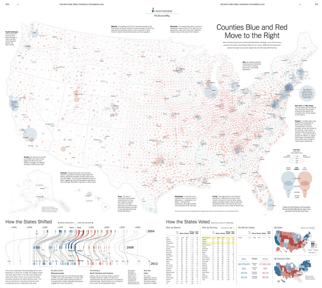
Infographics are all the rage. In fact, maps have always been information graphics. Sometimes, though, maps and mapping ideas can be used in extremely innovative ways to help create what might be termed a modern infographic.

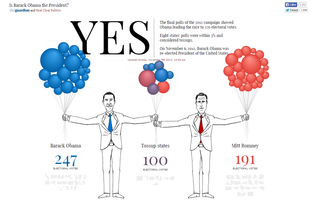
Take this illustration from The Guardian’s coverage of the 2012 Presidential election. It has the two candidates holding a handful of balloons. At first glance there’s very little map-like about this infographic but the balloons are, in fact, a Dorling cartogram. Each balloon represents a US state, coloured to show strength of vote, with the shared States being held by both candidates in the middle and the more partisan States being held well away from their opponent.

Each balloon is a perfect proportional circle and hovering over the balloon reveals further details.

MapCarte225_president_detail


The combination of illustration and the use of a statistical and highly abstract map form is a great way to present data in a new and interesting way and perfect for journalistic purposes.

The approach is supported by a clean look, effective typography and bold numbers to clearly inform the key facts. The balloons float into the screen and reorganise just as if filled with helium (or a metaphor for hot air perhaps?). There’s very little visual clutter on the page.

Take a look at the interactive version of the Obama map here or, for the sake of being equal, the Romney version here.

MapCarte 155/365: The carbon atlas by The Guardian, 2007

MapCarte155_carbonThere’s something very appealing about a well composed thematic map. The geometric character of the symbols often used as an overlay gives the work an abstract aesthetic whether they are draped across a real map of the world or not. Of of the central tenets of good thematic map design is that the underlying geography is really just a placeholder. Providing topographic detail is really nothing more than a distraction to the main event. The most explicit illustration of this is when the base map is disregarded altogether.

Here, The Guardian use a Dorling cartogram based on proportioanlly sized circles that convey both quantity of the phenomena being mapped as well as the geography itself. There’s no need for a base map as the position and adjacencies of the symbols work perfectly to tell the story. Cartograms are not to everyone’s taste though and they tend to find more favour outside North America than within which is in itself curious. They are often reserved for reporting of election results when the size and shape of real areas is secondary to the proportion of vote and the amount of red or blue one wants to paint across the map in true proportion.

They are also more heavily used in the media precisely because they are visually striking and attention-grabbing. The strong geometry coupled with bold colours used to differentiate between continents is particularly impactful. There’s a really good hierarchy of detail in the map from the large simple symbols through the typographic components providing facts to the small-print where we can read a little of the story. There’s a useful legend in the top right that relays the colour coding as well as an overall measure and the graphs and country list at the foot provide detail for those wanting to mine it.

A strong print graphic that The Guardian has used in subsequent years to good effect when updating the information.

MapCarte 144/365: Counties Blue and Red Move to the Right by New York Times, 2012

MapCarte144_watkins

Some of the best print cartography has always resided in the pages of quality newspapers. The use of maps and graphics have long been used effectively to illustrate stories and to provide a visually impactful way of engaging readers. Who wants to wade through pages of text that attempts to describe something when a full page spread of well crafted graphics can provide far more information as well as be more visually appealing?

The New York Times are currently at the forefront of journalistic cartography both in print and online. Here, Derek Watkins et al. uses a two-page print spread to illustrate not just the results of the 2012 Presidential election but also the context at a county level. The proportional symbols are well positioned and the overlaps are generally handled well (though transparency can cause some issues of perception with this sort of massively varying data it’s always a compromise). The swing in votes is illustrated by a small arrow which shows how voting changed between 2008 and 2012.

MapCarte144_watkins_detail

There are useful textual vignettes surrounding the main map to give some sense to the pattern the map illustrates and a band at the foot anchors the page with a novel graph showing change at State level. Tabular data presents the actual data and there’s even room for some headline figures and a State and Electoral Vote map…the latter using a cartogram approach.

This is an excellent example of composition and layout. Each component tells a part of the story and they fit together like a perfect jigsaw to tell the bigger story. The colours are both indicative of the different parties but are also in sympathy and balance across the page. The visual hierarchy is subtle but reinforces key information across the entire page.

Excellent print cartography that combines a rich variety of complimentary elements in a finely tuned overall composition.