 View the interactive histomap by clicking the image above
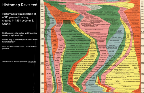
Maps don’t have to be made to look the same. Often, very abstract graphics can be equally deserving of the title ‘map’ even though they may not look anything like our conventional view of a map. In 1931, John B. Sparks produced what he referred to as a histomap which was a detailed diagrammatic layout and explanation of history with a focus on the relative power of contemporary states, nations and empires. It’s a pictorial map that plots four thousand years of world history linearly and which shows us how different countries came to be. The map begins at 2000 B.C. and identifies different ‘people’ loosely based on their geographical location in the world. Time passes as you read from top to bottom over 158cm and these peoples form identifiable groups and eventually, countries.
The original can be viewed on David Rumsey’s Map Collection site here and is an excellent information graphic in its own right. It has twin timelines on the left and the right to aid rapid reading across and the sans serif typeface allows a copious amount of detail to be included. Colours are simple and bold and allow the ebb and flow of the relative proportions of sub-groups to be seen through time. Representing time on any map poses challenges because to be really useful we need to see comparisons between and across different periods. Sparks was successful to an extent because he chose simply to plot everything on one lengthy document but there’s no denying it’s cumbersome.
Step forward 80 or so years and technology offers a new way to view the information. Rather than completely re-imagine the original, Santiago Ortiz has taken it and amplified it by creating a scrolling magnifier. The reader’s focus remains central to the image and simple mouse movements up and down (no clicking or dragging!) make the diagram scroll. The entire diagram fits within the window on screen and simply warps to unfurl as you explore. When you do click, you open a second tab that links to the Wikipedia article for that century. The map, then, not only gives information directly through the original image but adds to it through a link to additional resources. It’s an organised graphical map portal to world history.
There’s often very little that can be done to improve upon classic information design yet Ortiz brings a new approach, user interaction and aesthetic to the work. He enriches it and makes it attractive to modern eyes using modern viewing and data linkage mechanisms.