MapCarte 302/365: The 2002 Australian Total Solar Eclipse by Fred Bruenjes, 2002

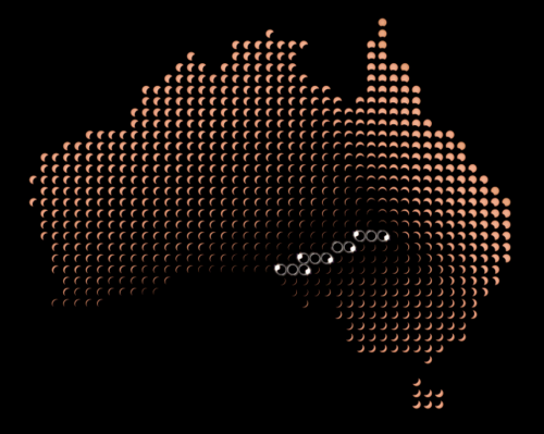
MapCarte302_eclipseThe normal way to set about making a map is to obtain some data that represents the shapes and features of the place you’re mapping and then to generalize, classify and symbolize it to suit your map. You then might overlay some thematic detail…again with heavy doses of processing to capture the essence of your message. You may add some textual components and all sorts of marginalia. WHat happens when you throw all of that out the window and approach the making of your map a different way. That’s exactly what Fre Breunjes did in this map of the 2002 Australian Total Solar Eclipse.

There’s no topographic detail, no thematic detail and no typography. There isn’t even a title! All of this accentuates the map rather than detract from it. Breunjes collected images of the solar eclipse at its maximum taken from various parts of Australia and mosaiced them into a grid of small multiples. A total solar eclipse will be observed as the Moon’s orbit passes between Earth and the Sun and if you are located somewhere near the middle of the shadow. Consequently, as the orbits move, a total solar eclipse will occur along a linear path. Either side of this path you’ll see a partial solar eclipse with less shadow the further away you are.

This beautiful map, then, doesn’t even map anything terrestrial, it maps an astronomical view from that location. The small multiples convey the amount of eclipse seen at each location and the grid of small multiples creates a quite spectacular pattern. Concentrating on the area near total eclipse you can see a variety of patterns that occur during the different phases of contact including the so-called Baily’s Beads and diamond ring effects.

You’d probably not teach a student of cartography to remove every conceivable element of a map in order to make a map yet this example proves that it’s possible. There’s absolutely no need for any other component (except perhaps a title but that’s part of the context in which Breunjes describes the map so it’s not totally absent).

You can see more detail of the maps and a version of the same approach for Africa at Breunjes web site here.

MapCarte 251/365: Lunar Landings Map by NASA, 1969

MapCarte251_lunar


Our fascination with the Moon can be traced back to Galileo who, in the early 17th Century, started making maps of the surface using telescopes. In the mid-1650s, many others including the astronomer Giovnni Battista Riccioli also made maps and named many of the features, the names of which survive to today.

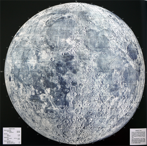
The use of unmanned space craft by NASA in the 1960s enabled far more detailed maps to be made. It’s Lunar Earthside Mosaic was a composite map created form many individual photographs. This version, at a scale of 1:2,500,000 used an orthographic projection and was used to plot Moon landings. Quite simply, it’s a beautifully detailed composite aerial photograph of the surface of the moon. The addition of labels that we’ve ascribed to the features gives it the appearance of being a little more inhabited than it is. It certainly helps us to characterise and converse about it in a way we couldn’t otherwise do.

Set against an inky black background, the simple blues and greys of the Moon stand out perfectly and the black typography is unobtrusive and uses thin line weights. A simple map created from a highly complex process.

MapCarte 115/365: Landsat imagery by USGS, 1972-present

MapCarte115_landsat1

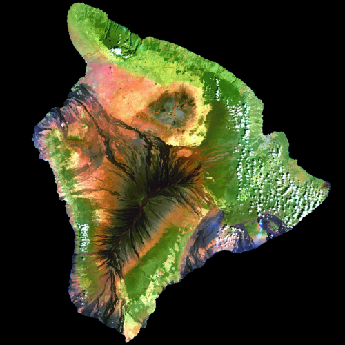
Hawaii

The Earth Resources Technology Satellites Program to launch satellites able to acquire remotely sensed images of Earth began in 1972 with the launch of what was to later become known as Landsat . April 2014 marks the 15th Anniversary of the launch of Landsat 7 and May 2013 saw the first data returned from the latest Landsat 8. Now managed by USGS in conjunction with NASA, the Landsat programme is the world’s longest running continuously acquired collection of space-based imagery of Earth. It’s imagery has revolutionised the way we view, explore, analyse, map and understand our world. It has provided an indispensable set of data to support agriculture, geology, planning, forestry and global change research.

MapCarte115_landsat2

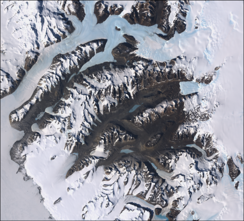
Dry valleys in Antarctica

The images and maps that have been made from Landsat data have given the world a new perspective. They’ve brought the beauty of the planet to popular media and the desktop. They’ve been uniquely informative in shedding light on our environment and how humans have reshaped it for better and worse. They enable us to better map and understand land use, land use change and help bring us discoveries that are only visible from space.

MapCarte115_landsat3

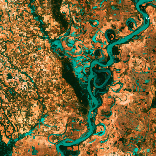
Mississippi River

While Landsat is only capable of capturing ‘data’, the way in which we interpret that and map it has given us some spectacular images of the earth. Remotely sensed images are, of course, a form of map.  The resolution of each pixel is a generalised representation of the predominant land cover captured. Successful data processing and symbolisation can bring to light very specific features. In particular, false-color composites can be processed to a true-colour likeness as the leading image of Hawaii shows from the Enhanced thematic mapper (ETM+) instrument on Landsat 7. What the image captures is the beauty of Hawaii’s land cover that shows us hardened lava flows, volcanic smoke plumes, lush tropical forests, plantations and human settlement.

MapCarte115_landsat4

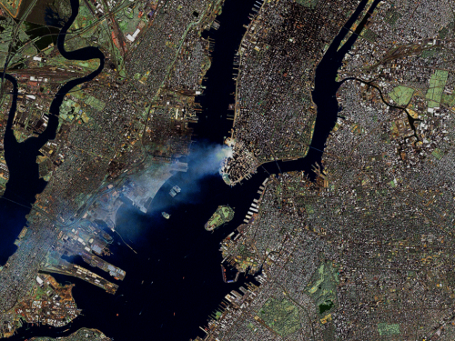
World Trade Center site in New York, September 12, 2001

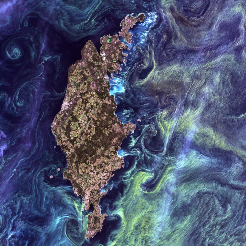
Depending on the precise timing of the satellite orbit and data captured, Landsat has also brought us spectacular images of major events such as tornadoes, hurricanes, sandstorms and even the 9/11 attack on the World trade Center in New York. It has also shown us natural beauty such as the almost Van Gogh-like appearance of the swirling waters and plumes of phytoplankton around the Swedish island of Gotland.

MapCarte115_landsat5

Swedish island of Gotland takes on the appearance of Van Gogh’s ‘Starry Night’

This MapCarte entry cannot possibly do justice in describing the detail of the Landsat programme or showcase the many fine examples of maps and imagery it has underpinned. It is a masterpiece of technological innovation and design to overcome our need for acquiring remotely sensed data to support our mapping of the planet.

For more, check out the Landsat pages on the USGS web site here and view and download Landsat scenes here.


MapCarte 57/365: Blue Marble by the crew of Apollo 17, 1972

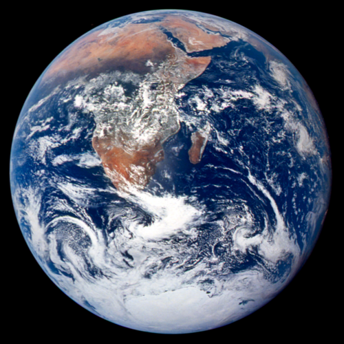
MapCarte57_bluemarbleOne of the most enduring and inspiring images of Earth, this classic photograph taken by Jack Schmitt (but credited to the entire crew of NASA’s Apollo 17 mission) was taken as the astronauts travelled toward the moon. It was shot at December 7, 1972, at 5:39 a.m. EST (10:39 UTC) with the sun directly behind the lens that created a fully illuminated Earth.

Maps take many forms and remotely sensed images are merely one end of the spectrum of abstraction. They are the most realistic of maps, capturing the features at a moment in time with the naturally occurring colours, shapes and forms of that make up the landscape in view. This view of Earth shows almost the entire coastline of Africa and, although shrouded in cloud, it was the first time that the Antarctic ice cap was visible from space due to the trajectory of the spacecraft. A cyclone exists in the Indian Ocean in the top right of the image.

The image has become arguably the most widely distributed photograph of all time and ignited a growing wave of environmentalism in the 1970s. Earth is seen as vulnerable and isolated in the expanse of space; it has become an icon of global awareness. Of course this image isn’t without some cartographic tweaking. The original photograph was taken showing Earth in a different orientation but the published version had been rotated to give us the familiar view of north upwards. Even a beautiful image such as this isn’t devoid of a little cartographic design to make it more understandable!