MapCarte 56/365: Die Landschaft Toggenburg by Johann Scheuchzer, 1710

MapCarte56_scheuchzer
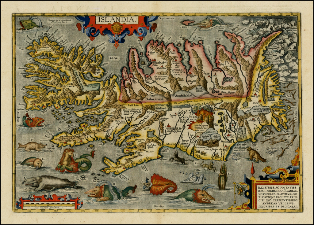
One often forgets the amount of work that was required to prepare a map in centuries past and this example illustrates the craft of copper-engraving as a method by which maps were drawn. The copper plate was engraved as a mirror image to prepare for printing…and the craftsmanship was down to highly skilled engravers. The results were often highly illustrative.

Here, Johann Jakob Scheuchzer prepared a beautiful map of the landscape of Toggenburg district, St. Gallen Canton. It shows the location of major topographic features such as cities and towns but the map belies the continuous religious strife that engulfed the area in the fifteenth to eighteenth centuries. What it does do is present the mountains as an illusive and highly symbolic, almost mythical element of the natural landscape. The reasons for such a representation were to give a sense of place to the home of ‘dragon sightings’ catalogued extensively by Scheuchzer in the early 1700s.

The marriage of mythology and copper plate artistry creates a magical picture of the dramatic mountainscape.

MapCarte 35/365: Islandia by Abraham Ortelius ca.1603

MapCarte35_ortelius

A highly decorative map. The first relatively accurate map of Iceland from indigenous sources published by Abraham Ortelius in various editions of his masterful Theatrum Orbis Terrarum. This map first appeared in the 1587 edition of Theatrum but the later versions (this is from the 1603 edition) had been refined, particularly in relation to the hand colouring. The content suggests Ortelius used many sources and the original map on which this is based is most likely drawn by the Icelander Gudbrandur Thorlaksson.

The mountains, fjords and glaciers are depicted in remarkable detail. Mount Hekla is seen erupting and it contains a wealth of detail about settlements and other points of interest…so in that sense this is an accurate, albeit stylised, topographic depiction. Perhaps the most interesting aspect of the map, however, is in the depiction of a fantastic array of legendary and mythical sea monsters from the 15th and 16th century. There are early depictions of sea horses and manta rays, walrus and even polar bears atop icebergs in the top right. Some fanciful creatures also exist and each is lettered, and has a short piece of associated descriptive text on the reverse of the map. A beautiful map that fills the empty voids with delightful curiosities.

MapCarte 17/365: Bomb Sight by The Bomb Sight Project, 2012

MapCarte17_BombSight

Click image to view the online web map

This web map presents the London WWII bomb census between 7.10.1940 and 6.6.1941. It’s a terrific effort that catalogues anti-invasions sites, bomb types and adding an overlay of the bomb maps themselves.  The map is the result of a year’s worth of work which hints at the effort needed to build an interactive web map with good quality content.

Zoomed out to a scale of 1:72,000 or smaller the map of London becomes awash with red symbols which ordinarily would be considered the antithesis of how to depict multiple overlaying features. Yet here, the result is to visually demonstrate the extent of the blitz and it’s visual impact is stunning. Zooming to a slightly larger scale and you can pick out individual strafing attacks and the impact of lines of bombs. When you zoom in further the symbols begin to separate and change into ones which portray individual bombs that can be interrogated.

Filters, graphs, search, statistics and ancillary information make this a well produced piece of work and if you view on a mobile device there’s a great augmented reality version that means you can view through your mobile phones camera with an overlay of bomb details as you wander around London.

Great example of a portal to historical information through a web map.

MapCarte 15/365: Wonderground map of London Town by MacDonald Gill, 1914

MapCarte15_Gill

The mapping of London’s Underground rail network predates the classic maps by Harry Beck but as significant features of the landscape the stations play a central role on this beautifully detailed and humorous map from 1914. Drawn by MacDonald Gill, the map was not designed for navigation or any functional use but, rather, as a story of a range of countless incidental details of London’s attractions.

The map was commissioned as an attempt to overcome the perception of the underground as overcrowded, dirty place with train services that were frequently late. The company was losing money as the trains were empty at weekends. The map, then, was central to a re-branding effort and presented a somewhat impressionable, romantic vision of train travel in an attempt to lure passengers to use the service. Hung at every station, it mixed topographical inaccuracy with a cartoon style and became extremely popular. It also became the first poster to be sold to the public and the tube to this day has a strong connection to artistic works.

Gill himself went on to design the official Underground maps between 1920-1924 and has another association with the tube in his tutor, Edward Johnston, who was himself commissioned to design the now famous letter form for the network.  The map is full of pithy stories and invites people to engage with the landscape proving that detail is often key to making a good map.

There’s a fantastic article on the history of the map including a hi-res version that allows you to explore the map in detail on the BBC web site here.

MapCarte 13/365: Atlas of the Historical Geography of the United States by Charles Paullin and John Wright, 1932

MapCarte13_Wright

Charles O. Paullin and John K. Wright’s Atlas of the Historical Geography of the United States, first published in 1932, is an award winning work of art. A magnificent historical atlas published ahead of its time and including innovative thematic representations. Each one of the nearly 700 maps makes it a truly fantastic cartographic work.  The attention to detail is exquisite and builds to a rich set of maps that detail just about every facet of America and the social, political and economic fabric of the country at that time.

The purpose of an atlas is to create a collection of works that relate to the area in question and this is one of the best of the early 20th century. Its contents are curated and written by authoritive figures. The maps are combined with temporal and statistical detail and context is provided through textual explanations. This is a true compendium that expertly mixes a range of approaches to capture the history and geography of the U.S.

A new digital version has brought the atlas to a new audience and while it doesn’t necessarily portray the work as well as the original the huge benefit of being made available online is it can be seen by a much wider audience now than ever before. You can see the online version here.