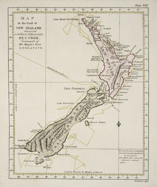
MapCarte 269/365: Map of the coast of New Zealand by James Cook, 1769

MapCarte270_cook

Imagine sailing to the southern oceans in the late 1700s without a proper clock and no accurate way of navigating and then attempting to create a map of the coastline of a country that had never been circumnavigated before. Captain James Cook was a British explorer, navigator, cartographer, and captain in the Royal Navy. After making detailed maps of Newfoundland during previous expeditions to the Pacific, Cook set out on his ship, Endeavor, to map uncharted territories.

Cook mapped New Zealand in 1769/70 in greater detail and on a scale not previously achieved. He both surveyed and named features, and recorded islands and coastlines on European maps for the first time. His mastery of surveying and cartography matched his seamanship in adverse conditions and his map of New Zealand is a masterful example of cartography given the conditions in which he was working. Indeed, It wasn’t until his second and third Pacific voyages in the 1770’s that he took one of Harrison’s clocks with him so his ability to make a map of this quality without a proper way to establish longitude was impressive.

In design terms the map is a simplified representation of the surveyed landscape. The outline of New Zealand is almost unbelievably accurate and the internal topography shows mountainscapes with molehill representations typical of the period. Labels are well positioned but its the coastline that is the main achievement of representation here. Accuracy is he success story of this map though it is a beautiful document and an important historical document.

MapCarte 256/365: Babylonian World Map by anon, c. 750-500 BC

MapCarte256_babylonian


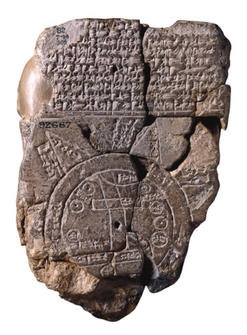
The first known map of the world inscribed on a clay tablet and depicting the known world from the perspective of Babylonia. It’s a design classic because it’s the first. Someone had the idea to represent the world around them using marks on a physical object to create a map and as far as inventions goes this has to rank among the most important to humankind.

The map is circular with cuneiform labels. The two circles represent the boundary of a water body, Babylonia is toward the centre and there is an area of marshland labelled to the south. Cities, water bodies, a mountain range and numerous islands are also shown though there is debate over whether these represent real places or mythological entities.

Possibly not quite as detailed or portable as we might prefer our modern maps but for its time this is a remarkable cartographic achievement.


MapCarte 243/365: Marshall Islands Stick Chart by anon, late 19th Century

MapCarte243_stick


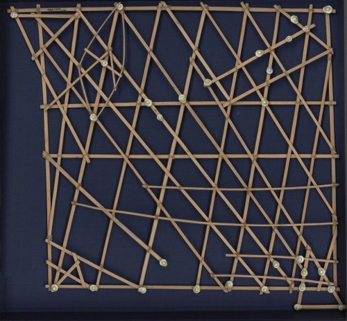
It’s doubtful any collection of cartographic design would be complete without some reference to Marshall Island stick charts. They represent perhaps one of the finest examples of form and function in map design. These navigation charts represent a system of ocean swells and the way in which islands disrupted the swells. They allowed the Marshallese to paddle by canoe between islands using these maps to aid their choice of route.

The charts were made of coconut fronds tied together to create a framework that represented the predominant direction of wave crests. Islands were represented by shells tied to the framework. Of course, there was no uniform system of design or construction but these were an early form of personalised mapping. The map-maker knew the ebb and flow of the seas and created a physical representation of their mental map.

Ironically, though the materials were perfectly suited to the wet conditions, being entirely waterproof, they were not used en route. They were more commonly consulted prior to a journey and committed to memory, with the canoeist laying in their vessel to understand how it was interacting with the swells to determine their course.

Map-making doesn’t have to be complex. Simple tools. Simple representations and a single, uncluttered theme. These charts are the epitome of cartographic simplification. All unwarranted detail is omitted. their form suits their function perfectly.

MapCarte 239/365: Carta Pisane by anon., c.1275

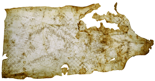
MapCarte239_pisaneThe form of a map goes a long way to defining whether it is well designed but rarely is a well designed map devoid of function. The balance between the two is likely harmonious if we see beauty in the form and function. Sometimes the simplicity of the function defines the form itself and beauty is derived largely from how the map is designed to work. This is certainly true of the Carte Pisane, the world’s oldest known portolan chart. Derived from the Italian word Portolano, or port, this map is designed to allow mariners to navigate between coastal settlements.

MapCarte239_pisane_detail


Their construction is simple, being based on the use circles, lines and grids with numerous compass directions. Coastlines and names were added according to known compass directions so the map’s appearance is strictly according to the knowledge of compass and wind direction between two ports. It’s a simple and ingenious approach to making a map to support one function – getting from A to B by sea. The shape of a coastline was accentuated by labelling the ports at 90 degrees to the coastline.

There is little need for any interior geography and the commercial importance of various trading regions is clear given the relatively poor shape and detail of the British Isles.

History can teach us much about map design. The portolan chart and Carte Pisane are exquisite examples of early map-making.

MapCarte 209/365: Bird’s eye view of China by Katushika Hokusai, 1840

MapCarte209_hokusai

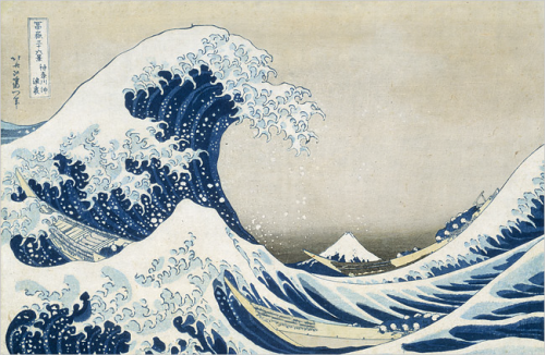
When classic artists and illustrators turn their attention to maps it’s going to go one of two ways. Either you get some sort of self-absorbed abstract bastardisation of a map…or you get the sort of beauty that Katushika Hokusai produced.

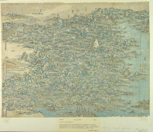
Hokusai painted ‘The wave’…the classic iconic illustration possibly only surpassed in reproduction by Munch’s ‘Scream’. Hokusai is arguably the most widely known Japanese artist in the west and he was prolific. His woodblock prints are exquisite and he’s widely known for his ’36 views of Mt Fuji’ from the early 1830s of which the wave was part (Mt Fuji is in the background). During his long and distinguished career, he turned his canvas to virtually every theme and style. Here, during the latter years of his life he created a superlative birds eye view of China.

MapCarte209_hokusai_wave

Let’s remember, this is the mid 1800s and there is very little evidence that Hokusai had even been to China yet he was able to turn his hand to the technique to perfection. He respresented many of China’s most important landscapes and places. He even managed to include a good portion of the ‘Great Wall’ and all in a perspective view with mountains standing impressive throughout. This is almost plan-oblique since there’s no hint of a vanishing point.

A fantastic piece of work by a fantastic illustrator and artist.

More of Hokusai’s illustrations including maps can be found here.

MapCarte 140/365: Historical map of Los Angeles by Gerald Eddy, 1929

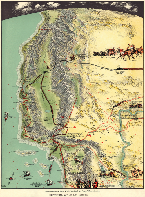
MapCarte140_losangelesIt’s often difficult to capture a range of different events, that occurred at different times that have contributed to growth of a region. More normally, we see single themes such as how industry has developed, or how transportation networks have developed. We then have to piece together an overall view.

This map of the early 1900s does things a little differently and presents 20 or so major events that led to the growth of Los Angeles. There is no indication of time other than the labels that accompany different vignettes. The map, then, explains the historical development as a collage of events that happened at different times but which collectively have their place in the historical context of the city.

The map makes good use of a progressive projection that curves away from a plan-oblique at the foot to an oblique view at the horizon. This gives a way to accentuate and focus on the study area as well as highlight the importance of Los Angeles by making it larger in relation to the rest of the layout. There’s a good amount of detailed topographic detail, particularly the mountain ranges beautifully depicted along with lush valleys and barren desert. The vignettes occupy space sensibly and are made to fit the available space. For instance, the Stage Line of 1851 is shown relatively large not because it was necessarily more important but because the desert has no other defining detail…so it is used as a space-filler as much as anything.

The vignettes are well drawn, mostly as side elevations, and create a certain dynamism to the map showing a region of growth and importance. Railroads are clearly represented and the typographic components sit well on the landscape.

Eddy uses a great deal of artistic license but does so to a high standard. An illustrative map that tells a simple story.

MapCarte 118/365: Britannia by John Ogilby, 1675

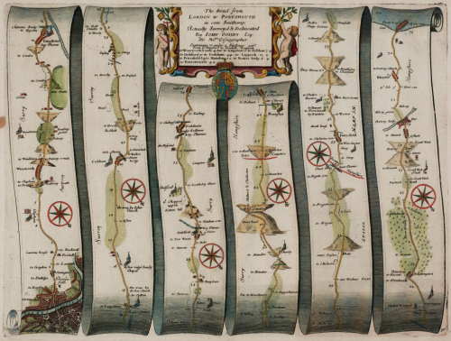
MapCarte118_ogilbyIn 1674 translator and publisher John Ogilby was appointed as His Majesty’s Cosmographer and Geographic Printer and published Britannia, a road atlas of Great Britain, in 1675 which set the standard for many years to come.

The atlas contained 100 strip maps accompanied by text at a scale of one inch to one mile.  The scale was innovative for the time and later adopted by Ordnance Survey in its first (one inch to one mile) map series. Ogilby’s maps are a linear cartogram and north varies between strips.

MapCarte118_ogilby_detail

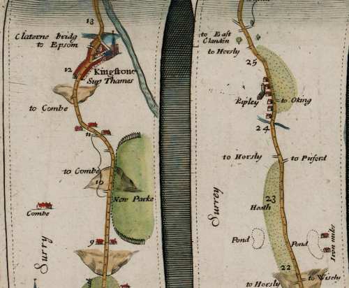
People can orient themselves in the direction of travel regardless of the true direction.  The scroll effect suggests their use for navigation as if they were to be opened and used on the journey itself.  The lines have been necessarily straightened to fit into each strip but the essential details along the route are maintained. Features are artistically represented but all have a practical value and a great deal of extraneous detail is omitted.  Hills are included, oriented to depict whether you would be ascending or descending depending on the direction approached. Distances are included as well as place names, illustrations of villages, towns and forests. The maps, marginalia and cartouches are particularly ornate and typography also includes flowing ascenders and descenders.

Ingenious for its time and a style still used today to show the linearity of route networks (e.g. motorway networks) in many street atlases. Certainly, the use of straightened lines has become a very familiar cartographic approach for depicting transport networks with subway maps being perhaps the most abstract.

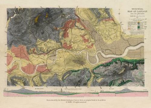
MapCarte 88/365: Geological Map of London and its Environs by Robert Mylne, 1871

MapCarte88_mylne

Maps that offer something new and unknown are often those that become classics for what they achieve as much as how they are designed…but the key to their success is they were very much designed to support a specific need. First published in 1856 in a period of great change in the understanding of public health and disease in cities, this was an important map in its day.  Robert Mylne was a Civil Engineer and Architect and knew that a detailed geological map was essential for informing major public works such as improved water supply and sewerage systems for London.

The original version contained only contours to show differences in elevation and though proposals to modernise the sewage system were neglected at the time due to a lack of funds, the Great Stink of 1858 persuaded Parliament of the urgency of the problem.  The map informed the design of an extensive underground sewerage system that drained downstream of the centre of population.

By 1871 the engraved map had been hand coloured to show the underlying geological structure and informed the construction of deep artesian wells and bore holes to supply the city with clean water.  The combination of plan view and cross-section help to tell the story of London’s topography and geology. Without such a map, it would have been impossible to plan the modernising engineering works required. The map is detailed…but only with the required detail. The cross-section provides an indispensable way to visualise the elevation across the city.

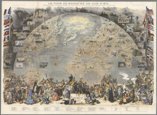
MapCarte 85/365: Le Tour du Monde en un Clin d’Oeil by Fortune Meaulle, 1876

MapCarte85_lemondePublished by Le Monde Illustré, a 19th century French news magazine, this map demonstrates the artistry of the engraver Meaulle and designers M. Scott and D Vierge. Entitled ‘Around the World in a Wink’ the map was a supplement designed to pictorially illustrate the world using a view from space perspective. The map details flora, fauna, historic events, cultural artifacts and indigenous people. Insets are used to great effect to highlight particular places or moments of historic interest.

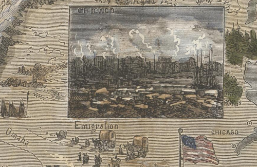
The map includes a wide array of national flags of major nations as well as figures in traditional costumes and the achievements of various explorers. The map tells a non-linear story and invites readers to explore the different parts of the world. It’s also an example of innovation and ingenuity in cartography since the map includes what appear to be photographs yet this was published in a time when photographic reproduction in print wasn’t technically possible. Instead, the solution was to create a wood-engraved version of the images in such detail that they take on the appearance of a photograph.

MapCarte85_lemonde_detail

Cartographers often have to find workarounds to achieve a particular effect. This example illustrates how technical limitations do not necessarily limit the design.

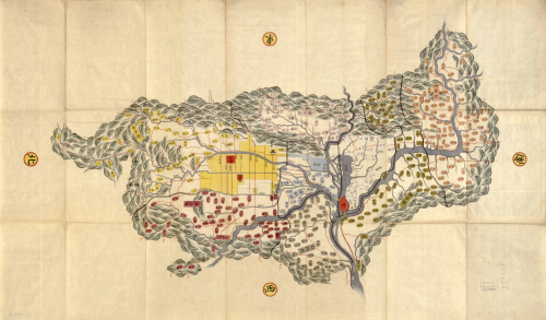
MapCarte 60/365: Yamashiro no Kuni ezu by Anon, ca1800

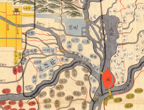
MapCarte60_yamashiroThe Yamashiro region of Japan hand-drawn using ink and watercolour around 1800 showing the artistry of far eastern mapping of the period. Scale is warped. East is up. The landscape is depicted pictorially, yet the key features are still easily recognised and give a sense of place. Nijō castle and the Imperial palace (the red areas within the yellow city) are labeled and clearly identify the place we refer to as modern day Kyoto.

MapCarte60_yamashiro_detail

Ovals are used to depict small villages, rectangles are larger ones and the place names describe modern districts of Kyoto. Temples are illustrated with mimetic symbols and colour is used to denote which ‘gun’ each village is located within. Tapered streams are used to illustrate some of the rivers and streams.

Here, then, despite the apparent artistry and simplistic approach, we see both quantitative and qualitative symbology working to communicate something of the size, character and relationship of the populated areas. Hierarchy is also used effectively for transport links and the surrounding mountains are depicted encircling the region rather than being presented planimetrically or, indeed, using a birds-eye representation from the viewer’s orientation.