MapCarte 218/365: Mapping Manhattan by Becky Cooper, 2013

MapCarte218_manhattan2

One could argue that any and every map is subjective to a degree. They are all products of our individual experience and approach though, naturally, maps made as part of a national mapping series for instance will contain less of the individual. At the other end of the spectrum there are the purely subjective; those maps that exist in our mind and which only rarely ever get committed to some tangible form.

Becky Cooper’s work is designed to capture the emotion of Manhattan as seen through a variety of lenses. Her intent is to capture subjective portraits, each of which tells a part of the story of the bigger place. It’s a collaborative portrait of the city completed by distributing outlines of Manhattan and asking people to make a map. The result is a fascinating, colourful and hugely varied collection of beautiful maps. Some approached it topographically, some thematically and some used it as a canvas to note memories and personal experiences.

MapCarte218_manhattanThe 75 maps in the collection are published as a book and are truly fantastic as give us an insight into people’s personal worlds. The book very cutely includes a blank map at the back which invites readers to create their own map.

more examples of the work can be seen on Cooper’s tumblr here.


MapCarte 203/365: Mt Fuji, by anon, 1830

MapCarte203_fuji


There’s very little that is genuinely new in cartography yet with such massive technological advances we see reinvention all the time. So it’s always useful to keep an eye on our cartographic heritage. It informs what we do because we can tease out best practice; and it shows us what has gone before so we can ensure we give credit where due.

This stunningly beautiful map of Mt Fiji from the early 1800s gives us much food for thought. The detail of the mountainscape and, in particular, the use of a side elevation to create the appearance of molehills was used earlier but used here to great effect. The fact the Fuji itself is given prominence by being depicted in the round, rather than an elevation works well and shows how different graphical treatments to similar phenomena can be used to classify importance.

There’s a fine mix of planimetric and plan oblique in the work with a coastline shown using a vignette and some sense of routes across the landscape. The surrounding text works well in the traditional vertical orientation.

Overall, a beautiful historical map. Simple.

MapCarte 199/365: Gifu by Hatsusaburo Yoshida, c.1940

MapCarte199_yoshida

Long before satellite imagery and aerial photography, cartographers had to imagine the landscape and explore different ways of representing the world. Hatsusaburo Yoshida trained as a textile designer but is well known for his spectacular birds eye view maps, produced in the early to mid 1900s.

His work was informed by tireless local surveys which included not only measurements of the landscape but meetings with local people to gain a sense of what’s important to an area. This provided a way of developing a sense of what to include or omit on the map.

Yoshida’s maps are vibrant and colourful. They sow mountains as key features represented almost in aspect while much of the other detail is presented in perspective. There’s an abstract feel to the symbology and the clean lines used to represent real world features yet he manages to maintain a certain realism to the portrayal. The textual components use a billboard technique that lifts labels off the map which is a clever technique for this style of mapping. His skies and clear, cloudless sunsets illuminate the map to give it a crystal clear depiction unencumbered by haze or clouds.

Beautiful hand drawn maps showing the very best of design and representation. More examples of Yoshida’s work can be seen here.

MapCarte 198/365: Carta Marina by Olaus Magnus, 16th century

MapCarte198_cartamarina


There’s something about hand drawn maps that draws cartophiles in. They more than often demonstrate the art of cartography simply because every mark has to be carefully thought through. This map is the first detailed map of Scandinavia and as a hanf drawn map it’s an absolute gem.

The symbology and colours, the typography and layout are second to none and demonstrate the very best of the art of cartography. Many of the defaults of modern software do not give this sort of final aesthetic yet with a little knowledge it’s not rocket science to replicate this sort of map.

MapCarte198_cartamarina_detail


The detail and typography is exceptional and the graphical techniques for different land types is particularly impressive. Trees as mimetic symbols and patterns fills for the water bodies are especially well designed.

A lovely historical map that gives us strong pointers to how we might implement similar techniques on contemporary efforts.

MapCarte 197/365: Tokyo by Benjamin Sack, 2014

MapCarte197_tokyo


Perspective illustrations of cities and landscapes have always been maps that inspire. They tend to be highly illustrative and show places in detail. This example of Tokyo by Benjamin Sack is both typical of the genre but also unique in that it takes the rendering of the environment to an incredibly detailed level.

The map uses a typical perspective view which incorporates foreshortening. While creating difficulties in measuring from place to place it’s a highly effective way of rendering an image that mimics the human point of view. What Sack does well is use shadow and depth of ink to make the background darker. This creates an illusion of depth in the image. The foreground water uses some subtle texture to create a more interesting image.

MapCarte197_tokyo_detailOverall, a beautiful map that uses light and dark to great effect and which illustrates the power of black and white maps.


MapCarte 167/365: Dry well-bores by Torgeir Husevaag, 2005

MapCarte167_husevaag2

Most maps are designed to show something that people want to know. Some are designed to show people what they might prefer not to know. This isn’t necessarily negative cartography but it’s often an uneasy way of looking at the world.

After some 50 years of successful oil exploration and drilling in the North Sea which has supported the Norwegian economy, Torgeir Husevaag paints a picture of all the futile test-drillings, literally. His hand-drawn approach lends a certain human exposure to the highly scientific approach of the drillings themselves. It’s an almost paradoxical way of representing the subject matter which would more usually be seen through engineer’s plans and charts using sterile, heavily specified symbols and linework.

MapCarte167_husevaag

The 150 or so dry bores are numbered and linked to show them in sequence. There’s no particular need for this and the lines don’t actually exist but by showing them in this manner he creates a richer story. It explains the perhaps haphazard, unscientific search akin to looking for a needle in a haystack.

This is an alternative history told through a sequence of maps. The illustrations are well produced and the unconventional symbology a rich metaphor for the futility of the endless search for black gold.

More at Husevaag’s web site here.

MapCarte 128/365: Stockport emotion map by Christian Nold, 2007

MapCarte128_stockport
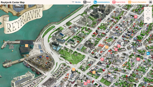
Mapping physical space is the cornerstone of cartography but it certainly isn’t limited to that realm. In some ways, many of our own mental maps are the most interesting yet they are rarely drawn. We hardly ever see a physical representation of the way in which our brain sees the world with all its distortions based on familiarity and bias and how we get from A to B using our own unique points of reference. Of course, the realm of mental maps is a fascinating area of cartographic discourse in its own right but there are simpler ways of exploring how we think and feel about a place.

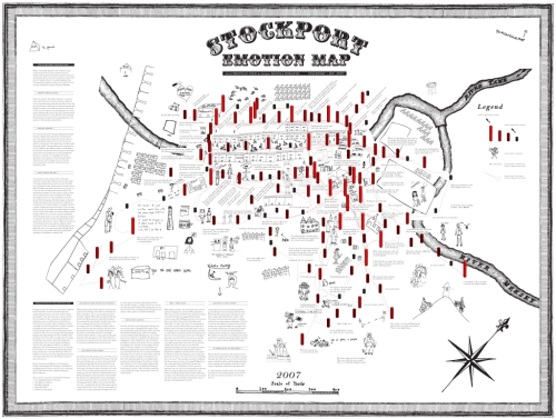
Christian Nold’s emotion map of Stockport in the UK goes beyond the conventional depiction of the buildings and urban fabric of a place. He has created a map that represents feelings, emotions, opinions and desires of local people. He bases the map on a project involving 200 people who completed a range of mapping exercises that required them to draw their responses to a variety of stimuli. What do they enjoy about Stockport? Where do they meet friends? Who are the most important or dangerous people in town? The resulting drawings were scanned and compiled into the map itself. He also measured individual arousal (positive or negative) at different places in town and included vertical bar graphs on the map to show how people react to different places. Finally, he annotated the measures with participant comments so we get a sense of what people think. It’s not one mental map – it’s a collective mental map.

What he ultimately creates is part art project, part insight into the way we really view a familiar place. The formation of clusters of concerns and comments gives rise to a way of seeing our surroundings that is often overlooked. These disconnected conversations become apparent through the map and reveal an until now hidden side to the way in which people feel about Stockport. For instance, the map revealed that the town’s history is somewhat marginalised, there is a predominance of shopping activities and young people feel somewhat isolated  due to lack of provision of things they find interesting.

MapCarte128_stockport_detail

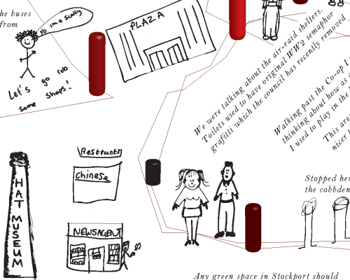
The map itself is a collage of different people’s work but that messy, unstructured appearance relates well to the project’s objective. This isn’t about creating a coherently designed view of features, it’s about exploring differences and the expression of those differences. The map won’t win any awards for the most beautiful map you’ve ever seen but it represents perhaps a hidden aesthetic – one that is only revealed when you stitch together seemingly random, disparate pieces into a whole. It’s not without graphical merit though – the hand-drawn approach follows through to Nold’s marginalia, borders and scale bar. There’s a consistent black on white treatment except for the emotional graphs that use colour effectively. Given the amount of random elements from multiple pieces, crafting a map that shows any amount of consistency in design is an achievement in itself.

Visit Nold’s web site here to see a larger version of the map and more detail. Nold has also taken completely different approaches to mapping different cities. Worth a look.
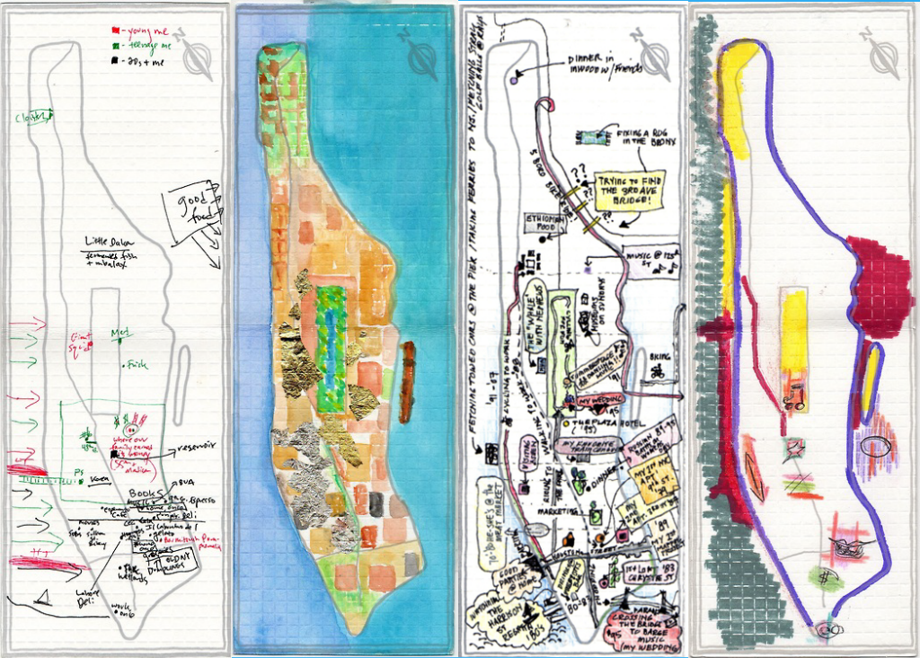
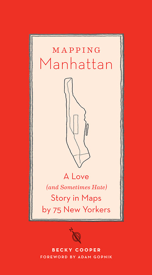
MapCarte 127/365: Iceland Illustrated by Borgarmynd, 2012

MapCarte127_iceland1

Click on the image to view online web map

Combining the artistry of a hand drawn map with a modern digital publishing approach may at first seem like some sort of paradox yet there is nothing that states a hand drawn map has to be on paper and a digital map has to be nodes and vertices. In fact, some of the most interesting cartography comes from combining techniques that at first sight might appear to be not particularly well suited to one another.

Iceland Illustrated, by Borgarmynd, have created a large 3D hand drawn terrain map of the country principally as a tourism related product. It is available as a printed map but they have also re-purposed it to provide the backdrop to an online web map. The map provides a beautifully rendered backdrop which is used to provide a base for the location of geotagged photographs of Iceland’s spectacular scenery with modern pictograms showing the locations. Compare the approach with the same areas on Google Maps illustrates the difference. Where Google shows us barren nothingness, Borgarmynd has detail, rock drawing, colour and features. Of course, Google’s approach has to be consistent globally…but when you’re mapping a specific place you can stretch your artistic license a little.

MapCarte127_iceland2

Click on the image to view online web map

The same approach has also been taken for their map of Reykjavik proving that you can easily transfer the same detailed, hand drawn watercoloured approach to a large scale environment and make it equally fit for purpose as the base for an online web map. Again, pictograms mark the locations of photographs and other points of interest. The only difference between the country and city level maps is the former is planimetric (with some plan oblique rendering of mountains) and the latter is an isometric drawing in greater detail.

A very successful marriage of old and new.

MapCarte 117/365: Atlas of Global Geography by Erwin Raisz, 1944

MapCarte117_raiszOne of the twentieth centuries foremost cartographers, Erwin Raisz was born in Hungary but emigrated to the US in 1923 and spent much of his professional career teaching cartography and curating the map collection at Harvard University. He was a prolific map-maker who produced thousands of maps comprising mainly of landform drawings. His style supported the easy interpretation of landform features “combining a scientist’s fascination with geomorphology with an artist’s drawing ability”

MapCarte117_raisz2

Rasiz’s maps were accurate, elegant and brought considerable aesthetic appeal to the depiction of the physical world in map form. His style was unique and his work was almost entirely pen and ink. More than his landform maps, Raisz published a seminal text on ‘General Cartography’ and introduced block-pile maps, created the orthoapsidal projection and value-by-area cartograms. His 1944 atlas showcased many of these techniques in a beautiful work. Each page of the atlas is a piece of art in its own right and shows how a cartographer should work in treating each theme as a unique challenge. While an atlas should be consistent, the consistency here comes in the quality and the variation of technique applied perfectly to each theme. The pages all look different yet they match in style and encourage exploration as each turn of the page brings a new visual delight.

The limits in colour printing meant the colour palette was at first glance very restrictive. However, this leads to a more consistent appearance with the same colours used across all maps and the thematic maps being predominantly two-colour. Such limitations also give the cartographer a strict set of constraints that focuses their design to optimize the pallete at their disposal. In short – technical constraints often bring out better work because quite simply it forces the cartographer to think and think inventively to take advantage.

MapCarte117_raisz3

Raisz spent much of his life educating people in the art and craft of cartography. In later life he experimented with the use of aerial photography in cartography but was skeptical about the use of computers to produce maps. His views were based on an impression that computers would remove the realism that a cartographer can bring to their work and that maps could end up being produced by technicians with little interest in geography or cartography.

MapCarte117_raisz4

Raisz died in 1968. Nearly 50 years on one could be forgiven for thinking he may have had a point but we can reflect on his work as a way to inform new work and bring some of his flair and technique to new map-making endeavors.

You can explore some of Raisz;s work here and also see high resolution zoomable version of pages of this atlas on David Rumsey’s site here.

MapCarte 95/365: Pictorial Guide to the Lakeland Fells by Alfred Wainwright, 1955-1966

MapCarte95_wainwrightThis MapCarte entry is more concerned with the illustrations and maps that Alfred Wainwright produced for his 59 walking guides and publications than specifically the Pictorial Guide to the Lakeland Fells series though they are perhaps the most widely known. The Pictorial Guide consisted of seven volumes compiled entirely of his own hand-written manuscripts, his hand-drawn maps and beautiful original illustrations drawn entirely in pen and ink. The Pictorial Guide has been in continuous publication since their first edition and remain as popular as ever. Their unique style and design that marries art, cartography and the written word brings a sense of romance to the long distance footpaths Wainwright wrote about and illustrated in such detail and with immense passion.

Wainwright’s maps are charming and bring to life not only the beauty of the landscapes he loved but also some of the desolation and isolation of the fells. The simple black ink drawings and maps lay bare the landscape yet contained a depth of detail and information that could only be re-told by someone who had walked every single mile and seen with his own eyes.

MapCarte95_wainwright2

The ascent maps are planimetric in the foreground and morph to become perspective in the distance showing natural features and the climb ahead along the route.  Contours not only provide useful information but add to the representation of the 3rd dimension.  The hand-drawn approach lends itself to giving a sense that the maps are somehow more real and match their in situ use perfectly (as tools to support wayfinding).  The maps are not just landscape sketches though.  Planimetric detail is marked and pictorial symbols (e.g. trees) are also used to good effect.  As a small format book the publications and the maps they contain are perfectly suited to their purpose. Many of the pages in the guides contain diagrams illustrating the directions of the fells on a compass rose. Drawings of key features as hikers would see them give a clear idea of location, scale and orientation. Small inset maps are littered throughout to bring clarity to specific parts of a route.

The Pictorial guides took 13 years to complete and are beautifully designed and constructed guidebooks that encompass the 214 peaks in the Lake District. The work is borne of a personal obsession but which clearly has the enjoyment of others as the driving motive. As such, the maps support navigation by all and are so much more than simply Wainwright’s own perspective. The cartography is exquisite but it is the bringing together of all the constituent parts of his guide book manuscripts that makes Alfred Wainwright’s work so enduring.