MapCarte 360/365: Hugg-a-planet by Peacetoys, 1982-present

MapCarte360_hugg
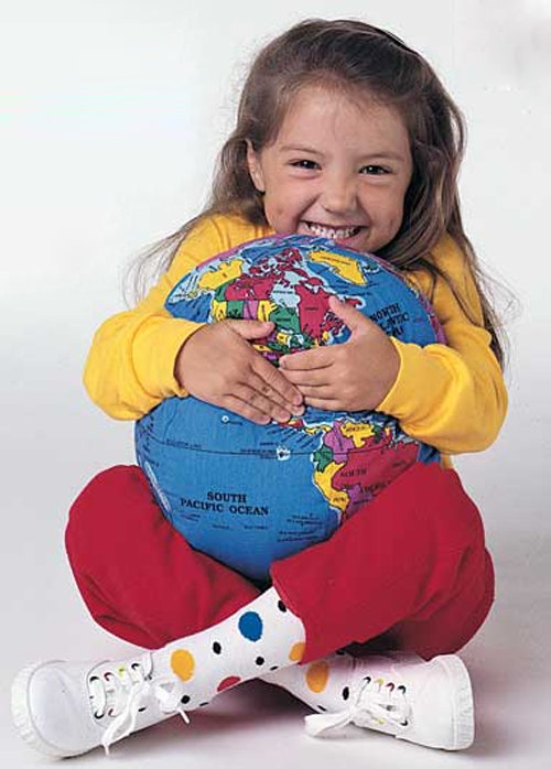
Tis the season…so another MapCarte entry that looks at the design of a toy based on a map. Sometimes the simplest ideas turn out to be the best and producing a globe made as a pillow has been a commercial hit for the designers and manufacturers of Hugg-a-Planet. The design is fun, useful and memorable as the central message is we can wrap our arms around the world and give it a hug. It’s an object that supports all sorts of play activities in young children and the map itself is designed to be colourful and attractive. This doesn’t need perfect cartography…just the sense of the shape of the world that children can get to grips with, literally.

Of course, it has a secondary purpose as an educational aid and allows children to begin to learn about geography by using the hugg-a-planet to show where countries and places are. Beyond childhood, hugg-a-planet has become somewhat iconic as a metaphor for global peace. It resonates with those seeking to explore enviromentalism and as pleasing object to have lying around as a cushion with meaning.

MapCarte360_hugg2
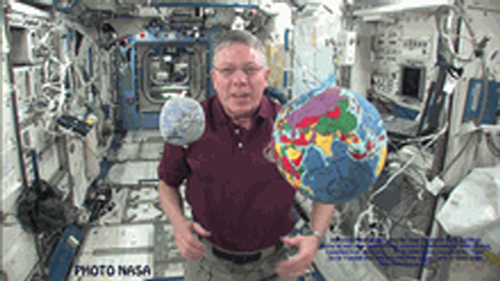
It’s a fun toy but one which has been used and shared by Presidents as well as global business and political leaders and televison, movie and musical celebrities. It’s even found its way onto the International Space Station where it began it’s orbit in 2009.

You can find out more about Hugg-a-Planet at the website here.

MapCarte 165/365: FIFA Development Globe by Studio NAND and Moritz Stefaner, 2012

MapCarte165_stefaner

View the web map by clicking the image above

Globes are always powerful symbols and more and more use of them is being made in the online world, largely as a result of the impact that Google Earth has had and people’s appetite for rotating, panning and zooming earth-like objects. We have always spun globes…we are just now able to do it digitally as well as we can the desk globe.

Moritz Stefaner, in collaboration with Studio NAND, Medienfabrik and Jens Franke have designed a truly abstract globe to act as a container for thematic detail relating to FIFA’s football related educational activities worldwide. The digital medium supports such an abstract approach well with countries and continents constructed from tessalated triangles. Triangles also follow through to the symbology used to represent the different activity with numeric and qualitative information being assigned. Symbols can be filtered and, of course, the globe can be manipulated to focus on specific countries.

As the globe spins we see the inverse of landmasses through what is, in effect, a transparent model. This could cause visual clutter but the elegant abstract nature of the approach allows the design to capitalize on the aesthetic.

Colours, graphs, statistics and navigation are all intuitive and the application performs smoothly. There are focus-context changes made all the time as you spin the globe to bring different information into view and you can filter any amount of the content. There’s even an ambient low-level soundtrack to provide an aural abstract experience at the same time as interacting with the globe and various clicks and indications that some state change has been implemented by the user controlling the map.

A globe is an enjoyable experience because it’s tactile and allows you to see what’s round the corner as it is spun. This digital version is no less tactile which is a success for a digital application.

More detail on Moritz Stefaner’s web site here.

MapCarte 119/365: Armsglobe by Google Ideas, 2012

MapCarte119_google

Click the image to go to Armsglobe

This data visualization (map?) was produced by Google as part of the 2012 Google Ideas INFO (Illicit Networks, Forces in Opposition) Summit. The data was provided by the Peace Research Institute Oslo (PRIO) and comprises a database of small arms imports and exports. There are over 1 million data points of individual exports and imports that map the transfer of small arms, light weapons and ammunition across 250 states and territories across the world between 1992 and 2010.

The purpose of the map was to highlight the illicit trade in small weaponry as a way to shed light on the fact that 60% of all violent deaths are due to small arms and light weapons. Creating a visually arresting, in-your-face map provides just the right aesthetic for capturing people’s attention. Sure, the data could have been mapped on a flat map with muted colours and a conservative approach but sometimes the subject matter and the purpose need something altogether different. The design is deliberately startling and captivating and illustrates patterns and trends in the import and export market so that one can better understand how they might relate to conflicts.

The armsglobe is fully interactive and allows intuitive zooming and rotation. Click events highlight a particular country and the labels rotate and scale as the map view updates. Graphs provide some quantifiable comparisons that show a breakdown of imports and exports. The viewer has control over showing or hiding some of the graphs as well as different ways to filter the data. In this way, one can show everything to gain an overall impression or focus on a specific type of import or export. there’s even a temporal slider to explore historic data.

Use of Armsglobe during the 2012 INFO Summit

The most impactful aspect of the design is the contrast between the map’s background and the flow lines themselves. A black background and a globe that has black water bodies and grey landmasses, turning lighter on selection is a perfect backdrop for the neon, pulsing flowlines. the animated symbology clearly shows the flow’s origin and direction as well as quantity. It’s unconventional but hugely effective.

Often the trick to producing a well designed map is not simply going with convention, but trying something altogether different. It’s often harder to succeed with the latter. This design approach wouldn’t suit every mapping need but here, it works in concert with the theme and the map’s purpose. Form and function.

MapCarte 113/365: Desk Globe by Bellerby & Co. Globemakers, 2012

MapCarte113_bellerby2

Globes. Possibly the finest representation of the planet in map form that exists. No need to be concerned about the awkward process of mathematically crow-barring the earth’s detail onto a flat map or a computer screen. No digital devices to be bothered with. A simple, spherical, physical model that shows us how the planet actually is – a three-dimensional physical object represented perfectly by a three-dimensional physical object. Most of us at one time or another have spun a globe in a classroom or on a desk. Many of us own a globe…most likely one made of a plastic printed shell, possibly that lights up and if you look closely you’ll likely find lines of latitude that don’t quite line up and overlaps of bits of countries and text. But not all globes are created equally and Peter Bellerby’s globes are exquisite.

In an era where digital is surpassing physical it was a brave man who decided to build his own globe making company. Bellerby did just that in 2008. He wanted to get a globe as a present for his father’s 80th birthday but couldn’t find one suitable…so he set about making his own and thus his company was born. Making globes is no easy task. Making high quality globes even harder and his story is one of dogged persistence in achieving perfection.

Peter Bellerby – The Globemaker from Cabnine.

Bellerby’s collection includes a wide range of globes from the 12″ desk globe shown here to massive 50″ Churchill globes. Each is hand-crafted, involving Formula 1 racing car fabrication techniques (to create a perfect sphere) and then hand painted. As maps they are simply beautiful with colour being expertley applied and labels sitting perfectly across the map. Of course, each globe can be customised to whatever requirements you wish but the standard desk globe is a perfectly balanced piece of work without modification. As a globe, the maps take on an extra dimension quite literally. The exacting construction means the gores line up perfectly and as you’d expect the map itself is based on up-to-date information and correct at the time of construction. The desk version weighs 3kg and sits atop a hand made black walnut plinth housing roller-bearings that allows the globe to glide and rotate effortlessly. This is the very essence of engaging with a map – to touch it and to feel it as you control its movement with perfect fluidity.

MapCarte113_bellerby1

You cannot just make a globe without a fine attention to detail. Precision and craftsmanship are what sets these globes apart and makes them not only unique but masterpieces of cartography. These globes are made to last and have brought a dying art back to the fore. Peter Bellerby has resurrected the lost art of high quality globe making and his globes are literally out of this world.

For a more detailed exploration of Bellerby’s history, collection and processes visit his web site here.