What could be more carto-artistic than 40 painted map frescoes in a 120m gallery? The Vatican is home to The Gallery of Maps, a stunning set of large-scale paintings that showcase Italy through wonderfully rich and vibrant topographic maps. They were drawn by geographer Ignazio Danti as part of a Commission by Pope Gregory XIII in 1580. Others painted (literally by numbers) to fill in the detail. It was simply designed as a way of decorating The Vatican. The 40 works took three years to complete and cover the whole of Italy as well as a range of panoramic views of major cities.
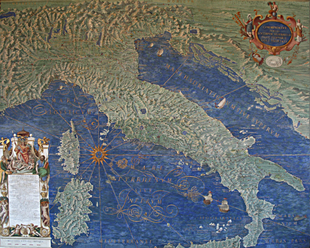 The timing was ripe for maps to be considered an important element in scientific discovery as well as for decoration. The age of discovery had revealed new knowledge and scientific instrumentation such as the sextant, magnetic compass and telescope had improved accuracy of measurement. Mercator and Ortelius were making landmark world maps at around the same time. Pope Gregory XIII wanted The Vatican to join the cartographic revolution through this ambitious project.
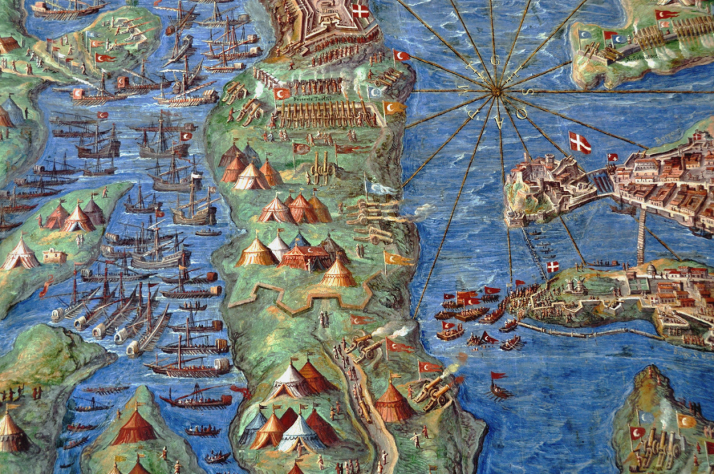 The maps are beautifully drawn and detailed. The large-scale paintings have a consistency that ensures they are seen as a set. The rich greens and blues for land and water create a beautiful palette that gives the hall a richness of colour. Terrain is well presented with detailed shading and the maps are full of ornate flourishes such as waves in the sea, cities, tents, boats and sea creatures. While many of these elements are totally out of scale compared to the backdrop map, they show a range of important scenes and the design supports the scale, size and purpose of the project as a gallery through which you walk en route to the Sistine Chapel.