 The artist’s palette is enriched by maps as they make use of them in a multitude of ways to inspire their work or, indeed, as objects within their work. Artist Heidi Neilson produces a wide range of eclectic works mainly through the medium of publication. Her prints and other works on paper tend to take on a specific theme and she often explores the subject matter of geography through one medium or another. Here, a series of works entitled ‘Maps’ takes maps as they exist and then cuts them up before restructuring them to create an entirely new object. that object shows a careful redistribution of linework, shapes and colours that build something other than the map. The work takes on a new form and new meaning that encourages us to look upon the maps in different ways.
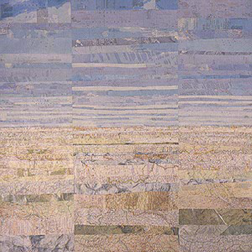
 Essentially, Neilson is taking an esoteric look at the way in which maps document space and through deconstruction and reconstruction, commenting on the ability of the same marks to give us something completely different, just reconfigured. The four works here reflect the new patterns that emerge. Sea level shows how strips of maps that contain broadly the same tone can be manuipulated to create a view of the horizon as if across a beach with the golden sands merging into the blue sky on the horizon.
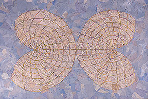
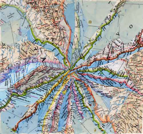
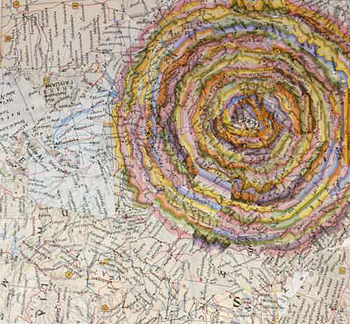 Projection takes tonal variation a stage further by reconstructing a map projection. Again, blues form the background while lighter colours and sharp lines are used to create the new map projection in the foreground. The other two examples are referred to as Collapsed Borders and the colourful vignettes often used to demarcate political boundaries are singled out and repurposed to create different shapes…a circle (perhaps a sun?) and converging lines (perhaps a mountain top with ridge lines). These two examples in particular show how the usual patterns we see on a map and the recognisable symbology can be manipulated into something quite different.
 Cartographically, it perhaps reminds us just how much we rely on our map user’s inate sense of what they expect to see on a map and how we design with that in mind. Rarely do we modify the codification of our maps beyond what is already familiar. We do this to establish trust and to ensure our map’s speak to our users. This sort of artistic venture with maps shows us that we can dare to be different and it brings a new aesthetic to the map. It may also help us to go beyond our defaults and search for new ways to represent meaning.